Usability Lynch: looking for interface vulnerabilities in CMS Diafan
Hi, Habr. I'm sure you still are not dying! I will try to have this material contribute its 5 kopecks to the “Habr - Live!” Development fund.
I have been doing interface design for quite a long time. I love my job and every time I look for any opportunity to develop. The search for errors and vulnerabilities of interfaces in working systems, prototypes and applications I find this opportunity. Having found some typical mistakes in others, the conclusions are accurately printed in the subconscious, which will allow not to step on such a rake again in their own daily routine.
I ask you not to judge strictly beforehand. The review is purely subjective. A look at this system is presented exclusively through the prism of personal professional experience. I am glad that there will be not only criticism - solutions will be offered!
By the way, if you use Figma , I recommend paying attention to our ready-made design systems . They help freelancers complete more orders per month, programmers can create beautiful applications on their own, and the Timlids run sprints faster using ready-made design systems for teamwork.
')
And if you have a serious project, our team is ready to deploy a design system within the organization based on our developments and tailor it to specific tasks using Figma. Web / desktop, and any mobile. We are also familiar with React / React Native. Write to T: @kamushken
Why Diafan?
It was decided to analyze several popular systems for creating and managing sites. Diafan just recently completely changed the interface and this is a great opportunity to “plunge into other people's problems” :) (speaking of the problems, I mean Beatrix, the interface of which vaguely resembles windows 95)
The argument of the choice was very simple: the faster we get to the demo access and plunge into the atmosphere of the system, the sooner we make our choice (try to find it on the site of the notorious Bitrix). Of course, the cost was not in last place. It is convenient to “drive” the product on a free basis, as they say, both into the tail and into the mane. And only then make a strategic decision!
Is everything so bright?
Certainly not. Diaphan, get ready :) The admin of the system meets us with minimalistic colors. And this is wonderful, because in the future our attention can be manipulated by introducing new colors in the required proportions. Always good in such a contrast will look alerts about new events in any section where they are implied.
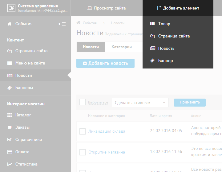
Menu
Unfortunately, against the background of empty dashboard, the gray menu takes all the attention away. Certainly there is an understanding that as the site is filled it will be filled, but first impressions are as follows. The user is doomed to study all the available sections that hit his shoulders at once:
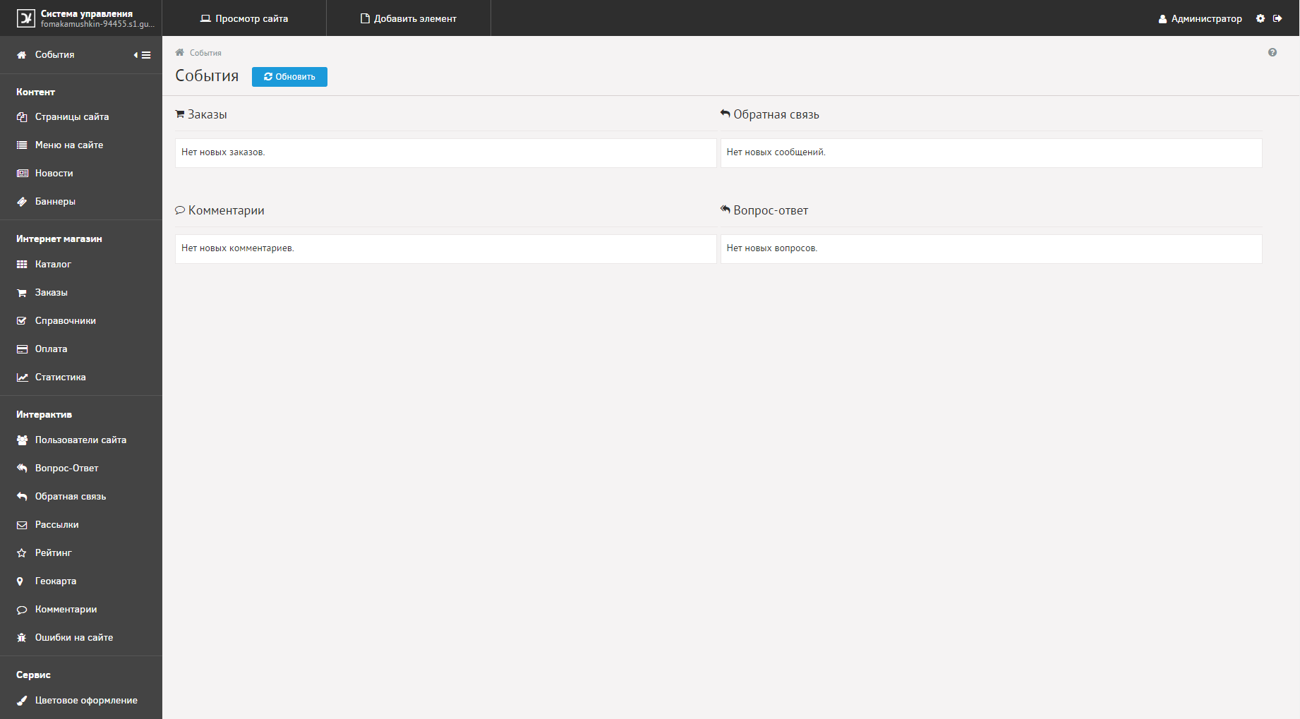
Scrollbar noticed? It turns out that the lower sections hid behind the scope.
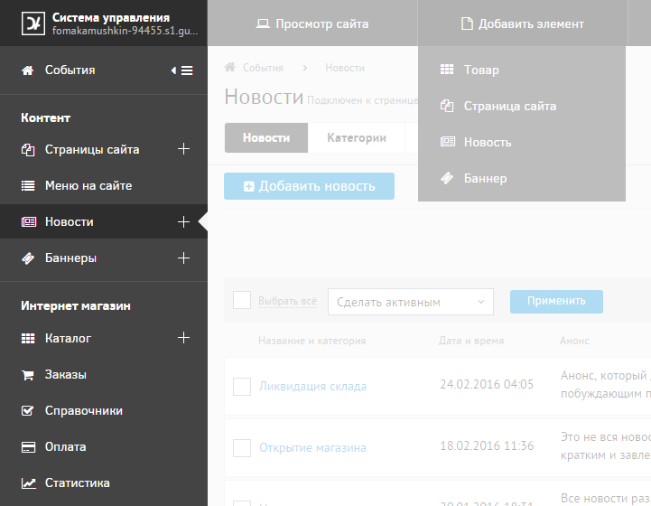
Decision. Rather trivial - the accordion will help group the sections and optimize the space on the left. By the way, there is a high probability that the layout of the sections will require revision in this case. By adding a dark gray tint we show the hierarchy:

Minimize menu
Unfortunately, folding the menu now loses all meaning. Icons are separated from critical descriptive text, making them unfit for perception.
In addition, when moving to another section, we mistakenly expand the menu again. Once we turned down the menu once - we have reasons for that. We will deploy it ourselves when the time comes.
Decision. Onhover tooltips instantly fix the situation:
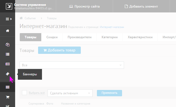
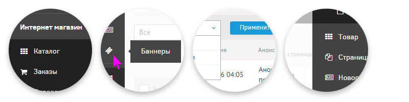
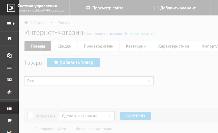
Adding an object
In the current mode, the functionality of adding an object is cut off from the context both logically and visually. Now it is proposed to choose specifics after the onhover event:
Decision. At a minimum, its rightful place: crowning the left menu. Items added could also appear on the accordion principle. But still, I believe that the best way to create an object would be to bind the “+” icon to the corresponding section:
Let's go deeper into sections ...
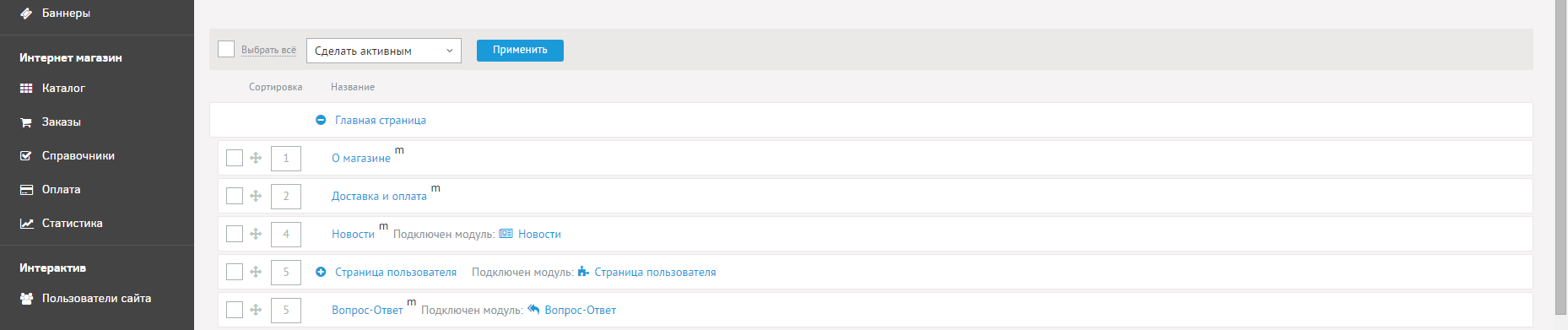
Unergonomics
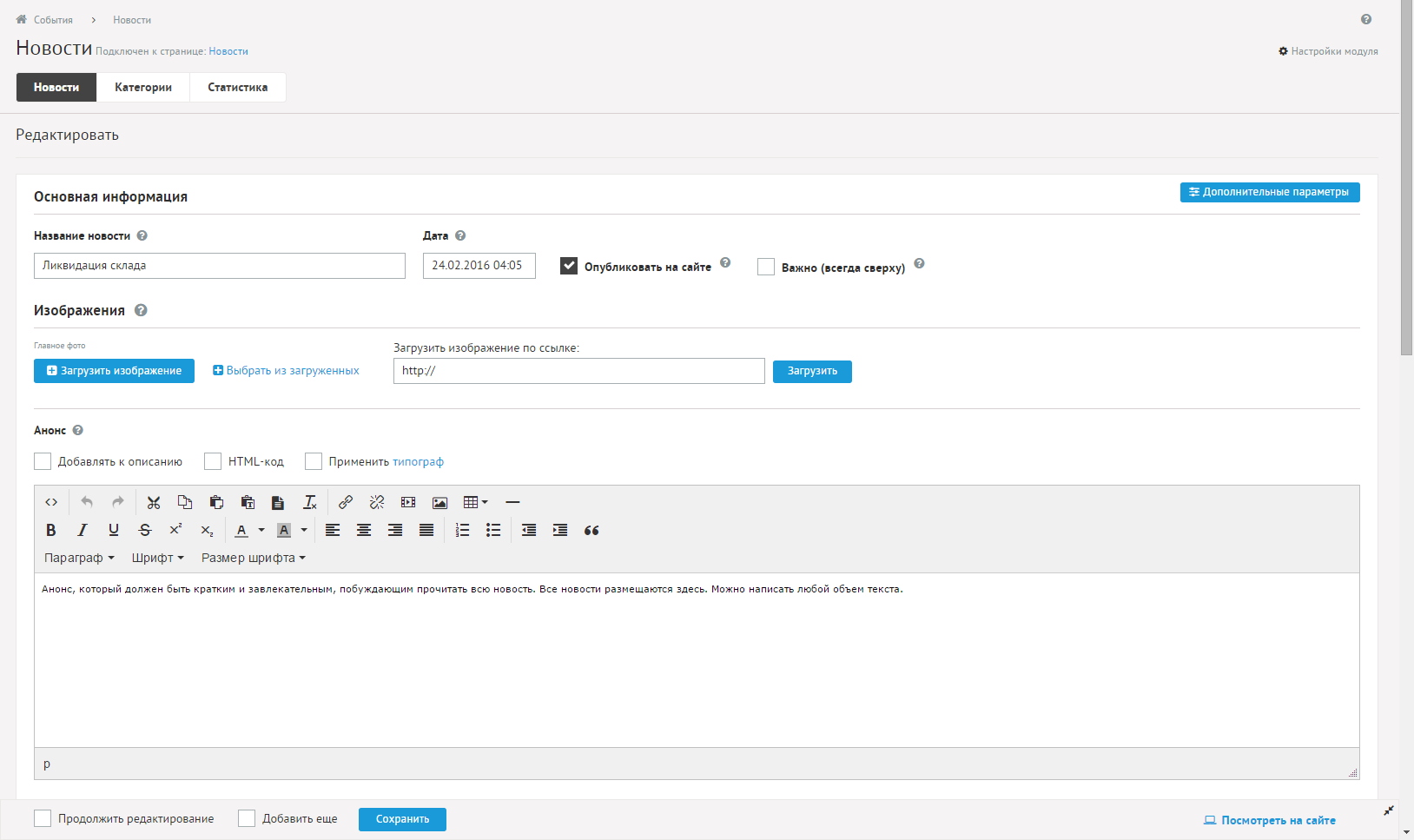
Or incorrect use of free space. At 1920 width instead of adaptability, we are offered to simply stretch the blocks:
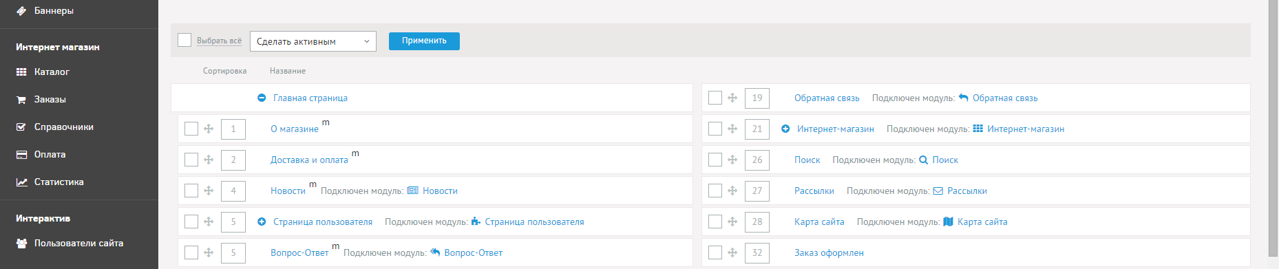
Decision. Just use the free space more efficiently:
A similar example: in the news adding section, due to the irrational use of space at 1080, the input form was not visible:
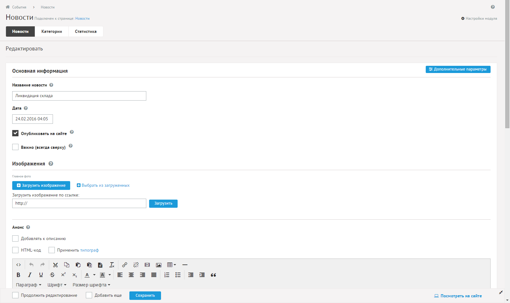
Decision. No comments.
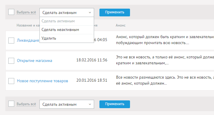
Control sequence
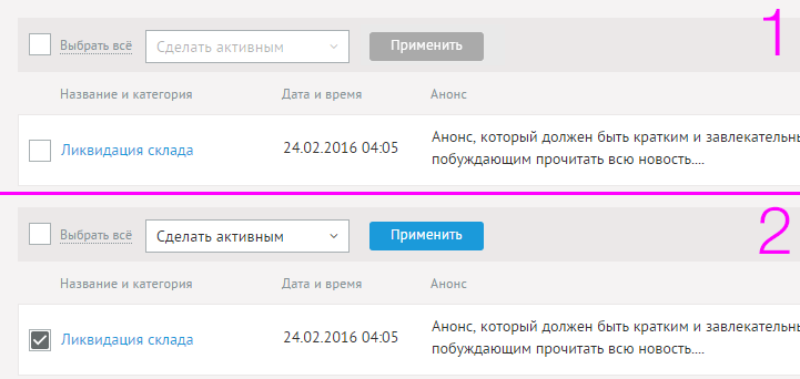
Before some sampling is done, we are already offered to operate with the drop-down list and to push the “Apply” button a lot without any response:
Decision. The change in the activity of the control in conjunction with the previous action causes a greater indication of their relationship:
Input forms
When working with some input forms, we were obliged to confirm the new data entered using the Enter key:

No need for such commitments. It is enough to shift the focus by making a click to the neutral area so that the data is preserved!
In small things like tooltips, overlapping controls, they describe; or need to click on the “?” icon to open a certificate about this section (and not send it to the general documentation) I will not go into it now ...
What is the result, cap?
In fact, the product is not so bad. I just did not include in this review all the positive points. Most interaction scenarios are built according to the usual UX paradigms, which means you can understand the basic mechanism without a user manual. The important point is that due to the cloudiness and quick start functionality, it was possible to actually launch your own resource (for the first few weeks for free) in a couple of minutes. It sounds justified: too lazy to study the manuals and you need to quickly run - you can close your eyes to some of the functional vulnerabilities. M ** kva is not built at once!
Will there be any sense?
According to the developer, he is open to feedback. And we are inclined to believe that this review will be sensible and will be in favor of a wide audience.
As a scriptum
A special invitation to kamenty those who used this CMS! It would be interesting to listen to your opinions about the pros and cons of Diafan.
Source: https://habr.com/ru/post/278507/
All Articles