Migration of UI patterns and gestures. Who has anyone that podtyril
After Apple presented the music service Apple Music, some “attentive” experts were embarrassed by the new Long Press gesture used in the app. I was embarrassed for the reason that it painfully resembled the Androids long press that shows contextual actions and opens context menus. But despite the fact that the gesture is not native for the platform and is not described in the guides, it has existed in iOS for a long time, although it is not very popular. Not everyone remembers that with its help you can not only move or delete icons on the home screen, but also show large previews in the photo album, get quick access to drafts in the mail, record audio messages, videos, take photos in messages and so on.
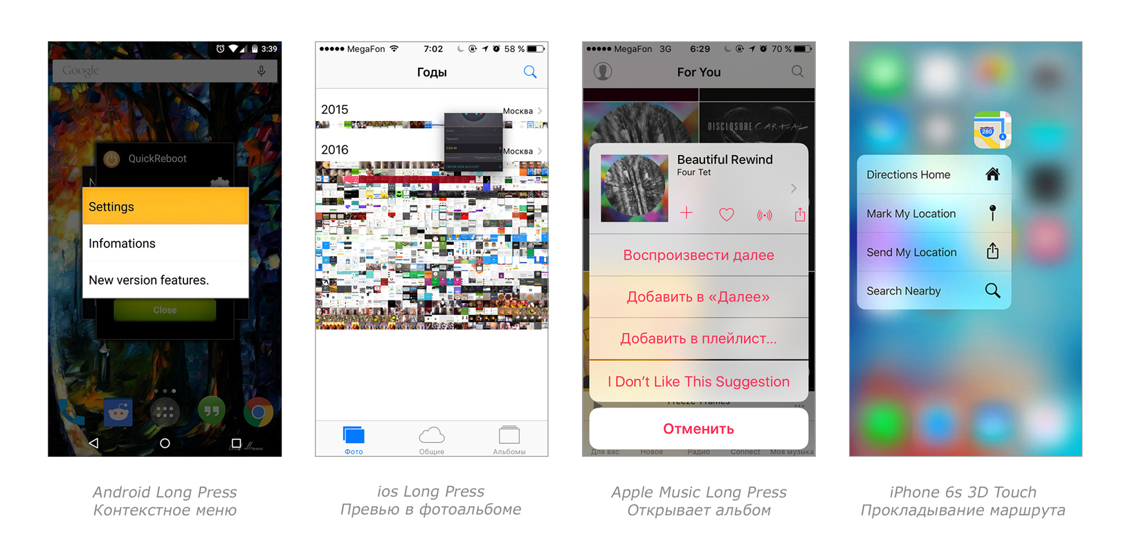
And now experts began to chop down, claiming that Apple stole the gesture from Android. But if you delve into the history of apple technology, you can remember that in March 2015, Apple patented Force Touch, which appeared in the Apple Watch, and later implemented in the MacBook with Retina Display. And truly "attentive" users should have guessed that this Long Press is nothing more than the next 3D Touch, which was supposed to appear in the iPhone 6s and iPhone 6s +. With the only difference that the owners of vintage iPhones have to manipulate not the force, but the duration of pressing.
This time, Apple turned out to be an innovator, proposing a fundamentally new way of interacting with the user interface. But is it always painfully familiar gestures and patterns to be original? If you delve into the history of iOS and Android platforms, taking with you the main trendsetters of our time - Twitter and Facebook - you can find interesting examples of borrowing, migration, and the open theft of UI patterns and gestures between applications and platforms.
')
This is an ancient and well-known function, for sure, someone tried to update the mail, sitting at the desktop and pulling the mouse down. Now pull to refresh can be found in most applications and under iOS, and under Android, for designers it is a way to make such an elegant curtsy towards the user.
Let's try to trace the history of the gesture: for the first time, pull to refresh was implemented in the Tweetie application in September 2009. The authorship belonged to the developer and creator of Tweetie Lorin Brichter, who initiated the massive use of this handy gesture. In 2010, Tweetie acquired Twitter, having received at the same time the rights to the invention of Brichter, but until 2012 this was not known to the general public. Contrary to the concerns of many developers, Twitter did not limit the use of gesture in third-party applications. In 2012, pull to refresh was implemented in an email client for iOS. In the summer of 2013, Google released an updated version of Gmail 4.5 for Android, in which the content update was also implemented using pull to refresh. And already in the Material Design, presented in 2014, the visual language of Android, the native gesture swipe to refresh was described.

Swipe became familiar to users with the advent of the trackpad in Mac OS X Lion, and later began to be used in iOS to open the multitasking panel on iPad 2, switch between open applications in iOS 5, receive calls, open Control Center, unlock the device and delete letters in iOS 7
In Android, the swipe has been used since the version of Ice Cream Sandwich, to close applications from the latest list, in the version of Jelly Bean to unlock the screen and open the widget. However, swipe entered the public consciousness thanks to the Tinder application launched in September 2012.
The gesture went beyond the narrow sphere of understanding of professionals from the world of mobile development and geeks, becoming a modern cultural phenomenon. In an interview, the creators of Tinder have repeatedly recognized their discovery as a breakthrough, as they managed to combine the navigation model and the performance of actions in one gesture. This allowed the user to quickly deliver the content to the user and gain advantage in the struggle for his attention in an era of oversaturation with this very content. Why is the phenomenon ranked as a cultural phenomenon? Studies have shown that it is much easier for people to give a refusal remotely, without feeling remorse. And what do we have today? A user moving his hands to the right or left equally easily accepts or rejects potential lovers, dogs and even shoes.

It's not a secret for anyone that in iOS 7 many functions were implemented that by that time were already available to owners of Android devices. For example, support gestures for deleting, archiving and other actions with letters. This feature first appeared with the release of Gmail 4.2 for Android in December 2012. And in February 2013, a new Mailbox app for iOS was released, in which you could also archive, delete and sort letters using swipe to left and swipe to right gestures. And only in September 2013, all this stuff migrated to the standard apple mailer. However, we must not forget that the ability to delete a particular call from the call history using a swipe in the iPhone has always been.

The side navigation trend along with the hamburger icon asked Facebook, after which many applications picked up this pattern. Soon, side navigation also appeared on Google+, and on Android it became an excellent replacement for the Dashboard pattern, as it allowed you to immediately see the content and navigate through it without having to return to the main screen. However, for an iPhone with a tabbar in it, this was a dubious innovation, since, on the contrary, it made access to the content more difficult. This led to a bunch of criticism, confirmed by tests and studies. Now, iOS developers are increasingly careful in designing navigation in their applications and avoid unnecessary hamburgers. It is noteworthy that even the main trendsetter of the mobile world, represented by Facebook, eventually abandoned this model. And only Google was able to figure out the side navigation and make clear recommendations when to use it, describing the official Navigation Drawer pattern in their guidelines.

Some time ago, Facebook began to test a new floating menu, which was borrowed from the Path application, and even, without embarrassment, stated this . Some users noticed flying buttons in the messenger, I got them in the add friends section, but also safely and disappeared after a couple of weeks. The button initiating the appearance of a pop-up menu was suspiciously similar to the Android action floating button. After what I saw, I wanted to grumble a little: how is it not so embarrassing for Facebook? And the solution from another application, and not on the platform guidelines.
But is it really worth making claims? Thoughtful breaking the rules always leads to development and progress. And the guys from Google forgivably have an active use of Material Design in iOS versions of applications, yet they own their own mobile platform and are simply obliged to promote their design solutions. Well, Facebook, given the size of the audience, is fully entitled to cross-platform unification. Others should be wary of such experiments.

Unfortunately or fortunately, no matter how many people dug in and borrowed successful solutions, we cannot see a single interface for all. It is impossible to invent a new solution from the void, in any case it is a superstructure or rethinking of some existing mechanism. And then there are no limits for theft, if such theft ultimately benefits all.
And finally: it doesn’t matter who saw what, who guided, didn’t violate the guides, if in the end this technology should be in the service of the user, and not vice versa. In the ideal tech world, there are no iTunes fanboys and slaves, a computer and a smartphone are tools that bring joy to the user, not batherths.
And now experts began to chop down, claiming that Apple stole the gesture from Android. But if you delve into the history of apple technology, you can remember that in March 2015, Apple patented Force Touch, which appeared in the Apple Watch, and later implemented in the MacBook with Retina Display. And truly "attentive" users should have guessed that this Long Press is nothing more than the next 3D Touch, which was supposed to appear in the iPhone 6s and iPhone 6s +. With the only difference that the owners of vintage iPhones have to manipulate not the force, but the duration of pressing.
This time, Apple turned out to be an innovator, proposing a fundamentally new way of interacting with the user interface. But is it always painfully familiar gestures and patterns to be original? If you delve into the history of iOS and Android platforms, taking with you the main trendsetters of our time - Twitter and Facebook - you can find interesting examples of borrowing, migration, and the open theft of UI patterns and gestures between applications and platforms.
')
Pull to refresh
This is an ancient and well-known function, for sure, someone tried to update the mail, sitting at the desktop and pulling the mouse down. Now pull to refresh can be found in most applications and under iOS, and under Android, for designers it is a way to make such an elegant curtsy towards the user.
Let's try to trace the history of the gesture: for the first time, pull to refresh was implemented in the Tweetie application in September 2009. The authorship belonged to the developer and creator of Tweetie Lorin Brichter, who initiated the massive use of this handy gesture. In 2010, Tweetie acquired Twitter, having received at the same time the rights to the invention of Brichter, but until 2012 this was not known to the general public. Contrary to the concerns of many developers, Twitter did not limit the use of gesture in third-party applications. In 2012, pull to refresh was implemented in an email client for iOS. In the summer of 2013, Google released an updated version of Gmail 4.5 for Android, in which the content update was also implemented using pull to refresh. And already in the Material Design, presented in 2014, the visual language of Android, the native gesture swipe to refresh was described.
Swipe for action
Swipe became familiar to users with the advent of the trackpad in Mac OS X Lion, and later began to be used in iOS to open the multitasking panel on iPad 2, switch between open applications in iOS 5, receive calls, open Control Center, unlock the device and delete letters in iOS 7
In Android, the swipe has been used since the version of Ice Cream Sandwich, to close applications from the latest list, in the version of Jelly Bean to unlock the screen and open the widget. However, swipe entered the public consciousness thanks to the Tinder application launched in September 2012.
The gesture went beyond the narrow sphere of understanding of professionals from the world of mobile development and geeks, becoming a modern cultural phenomenon. In an interview, the creators of Tinder have repeatedly recognized their discovery as a breakthrough, as they managed to combine the navigation model and the performance of actions in one gesture. This allowed the user to quickly deliver the content to the user and gain advantage in the struggle for his attention in an era of oversaturation with this very content. Why is the phenomenon ranked as a cultural phenomenon? Studies have shown that it is much easier for people to give a refusal remotely, without feeling remorse. And what do we have today? A user moving his hands to the right or left equally easily accepts or rejects potential lovers, dogs and even shoes.
Swipe to delete
It's not a secret for anyone that in iOS 7 many functions were implemented that by that time were already available to owners of Android devices. For example, support gestures for deleting, archiving and other actions with letters. This feature first appeared with the release of Gmail 4.2 for Android in December 2012. And in February 2013, a new Mailbox app for iOS was released, in which you could also archive, delete and sort letters using swipe to left and swipe to right gestures. And only in September 2013, all this stuff migrated to the standard apple mailer. However, we must not forget that the ability to delete a particular call from the call history using a swipe in the iPhone has always been.
Sidebar menu
The side navigation trend along with the hamburger icon asked Facebook, after which many applications picked up this pattern. Soon, side navigation also appeared on Google+, and on Android it became an excellent replacement for the Dashboard pattern, as it allowed you to immediately see the content and navigate through it without having to return to the main screen. However, for an iPhone with a tabbar in it, this was a dubious innovation, since, on the contrary, it made access to the content more difficult. This led to a bunch of criticism, confirmed by tests and studies. Now, iOS developers are increasingly careful in designing navigation in their applications and avoid unnecessary hamburgers. It is noteworthy that even the main trendsetter of the mobile world, represented by Facebook, eventually abandoned this model. And only Google was able to figure out the side navigation and make clear recommendations when to use it, describing the official Navigation Drawer pattern in their guidelines.
Flyout buttons
Some time ago, Facebook began to test a new floating menu, which was borrowed from the Path application, and even, without embarrassment, stated this . Some users noticed flying buttons in the messenger, I got them in the add friends section, but also safely and disappeared after a couple of weeks. The button initiating the appearance of a pop-up menu was suspiciously similar to the Android action floating button. After what I saw, I wanted to grumble a little: how is it not so embarrassing for Facebook? And the solution from another application, and not on the platform guidelines.
But is it really worth making claims? Thoughtful breaking the rules always leads to development and progress. And the guys from Google forgivably have an active use of Material Design in iOS versions of applications, yet they own their own mobile platform and are simply obliged to promote their design solutions. Well, Facebook, given the size of the audience, is fully entitled to cross-platform unification. Others should be wary of such experiments.
And what is the result?
Unfortunately or fortunately, no matter how many people dug in and borrowed successful solutions, we cannot see a single interface for all. It is impossible to invent a new solution from the void, in any case it is a superstructure or rethinking of some existing mechanism. And then there are no limits for theft, if such theft ultimately benefits all.
And finally: it doesn’t matter who saw what, who guided, didn’t violate the guides, if in the end this technology should be in the service of the user, and not vice versa. In the ideal tech world, there are no iTunes fanboys and slaves, a computer and a smartphone are tools that bring joy to the user, not batherths.
Source: https://habr.com/ru/post/278423/
All Articles