Emotional landing page? Wow wow, easy
“Sell an emotion, not a product”, “Tell me about the long-term effect of the purchase” - these were the headlines in one of the articles that once spoiled the morning for me.
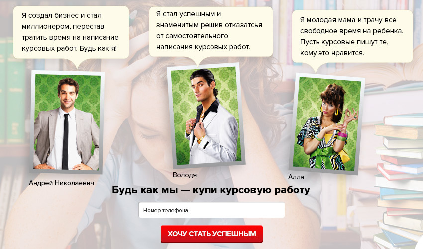
Parody of excessive emotionality in interfaces
It all began with a client who read an article about the "correct" sales technique and questioned my competence. That article was worth a 2-hour conversation and forced to decompose the issue of emotionality in the interfaces in order.
The reason for our dispute with the client was the prototype of the landing page “helping students write diploma / coursework / other papers”. In his presentation (after reading the article), the interface should have appealed to the sensations of success, the desire to rather get rid of this training and enter adulthood. We did not think so.
')
Before proceeding with the design of the interface, we always do some work: we communicate live with all significant business representatives (be it a manager or an ordinary employee), analyze competitors, look for clues in the Central Asian habitats (forums, groups, etc.). Such work allows you to plunge into the business, to see it from the inside, to understand the target audience: its needs and fears on the way to achieving the goal.
Based on these data, characters are compiled - collective images that combine total user experience into a specific (made-up) personality. Usually, 1-3 characters are enough, but in complex products there can be a lot of them - one for each segment of the audience.
Characters - common practice in the design of interfaces, allow you to abstract from their own "wishes" and design the interface to meet the needs of a particular segment of the target audience.
Having a clear understanding of what goal the customers pursue and with what tasks they visit the project, we can bring in the corresponding emotions.

Masha is the key character of the project. Details and a photograph of a real person cause a greater empathy in comparison with the list of requirements on a sheet in a notebook. This user portrait is greatly simplified for the article. The working image contains more details.
Masha is a third-year student at the Faculty of Economics of the Moscow State Technical University, who for the first time during her studies decided to curry and order coursework. Masha has established herself as a very responsible student and she is ashamed to admit to herself the intentions, not to mention telling her classmates.
In the evening after work, Masha, using a tablet, browses the sites of companies performing work for students. Her main goal is to find a performer who will write her term paper. And, in order to satisfy this main goal, the interface must allow Masha:
And about 20 other needs.
Not all needs are important and are realized only by means of the interface. But the main thing is that in realizing the goal of “ordering course work,” Masha has no need to quickly complete her studies or become successful. These are global goals and they have a very indirect relation to the interface itself.
Realizing the real needs of Masha in the interface, we guarantee satisfaction from the interaction and create the emotion of trust. As a result, Masha with greater confidence will leave the application and become a client of the company.
Having justified our position and completed the project, we received a conversion of ~ 9.77% and positive feedback from visitors in the first week. The client was satisfied. But would it be so if we went on about? Probably, it is worth asking those who still routinely rivet something called the “seizure page”, emotionally “packaging” something “selling”.

Without going into details of specific emotions, the interfaces can be divided into two groups:
emotional interface - interacts with the user at the level of vivid images and associations.
rational interface - interacts at the level of details and facts.
And if with a rational interface everything is more or less clear, then emotional causes many questions and erroneous interpretations.
In the view of many developers of landing pages, emotions appear in the interface either in the form of endless manipulations with stocks, discounts with obligatory countdown timers, which form expectations of false gain with contrived time limits, or in attempts to create empathy for success, expressed in the block “Our clients are successful people ".
In fact, the range of possible emotions is much broader and depends primarily on a combination of facts:
To better understand this dependency, consider specific examples of interfaces.
When designing a landing page interface for a business selling nylon grass slippers, we considered the following:
Using knowledge of the source of traffic and the motivation of Central Asia, the interface was focused on a large presentation of the product with a short text accompaniment.
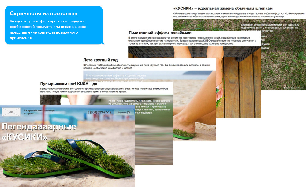
Each large photo presented one of the features of the product or unobtrusive presentation of the context of the possible application.
After completing the product presentation, the interface focused on social confirmation.
While the majority still considers the only social confirmation of 3-5 invented reviews from conditional customers, the social activity of the brand allowed to do otherwise.

The brand was very actively represented in the public of famous TV stars and fashion blogs. All that remained was to accumulate this activity and submit it correctly.
So in the interface appeared links to the publication of TV stars in Instagram and quotes from the blog of the leading fashion blogger in Russia.
Given the initial needs of Central Asia, we were able to convey through the interface the emotional component of the product. And it worked.
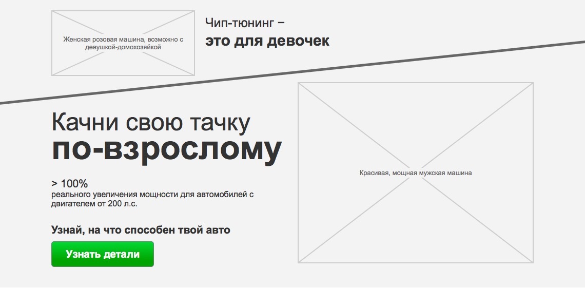
When designing the interface for a project involved in increasing the power of cars, we are faced with the problem of the lack of a sufficient number of target audiences - one that already knows what spider is, for example, why it is needed and how its replacement will affect the increase in power. However, the Internet is quite popular another related topic - chip tuning. It is less expensive, easier to install and gives some power gain. And the path of cardinal pumping of the car’s power usually begins with it.
Screenshot from prototype
Possessing this knowledge and imposing it on the needs of our Central Asia, a provocative interface was designed that casts doubt on the effectiveness of just one chip tuning. Using simple analogies: a female pink compact car and a powerful voracious mustang, the interface evokes appropriate associations and touches a sense of dignity. Pointing to the insignificant place of chip tuning in the overall process of increasing the power of a car, the interface introduces the visitor to other possibilities of more efficient power pumping.
Understanding that the audience is still completely unprepared, we dwell on each method of increasing power, explaining the purpose of this or that detail, the need for its replacement and the expected effect.

Screenshot from prototype
An experienced streetcar just needs to see a photo of a custom “spider” to admire the wizard’s experience. In our case, any photo is accompanied by detailed information: what it is and what effect it gives.
Periodically reminding that chip tuning is “more for girls”, the interface becomes a guide to the world of serious tuning, setting the main task to invite in a tuning studio, where you can get acquainted with real street racers, see the cars pumped out and maybe even ride on one of them .

Screenshot from prototype
Emotionality in this interface was built to a greater extent on provocation - a challenge, which is very characteristic of our Central Asia. At the same time, the second interface was also designed - for the experienced segment of Central Asia, which are already “in the subject line” and they just need to know who can weld them with a “spider”, “downpipe” or perform “Piping the integrator”. Despite the relatedness of the topic and, in fact, one Central Asian, the second interface is completely devoid of images of power, speed and any provocations - everything is dry and to the point. The only difference is that the first interface is aimed at a less prepared audience, the second one is aimed at those who are already “in the subject line”.
Contrary to the first opinion, the interface of the design bureau should be rational.

Screenshot of the prototype's main screen
Yes, in the question of architecture and interior design - emotions play a fundamental role, but are associated, primarily, with the work in the portfolio. They must generate exciting images in the mind and motivate to action. The interface itself is just a convenient shell that provides a simple way to interact with the content of the portfolio.
Any flirting with status (such as “show your neighbors, a few are cool”) will only annoy Central Asia and indicate that the company is not serious.
After conducting a series of interviews with business representatives and collecting additional information, it was decided to move away from the initial design of one landing page, and create a new full-fledged product that allows us to interact with the work in the portfolio in a more convenient form (compared to the old version of the site). The main emphasis was placed on video, large photographs and a special technology that unites similar projects.
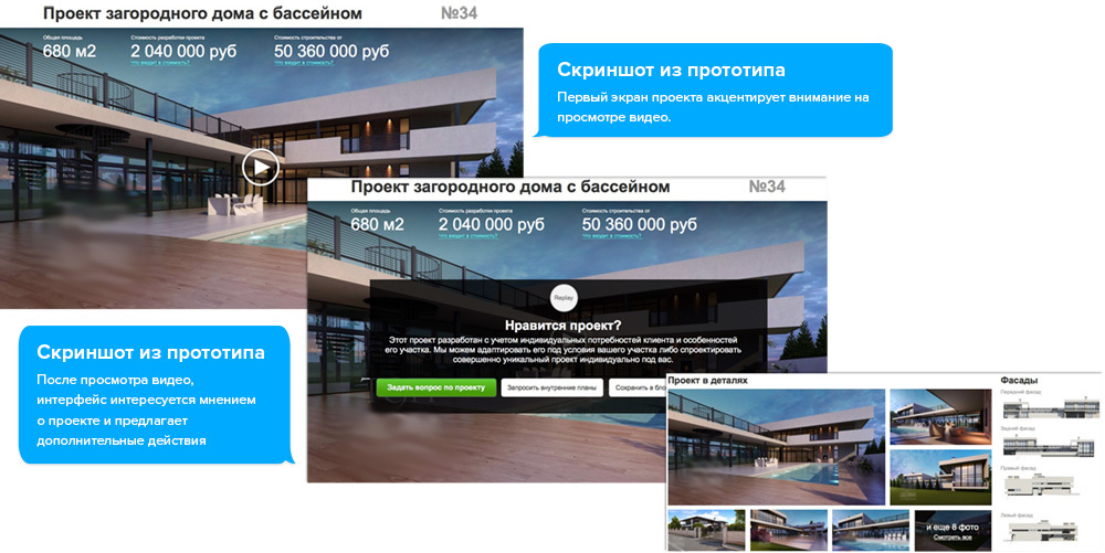
Knowing that it may take a long time between the ideas of building a country house and turning to the project company, during which Central Asia collects ideas, we transferred these tasks to the interface, allowing you to save any interesting idea to a notebook or print the project.
As a result, the designed interface carries only the navigation entity, which helps to conveniently interact with the portfolio and get inspired for your own project. And this, it would seem, in the complete absence of obvious emotionality, evokes emotions: trust, satisfaction, understanding. Thus, it can be concluded that rational interfaces are also emotional, but act on a different level.
Even when we are not aware of this. They are manifested by the reaction to absolutely everything that surrounds or interacts with us. They are a kind of mediator of our life. Emotions help make a choice, but are not the only factor for making a decision.
Whether a vivid manifestation of emotionality in the interface is needed, or just enough to get by with a “dry presentation” depends on a combination of factors.
In the question of interfaces you should always rely, first of all, on the needs of Central Asia. They are the foundation, the foundation of everything. Knowing how to truly understand what your audience needs, you can create a truly perfect interface, regardless of any patterns or stamps. Whether there is a manifestation of vivid emotionality in this interface or a dry statement of facts is not the essence. The main thing is that your target audience will fully satisfy your needs. And in response, it will surely satisfy the needs of your business.
Stop clinging to the excellent translations of western articles. The fact that the material was written in the west does not make it exceptional. If another Western marketer calls to talk about the long-term effect of the purchase, stop and think about how suitable and whether it is suitable for your product or service at all. Think of your target audience, identify real needs and reflect only what your customers really need in the interface.
How, among other things, understand what kind of interface your central auditorium needs? We came up with one simple idea - to present the interface with a real-world analogy. If your product is wine, let the interface be a sommelier. If you are a real estate agency - give it the features of a professional realtor. Properly selected image in combination with the needs of the target audience will allow you to realize the most organic emotion in your interfaces.
Parody of excessive emotionality in interfaces
It all began with a client who read an article about the "correct" sales technique and questioned my competence. That article was worth a 2-hour conversation and forced to decompose the issue of emotionality in the interfaces in order.
Sell emotions, bro!
The reason for our dispute with the client was the prototype of the landing page “helping students write diploma / coursework / other papers”. In his presentation (after reading the article), the interface should have appealed to the sensations of success, the desire to rather get rid of this training and enter adulthood. We did not think so.
')
Before proceeding with the design of the interface, we always do some work: we communicate live with all significant business representatives (be it a manager or an ordinary employee), analyze competitors, look for clues in the Central Asian habitats (forums, groups, etc.). Such work allows you to plunge into the business, to see it from the inside, to understand the target audience: its needs and fears on the way to achieving the goal.
Based on these data, characters are compiled - collective images that combine total user experience into a specific (made-up) personality. Usually, 1-3 characters are enough, but in complex products there can be a lot of them - one for each segment of the audience.
Characters - common practice in the design of interfaces, allow you to abstract from their own "wishes" and design the interface to meet the needs of a particular segment of the target audience.
Having a clear understanding of what goal the customers pursue and with what tasks they visit the project, we can bring in the corresponding emotions.
Hello, I'm Masha
Masha is the key character of the project. Details and a photograph of a real person cause a greater empathy in comparison with the list of requirements on a sheet in a notebook. This user portrait is greatly simplified for the article. The working image contains more details.
Masha is a third-year student at the Faculty of Economics of the Moscow State Technical University, who for the first time during her studies decided to curry and order coursework. Masha has established herself as a very responsible student and she is ashamed to admit to herself the intentions, not to mention telling her classmates.
In the evening after work, Masha, using a tablet, browses the sites of companies performing work for students. Her main goal is to find a performer who will write her term paper. And, in order to satisfy this main goal, the interface must allow Masha:
- understand where she got
- make sure that you can order a term paper
- understand the cost and deadlines
- make sure that the work will be unique
- make sure that the work will be done taking into account all the requirements of the teacher
- make sure not to be deceived
- make sure they have time on time
- find out the exact cost of her work specifically
- understand who writes work
And about 20 other needs.
Not all needs are important and are realized only by means of the interface. But the main thing is that in realizing the goal of “ordering course work,” Masha has no need to quickly complete her studies or become successful. These are global goals and they have a very indirect relation to the interface itself.
Realizing the real needs of Masha in the interface, we guarantee satisfaction from the interaction and create the emotion of trust. As a result, Masha with greater confidence will leave the application and become a client of the company.
Having justified our position and completed the project, we received a conversion of ~ 9.77% and positive feedback from visitors in the first week. The client was satisfied. But would it be so if we went on about? Probably, it is worth asking those who still routinely rivet something called the “seizure page”, emotionally “packaging” something “selling”.
Emotions in the interface
Without going into details of specific emotions, the interfaces can be divided into two groups:
emotional interface - interacts with the user at the level of vivid images and associations.
rational interface - interacts at the level of details and facts.
And if with a rational interface everything is more or less clear, then emotional causes many questions and erroneous interpretations.
In the view of many developers of landing pages, emotions appear in the interface either in the form of endless manipulations with stocks, discounts with obligatory countdown timers, which form expectations of false gain with contrived time limits, or in attempts to create empathy for success, expressed in the block “Our clients are successful people ".
In fact, the range of possible emotions is much broader and depends primarily on a combination of facts:
- product / service assignment
- target audience and its needs
- traffic source
To better understand this dependency, consider specific examples of interfaces.
Emotional interface example: Grass slippers
When designing a landing page interface for a business selling nylon grass slippers, we considered the following:
- Central Asia: girls 17-26 years old
- customers are not directly interested in the product
- main sources of traffic: instagram and fashion blogs
Using knowledge of the source of traffic and the motivation of Central Asia, the interface was focused on a large presentation of the product with a short text accompaniment.
Each large photo presented one of the features of the product or unobtrusive presentation of the context of the possible application.
After completing the product presentation, the interface focused on social confirmation.
While the majority still considers the only social confirmation of 3-5 invented reviews from conditional customers, the social activity of the brand allowed to do otherwise.
The brand was very actively represented in the public of famous TV stars and fashion blogs. All that remained was to accumulate this activity and submit it correctly.
So in the interface appeared links to the publication of TV stars in Instagram and quotes from the blog of the leading fashion blogger in Russia.
Given the initial needs of Central Asia, we were able to convey through the interface the emotional component of the product. And it worked.
Emotional interface example: Auto power increase
When designing the interface for a project involved in increasing the power of cars, we are faced with the problem of the lack of a sufficient number of target audiences - one that already knows what spider is, for example, why it is needed and how its replacement will affect the increase in power. However, the Internet is quite popular another related topic - chip tuning. It is less expensive, easier to install and gives some power gain. And the path of cardinal pumping of the car’s power usually begins with it.
Screenshot from prototype
Possessing this knowledge and imposing it on the needs of our Central Asia, a provocative interface was designed that casts doubt on the effectiveness of just one chip tuning. Using simple analogies: a female pink compact car and a powerful voracious mustang, the interface evokes appropriate associations and touches a sense of dignity. Pointing to the insignificant place of chip tuning in the overall process of increasing the power of a car, the interface introduces the visitor to other possibilities of more efficient power pumping.
Understanding that the audience is still completely unprepared, we dwell on each method of increasing power, explaining the purpose of this or that detail, the need for its replacement and the expected effect.
Screenshot from prototype
An experienced streetcar just needs to see a photo of a custom “spider” to admire the wizard’s experience. In our case, any photo is accompanied by detailed information: what it is and what effect it gives.
Periodically reminding that chip tuning is “more for girls”, the interface becomes a guide to the world of serious tuning, setting the main task to invite in a tuning studio, where you can get acquainted with real street racers, see the cars pumped out and maybe even ride on one of them .
Screenshot from prototype
Emotionality in this interface was built to a greater extent on provocation - a challenge, which is very characteristic of our Central Asia. At the same time, the second interface was also designed - for the experienced segment of Central Asia, which are already “in the subject line” and they just need to know who can weld them with a “spider”, “downpipe” or perform “Piping the integrator”. Despite the relatedness of the topic and, in fact, one Central Asian, the second interface is completely devoid of images of power, speed and any provocations - everything is dry and to the point. The only difference is that the first interface is aimed at a less prepared audience, the second one is aimed at those who are already “in the subject line”.
An example of a rational interface: exclusive home projects
Contrary to the first opinion, the interface of the design bureau should be rational.
Screenshot of the prototype's main screen
Yes, in the question of architecture and interior design - emotions play a fundamental role, but are associated, primarily, with the work in the portfolio. They must generate exciting images in the mind and motivate to action. The interface itself is just a convenient shell that provides a simple way to interact with the content of the portfolio.
Any flirting with status (such as “show your neighbors, a few are cool”) will only annoy Central Asia and indicate that the company is not serious.
After conducting a series of interviews with business representatives and collecting additional information, it was decided to move away from the initial design of one landing page, and create a new full-fledged product that allows us to interact with the work in the portfolio in a more convenient form (compared to the old version of the site). The main emphasis was placed on video, large photographs and a special technology that unites similar projects.
Knowing that it may take a long time between the ideas of building a country house and turning to the project company, during which Central Asia collects ideas, we transferred these tasks to the interface, allowing you to save any interesting idea to a notebook or print the project.
As a result, the designed interface carries only the navigation entity, which helps to conveniently interact with the portfolio and get inspired for your own project. And this, it would seem, in the complete absence of obvious emotionality, evokes emotions: trust, satisfaction, understanding. Thus, it can be concluded that rational interfaces are also emotional, but act on a different level.
Emotions are always near
Even when we are not aware of this. They are manifested by the reaction to absolutely everything that surrounds or interacts with us. They are a kind of mediator of our life. Emotions help make a choice, but are not the only factor for making a decision.
Whether a vivid manifestation of emotionality in the interface is needed, or just enough to get by with a “dry presentation” depends on a combination of factors.
In the question of interfaces you should always rely, first of all, on the needs of Central Asia. They are the foundation, the foundation of everything. Knowing how to truly understand what your audience needs, you can create a truly perfect interface, regardless of any patterns or stamps. Whether there is a manifestation of vivid emotionality in this interface or a dry statement of facts is not the essence. The main thing is that your target audience will fully satisfy your needs. And in response, it will surely satisfy the needs of your business.
Stop clinging to the excellent translations of western articles. The fact that the material was written in the west does not make it exceptional. If another Western marketer calls to talk about the long-term effect of the purchase, stop and think about how suitable and whether it is suitable for your product or service at all. Think of your target audience, identify real needs and reflect only what your customers really need in the interface.
Interface imagery
How, among other things, understand what kind of interface your central auditorium needs? We came up with one simple idea - to present the interface with a real-world analogy. If your product is wine, let the interface be a sommelier. If you are a real estate agency - give it the features of a professional realtor. Properly selected image in combination with the needs of the target audience will allow you to realize the most organic emotion in your interfaces.
Source: https://habr.com/ru/post/278421/
All Articles