Graphs and charts are moving.
Researchers at MIT found a way to display activity in newsgroups on interactive animated graphs. According to scientists, they are much more informative than static charts, and in the future animated graphics will be a standard element of any presentation.
Research from MIT scientists is one of the first steps towards using animation as a standard way to visualize data. The group, led by Francis Lam, developed two interfaces, Seascape and Volcano , which clearly demonstrate that the animation is well suited to display different types of data, such as behavioral and user data, as well as different types of social activity. The preliminary results of their work, scientists have published in a scientific paper ( PDF ), which is complemented by a presentation and demo .
Static graphics have a limited arsenal of information transmission tools: only with the help of color, form, location, and transparency. In some cases, this is clearly not enough. To transfer more complex heterogeneous information flows, it is required to create a multitude of static graphs, which often exceed the threshold of human perception. It is very difficult for a person to assimilate the information that the graphs must transmit. Animation - a possible solution to the problem. It easily attracts the attention of a person and is able to quickly transfer information to the brain. The problem is that effective and generally accepted methods for generating animated graphs have not yet been created.
The demo video shows how Seascape and Volcano interfaces display user activity in two newsgroups:
')
REC.SPORT.SOCCER (500 threads, 1512 people)
REC.SPORT.TABLE-SOCCER (258 threads, 442 people)
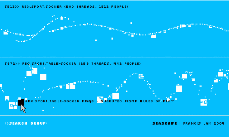
In the movement of objects on the diagram, information about the social activity of users is encoded. Scientists have tried to make the "decoding" of the animation as intuitive as possible. So, every square in the information flow is a certain thread. Its size depends on the volume of the topic (cumulative email size). When you hover over a thread, its name is displayed. The speed of movement symbolizes the activity of the topic (the number of letters), and the amplitude of oscillations - the difference in dates between letters in the chain.
If you click on the box, the topic is revealed and the individual users who participate in the discussion are displayed on the screen as circles. The speed of Brownian movement of circles on the screen symbolizes, again, the activity of users.

The Seascape and Volcano interfaces differ from each other not only in the range of colors (white-blue Seascape and red-black Volcano), but also in the way they visualize traffic. In the "volcanic" interface there is no undulating movement.
Research from MIT scientists is one of the first steps towards using animation as a standard way to visualize data. The group, led by Francis Lam, developed two interfaces, Seascape and Volcano , which clearly demonstrate that the animation is well suited to display different types of data, such as behavioral and user data, as well as different types of social activity. The preliminary results of their work, scientists have published in a scientific paper ( PDF ), which is complemented by a presentation and demo .
Static graphics have a limited arsenal of information transmission tools: only with the help of color, form, location, and transparency. In some cases, this is clearly not enough. To transfer more complex heterogeneous information flows, it is required to create a multitude of static graphs, which often exceed the threshold of human perception. It is very difficult for a person to assimilate the information that the graphs must transmit. Animation - a possible solution to the problem. It easily attracts the attention of a person and is able to quickly transfer information to the brain. The problem is that effective and generally accepted methods for generating animated graphs have not yet been created.
The demo video shows how Seascape and Volcano interfaces display user activity in two newsgroups:
')
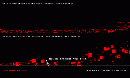
REC.SPORT.SOCCER (500 threads, 1512 people)
REC.SPORT.TABLE-SOCCER (258 threads, 442 people)
In the movement of objects on the diagram, information about the social activity of users is encoded. Scientists have tried to make the "decoding" of the animation as intuitive as possible. So, every square in the information flow is a certain thread. Its size depends on the volume of the topic (cumulative email size). When you hover over a thread, its name is displayed. The speed of movement symbolizes the activity of the topic (the number of letters), and the amplitude of oscillations - the difference in dates between letters in the chain.
If you click on the box, the topic is revealed and the individual users who participate in the discussion are displayed on the screen as circles. The speed of Brownian movement of circles on the screen symbolizes, again, the activity of users.
The Seascape and Volcano interfaces differ from each other not only in the range of colors (white-blue Seascape and red-black Volcano), but also in the way they visualize traffic. In the "volcanic" interface there is no undulating movement.
Source: https://habr.com/ru/post/2779/
All Articles