Framer Animation for Beginners
What is a framer ?
Framer is a prototyping program in which a prototype is created right away in code, in CoffeeScript , which is compiled into JavaScript.
')
Framer allows you to create interactive animations, makes it easier for developers to understand how a prototype should function and how the presented animation can be implemented. He also teaches the designer to understand the code.
The prototype created with the help of Framer can be given to customers to test directly from the device in full size, while the time to create it is much less than if the developers created the prototype.
As it may seem at the beginning, Framer is a complex program that requires knowledge of the code, although in fact it is much easier to write code in it than it seems.
To work with Framer, it is enough to draw a prototype in Sketch or Photoshop and come up with the interaction between the layers. Also here you can create your own layers, animate and change their properties.
The writing of the code in Framer is an interesting and fascinating process that does not require any special preparation, besides, the program's website has very detailed documentation with examples and tutorials.
In the animation, which will be discussed further, I wanted to display loading, where the percentage of loading serves as a process indicator.
To create this animation you need to know 4 things: Layer, State, Event, Animation.
Layer - a layer can be created directly in Framer, or it can be any layer from Sketch or Photoshop.
State is the state of the object (layer). For example, an object will have some kind of default state (such as we drew it in Sketch or Photoshop) and an infinite number of states that we can give it by changing its properties (transparency, shadow, blurriness, size, position, etc.). )
Event is an event. They can be click, swipe, drag, scroll and so on. When each of these events occurs, we can change the state of objects (State), animating the layers.
Animation - except for states, we can create directly in Framer or set layers, animations (for example, rotation, change of transparency, etc.).
So, let's start creating the animation.
As a result, we should have the following:
Step 1:
We draw a prototype in Sketch or Photoshop.
I used Sketch. Download my prototype here.
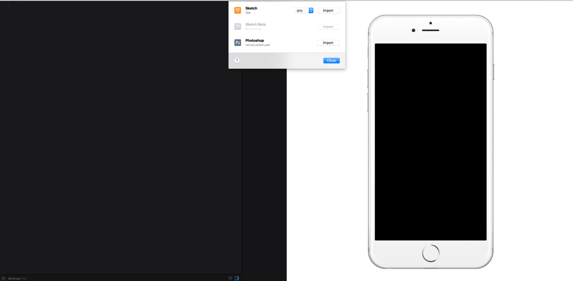
Import this prototype into Framer.
Sketch (or Photoshop) with a prototype must be opened upon import.
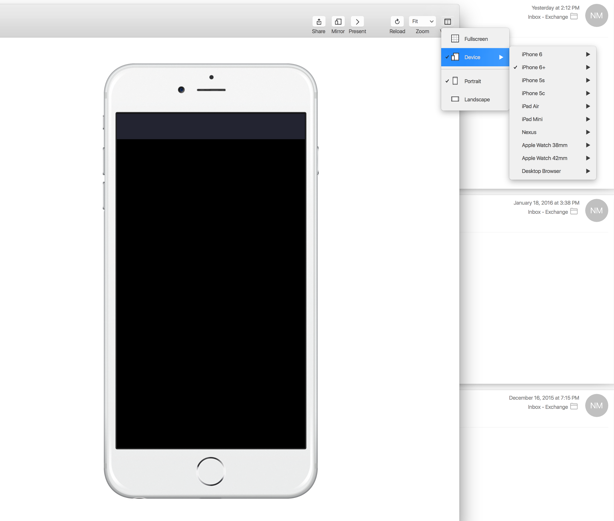
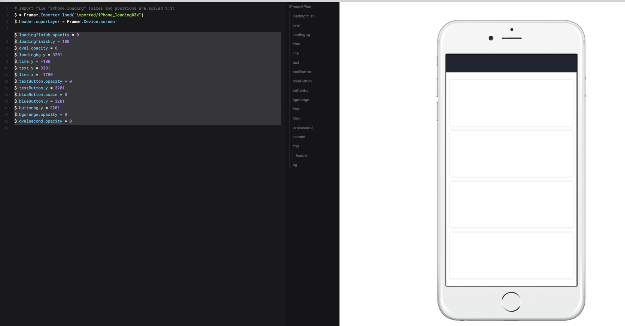
In Framer, select the type of device (the Viewer icon), in my case it is iPhone 6+.
Since my prototype Sketch is drawn on a scale of 1: 1, and for iPhone 6+ we use the multiplier 3, then when importing, select @ 3x from the drop-down list and do not forget about it (after, when describing the position of the object in x and y coordinates, which can be viewed in Sketch, we multiply them by 3, respectively).
All layers in Sketch should be grouped together, the only way they will be visible in Framer. Import will not occur if the name of at least one group begins with a number (will give an error).
After import, the following line should appear:
# Import file "iPhone_loading" (sizes and positions are scaled 1:3) Sketch = Framer.Importer.load("imported/iPhone_loading@3x") “Loading @ 3x” - means that the prototype was imported with a 3x multiplier, which we previously selected. “Sketch” can be replaced with any word or sign (for example, $) - and put it ahead of the description of each layer from the Sketch prototype. For example, in the Sketch prototype, all layers are included by default, but since we are not interested in the upper layers yet, we can make them transparent:
Sketch.loadingfinish.opacity = 0 or you can write $ .loadingfinish.opacity = 0
where $ = sketch
loadingfinish is the topmost layer.
In order not to constantly write a Sketch. Layer or $. Layer, you can insert the following line:
Utils.globalLayers $ then to make the loadingfinish layer transparent, just write:
loadingfinish.opacity = 0 More details about Utils can be found in the Framer documentation here.
Here I left a $ sign.
Next, we set the parent element (SuperLayer) for the header layer, in relation to which the header will be a child.
$.header.superLayer = Framer.Device.screen Now the header is a child of the device screen, which means it will always be visible and stationary.
Step 2:
Next we set the parameters for the loadingfinish, oval, textButton, bgorange, ovalsecond layers, making them transparent:
$.loadingfinish.opacity = 0 $.oval.opacity = 0 $.textButton.opacity = 0 $.bgorange.opacity = 0 $.ovalsecond.opacity = 0 We change the position of the y coordinates for the textButton, blueButton, buttonbg, loadingfinish, loadingbg, time, text layers so that they move vertically either up (minus) or down. As you can see, we set transparency for the loadingfinish layer and moved it down by 100px.
$.loadingfinish.y = 100 $.textButton.y = 3201 $.blueButton.y = 3201 $.buttonbg.y = 3201 $.loadingbg.y = 3201 $.time.y = -100 $.text.y = 3201 For the line layer, change the x coordinate so that the layer extends horizontally from the left.
$.line.x = -1700 Finally, for the blueButton layer, set scale = 0 to make the layer disappear.
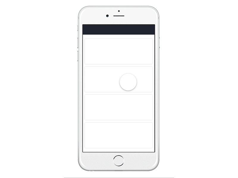
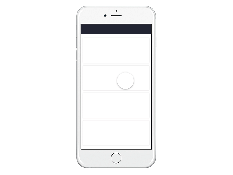
$.blueButton.scale = 0 As a result, we got a layer with empty white rectangles.
Next we need to, when clicking on the second rectangle on top, an orange circle appears, expand (fill the white rectangle in orange), and then increase to the full screen. To do this, we create a new layer (which is not in the Sketch prototype), call it Rectangle and set its parameters as in CSS.
Initially, it is a square with the given parameters of height and width (436px), orange, located exactly in the center of the white rectangle (x: 410, y: 730). To make a circle out of it, we give it a border radius equal to half the side (436/2 = 218px), make it invisible using the scale: 0 parameter.
Rectangle = new Layer width: 436 height: 436 backgroundColor: "#FF7841" borderRadius: 218 x: 410 y: 730 scale: 1 In JavaScript, it would look like this:
(function () { var Rectangle; Rectangle = new Layer({ width: 436, height: 436, backgroundColor: '#FF7841' borderRadius: 218, x: 410, y: 730, scale: 1 }); }.call(this)); As you can see, in CoffeeScript, unlike JavaScript, there are no numerous quotes and commas, here they are replaced with spaces - so we make sure that the parameters in the description of the object begin with a new line after 3 spaces, otherwise it will produce an error.
Step 3:
To make our circle of the invisible become visible, and then actually a rectangle, we give it new states using Rectangle.states.add:
Rectangle.states.add toFront: scale:0.5 toRectangle: scale: 1 opacity: 1 x: 37 y: 727 width: 1168 height: 436 borderRadius: 12 All: scale:7 time:1.1 We have added 3 states:
toFront (you can call it whatever you like) - in this state the circle becomes half as large
toRectangle - the circle becomes a rectangle with the parameters exactly the same as the white rectangle in our Sketch file.
All - the rectangle unfolds in full screen. Here we also set a time of 1.1 seconds, with which this happens.
4 Step
Now create an event (Events) - Click (Click), in which the circle will begin to transform according to the specified states (States).
A click will go to the second rectangle on top, which is called in the Sketch prototype layer second.
We write - $ .second.on Events.Click - what is read in a human language like this - when you click on the second rectangle, the following happens - and we describe exactly what:
$.second.on Events.Click, -> Rectangle.states.switch("toFront", curve: "spring(300, 30, 0)") Utils.delay .2, -> Rectangle.states.switch("toRectangle", time: 1, curve: "easy") Utils.delay 1, -> Rectangle.states.switch("All", time: 1, curve: "ease out") The Rectangle state is switched to toFront, then the 0.2 second delay (Utils.delay .2) - then it switches to toRectangle - 1 second delay (Utils.delay 1) and the last switch to the All state. It also sets the parameters of the curve and time - changing them, the animation will take place in different ways.
We get:
5 Step
Next we need to set the state for the remaining layers, which we defined at the beginning. We write:
$.text.states.add Show: y: 921 $.time.states.add Show: y: 321 $.line.states.add Show: x: 36 $.buttonbg.states.add Show: y:1509 $.blueButton.states.add Show: scale:1 y: 1773 Extend: scale: 10 $.textButton.states.add Show: opacity: 1 y:1845 $.loadingbg.states.add Show: y:0 $.oval.states.add Show: opacity: 1 $.loadingfinish.states.add Succes: y: 861 opacity: 1 For the blueButton layer, we added 2 states - in the first (Show) it is simply shown, in the second (Extend) - it expands to full screen.
Step 6:
Now we have to destroy the Rectangle that we have created so that it does not interfere with the other layers. We are writing:
Rectangle.on "end", -> Rectangle.destroy() $.bgorange.opacity = 1 $.text.states.switch("Show", time: 1.2, curve: "ease") $.time.states.switch("Show", time: 1.2, curve: "ease") $.line.states.switch("Show", time: .8, curve: "spring(500, 50, 0)") $.buttonbg.states.switch("Show", time: 2, curve: "easy out") $.blueButton.states.switch("Show", time: 2, curve: "easy") $.textButton.states.switch("Show", time: 2, curve: "easy out") What does it mean - when the Rectangle has completed its transformations - it is destroyed (destroy), the layers we have shown are shown in its place, according to their previously defined states. The layers change their states with the time defined by us and according to the curve defined by us (for example: time: 1.2, curve: “ease”)
Do not forget to update the screen (⌘ + R).
We get:
Step 7:
Now we need to create a text layer - which will display the percentages when loading.
textLabel = new Layer width: 500 height: 150 backgroundColor: null textLabel.center() # Style text textLabel.style.color = "#fff" textLabel.style.fontSize = "100px" textLabel.style.fontFamily = "Proxima Nova" textLabel.style.lineHeight = "100px" textLabel.style.textAlign = "center" Set it to backgroundColor: null, that is, empty (if we don’t specify backgroundColor, it will turn blue by default) and align it with the center of the entire screen thanks to the textLabel.center () function.
We describe the parameters of the style # Style text.
And note that we do not write which text will be displayed, otherwise we would write html: “some kind of Text”.
To change the interest, we add a line of code at the end.
In the meantime, we need to remember that in Sketch of the prototype there is a layer called “Oval”, which should rotate around its axis. To make this happen, we create a new animation and call it “spinLoad”.
spinLoad = new Animation layer: $.oval properties: rotation: 760 time: 2 curve: "easy" Rotation we set 760 - it means it will spin 2 full turns and 40 degrees additionally (360 + 360 + 40). You can put any value of degrees.
Add another showTextLabel animation:
showTextLabel = new Animation layer: textLabel properties: opacity: 1 time: 4 curve: "easy" Now we create a condition under which the percent change will begin when the oval is rotated. We write:
$.oval.on "change:rotation", -> percentage = Utils.modulate $.oval.rotation, [0,760], [0,100] textLabel.html = Utils.round percentage, 0 Here we also set the degree of rotation of the oval to 760, and the change of percentages - from 0 to 100 (that is, in 2.4 turns of the oval, the percentages change from 0 to 100).
Step 8:
All the above animations will occur when you click on the “Save” button (blueButton layer), so create a new event click (Events.Click):
$.blueButton.on Events.Click, -> $.blueButton.states.switch("Extend", time: 1, curve: "easy in") $.loadingbg.states.switch("Show", time: .5, curve: "spring(500, 50, 0)") $.textButton.states.switch("default") $.oval.states.switch("Show", time: 1, curve: "easy in") spinLoad.start() Utils.delay 1.5, -> showTextLabel.start() Which means - by clicking on the button, the blue background (the blueButton layer) starts to expand (the Extend state), the loadingbg layer changes its state to “Show”, the text “Save” on the button returns to its original state: $ .textButton.states.switch (“Default”) (that is, disappears), an oval appears and the spinLoad.start () animation starts, we give a delay of 1.5 seconds and we start the showTextLabel.start () animation.
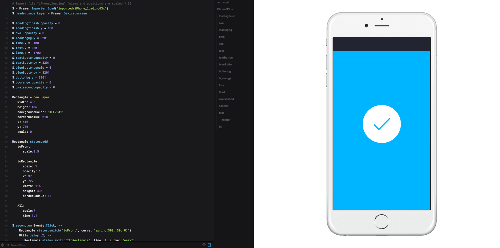
And finally, the last condition - after the percentages reach 100 and the oval has completed all its turns, a circle with a check mark should appear, signifying successful completion of the operation.
spinLoad.on Events.AnimationEnd, -> $.loadingfinish.states.switch('Succes') $.oval.opacity = 0 textLabel.opacity = 0 We get the final animation!
Author: Abrosimova Nadezhda, interface designer.
Source: https://habr.com/ru/post/277565/
All Articles