We return ICQ to life (ICQ). Designer's opinion
There is such a dinosaur - ICQ. Did you remember the sound of the incoming message? Oh yeah! I also immediately remembered studying at the university: it was then that I discovered the flowering of this messenger. True, I used another client myself, it seems it was QIP. Now I don’t remember exactly. ICQ had a very sophisticated interface, my young brain could not cope with it. And there were some cool numbers that everyone bragged about. More precisely boasted the number of digits in it. My neighbor in the dorm was 5-digit. And it was awesome.

And now to the point. Recently Mail.ru decided to organize a competition for the design of the mobile application of this client. I decided to participate. What came of it, look further.
First, the choice of platform: Android or iOS. I chose the first, because I use it at the moment.
')
According to the assignment, it was necessary to focus on video communications, but text messages should remain and be equally accessible to the user. What could be the video link:
● video call
● video message
● video conference
● video stream
Which one to choose you need to decide for yourself.
Skype

Of course, this is the main competitor. Skype is a synonym for video calling. The application consists of 3 tabs: recent actions, contacts and dialing any phone number for a call. I liked the floating button that expands the list of actions that can be performed: a message, a call, a video message and a video call. And the last one is recording and sending New Year greetings. But this functionality is only on the tab with the latest actions. On the contacts tab, this is a search for friends. And this is bad, because the type of tabs is almost the same, and you quickly get confused with the application.
You can start interacting with a person by opening a dialogue with him. Voice and video calls are made from above, text below.
Phone
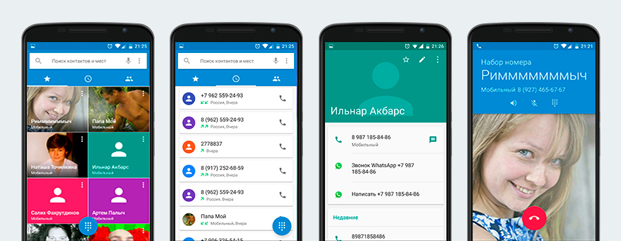
I think the dream of any developer is when people use his application instead of the standard pre-installed application from Google. So it is here. If ICQ replaces the application “Phone”, it will be a complete victory, but this mission is very difficult, close to impossible.
Structure. Also 3 taba: favorites, recent calls, contacts. An interesting way to display a contact card: it pops up from the bottom with the ability to swipe up or down, respectively, to open the card completely or close it.
Of the features: a constantly hanging drain search for a contact using the keyboard or text.
Hangouts

The Google manager is primarily for SMS correspondence. Its interface is different from the interfaces of most instant messengers. No tabs. When you start the application, a list of dialogs opens in chronological order. You can switch between sections of the application using the left menu, when opened, the menu button turns into a back button. This is typical of mobile applications and even Google’s web interfaces.
Up to this point, I, like many, did not pay attention to the fact that from this invitation you can call (link to the application "Phone") and communicate via video.
With the help of a floating button, you can contact by video, write SMS and create a group for correspondence.
Whatsapp
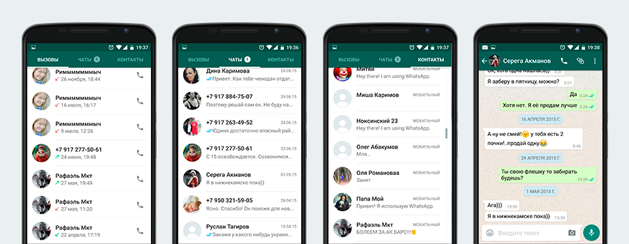
Not a direct competitor, but close. The application is also divided into 3 tabs, but slightly different: calls, chats (opens by default), contacts. The bell button is located on top. And below the voice message, the work of which I did not like: you need to continuously hold the button for recording and you can not listen to the result before sending, the cancellation animation is too complicated. Conceptually, this is a text messenger with the ability to call. Plus: in the “Calls” tab there is an instant call button (as in the “Phone” application).
Messenger (Facebook)
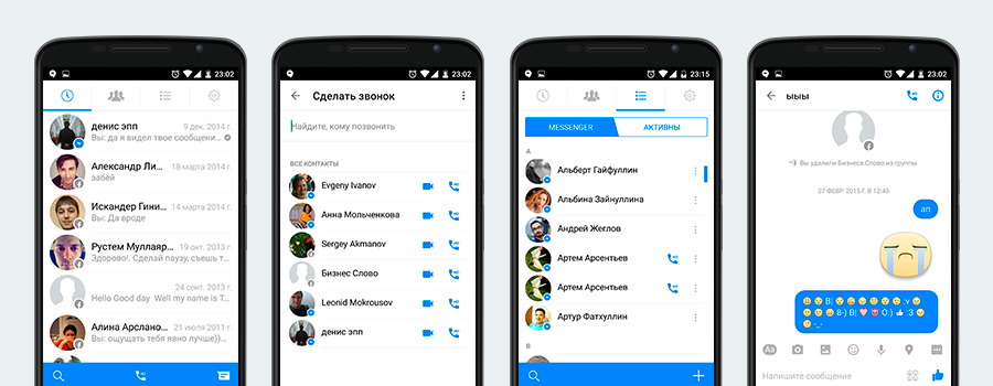
It differs in design from other instant messengers. Everything is also organized by tabs, of which 4. To the last one, we moved all user settings and thereby got rid of all sorts of menus getting out from behind the edges. Chat screen is similar to skapovskomu.
Periscope
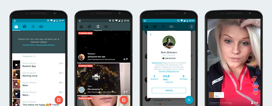
Fashion is now streaming service. Nice modern design. Easy to use, so streaming all and sundry.
Glide

It has 2 interesting solutions, in my opinion:
1. The tab “Discover” shows people who are close to you, sorted by distance. The display format is a large card in full screen. A large photo where you can view everything without going to the person’s page and using the “open dialog” and “hide user” buttons
2. When you open a dialogue with the user, the keyboard does not unfold, as it happens in most instant messengers. On the bottom panel, the blue circular button for recording a video message takes center stage. You can send a text message by clicking on the icon on the left in the same panel. Right - sending pictures.
Tango
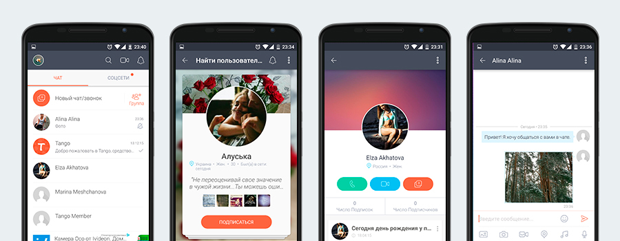
The most interesting messenger of those that I met. It can even be played against the background of a conversation. This is not just an instant messenger, but a mini-network with profiles, friends activity tape and own news feed.
There are 2 options for finding people. By text request and output in the form of a standard list. And recommended people with a conclusion in a beautiful “card” form. The second option resembles many dating apps (Badoo, Tinder, etc.), where you look through people's cards and choose a person to talk to.
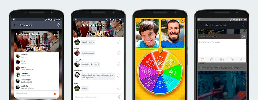
Group chats are called rooms (nice name). A beautifully decorated list of these rooms is also in the “card” form and the chat page itself.
On the wall of your profile can be placed as a text message, as well as video, photos and audio,
You can also send messages to people from the full list of phone contacts, even if the person does not have the application installed. The message is sent as an SMS with a link to install the application, of course.
ICQ (for now)

On the tabs of the last chats is a bad analogue of a floating button that I liked on Skype. It has 2 functions: start chat and start group chat. But by and large, only one, because you can start a chat by clicking on the user. The contacts tab is good for having a quick video call button. Chat page is similar to Skype page, but simpler, with fewer functions.
The task is to shift the emphasis on video communications, but copying Skype and hoping that all its users will “climb” to ICQ is stupid. Standard messengers, which are completely and all alike, are not very interesting. People enter them only to send something and clicking on the push-notification when something comes.
There are 2 types of development: evolutionary and revolutionary. I think more than the second is suitable for this task. It is necessary to introduce something new and interesting around which people would be able to collaborate and return to the application again and again.
Let's start with the meaning of the name. ICQ stands for “I seek you”, and in Russian “I'm looking for you.” Previously, the name had only the Internet entity: a person could be found on the network, knowing his uin-identifier. But today you can put a new meaning into it. I can know a person personally or find out about him, again, having found him in social networks. He, in turn, is geographically located at a specific time in a certain place.
Thus, we obtain 3 components of the same entity: a person, his geographical coordinates and time. Essence is the moment.
Human life consists of moments: bad and good. Time passes and in the hectic days a lot is forgotten. But you want to remember pleasant moments. And you need to find a way to fix it right here and right now. Often you want to share the moment with a specific person or tell all your friends. Social networks come to the rescue. What are they bad for? They are full of fake pages, ads, dirty politics, repost of questionable pages and contests. ICQ is now turned from a messenger into a social network, but not in the full sense of the word.
I propose to continue the development of the “sociality” of the application. Additional social elements motivate to go into the app more often, to spend more time there. As in order to see the activity of friends, and in order to share something.
Add an entity like “Moment”. It is a fixation of the place, time and thoughts or feelings of a person with the help of video, photo or text. The result can be placed on your wall and sent in dialogs.
The logo and at the same time the application icon, I think it is not necessary to change it drastically. It is recognizable, does not cause any negative associations. The only thing you can upgrade, make it more modern and neat. Cheap techniques for adding video elements to a flower are also useless.

Total

Application icon
I decided to abandon leaving the left menu with a hamburger - it is difficult. Made 4 tabs in which all the work with the application takes place.

Tabs of simplicity, a minimum of clicks and immediately before the eyes of all the features of the application. In this regard, the Youtube application is a trend setter. Its developers were among the first to start using the left hamburger exit menu, and the first ones abandoned it.

You can click on a prototype close to reality at Invision.
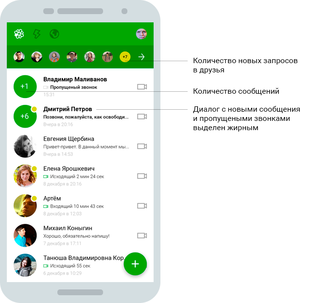
Absolutely new application interface. Here I got rid of second-level tabs, which also complicate perception. First of all, the latest dialogues are shown; people are most often guided by them.
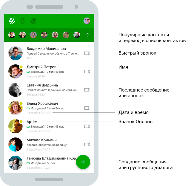
The panel with avatars under the application header is a quick access to 7 popular contacts and the left arrow throws “communication” into the window, where there is a lot of interesting things (paragraph 5.2).
What prevents people from calling in messengers? Of course the possibility of typing a message, because it is an instant messenger. To shift the focus to the video call, I redid the bottom panel. Now there are 3 buttons:
And if a person has already started typing a message, but suddenly decided to call, then the call button is duplicated in the top panel.
The window is divided into 2 parts: friends and rooms.
Friends This is primarily a list of all friends from ICQ in alphabetical order. But also below is another list of contacts from the phone’s address book. You can send an SMS message to these contacts, at the bottom of which there will be a link to the application.

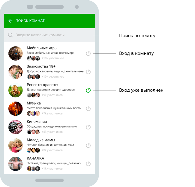
Search for people. You can get here by clicking on the floating button in the previous window. Initially, cards are shown recommended people. They slide their finger up. If a person clicks on a block of text search with a magnifying glass, the keyboard is opened and the people found on request are displayed in the standard list.

Rooms are life chat rooms, only with a new name. I wanted to change this overseas word to something more pleasant to the ear and clearer to the Russian person. Room - a good analogy to this method of communication.
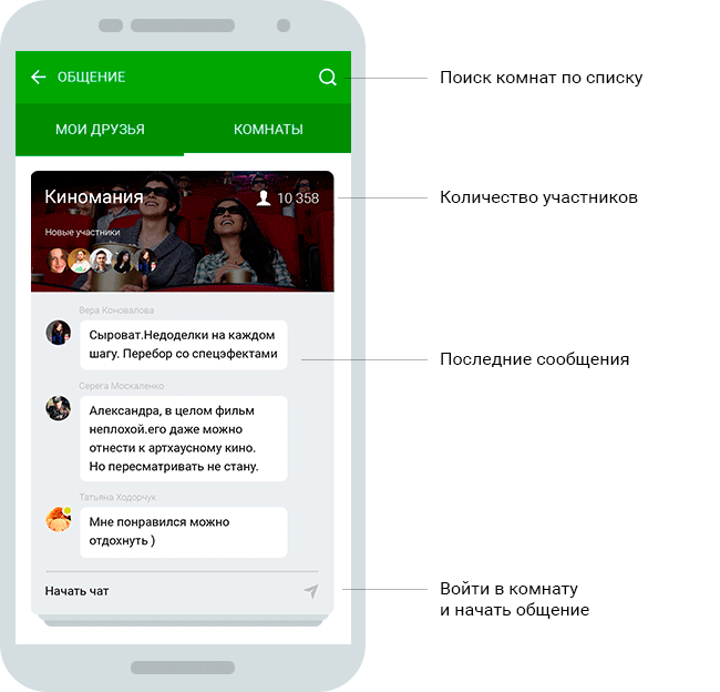
Here, the rooms are immediately displayed in the card view, and when you click on the search icon, they are displayed in a list with the ability to search by text.
I will go over before telling about the windows “Tape of news” and “Kata of moments”, I will go first to the profile, because a new concept of “Moment” is introduced there.
I will duplicate this text once more. Human life consists of moments: bad and good. Time passes and in the hectic days a lot is forgotten. But you want to remember pleasant moments. And you need to find a way to fix it right here and right now. Often you want to share the moment with a specific person or tell all your friends.
Save the moment is very simple. Just a few simple steps:

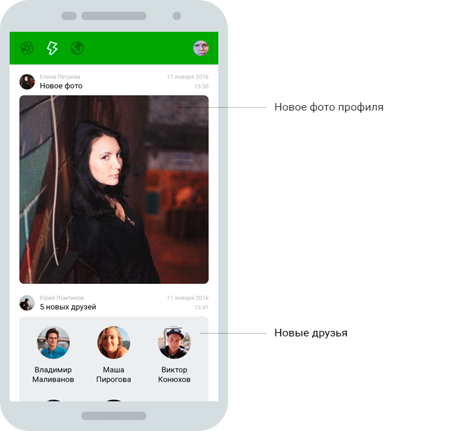
Ordinary tape of friends activity in chronological order. It's simple, but it is she who makes a bunch of people stick in all social networks.
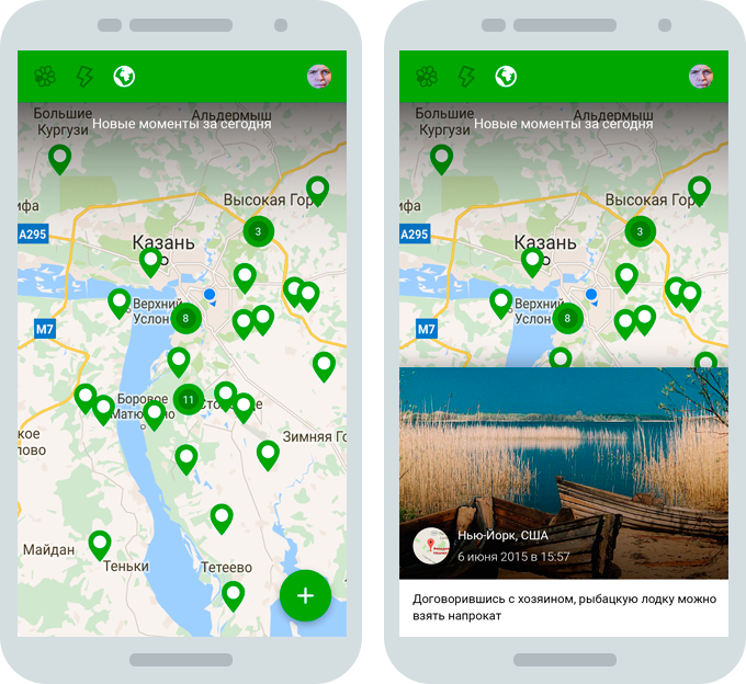
Interactive like everything. There are many successful projects based on maps. See what is happening next to you at the moment is very interesting. If you map the moments that occurred in the last 24 hours, they have value, because they are limited in time. In addition, the number of labels on the map will not be so huge that it was impossible to move around the map.
The picture on the left shows the normal state of the map, and on the right a pop-up block when you click on the map label.
Key benefits that I would like to highlight again:
Once again I will duplicate the link to the prototype , where you can click a little.
And now to the point. Recently Mail.ru decided to organize a competition for the design of the mobile application of this client. I decided to participate. What came of it, look further.
First, the choice of platform: Android or iOS. I chose the first, because I use it at the moment.
')
According to the assignment, it was necessary to focus on video communications, but text messages should remain and be equally accessible to the user. What could be the video link:
● video call
● video message
● video conference
● video stream
Which one to choose you need to decide for yourself.
1. First, run over competitors.
Skype
Of course, this is the main competitor. Skype is a synonym for video calling. The application consists of 3 tabs: recent actions, contacts and dialing any phone number for a call. I liked the floating button that expands the list of actions that can be performed: a message, a call, a video message and a video call. And the last one is recording and sending New Year greetings. But this functionality is only on the tab with the latest actions. On the contacts tab, this is a search for friends. And this is bad, because the type of tabs is almost the same, and you quickly get confused with the application.
You can start interacting with a person by opening a dialogue with him. Voice and video calls are made from above, text below.
Phone
I think the dream of any developer is when people use his application instead of the standard pre-installed application from Google. So it is here. If ICQ replaces the application “Phone”, it will be a complete victory, but this mission is very difficult, close to impossible.
Structure. Also 3 taba: favorites, recent calls, contacts. An interesting way to display a contact card: it pops up from the bottom with the ability to swipe up or down, respectively, to open the card completely or close it.
Of the features: a constantly hanging drain search for a contact using the keyboard or text.
Hangouts
The Google manager is primarily for SMS correspondence. Its interface is different from the interfaces of most instant messengers. No tabs. When you start the application, a list of dialogs opens in chronological order. You can switch between sections of the application using the left menu, when opened, the menu button turns into a back button. This is typical of mobile applications and even Google’s web interfaces.
Up to this point, I, like many, did not pay attention to the fact that from this invitation you can call (link to the application "Phone") and communicate via video.
With the help of a floating button, you can contact by video, write SMS and create a group for correspondence.
Not a direct competitor, but close. The application is also divided into 3 tabs, but slightly different: calls, chats (opens by default), contacts. The bell button is located on top. And below the voice message, the work of which I did not like: you need to continuously hold the button for recording and you can not listen to the result before sending, the cancellation animation is too complicated. Conceptually, this is a text messenger with the ability to call. Plus: in the “Calls” tab there is an instant call button (as in the “Phone” application).
Messenger (Facebook)
It differs in design from other instant messengers. Everything is also organized by tabs, of which 4. To the last one, we moved all user settings and thereby got rid of all sorts of menus getting out from behind the edges. Chat screen is similar to skapovskomu.
Periscope
Fashion is now streaming service. Nice modern design. Easy to use, so streaming all and sundry.
Glide
It has 2 interesting solutions, in my opinion:
1. The tab “Discover” shows people who are close to you, sorted by distance. The display format is a large card in full screen. A large photo where you can view everything without going to the person’s page and using the “open dialog” and “hide user” buttons
2. When you open a dialogue with the user, the keyboard does not unfold, as it happens in most instant messengers. On the bottom panel, the blue circular button for recording a video message takes center stage. You can send a text message by clicking on the icon on the left in the same panel. Right - sending pictures.
Tango
The most interesting messenger of those that I met. It can even be played against the background of a conversation. This is not just an instant messenger, but a mini-network with profiles, friends activity tape and own news feed.
There are 2 options for finding people. By text request and output in the form of a standard list. And recommended people with a conclusion in a beautiful “card” form. The second option resembles many dating apps (Badoo, Tinder, etc.), where you look through people's cards and choose a person to talk to.
Group chats are called rooms (nice name). A beautifully decorated list of these rooms is also in the “card” form and the chat page itself.
On the wall of your profile can be placed as a text message, as well as video, photos and audio,
You can also send messages to people from the full list of phone contacts, even if the person does not have the application installed. The message is sent as an SMS with a link to install the application, of course.
ICQ (for now)
On the tabs of the last chats is a bad analogue of a floating button that I liked on Skype. It has 2 functions: start chat and start group chat. But by and large, only one, because you can start a chat by clicking on the user. The contacts tab is good for having a quick video call button. Chat page is similar to Skype page, but simpler, with fewer functions.
2. Concept
The task is to shift the emphasis on video communications, but copying Skype and hoping that all its users will “climb” to ICQ is stupid. Standard messengers, which are completely and all alike, are not very interesting. People enter them only to send something and clicking on the push-notification when something comes.
There are 2 types of development: evolutionary and revolutionary. I think more than the second is suitable for this task. It is necessary to introduce something new and interesting around which people would be able to collaborate and return to the application again and again.
Let's start with the meaning of the name. ICQ stands for “I seek you”, and in Russian “I'm looking for you.” Previously, the name had only the Internet entity: a person could be found on the network, knowing his uin-identifier. But today you can put a new meaning into it. I can know a person personally or find out about him, again, having found him in social networks. He, in turn, is geographically located at a specific time in a certain place.
Thus, we obtain 3 components of the same entity: a person, his geographical coordinates and time. Essence is the moment.
Human life consists of moments: bad and good. Time passes and in the hectic days a lot is forgotten. But you want to remember pleasant moments. And you need to find a way to fix it right here and right now. Often you want to share the moment with a specific person or tell all your friends. Social networks come to the rescue. What are they bad for? They are full of fake pages, ads, dirty politics, repost of questionable pages and contests. ICQ is now turned from a messenger into a social network, but not in the full sense of the word.
I propose to continue the development of the “sociality” of the application. Additional social elements motivate to go into the app more often, to spend more time there. As in order to see the activity of friends, and in order to share something.
Add an entity like “Moment”. It is a fixation of the place, time and thoughts or feelings of a person with the help of video, photo or text. The result can be placed on your wall and sent in dialogs.
3. Application Icon
The logo and at the same time the application icon, I think it is not necessary to change it drastically. It is recognizable, does not cause any negative associations. The only thing you can upgrade, make it more modern and neat. Cheap techniques for adding video elements to a flower are also useless.
Total
Application icon
4. We start with the structure
I decided to abandon leaving the left menu with a hamburger - it is difficult. Made 4 tabs in which all the work with the application takes place.
Tabs of simplicity, a minimum of clicks and immediately before the eyes of all the features of the application. In this regard, the Youtube application is a trend setter. Its developers were among the first to start using the left hamburger exit menu, and the first ones abandoned it.
5. Run the application
You can click on a prototype close to reality at Invision.
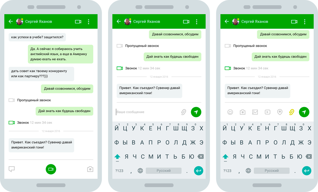
5.1. Dialogues
Absolutely new application interface. Here I got rid of second-level tabs, which also complicate perception. First of all, the latest dialogues are shown; people are most often guided by them.
The panel with avatars under the application header is a quick access to 7 popular contacts and the left arrow throws “communication” into the window, where there is a lot of interesting things (paragraph 5.2).
What prevents people from calling in messengers? Of course the possibility of typing a message, because it is an instant messenger. To shift the focus to the video call, I redid the bottom panel. Now there are 3 buttons:
- Central - instant video call
- Left - opens a set of messages
- Right - quickly send a photo from the gallery or a snapshot of the camera
And if a person has already started typing a message, but suddenly decided to call, then the call button is duplicated in the top panel.
Communication
The window is divided into 2 parts: friends and rooms.
Friends This is primarily a list of all friends from ICQ in alphabetical order. But also below is another list of contacts from the phone’s address book. You can send an SMS message to these contacts, at the bottom of which there will be a link to the application.
Search for people. You can get here by clicking on the floating button in the previous window. Initially, cards are shown recommended people. They slide their finger up. If a person clicks on a block of text search with a magnifying glass, the keyboard is opened and the people found on request are displayed in the standard list.
Rooms are life chat rooms, only with a new name. I wanted to change this overseas word to something more pleasant to the ear and clearer to the Russian person. Room - a good analogy to this method of communication.
Here, the rooms are immediately displayed in the card view, and when you click on the search icon, they are displayed in a list with the ability to search by text.
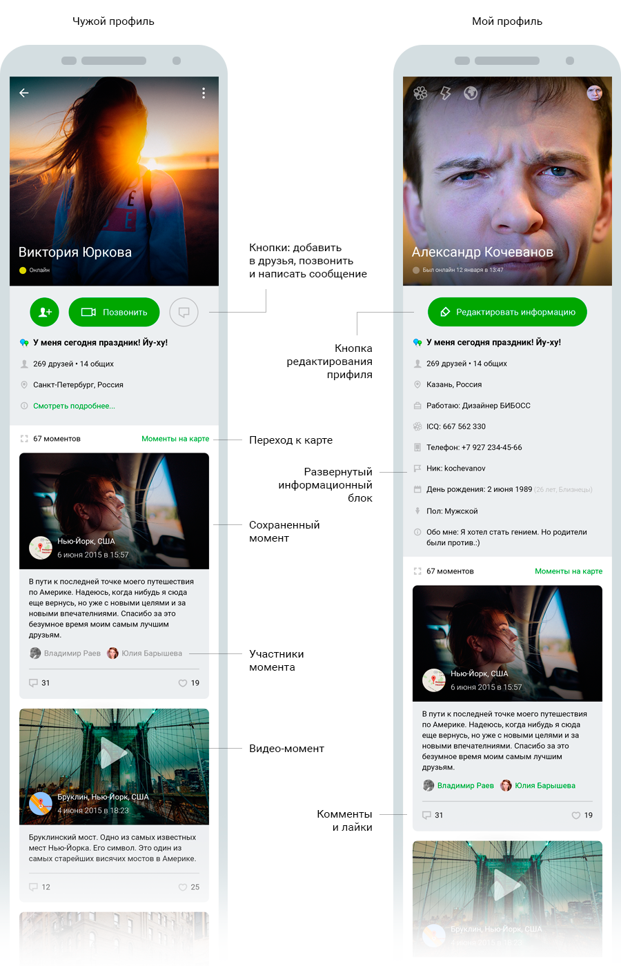
5.2. Person profile
I will go over before telling about the windows “Tape of news” and “Kata of moments”, I will go first to the profile, because a new concept of “Moment” is introduced there.
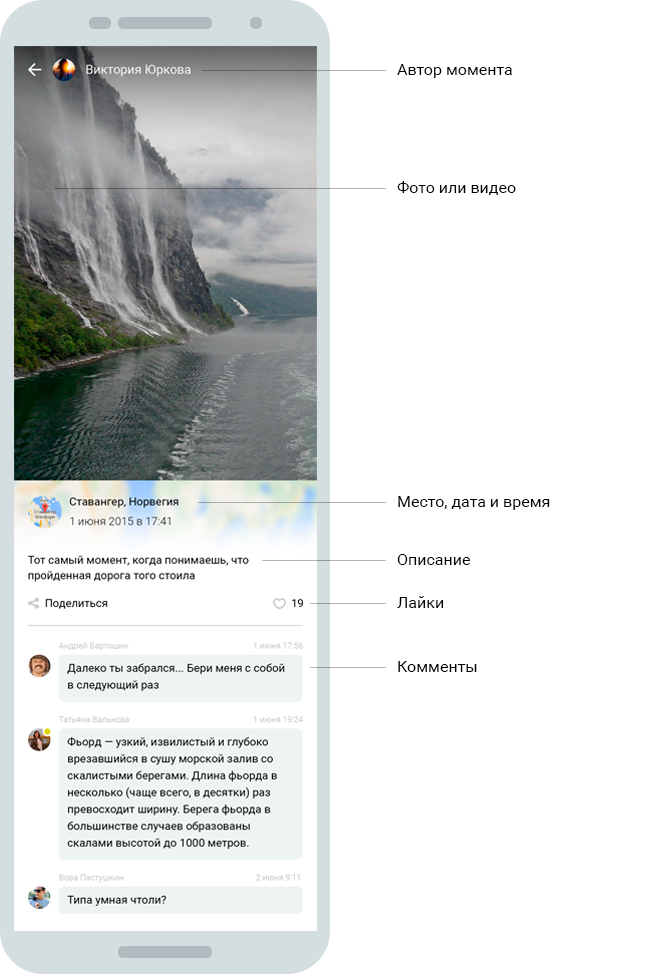
Moment
I will duplicate this text once more. Human life consists of moments: bad and good. Time passes and in the hectic days a lot is forgotten. But you want to remember pleasant moments. And you need to find a way to fix it right here and right now. Often you want to share the moment with a specific person or tell all your friends.
Save the moment is very simple. Just a few simple steps:
- Choosing a save method (photo or video)
- Preservation
- Optional color correction
- Optional text description of the moment
- Optionally add participants to the moment
- Publication
5.3. news feed
Ordinary tape of friends activity in chronological order. It's simple, but it is she who makes a bunch of people stick in all social networks.
5.4. Moment Map
Interactive like everything. There are many successful projects based on maps. See what is happening next to you at the moment is very interesting. If you map the moments that occurred in the last 24 hours, they have value, because they are limited in time. In addition, the number of labels on the map will not be so huge that it was impossible to move around the map.
The picture on the left shows the normal state of the map, and on the right a pop-up block when you click on the map label.
6. Total
Key benefits that I would like to highlight again:
- "Hot" call icon in all lists of people
- Another principle of communication in dialogue
- "Hot" call icon in all lists of people
- Increased sociality of the application
- Easy navigation
- Cards of people when searching
- Interactive availability
Once again I will duplicate the link to the prototype , where you can click a little.
Source: https://habr.com/ru/post/277447/
All Articles