My rules for a good interface design
In this article I give examples of basic principles or concepts that guide the design of desktop interfaces. I do not plan to be an innovator or teacher, but I’m happy to share a set of installations that helps me in my work.
By the way, if you use Figma , I recommend paying attention to our ready-made design systems . They help freelancers complete more orders per month, programmers can create beautiful applications on their own, and the Timlids run sprints faster using ready-made design systems for teamwork.
And if you have a serious project, our team is ready to deploy a design system within the organization based on our developments and tailor it to specific tasks using Figma. Web / desktop, and any mobile. We are also familiar with React / React Native. Write to T: @kamushken
')
Accents and Priorities
Each time, when designing an interface, I ask myself or the client a question: “What information is now important for the end user? How do we distribute his attention in a particular case? ”For this, we have in our armament a color and its shades, font size, its intensity. Together, using these tools correctly, we “leave a message” to the user, guide him along the path we need, concentrating his attention on the most important.
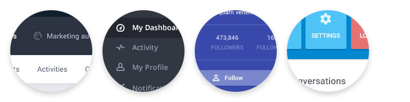
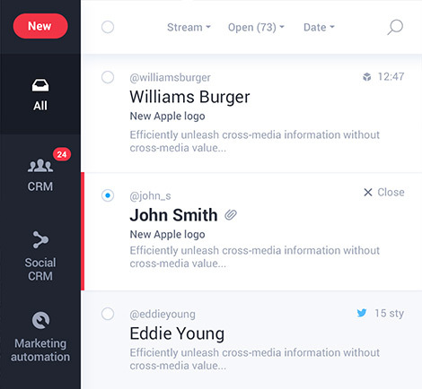
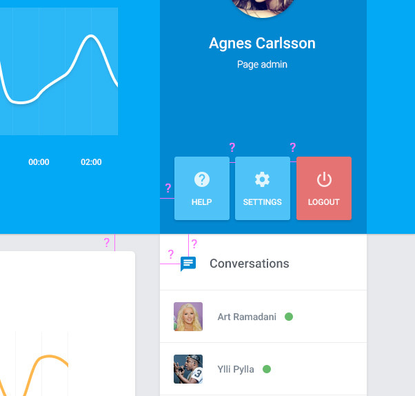
A good example is when the designer gave the user an understanding that it is important to see the sender, then the topic, and only then the content or his @ nickname in the system:
A bad example where the designer “claims”: the most important thing is the avatars, and somehow you will understand the rest:
Indents and their proportionality
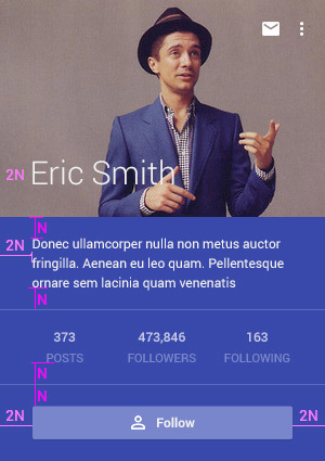
Modern design is light, simple and “airy”. He is filled with breath. And not the last role in the formation of these sensations play indents. Significant indentation helps to simplify the flow of material. But they should be subject to some regularity and proportionality. I define N pixels for myself as the baseline when I start a new project. Then I use 2N, 3N and so on proportionality to create a visual balance, if you need a large indent somewhere.
A good example is when a designer more or less respects the proportionality of indents:
A bad example is when indents are practically based on a random number generator:
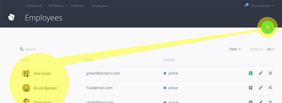
Button text is always more primary than icon.
Do not forget that it is the text that is the determining factor of what kind of expectation or reaction the user will have beforehand at the sight of the button. And only the image of the icon in a secondary way complements the meaning. The image of a bell with the inscription “notifications” gives us some idea of the purpose of this function before we click. A similar unsigned bell in another application will lead us to the alarm clock, although we are most likely to expect a notification screen. I advise you to always give the inscription more “weight” than icons. I generally consider them as cheating. Many modern interfaces are quite capable of doing without them. It would just be too boring!
Overall good:
But you can do better:
It looks good too:
And here is where to improve:
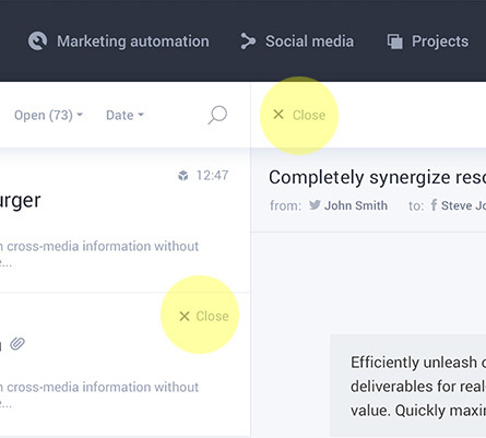
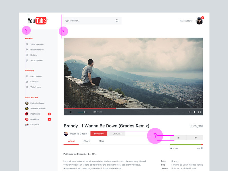
Do not try to be too clear
Not all designed interfaces are required to be intuitive. There are many complex systems with which we have been trained (!) To interact for a while. Perhaps now they seem simple to us, but we are not aware of the fact that the first minutes, hours or more were discoverer researchers. And since we continue to work within some initially complex system, apparently nothing prevented our first research path. Most likely, the designer did his work so well that we easily mastered the new environment. A vivid example of life: try for a moment to imagine that you do not know the meaning of the mathematical sign “equal”. Agree, these two lines are one above the other, they do not seem intuitive at all. Just once in school a math teacher taught us this. I urge not to try to be clearer than what is required at the minimum necessary level.
In this example, the designer was overly clear with the close button:
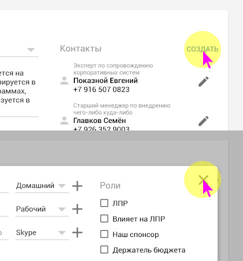
And in this example, the designer was overly understandable with the possibility of adding:
Moving the cursor takes power
We should not oblige the user to reach the other part of the screen in order to get advanced functionality. If the user works with the list, then the button for creating a new item should be nearby. Or if we generate a new pop by clicking on the button at the bottom left, it is absurd to force the user to drag the cursor diagonally right up to close the window.
A good example is when a designer offers to close a popup in the same area that caused its generation:
A bad example is when a designer removes the functionality of adding an item to the list from the list itself:
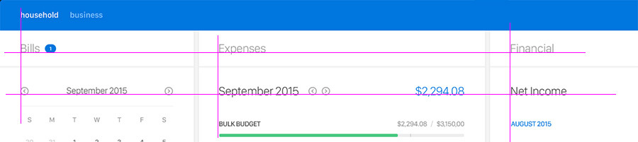
Location Relationships or Single Plane
This is another technique of balancing the interface. Similarity grid if you want. For example, you use a three-column. Are its headers in the same plane along the x axis? Or the location of the icons with the buttons. Is it possible to draw an imaginary Y-axis and find that they both gently fit it? If the answers are yes, things are going well. This is due to the fact that visually it is easier for a person to perceive a tabular view due to the structured data. And we in the development of the interface should have elements with some tabular logic.
Bad example with inconsistencies:
A good example with harmony and conformity:
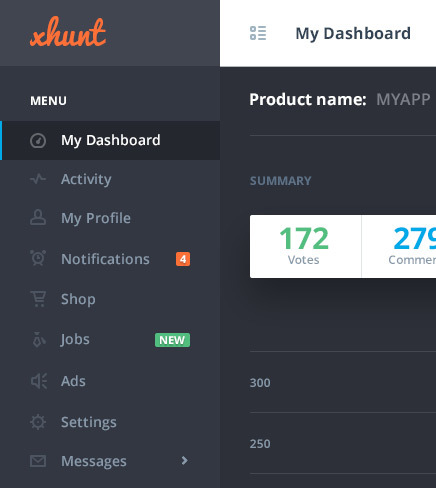
Color makes sense
Beaten at last. Red - anxiety, green - all is well. From time immemorial for a person, the best perception of textual information is in black and white. If you use a lot of colors without argumentation, you create chaos. If you color elements by meaning, you create even more order.
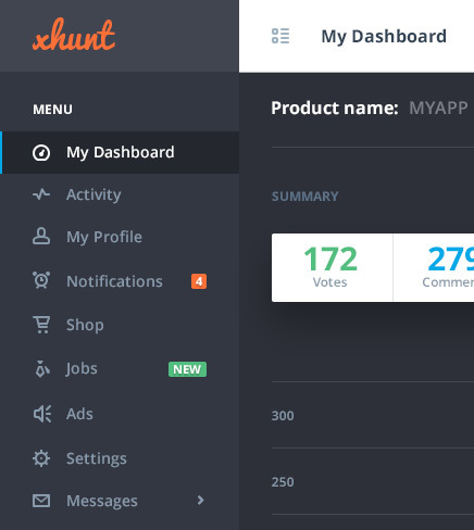
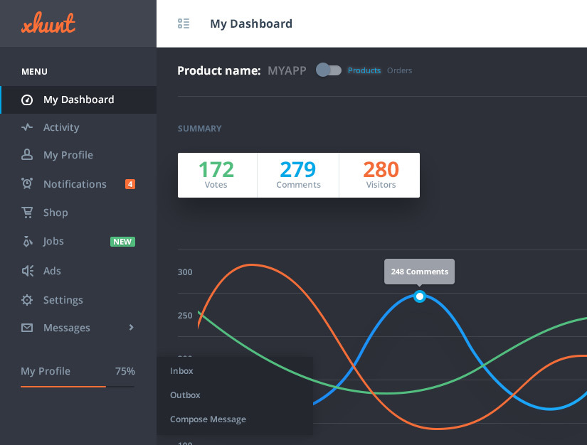
An example of chaos: (172 votes in green means a positive state? If, yes, then 280 visitors in orange means a negative logically? Not at all! The designer only divided the numbers between themselves)
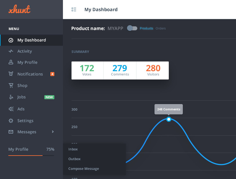
An example of creating an order and justification of color (I just added graphics over other people's creativity)
A good example of not using flowers:
As an epilogue ....
I thank the members of the dribbble community for the informal agreement to submit their work for this review. I want to remind you that the above principles in interface design are basic for me. I always keep them in mind when designing interfaces. Decide which side you're on ... Do you want to create interfaces for designers and work on likes (for example, 98% of work with behance) or are you trying to solve user problems (dribbble)? By the way, I think a great example of how the closeness of the community allows you to maintain focus on the main purpose of interfaces!
Source: https://habr.com/ru/post/277399/
All Articles