Conversion design: creating online services that users truly love
The term "conversion" for many years has been associated with civilian products of defense enterprises. But IT specialists will most likely have a completely different association . However, now we would like to talk about such a concept as conversion design. The generally accepted approach to the development of the site looks like this: there is a block on web design, there is a block on layout, on development, and so on. But over the past two or three years, everything began to change rapidly. The term “web design” gradually dies, because besides the browser, we have a responsive design. By and large, web design has ceased to exist in such an unambiguous way. There are all sorts of additional terminology, as a service design - data-driven design, which, including, is conversion. This event was dedicated to the 1C-Bitrix partner conference in Kiev by AIC managing partner Sergey Popkov and the head of the AIC product analytics department Vitaly Cheremisinov .
First, let's look at current trends. In general, the situation today is not much different from 2015. But we found a couple of curious examples of what, as it seems to us, it will be relevant in 2016.
Current trends
The first example is “chaschina”. Smart watches are now on all platforms. In absolute terms, there are not many users yet, but still this is a growing trend. Many designers are starting to experiment with concepts of how applications interact with these microscopic displays.
')

The second example is the intensive simplification of the design of the products themselves and web pages in particular, getting rid of everything superfluous. In some cases, they generally begin to avoid icons, leaving clean typography. In other words, if there is a product that you can be proud of, then it is better to focus on the product itself rather than on all sorts of decorations on the web page.
The third trend is the visualization of big data. Common interfaces are created when different data slices are superimposed on the maps and very interesting things are obtained, such as interactive infographics.

The fourth trend is the widespread introduction of animation. It is designed to compensate for graphic minimalism, getting rid of "excesses". Now, animation of micro-interactions is used everywhere, developers work more with Javascript and HTML5, they animate interfaces so that they look more interesting.
This is how another one appeared - the fifth - the trend: spatial interfaces, when websites start working without reloading. Everything is loaded in the background: video, graphics, pictures, everything flies, jumps ... For analysts, this is just a headache: not a single physical URL, everything is on anchors. Additional integration is not always convenient to configure. For example, the new site of a large manufacturing company Acme:

From the point of view of design of corporate sites, this is a very unusual decision, when a spatial interface is built on complete minimalism. And here we come close to the question: why do we need design today?
Essence of design
According to one approach, there are two forms of design: emotional and service. In our practice, we often encounter the fact that customers are focused on the first form.
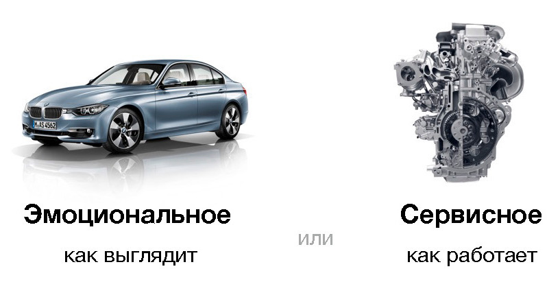
Which picture do you like more? Surely the car, because it is so beautiful. But everyone forgets why you really need a car. Many come to the car dealership and choose the model that they like. And few people ask themselves the question: how will this car go? Often buy, even without using a test drive.
Today, service design is becoming increasingly popular. For him, first of all, the answers to the questions “How does the interface work?”, “How does the user interact with it?” Are important. The emotional component plays a lesser role, online services appear, in which it doesn’t matter how everything is designed, the main thing is how it works. What path the user goes from the entry point to the exit point, to the first account, payment, and so on.
According to Wikipedia, the definition of “design” is:
"In a broader sense, design is intended not only for artistic design, but should be involved in solving broader social and technical problems of the functioning of production, consumption, and the existence of people in the subject environment."
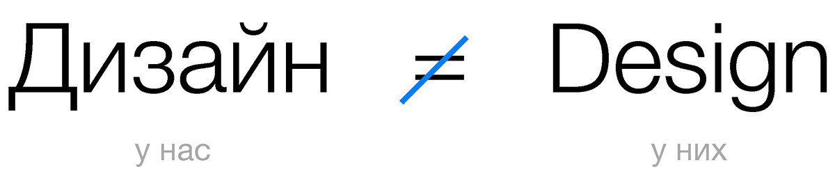
We dare to suggest that the western approach is described here. In Russia, the design is the color of the buttons, font size, beautiful photos. And they have a much broader, deeper meaning in the concept of design.
In the above description, the ratio of service and emotional component is well reflected. An ideal design is when we, on the one hand, like the design, and on the other hand, it is perfectly clear to everyone how it works. And this is precisely the beauty of design.
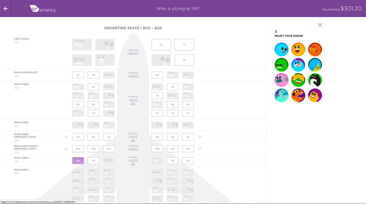
Take a look at the new Virgin America airline website. They who completely abandoned some kind of emotional message on the main page.
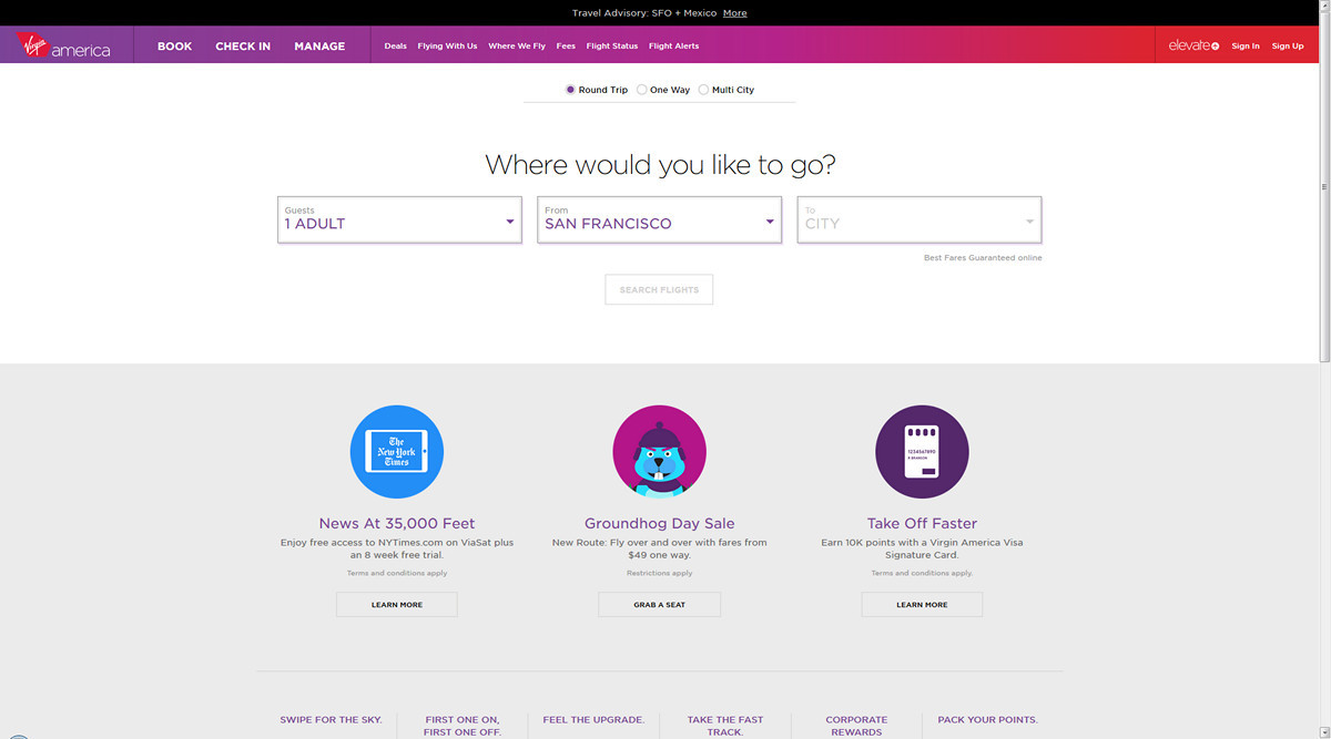
This is the first site on which no one tells the user what we have amazingly beautiful flight attendants, what beautiful planes soar in the air. This is all nonsense. The user comes to this site in order to buy a ticket, he does not need anything else.
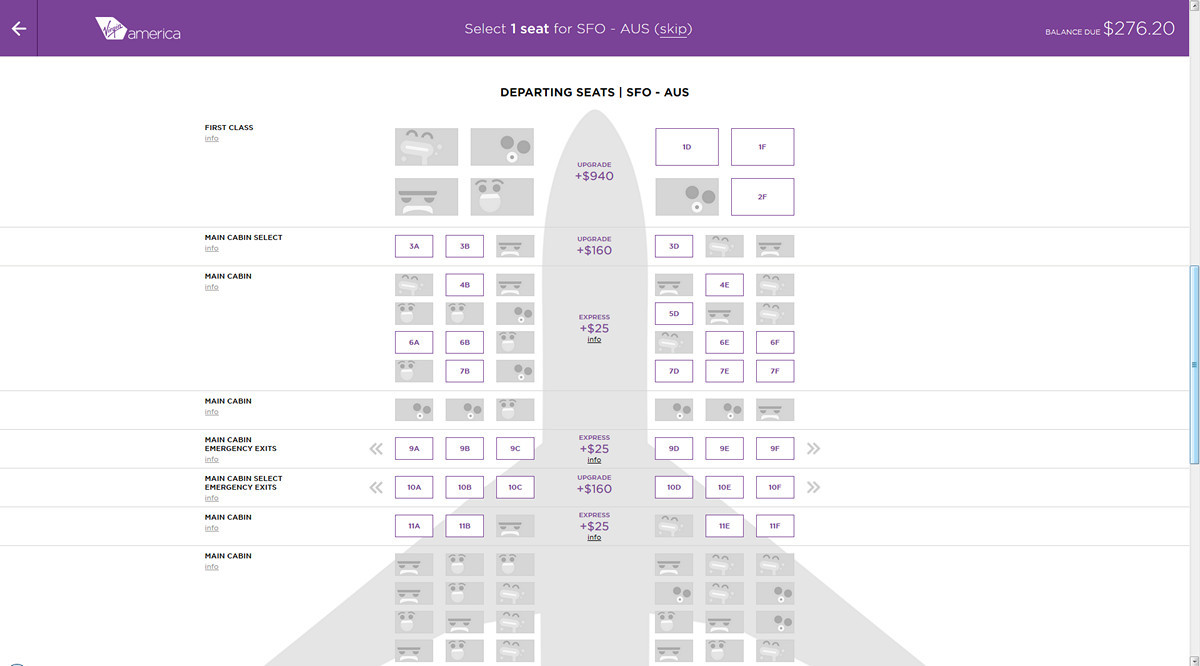
In the classic sense of the word "design" there is no design here. The average customer, seeing such a layout, will say that he does not like. It is somehow dry. No design. Where are the pictures? And only at the very end of the ticket selection process Virgin America took advantage of the emotional component: when filling in your data, you can choose the mood icon, and the next user, your potential neighbor, will see your mood and face. At the same time, the rest of the site solves exclusively service tasks.
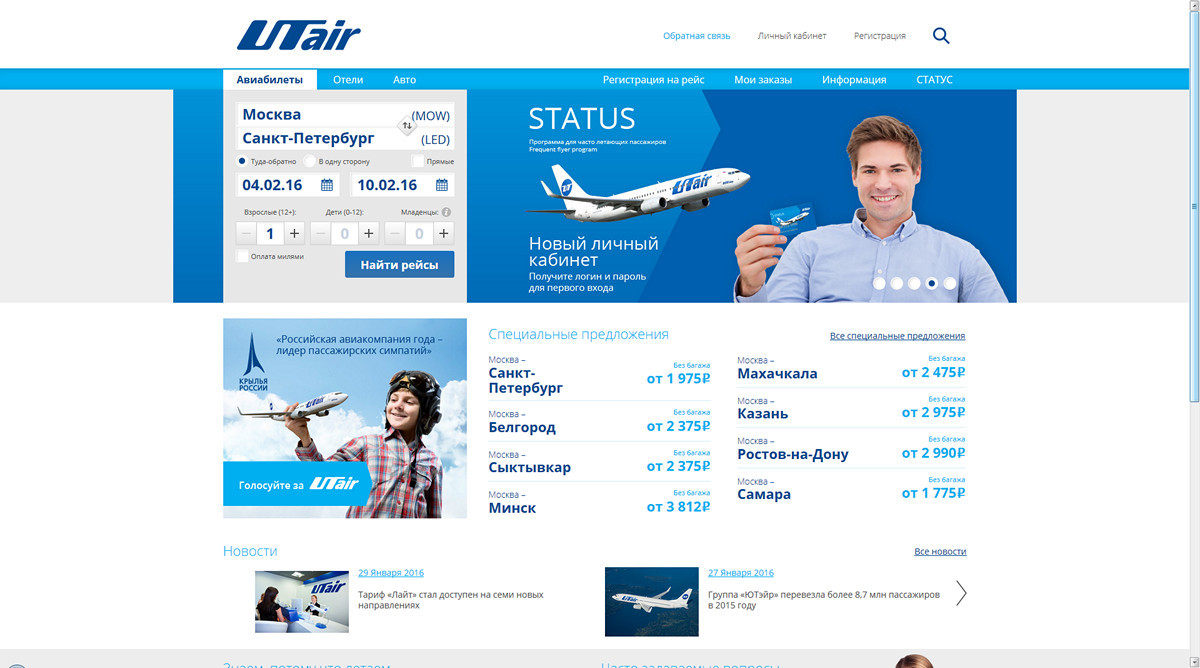
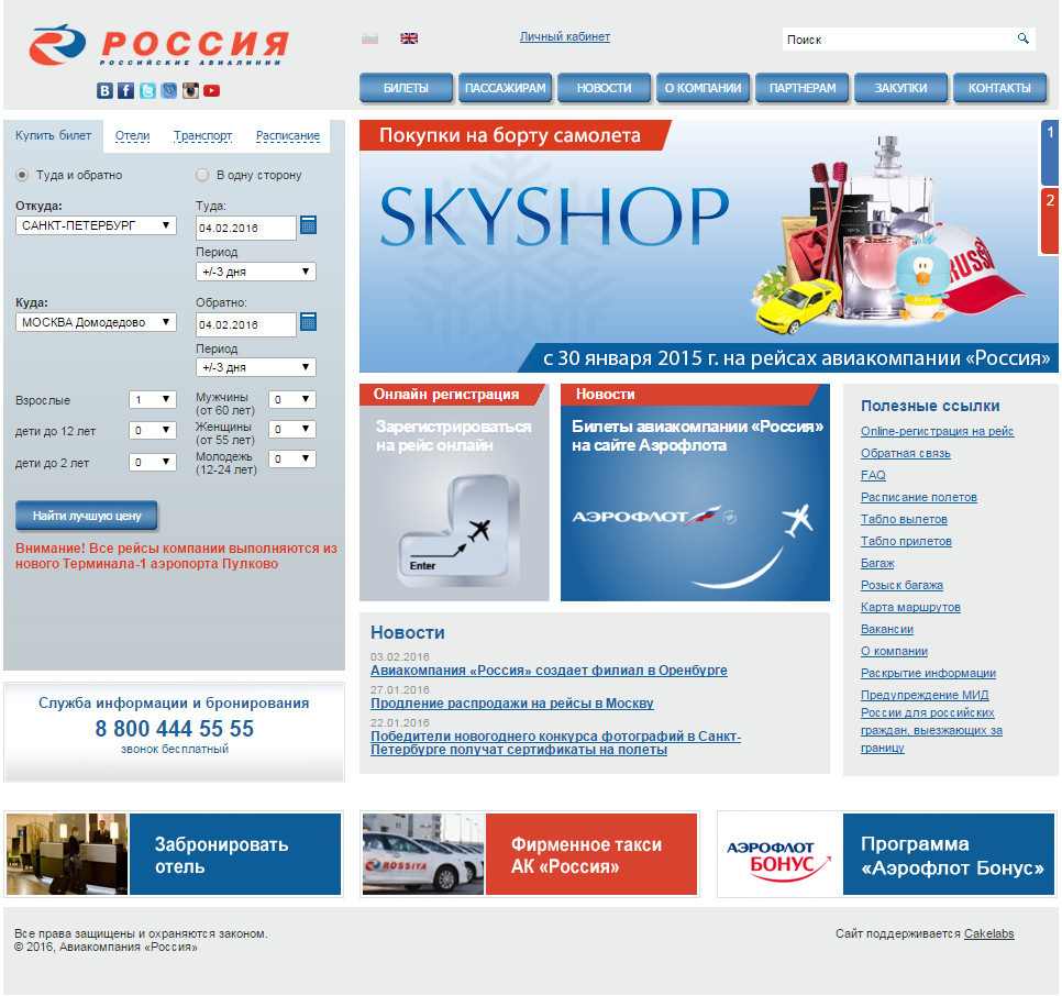
But, for comparison, the sites of domestic airlines. Here we see the same design that we are used to.

Why is it historically so that initially emotional design prevailed on the net? When the Internet first appeared, the sites were very simple. They were a collection of static pages, and nothing could be done about it. Even the creation of the application form was quite a non-trivial task. Therefore, webmasters hit the emotional design. It was important for everyone that their website should surprise everyone with their appearance. Later, online sales sites began to appear, search engines appeared, and issue appeared. More convenient forms began to appear. And in the end we came to global online services.
For them, design emotions have very little in common with how these services should work. And even when a potential customer says: “I want an application like Uber. I like this design, ”then, most likely, he means not the graphic design of the interface, but the ease and consistency with which this application works. To approach the customer from the right side, it is necessary to change the process of communication, to help the customer formulate a request. The overwhelming majority of developers approach this incorrectly from the beginning: “Why do you need to change the design of the site?” - “It is morally outdated”. That is, the customer feels that the design of the site just looks not too modern. It is good if he himself comes to a formulation like: “Our site is poorly displayed on a mobile phone.” This is a prerequisite to the fact that the customer is thinking in the right direction.
Another interesting example is the Russian Post site. Once it was like this:
And the new site is already working on a purely service principle:


On the main page, the user is offered a choice of 5 key scenarios. In this case, all scenarios are implemented linearly. If you select the “send parcel” script, then the horizontal navigation on the site disappears, because at this moment it is very important not to distract the user from what he really needs. And this is also a good example of service design.
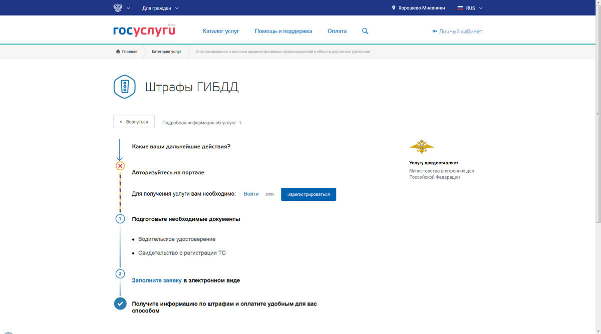
The updated site of state services. Here the user comes to the paperwork, payment of fines or tax arrears. There is no visual design as such.
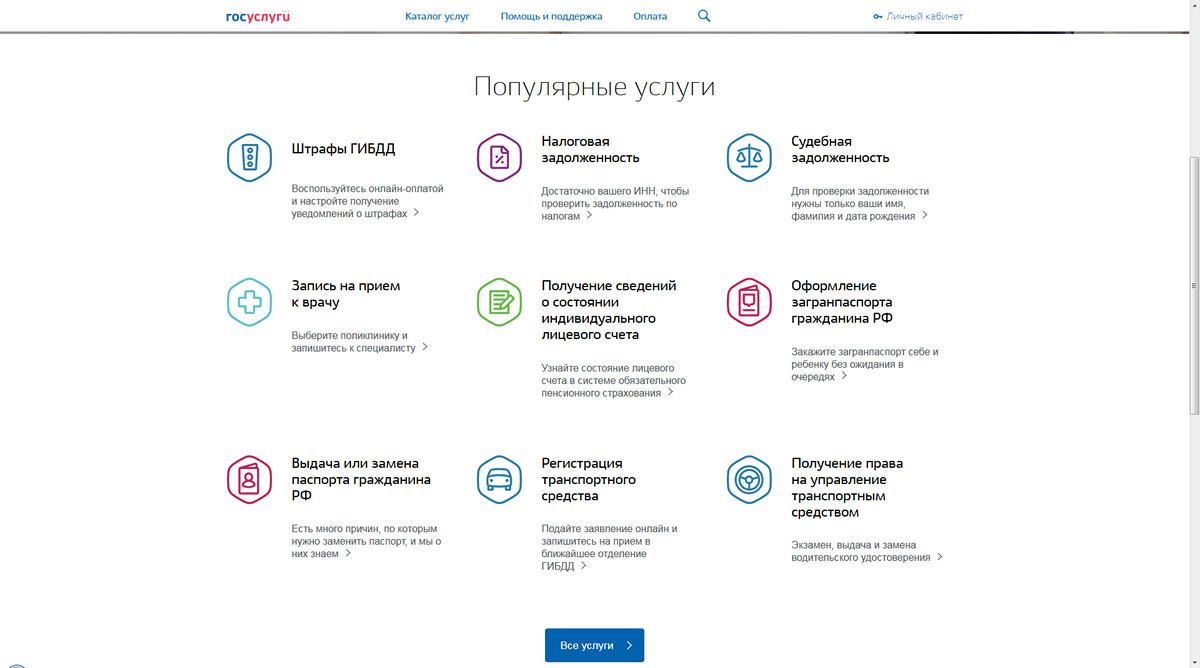
The clean, snow-white interface that follows the user, engages him, tells him in time what documents to prepare. If a person comes to the site a second time, then interactive widgets are already being created for him, which automatically check his debts. That is, the user does not need to repeat these scripts again and again, he does it once, and the next time he will immediately receive all the necessary notifications and messages.
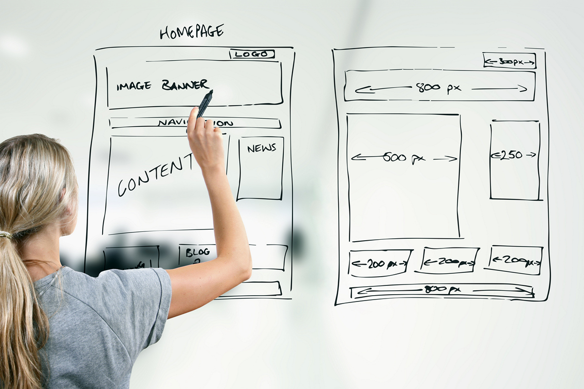
Web design
The paradigm shift of web design, the transition from colorful scenery to orientation on logic and principles of work led to the emergence of new and unexpected professions: strategist, analyst, designer. The visual designer is responsible for the graphic display: colors, a specific library of styles, and so on.
Constant changes in technology and platforms lead to a number of problems. Yesterday there was a mobile phone, today there was a clock, tomorrow it could be some kind of neural interface. New ideas are already hovering in the air, everyone is waiting for Zero UI, when the beauty of the interface will be in its absence. All this constantly leads to changes in the workflow for creating websites. And the emergence of conversion design is also due to the development of technology, analytical data systems.
How did they determine the effectiveness of design? It was important to us that the customer accepted it, and it does not matter whether he liked it. In rare cases, they did some polls and tests, asked their relatives and friends. We looked, "it looks cool, there is not enough of some kind of chip." As a result, they were played with fonts, buttons, and so on for a long time.
And now it might look something like this:
Var. A: CTA 4.75% Retention 3w >>> Win <<<
Var. B: CTA 4.35% Retention 3w
When you introduce a new feature in the functionality, develop a new product, this idea will not always come from the customer. But for you, as for the developer, the person who is responsible for the product and wants it to develop, the main quality criteria are some elements of the conversion, the return rate of the user at a certain time interval after some action. Such indicators help to assess, firstly, the business involvement of the user, and secondly - the quality of the product itself. And this is much more important than the story about the fonts and buttons.
The design took a big step forward, and new quality criteria appeared. Evaluate loyalty to your product, and most likely, the quality of your interface allow conversion on the second purchase, third and so on, the frequency of the user performing those or other actions, what are the scenarios for performing these actions, cohort analysis, and so on.
How often does the user return to you? And how much, on average, he spends time in your service? For example, according to Facebook Messenger statistics, users most often return to them after they add 5 friends to their application, and these 5 friends will send at least 10 messages. That is quite a specific, tangible criterion of product quality. In fact, the interface is not there. There are only product metrics. Unit economy is a description of the life of your product in terms of finance: how much does it cost to attract a new user, how much does it cost to return an old one, what size is the average check for a user, and so on.
Data driven design
Data-driven design is the creation of a design based on some data. The more we use diverse metrics, analytical tools and testing methodologies, the more evidence we have of design effectiveness.
In the old days, website design was usually created by one person - a web designer. It was a universal man, he also made up some places. Then such a mythical animal as a designer connected to the designer. This is a person who conditionally helps the designer to develop some kind of interfaces in the form of interactive black and white squares. Over time, a service design appeared, during the creation of which the analyst, designer, visual designer and interaction designer found a place. A service designer is committed to the development of service based on strategy and concept.

There is such a global service https://www.simple.com/ , a financial aggregator; over the past 4 years, they have changed the site design 3 times. What's the point? When a startup just starts up, it is important for them to make the maximum impression on new users, to lure geeks, so they make the most stunning design. When the primary stable audience is recruited, when users feel that the product is already of sufficient quality, then it is time to drive the conversion. Need as many registrations as possible. And then the owners of the service begin to change the design in the direction of increasing conversion in registration, and this design may not be so beautiful and stunning, with a bunch of animation. A new design should solve other problems.
This phasing determines service design as part of the development of a UX-strategy for product and service development, from the day of launch and for the next few years.
In principle, a service designer can be called a product manager, because he is partially responsible for the product, the introduction of new chips and their life cycle.
Simplified, the development stages of service design can be represented as follows:
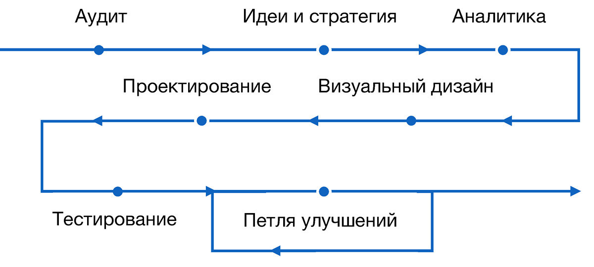
In fact, it all starts with analysis and ends with it. All intermediate stages revolve around the data we collect about the product. For clarity, we describe them in examples of several cases from our practice. They are quite simple, they are nothing mega-special, but they seem interesting to us.
Flat and voluminous
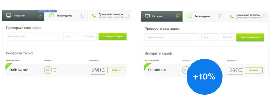
As a friendly company, we discussed the development of mobile platforms: iOS, Android and Windows Phone. And they realized that a user who interacts with a mobile device always gets used to some kind of infrastructure. When it opens a mobile application, it acts within the framework of inherited templates. Navigation is the same everywhere, sometimes even UI elements are similar.
In desktop systems, this unity is not observed. And we decided to see how changes in the interface depending on the platform will affect the behavior of users. For this, a small personalized test was conducted.
For Windows users up to version 10, we showed two interface options: with flat buttons and with voluminous buttons. As a result, among users who worked with voluminous (convex) buttons, and in general with a design that is similar in its patterns to OS design, conversion growth (product order) increased by 10%.
Commodity showcase
Very often we want to show at once all product chips or the entire product matrix, as many offers as possible. You can make a very beautiful interactive showcase. On it all products will be very beautifully located. But in reality, users do not always need it. Many developers create design based on the fact that the user with a full understanding of the case will go to the page and perform the necessary actions in the right sequence.
For example, when connecting to a new Internet provider, check the address, select a tariff and go on. In reality, everything turned out to be wrong. Users ignored address verification, immediately chose a tariff, reached the end and received the message “choose address”. They were somewhat discouraged, and they left the resource, because at the very beginning they ignored the first paragraph. Then we decided to force users to first verify their address, and only then choose a tariff. The customer resisted for a very long time: “How is that? Are we closing such a beautiful shop window? We have amazing fares! ”. We persuaded him to follow our proposal, and it turned out that the restriction in the choice and concentration on certain objects, even if not always convenient, increases certain product indicators. Conversion increased by 20%.

Progress indicator
If you open any UX Kit, or read Western blogs with recommendations on the design of pages and forms, it will be written everywhere: “Make progress indicators. Tell your users to go from point A to point B and talk about the intermediate stage. ” Everywhere it is written that it is important for the user to see where he is going.
However, one important aspect is not taken into account: when you do, for example, a questionnaire for several steps, then you, of course, tell the user what he will need to fill out on the next page. But you do not say how long it will take him. It turns out that you somehow do not fully inform. So the user does not know how much time will be spent, and therefore does not even think about it. Now we are testing an approach in which the progress indicator not only suggests the number of remaining steps, but also predicts how long it will take.
By the way, another reason for the popularization of progress indicators is their aesthetic appeal. Beautifully, when you have a strip running, or something there is filled, poured. This is one of the manifestations of the emotional component of the design.
Product consumption funnel
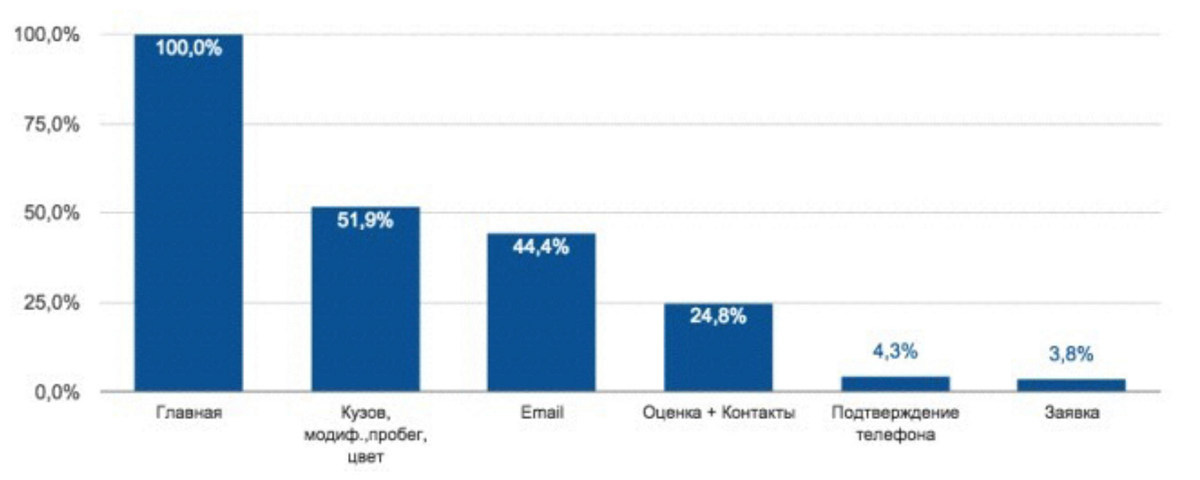
For one of our customers, we have developed a consumption funnel. This is a car evaluation service. You drive in the parameters of your car, and the system says how much the car can cost. Then you put it up for auction and sold without your physical participation. Very comfortably.
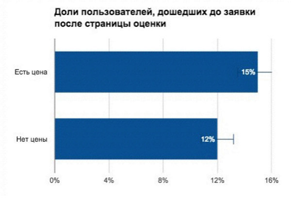
Began to discuss with the user. Immediately decided that we have a huge problem in the "Assessment and Contacts", because the user at this stage, the user receives the first assessment of the cost. Accordingly, the client all this time thought that the problem is in price. We conducted a small A / B test: 1) after the assessment, the cost of the car was shown, 2) the cost was not shown. When the user was offered a certain cost, the conversion increased, but not as dramatically as we would like. That is, this item could be ignored.
Then we did a little research and found out that at the “Evaluation and Contacts” stage the user not only receives the price, but also encounters the word “auction” for the first time. That is, only here he realizes that through the step the car will go to some kind of auction. As a result, the problem was in the creation of the first session. The user simply did not understand how the service works and what will happen. If we had not conducted these studies, then we would have wasted a lot of time.
The target audience
Another instructive story was connected with the aforementioned service. The client carried out all his advertising activity on the assumption that his target audience was owners of a budget machine, cheaper than 10 thousand dollars. But it turned out that the owners of cars of higher class, about 15 thousand dollars, buy much better. That is, the representatives of the service were not the consumers of the service. Although this information could be obtained in half an hour by digging into Google Analytics or analyzing data from a CRM system.
Linear habit
And the last example, again the consumption funnel.
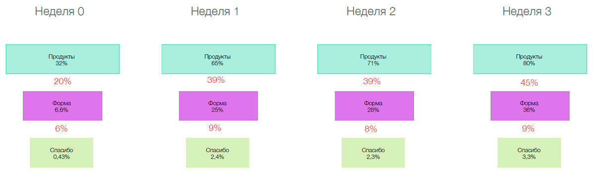
But what is the funnel problem? The developer goes to Google Analytics, builds a funnel and understands that there are tremendous losses on the way from “Product” to “Form” and to “Thank you”. He thinks: “Something is wrong. Most likely, with the product some kind of trouble. " And what happens in reality? Suppose a user wants to take a loan from a bank. He first goes to the site, looks: “Aha. This kind of interest rate. So much I will pay. I'll go see other conditions. " And leaves.
In this scenario, there is no problem in the interface. And the developer, not understanding it, can rush to correct some mythical problems.
This is a funnel that works as a cohort. That is, we can see how often the user returns to a certain page over time. The user first logged in, then returned after a week, after two, after three. And as can be seen from the illustration, it is in the third week that users begin to act much more actively than in week 0.
This suggests that they need time to “ripen”. And around these very useful data we can build personalized models through “1C-Bitrix”, launch triggering campaigns, that is, interact with the user personally. And if we look exclusively at linear processes, that is, what is happening here and now, there will always be a chance to make a big mistake.
Source: https://habr.com/ru/post/276683/
All Articles