Product Design Digest, January 2016
For five years now I have been publishing regular reviews of fresh articles on the topic of interfaces, new tools and collections of patterns, interesting cases and historical stories. From the tapes of several hundred thematic subscriptions, approximately 5% of the worthwhile publications are selected that are interesting to share. Previous materials: April 2010-December 2015 .
A Conversation with Norm Cox, Creator of the Hamburger Menu
A chic interview with Norm Cox, the original author of the burger icon for the first commercial graphical user interface on Xerox. The ideal answers to the topic of one of the most idiotic community discussions in recent years are just one of the patterns that can be relevant or not in a particular screen of a specific product. He masterfully reduces all interviewer's questions to this. An accompanying article describing the issues .
')

Design solutions. Checked by experiment in Mail.Ru Group (Ksenia Sternina presentation)
Ksenia Sternina analyzes the results of user research of Mail.Ru Group products over many years and tries to compile information from them. The result should be a library of patterns, which are accompanied by conclusions about their usefulness and efficiency in practice. This is the first presentation of the series. Continuing the theme:
The Illusion of Completeness
Excellent tips from KN Flaherty of NN / g on how to show the user that the content continues on the following screens. This is typical for long pages and horizontal scrolling.
Design Principles
Mailing letters
The Curtain Menu - A drop-down menu.
Joe Rabbitt talks about an interesting adaptive navigation pattern that he proposed for the PlayStation site. In the large web, this is the standard menu, and in the mobile - the “curtain”, which allows you to visually explore two levels of navigation at once.
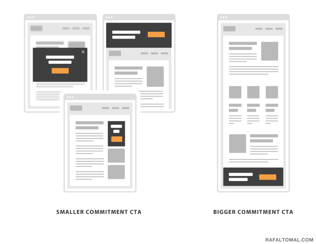
How to Create Visually Effective Calls-To-Action
Simple and visual pictures on how to highlight key elements on the page. Many people constantly forget the simple rule - it is not enough to make the main action button large and noticeable, it should also have a color contrast.
Baymard Institute Studies
The Crucial Role Deep Linking Should Play in Your Mobile App
A small review of the practice of installing links within the application from Bobby Emamian. This feature has appeared relatively recently and can make products healthier.
Dark patterns
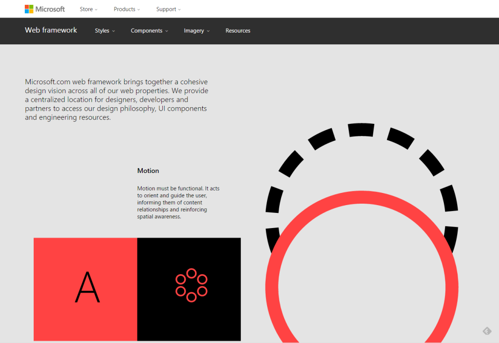
Microsoft Web Framework
Microsoft published the Web Framework, a visual language for their web services. The language itself, especially the animation , is very well presented and described. But the description of the components is more primitive, pure statics with a not very small set of solutions. It will be interesting to follow its development.
Facebook Design Resources: Devices
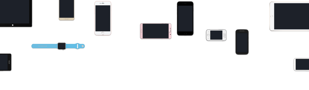
A huge collection of phone templates, smart watches and other devices in perspective.
Apple iOS 9
The Facebook-Loving Farmers of Myanmar
An interesting story about the ethnographic study of farmers in Myanmar on how they use Facebook. Interestingly, how economics and culture can influence the consumption of digital products.
How to Measure Customer Satisfaction
Jeff Sauro describes in detail the methods for assessing user satisfaction. He identifies four characteristics: attitude to product use, satisfaction with the brand and the product as a whole, as well as its individual characteristics.
Design for children
Phones with large screens
Forming user habits
Accessibility
Unified animation language
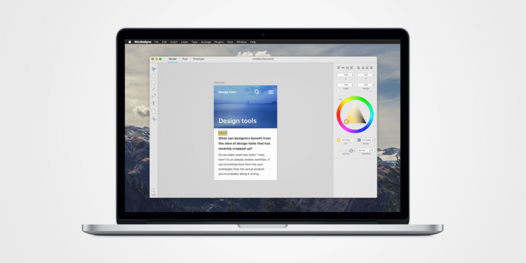
Where tools for designers develop
Using Visual Loudness for Better Wayfinding
A good approach to building a visual hierarchy in design guidelines from Tom Osborne from Viget, which allows you to make a gradation of patterns in importance and visibility.
The degree of detail of prototypes
Sketch
Macaw
Marvel
Handbook: image sizes for 9 social networks
Detailed cheat sheet for the size of graphic elements on social networks from the team Tilda. Facebook, Vkontakte, Twitter, Instagram, YouTube, Pinterest, Linkedin, Google+ and Odnoklassniki.
Tobii shows prototype laptop with 6th-gen eye tracking camera
Tobii showed at CES the sixth generation of the IS4, an eye control module built into the computer. Video work (and one more ). The recent Desktop Neo concept just realizes its capabilities .
Classification of user research methods
How To
Ritch Macefield and Janet M. Six actualize the question of how many respondents are sufficient for usability testing. Someone talks about the importance of a wide range of respondents, Jacob Nielsen says that for many situations 5 people are enough. The article describes well different situations and different tasks, and also gives recommendations on the number of respondents for them.

Desk research - The what, why and how
David Travis talks about the desk research method that is needed to prepare for the study with users. A UX-specialist collects information from previous studies, within the company or other industry representatives.
Creolabs - Native App Design and Development Reinvented
New tool for designers Creolabs is trying to marry the design and development. The output is a native iOS application that uses real data and is well animated. True, the question of the quality of the final code.
Live guidelines and component systems
Getting started with Progressive Web Apps
Addy Osmani talks about a relatively new approach to creating progressive pseudo-applications based on mobile sites. This is an easy to install shell that looks and works in many ways as a native application.
New scripts
Swift for designers
Loud links
JavaScript library Loud Links to add sounds to the interface. By itself, this practice requires extremely careful attitude in order not to frustrate the user. But several well-known UX designers noted their interest in studying sound design more closely in 2016 when describing trends, so there is a high probability of a surge in this topic. The branch will collect materials on working with sound in familiar interfaces.
Web typography
Layer blending modes in the browser
CSS animation
Work with color
Images in responsive design
CSS Grid
Flexbox
Readymag
Success funnel and its aftermath
Vladislav Golovach writes about the funnel of successful operations in modern interfaces. It has now reached 80%; however, success decreases from task to task and if we take away 20% from each of the following steps, 65% will remain. Good metrics for evaluating design.
Leah Buley - The Modern UX Organization
One of the best performances of recent years from Leah Buley, in which she talks about the modern approach to building UX in the company. She recently moved to Forrester, where she is engaged in analytics of the design market, which in itself is an important step for the profession. In this talk, Leah talks about a survey of companies of various levels and sizes, thanks to which she drew conclusions about the success criteria for UX teams. All this is available as a report for $ 499 . Speech is almost a year now, but this is one of the most valuable insights for those who want to move forward design in a company. Very, very, very cool.
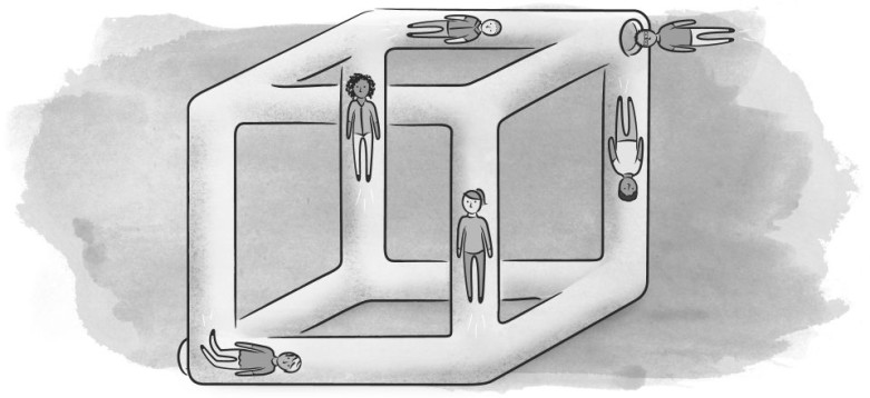
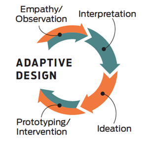
Leading Change Through Adaptive Design
The most elegant article by Maya Bernstein and Marty Linsky on the topic of introducing changes in companies. Design thinking is considered a good methodology to come up with a future, but then everything is often sad - it still remains a beautiful visionary. But in conjunction with adaptive leadership, a modern approach to management, you can realize your plans. Maya and Marty offer a “responsive design” methodology at the intersection of design thinking and adaptive leadership, which allows for the implementation of bold ideas and changes. The name, however, is not very good, because it is responsive and adaptive-technicians working with a string of devices and screens.
Building a design culture
Excerpts from Jamie Levy’s “UX Strategy”
Corporate Software Interfaces
Statsbot for Slack
Analytical bot for Slack, working with Google Analytics. Soon full support for Mixpanel will be added.
Why Day 1 Retention Matters
Luke Wroblewski writes about the importance of returning users the day after installation. The figures show that after this period the chances of returning the user are rapidly falling, and given the complexity of their involvement, this is especially painful.
Apps against mobile web
IBM Design Thinking
IBM published a training manual on its version of design thinking. In its pure form, the methodology is more useful in pieces, but here an excellent working tool is assembled from it for real companies. IBM has been talking about this for the last couple of years, but now there is a good and clear guide. Announcement .
Design Criticism
Uninvited Redesigns
Redesign Cases
Adobe portfolio
Released Adobe Portfolio, portfolio tool. Andrew Couldwell talks about working on the product .
The study of the location of the phone buttons from Bell
Forecasts for 2016
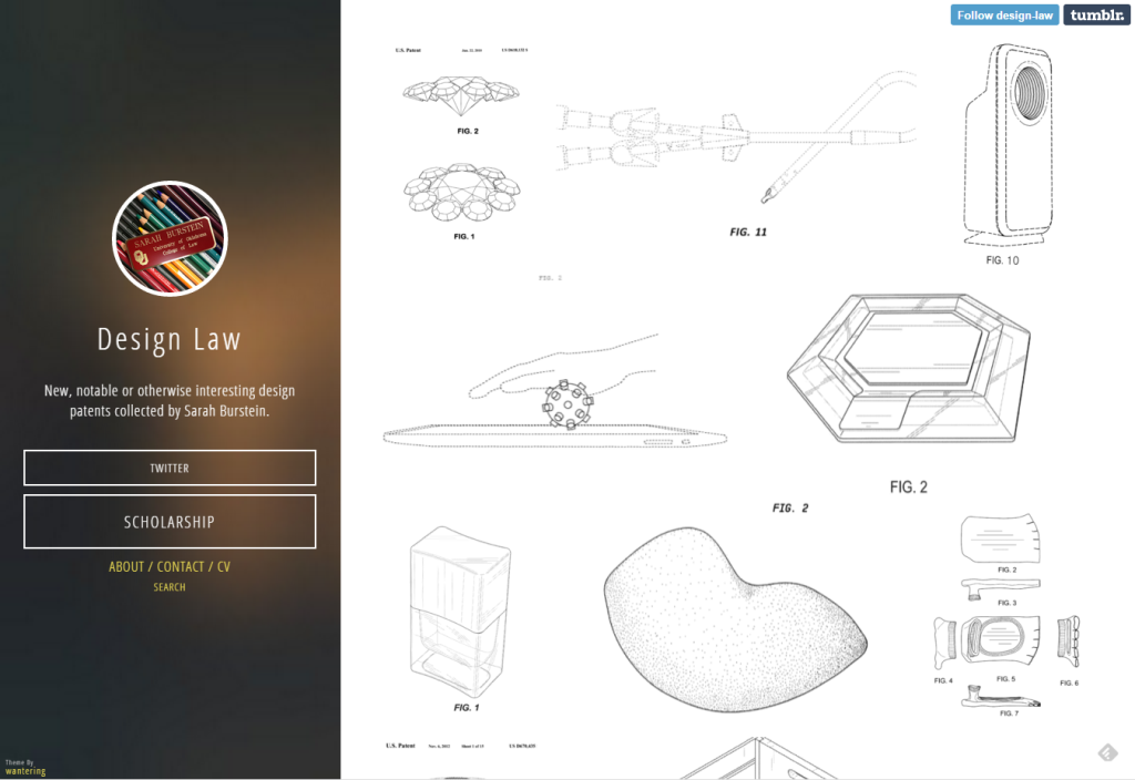
Design law
Sarah Burstein collects fresh design patents. Physical devices, interfaces, industrial design.
Small is Beautiful - Why Desktop UX still has something to teach Mobile
Scott Jenson very well described the problems of mobile and tablet interfaces that prevent them from going far beyond consumption devices. These are the most basic things that we take for granted, like doing a good job with the clipboard or highlighting text. That's why I'm sitting on MS Surface is a good compromise between two worlds, from which the iPad Pro is very, very far.
Conversation as Interface - WSJ & Dow Jones Mobile Weekly Presentation
The voluminous and interesting presentation of Nicolae Rusan on the current state and trends in messengers, bots, personal assistants and everything connected with it. Current players, development directions, patterns, effects on interfaces, etc. Textual liner . Continuing the theme:
The Most Important Design Jobs Of The Future
Designers of famous studios and food companies fantasize about the design professions of the future. Something sounds sensible, but much of what is described will be done rather by people from other industries, and not designers who lack the specialized skills in the same biology.
No ui
The virtual reality
Car Interfaces
Internet of things
 The book by Alan Cooper, Robert Reiman, David Cronin and Christopher Nossel “Interface. Basics of interaction design " (4th edition)
Publisher Peter released a translation of 4 editions of one of the main books for interface designers from Alan Cooper and the team. Alexey Kopylov, who was a scientific advisor to the previous translation, was not involved this time. By the way, Mikhail Zislis, translator of the third edition, has property and copyright to translate.
Yandex Design School
The Yandex Design School has formed a video lecture course based on last year’s program. The first entries are available on YouTube channel , the rest will gradually appear. The creators of the school Lola Kristallinskaya and Taras Sharov told about the results of last year’s recruitment .
Articles for the Ergonomist Newsletter
Earlier this year, Alexei Anokhin is preparing a thematic issue of the Ergonomist newsletter dedicated to user interfaces. He will be happy to publish your materials. Considering that the bulletin is not a scientific journal, there are no requirements to the format of the materials, rigor of presentation and scientific novelty. Welcome (but not limited to):
What does this give? First, the dissemination of information among more than 300 subscribers of the newsletter - professional ergonomists and usabilityists. Secondly, the practice of more or less strict, but at the same time popular presentation and reflection on their results.
What will it give to our discipline? First, if you personally respond, as well as many others, we will receive a useful exchange of information and achievements. Secondly, this contributes to the convergence of the "traditional" ergonomists and computer usability, which, believe me, is now very necessary.
Materials can be sent to Alexey Anokhin by e-mail anokhin@obninsk.ru with the topic: “Ergonomist” edition on PI. Naturally, all for free.
The Problem With Dribbble
Tobias van Schneider encourages everyone to finally breathe out about Dribbble. This is primarily a tool for leveling skills, and the fact that someone sees in it something else is a personal problem of perception.
Why are all sites the same?
Interface debt
100 100
Product Designers
Jokes about designers for 400
O'Reilly 2016 Design Salary Survey Report
, O'Reilly 2015. , .
Adobe
Upcoming Web Design Conferences (January—June 2016)
- 2016 . 2016 .

Forge Conference 2015
Forge 9 2015 , . UXMatters .
Fresh links can also be tracked in the Facebook group of the same name or received once a month by mail . Thanks to everyone who also publishes links in it, especially Gennady Dragun, Pavel Skripkin, Dmitry Podluzhny, Anton Artyomov, Denis Efremov, Alexey Kopylov, Taras Brizitsky and Yevgeny Sokolov. More and more materials in reviews appear thanks to them.
Subscribe to the newsletter ! A letter arrives once a month.
Patterns and Best Practices
A Conversation with Norm Cox, Creator of the Hamburger Menu
A chic interview with Norm Cox, the original author of the burger icon for the first commercial graphical user interface on Xerox. The ideal answers to the topic of one of the most idiotic community discussions in recent years are just one of the patterns that can be relevant or not in a particular screen of a specific product. He masterfully reduces all interviewer's questions to this. An accompanying article describing the issues .
')
Design solutions. Checked by experiment in Mail.Ru Group (Ksenia Sternina presentation)
Ksenia Sternina analyzes the results of user research of Mail.Ru Group products over many years and tries to compile information from them. The result should be a library of patterns, which are accompanied by conclusions about their usefulness and efficiency in practice. This is the first presentation of the series. Continuing the theme:
- My colleagues Olya Kuritsyna and Oleg Parinov talk about the unusual behavior of users in the Mail.Ru and Mail for Business interfaces . The second part .
The Illusion of Completeness
Excellent tips from KN Flaherty of NN / g on how to show the user that the content continues on the following screens. This is typical for long pages and horizontal scrolling.
Design Principles
- Posters 5 UX principles from Shopify .
- The capacious and thoughtful principles of product design from Wouter de Bres .
Mailing letters
- Litmus released a detailed report on the main changes in the market of mail clients and in general the prospects for designers and developers of mailing lists .
- The authors of the site Really Good Emails have collected a collection of code for mailing lists on CodePen .
The Curtain Menu - A drop-down menu.
Joe Rabbitt talks about an interesting adaptive navigation pattern that he proposed for the PlayStation site. In the large web, this is the standard menu, and in the mobile - the “curtain”, which allows you to visually explore two levels of navigation at once.
How to Create Visually Effective Calls-To-Action
Simple and visual pictures on how to highlight key elements on the page. Many people constantly forget the simple rule - it is not enough to make the main action button large and noticeable, it should also have a color contrast.
Baymard Institute Studies
The Crucial Role Deep Linking Should Play in Your Mobile App
A small review of the practice of installing links within the application from Bobby Emamian. This feature has appeared relatively recently and can make products healthier.
Dark patterns
Guidelines for platforms and companies
Microsoft Web Framework
Microsoft published the Web Framework, a visual language for their web services. The language itself, especially the animation , is very well presented and described. But the description of the components is more primitive, pure statics with a not very small set of solutions. It will be interesting to follow its development.
Facebook Design Resources: Devices
A huge collection of phone templates, smart watches and other devices in perspective.
Apple iOS 9
- About the night shift feature built into iOS 9.3 . Studies show that using devices at a later time can disrupt sleep patterns. Some applications make a special "night mode" for the comfort of users, there are separate applications for computers that solve the problem at the OS level. Now the problem begins to be solved systematically and on mobile.
Understanding the user
The Facebook-Loving Farmers of Myanmar
An interesting story about the ethnographic study of farmers in Myanmar on how they use Facebook. Interestingly, how economics and culture can influence the consumption of digital products.
How to Measure Customer Satisfaction
Jeff Sauro describes in detail the methods for assessing user satisfaction. He identifies four characteristics: attitude to product use, satisfaction with the brand and the product as a whole, as well as its individual characteristics.
Design for children
- Another article with design tips for kids . Becky White talks about how to do research and leads important patterns.
Phones with large screens
Forming user habits
- Nir Eyal writes about the difference between habits and routine . Routine actions require additional motivation and standard tricks do not always work here. But he found a great hack - to burn a hundred dollar bill for non-compliance with the schedule of routine actions like going to the gym. Works with a bang!
Accessibility
- Denis Kuznetsov from Yandex talks about how the company provides accessibility in their products .
- Geri Coady tips on adapting online store interfaces for users with color perception .
- Usabilla's Netania Engelbrecht offers tips on how to customize interfaces for dyslexic users .
- The Blog “Design of State Systems” makes recommendations on highlighting the links in the text, taking into account users who have one or another type of color blindness . Underlining works best, one color is not enough.
Design and design of interface screens
Unified animation language
- yuming offers 7 questions that allow you to systematically approach the interface animation . Who (component), environment (where), choreography (when), user behavior (why), property (what), interdependence of properties (with what) and time function (how).
- Amin Al Hazwani and Tobias Bernard reflect on the semantics of interface animation . How to make it meaningful, complete and predictable in the product as a whole.
- Kit Oliynyk from Capital One / Adaptive Path proposed an interesting categorization of interface animation principles . He combined the task of animation (functional, spatial, emotional) and 12 principles of Disney. It turned out a good transposition of the theory into practice.
- Val Head is pondering on the holivar topic - are the 12 Disney animation principles that are relevant for interfaces ? Not all of them are well suited for digital products, but in general it is a good classification system that is needed for system work.
Where tools for designers develop
- Erik Friberg rather comprehensively approached the question of what an ideal designer tool should be able to do . He examines in great detail the main tasks in the work of a modern designer and gives examples of how existing products solve this.
Using Visual Loudness for Better Wayfinding
A good approach to building a visual hierarchy in design guidelines from Tom Osborne from Viget, which allows you to make a gradation of patterns in importance and visibility.
The degree of detail of prototypes
- Excellent memo Ryan Singer on choosing the right way to work out the interface for a specific task . He proposes to compare the time required to prepare the interface artifacts with the time it takes to develop. If they are not very different, it is better to immediately proceed to the assembly in the code; if the cost of the error is high - it is worth working on the prototype.
Sketch
- Template for pictures of social networks: posts, covers, profiles, etc.
- Geoff Teehan's excellent interview with Pieter Omvlee, one of the creators of Sketch, about the future of the product and attitude towards Adobe Comet .
- Sketch 3.5 came out (and after 3.5.1 ). What is new .
- The plugin allows you to make segmented circles .
- A plugin for analyzing color contrasts to help verify design compliance with accessibility rules .
- Integration with git .
Macaw
- InVision buys Macaw . Judging by the FAQ, in many respects for the new product Scarlet. The tool becomes free, but will not be updated.
Marvel
- Updated Marvel site . There was a collection of examples of prototypes .
Handbook: image sizes for 9 social networks
Detailed cheat sheet for the size of graphic elements on social networks from the team Tilda. Facebook, Vkontakte, Twitter, Instagram, YouTube, Pinterest, Linkedin, Google+ and Odnoklassniki.
User research and testing, analytics
Tobii shows prototype laptop with 6th-gen eye tracking camera
Tobii showed at CES the sixth generation of the IS4, an eye control module built into the computer. Video work (and one more ). The recent Desktop Neo concept just realizes its capabilities .
Classification of user research methods
- Jeff Sauro leads 7 basic methods for detecting problems in usability .
- Jeff Sauro describes 7 types of surveys to assess customer experience .
- Intercom's Sinéad Cochrane provides a reminder in case there are no time or resources for user research . As in these conditions, the team can get feedback from users.
How To
Ritch Macefield and Janet M. Six actualize the question of how many respondents are sufficient for usability testing. Someone talks about the importance of a wide range of respondents, Jacob Nielsen says that for many situations 5 people are enough. The article describes well different situations and different tasks, and also gives recommendations on the number of respondents for them.
Desk research - The what, why and how
David Travis talks about the desk research method that is needed to prepare for the study with users. A UX-specialist collects information from previous studies, within the company or other industry representatives.
Visual programming and browser design
Creolabs - Native App Design and Development Reinvented
New tool for designers Creolabs is trying to marry the design and development. The output is a native iOS application that uses real data and is well animated. True, the question of the quality of the final code.
Live guidelines and component systems
- Karen Menezes gives advice on how to work with variables in pre-processors . At the end of the article are sensible tips on structuring the basic values of the visual language.
- Good thoughts Dan Mall on the competent construction of components . He talks about the importance of understanding the difference between presentation patterns and patterns of information structure.
- My colleague Artem Mezin talks about how the Mail.Ru Mail framework is technologically arranged . The interface part of this story will eventually become the third publication in a series of articles on the unification of the design of our products.
- Live guide from edX .
- Katey Basye recently joined the Salesforce design team and talks about how the Lightning design system made it easier for her to get involved in work and devote more time to grocery work, rather than reinventing the wheel . Useful for those who think that such frameworks take work from the designer.
- The second version of the rapid prototyping tool in the browser from the GOV.uk team has been released .
Getting started with Progressive Web Apps
Addy Osmani talks about a relatively new approach to creating progressive pseudo-applications based on mobile sites. This is an easy to install shell that looks and works in many ways as a native application.
New scripts
- An impressive experimental interface to select places in the cinema, although it is too skeomorphic .
- Classic Swiss style with CSS and animation .
- The best scripts and publications of Codrops for 2015 .
- A collection of menu item animations .
- Review of useful practices for implementing design techniques in pure CSS from Ilya Pestov .
- Handbook of cursors that can be set via CSS. Marked support for different browsers .
- Animation of possible button click processing states .
- Gallery with elastic animation for online stores .
- Voxel library allows you to create three-dimensional objects in CSS .
Swift for designers
Loud links
JavaScript library Loud Links to add sounds to the interface. By itself, this practice requires extremely careful attitude in order not to frustrate the user. But several well-known UX designers noted their interest in studying sound design more closely in 2016 when describing trends, so there is a high probability of a surge in this topic. The branch will collect materials on working with sound in familiar interfaces.
Web typography
- Kenneth Ormandy’s OpenType CSS utility that makes it easy to use the less popular web typography features .
- Excellent material on the implementation of font grids, based on the idea of scaling relative to the base text .
- Library Typi , facilitates the introduction of adaptive typography. An accompanying article with a discussion of issues .
Layer blending modes in the browser
CSS animation
- Petr Tichy sorted out 31 Awwards marked sites for technologies used for animation . Interesting statistics on the demand for implementation methods.
- Tobias Ahlin features a hack that allows you to animate objects in CSS in a non-linear way .
Work with color
Images in responsive design
CSS Grid
Flexbox
- How to assemble an iPhone on flexbox .
- Flexbox Grid is a flexbox grid system.
- Experimental page that allows you to clearly play with the properties of flexbox .
Readymag
Metrics and ROI
Success funnel and its aftermath
Vladislav Golovach writes about the funnel of successful operations in modern interfaces. It has now reached 80%; however, success decreases from task to task and if we take away 20% from each of the following steps, 65% will remain. Good metrics for evaluating design.
UX strategy and management
Leah Buley - The Modern UX Organization
One of the best performances of recent years from Leah Buley, in which she talks about the modern approach to building UX in the company. She recently moved to Forrester, where she is engaged in analytics of the design market, which in itself is an important step for the profession. In this talk, Leah talks about a survey of companies of various levels and sizes, thanks to which she drew conclusions about the success criteria for UX teams. All this is available as a report for $ 499 . Speech is almost a year now, but this is one of the most valuable insights for those who want to move forward design in a company. Very, very, very cool.
Leading Change Through Adaptive Design
The most elegant article by Maya Bernstein and Marty Linsky on the topic of introducing changes in companies. Design thinking is considered a good methodology to come up with a future, but then everything is often sad - it still remains a beautiful visionary. But in conjunction with adaptive leadership, a modern approach to management, you can realize your plans. Maya and Marty offer a “responsive design” methodology at the intersection of design thinking and adaptive leadership, which allows for the implementation of bold ideas and changes. The name, however, is not very good, because it is responsive and adaptive-technicians working with a string of devices and screens.
Building a design culture
- 30 design managers answer three questions about how to measure the effectiveness of their work, what is most important in their work and what are the main professional challenges . Inserted five cents about the experience of our team.
Excerpts from Jamie Levy’s “UX Strategy”
Corporate Software Interfaces
Product management and analytics
Statsbot for Slack
Analytical bot for Slack, working with Google Analytics. Soon full support for Mixpanel will be added.
Why Day 1 Retention Matters
Luke Wroblewski writes about the importance of returning users the day after installation. The figures show that after this period the chances of returning the user are rapidly falling, and given the complexity of their involvement, this is especially painful.
Apps against mobile web
- Luke Wroblewski gives statistics on the use of mobile phones and says that, ideally, you need to make both an application and a mobile site . Although users spend more time in applications, most of it is just a few of the most popular. At the same time, mobile sites are growing in popularity very quickly, and Facebook is responsible for 20% of the mobile web views from the embedded browser.
Methodologies, procedures, standards
IBM Design Thinking
IBM published a training manual on its version of design thinking. In its pure form, the methodology is more useful in pieces, but here an excellent working tool is assembled from it for real companies. IBM has been talking about this for the last couple of years, but now there is a good and clear guide. Announcement .
Design Criticism
Cases
Uninvited Redesigns
- Ted Goas asks to stop harassing authors of uninvited products . Yes, they have little connection with reality and in most cases are not applicable in the proposed form. But this is a great platform for experimentation, which often introduces new design techniques or patterns.
Redesign Cases
Adobe portfolio
Released Adobe Portfolio, portfolio tool. Andrew Couldwell talks about working on the product .
Story
The study of the location of the phone buttons from Bell
- CY Gopinath carefully studied this study, and also dug in the history of the appearance of the calculator layout . True, after that he proposed a rather ambiguous concept of a mobile calculator.
Trends
Forecasts for 2016
- Chase Buckley makes predictions for 2017 right away . It is a great relief to see an interesting train of thoughts, rather than the “animation”, “video in the background”, and “big pictures” that are killer and tiring from year to year.
- A List Apart surveyed well-known designers and developers about their plans for 2016 and the potential directions for the development of the profession .
- Erik Flowers gives forecasts on the prospects for the discipline of service design and its growth directions in 2016 .
- Rob Tannen decided to look quite far away, 500 years ahead . He turns to Kevin Kelly's book “What do they want technology,” which, using prediction of the internal logic of technology development, tries to understand where the industry is heading. He views this logic in terms of interfaces and designers. And the interface itself compares with the language and the alphabet, which helped to establish communication between people, while the UX allows you to communicate to a person and a computer. Very interesting approach.
Design law
Sarah Burstein collects fresh design patents. Physical devices, interfaces, industrial design.
Small is Beautiful - Why Desktop UX still has something to teach Mobile
Scott Jenson very well described the problems of mobile and tablet interfaces that prevent them from going far beyond consumption devices. These are the most basic things that we take for granted, like doing a good job with the clipboard or highlighting text. That's why I'm sitting on MS Surface is a good compromise between two worlds, from which the iPad Pro is very, very far.
Conversation as Interface - WSJ & Dow Jones Mobile Weekly Presentation
The voluminous and interesting presentation of Nicolae Rusan on the current state and trends in messengers, bots, personal assistants and everything connected with it. Current players, development directions, patterns, effects on interfaces, etc. Textual liner . Continuing the theme:
The Most Important Design Jobs Of The Future
Designers of famous studios and food companies fantasize about the design professions of the future. Something sounds sensible, but much of what is described will be done rather by people from other industries, and not designers who lack the specialized skills in the same biology.
No ui
- Goran Peuc writes that any interface is the result of insufficient automation and is not needed by the user by itself . He compares digital products with a microwave - it’s a commonplace appliance in which most people simply heat up food and then go about their business all day; they should not love her and study all modes of operation. I have been using exactly the same analogy for a long time, it allows you to look at things realistically.
The virtual reality
Car Interfaces
- Concept i Vision Future Interaction from BMW, which gathered the company's achievements in terms of modern ways of interacting with automotive interfaces . A little more than a year ago, Holger Hampf from frog design came to the company and this is the result of his work.
- Audi's interesting approach to the car as a fitness device . The driver spends a lot of time inside and the company thought about how to use it to benefit a healthy lifestyle.
Internet of things
- Brian J. Curran chewed very well the basic principle of the companies with the Internet of things . Collect data, analyze them, make decisions based on analysis, and then use these findings to modify the adjustment of the entire system.
For general and professional development
The book by Alan Cooper, Robert Reiman, David Cronin and Christopher Nossel “Interface. Basics of interaction design " (4th edition)Publisher Peter released a translation of 4 editions of one of the main books for interface designers from Alan Cooper and the team. Alexey Kopylov, who was a scientific advisor to the previous translation, was not involved this time. By the way, Mikhail Zislis, translator of the third edition, has property and copyright to translate.
Yandex Design School
The Yandex Design School has formed a video lecture course based on last year’s program. The first entries are available on YouTube channel , the rest will gradually appear. The creators of the school Lola Kristallinskaya and Taras Sharov told about the results of last year’s recruitment .
Articles for the Ergonomist Newsletter
Earlier this year, Alexei Anokhin is preparing a thematic issue of the Ergonomist newsletter dedicated to user interfaces. He will be happy to publish your materials. Considering that the bulletin is not a scientific journal, there are no requirements to the format of the materials, rigor of presentation and scientific novelty. Welcome (but not limited to):
- a statement of their own successful solution (preferably with an explanation: why this solution is good);
- a review of technology, tools and solutions (the review may be personalized);
- historical essay on the interfaces of the past and their evolution;
- information and reports on events (conferences, seminars, exhibitions) on the subject of the user interface;
- information (maybe even advertising) about your company developing user interfaces (no more than 1 page);
- personal information about you personally as a developer of user interfaces (information format - see the section “Personalia” in the Ergonomist newsletter, p. 34);
- analysis of failed user interface examples (it is desirable that the example be impersonal);
- professional ads.
What does this give? First, the dissemination of information among more than 300 subscribers of the newsletter - professional ergonomists and usabilityists. Secondly, the practice of more or less strict, but at the same time popular presentation and reflection on their results.
What will it give to our discipline? First, if you personally respond, as well as many others, we will receive a useful exchange of information and achievements. Secondly, this contributes to the convergence of the "traditional" ergonomists and computer usability, which, believe me, is now very necessary.
Materials can be sent to Alexey Anokhin by e-mail anokhin@obninsk.ru with the topic: “Ergonomist” edition on PI. Naturally, all for free.
The Problem With Dribbble
Tobias van Schneider encourages everyone to finally breathe out about Dribbble. This is primarily a tool for leveling skills, and the fact that someone sees in it something else is a personal problem of perception.
Why are all sites the same?
- Espen Brunborg continues the discussion . Mostly controversial, but interesting thoughts on the topic.
Interface debt
100 100
- Benjamin Berger, , , «Daily UI» «100 100 » . - , . , . , .
Product Designers
- UX .
Jokes about designers for 400
- - .
O'Reilly 2016 Design Salary Survey Report
, O'Reilly 2015. , .
- Jim Ross .
People and companies in the industry
Adobe
Conference proceedings
Upcoming Web Design Conferences (January—June 2016)
- 2016 . 2016 .
Forge Conference 2015
Forge 9 2015 , . UXMatters .
Fresh links can also be tracked in the Facebook group of the same name or received once a month by mail . Thanks to everyone who also publishes links in it, especially Gennady Dragun, Pavel Skripkin, Dmitry Podluzhny, Anton Artyomov, Denis Efremov, Alexey Kopylov, Taras Brizitsky and Yevgeny Sokolov. More and more materials in reviews appear thanks to them.
Subscribe to the newsletter ! A letter arrives once a month.
Source: https://habr.com/ru/post/276469/
All Articles