Bayesian neural network - because why not, damn it (part 1)
What I’ll try to tell you now looks like real magic.
If you knew something about neural networks before this - forget it and don’t remember how terrible a dream.
If you didn’t know anything, it’s easier for you, halfway through.
If you are on “you” with Bayesian statistics, read this and here this article from Deepmind - ignore the previous two linesand allow me to sign up for a consultation on one theological issue .
So, the magic:
')
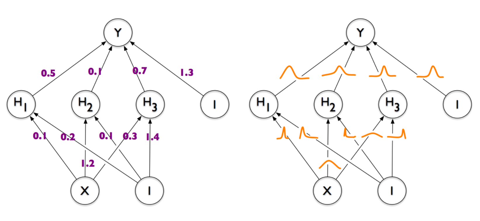
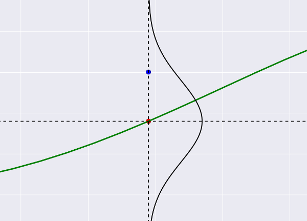
On the left is a common and familiar neural network, in which each connection between a pair of neurons is given by some number (weight). On the right is a neural network, the weights of which are represented not by numbers, but by demonic clouds of probability , oscillating whenever the devil plays dice with the universe. That is what we want to end up with. And if you, like me, are puzzled, shake your head and ask "but what for is all this necessary" - welcome under the cat.
Let's start to take the world's simplest neural network, consisting of as much as one neuron. Saw off his activation function and make spit out just the product of inputs by weights (w) plus b, and we get what is called a linear regression.
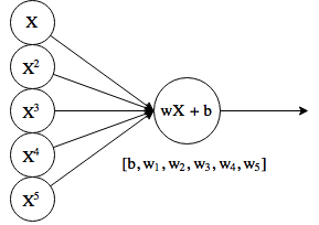
At the entrance there are additionally several copies of the original X, raised to a power. This is sometimes referred to as polynomial regression, although theoretically, the “neuron” still makes a linear function.
Well, as in the classic puzzles, let's say we have some points, and we need to adjust the function to them. Let's write some not very nice, but the easiest code in the world:
And we get something like this:
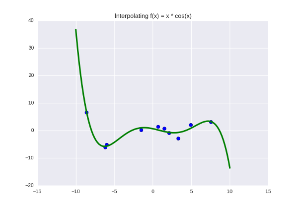
The function we are trying to push through the blue dots is right now given by a fifth-degree polynomial, and its coefficients are: . Suppose we looked at the graph, made sure that the green line does not do anything particularly bad and fits well with the data, maybe we checked how it behaves on a separate (previously hidden) test sample, and we are all arranged. Then these six digits are the almost-truth found by us, some "real" parameters governing the laws of nature (in this case, the law of the function
  But these are the details - let's assume that we are looking at some real and very important data, something like a temperature graph for estimating global warming).
Okay, if we found the real parameters, why does the green line nevertheless pass through the blue points imperfectly? The standard deviation for this line is still not zero (in fact, it is about 0.97). Is this normal, or have we done something wrong? There are two answers to this question:
1. Our model is not steep enough and does not fully reflect the desired pattern. We can “enrich” it by adding more parameters — that is, increase the degree of the polynomial. For dots are enough for us to take a polynomial of degree
  so that it goes perfectly through all the points.
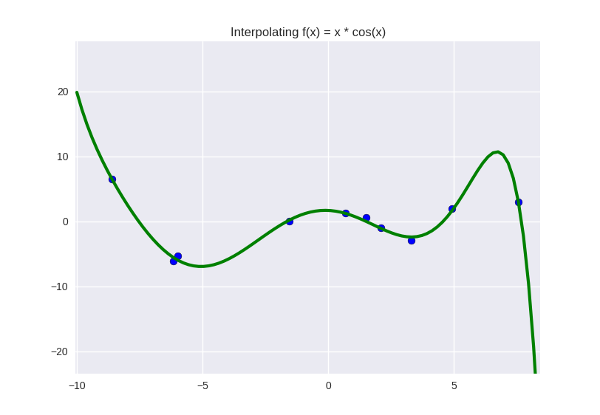
... not exactly perfect, but why not? It looks even a little nicer, in my opinion. Let's leave as a working hypothesis.
2. Our model is pretty cool, the problem is in the data . There is some kind of noise in them, caused by the imperfection of our world (in this case, by the fact that I have treacherously added some randomness to the points, but let's imagine that these are some real data). Even if this noise is not truly random, but the truth is caused by factors that we did not take into account when formulating the problem, we can simulate it as random - and assume that the oscillations caused by the variations of all these factors might well fall into a normal distribution. .
I don’t know about you, but the second conclusion seems to me, if not even right, then at least a priority one. In the end, we can always suspect that there will be some noise in our data that interferes with our plans and deviates points from the desired value. We will first think about it, and then, if anything, you can twist the degree of the polynomial.
So, we make the second conclusion, pronounce the word "noise" and immediately transfer to the theory of probability. The most convenient way (in any case, to me) is to present it this way: our green line tries to “shoot through” all the blue dots that play the role of targets, while it can “miss the mark”, and the size of the slip is precisely that noise. Suppose that he is Gaussian (why not). Then the target shot will look like this:
This is all the same regression graph, only with zoom. The blue dot is the actual value from the dataset, the red dot is what the regression predicts. Small deviations of blue from red are more likely (lie near the center of the Gaussian), large deviations are less likely. It becomes clear that if we predict the “wrong center” (we place the red dot somewhere far away), the deviation for the blue dot will become large and therefore unlikely.
Translated into a slightly more generally accepted language, this probability is called likelihood and is written in our Gaussian case as (Where
  and
and  - the center and standard deviation of the Gaussian curve), and in general, as
  where under
  mean any parameters. Its meaning is the same everywhere - “the probability that if the distribution of data is controlled by such and such parameters , the result will be exactly
  ".
".
Now we can slightly reformulate the regression problem. In terms of targets and credibility, they will sound something like this: shoot so that the shooter does not look like a complete loser, that is, so that his misses look like misses and lie within the bounds of error. Adhering to the generally accepted statistical language, we need to maximize the likelihood .
The desired probability itself, as we assumed, is given by a normal distribution . We write down the formula from Wikipedia and multiply the probabilities for each point between each other (hence the index ):
):

Oookey, looks a little scary already. Let's make it a little easier, we fix - then we can throw half the characters out of here. In order not to spoil the expression of probability, let us separately indicate that we are interested in the maximum:

Heei, it became much more fun. Take from this thing logarithm. The maximum point is not going anywhere, but the product will turn into a sum, and the exponent will become its indicator:

And finally, we’ll remove the minus in the amount, replacing the maximum with the minimum:

Hmm, somewhere I have already seen such an expression ...
... and it turns out that the maximum likelihood is reached in the same place where the minimum of the standard deviation of the regression is. For some reason, such moments are always terribly disappointing - I was already sure that I would discover some new regression method, and we returned to where we started.
On the other hand, now we know the answer to the question “why do we use exactly standard deviation?” Previously, we mentally shrugged it off, but now we know that it corresponds to Gaussian noise. Bonus material - if an absolute error is used to optimize the regression ( ), then we get a noise in Laplace (so pointed in the center). From the question "and one is better than the other" shamefully dodge.
Well, it was all fun, and quite common, in fact - we just re-invented the maximum likelihood method here at our leisure. It is time to step a little deeper and to another level of sleep.
... do you think the universe has any parameters ?
This is a serious question. We still know from school physics that some things seem to have exactly - acceleration of free fall, say, 9.8 meters per second squared, and if we want to find out how things fall, or say, to model a computer game with physics, we you have to twist this number there (or how computer games do, hmm? maybe the Earth’s attraction is done according to Newton's law? or, hell, taking into account the effects of the theory of relativity?). Or let's say space has three dimensions ( macroscopic dimensions , Martin Reese corrects me); not 3.1 and not 2.8, but exactly 3. If we suddenly decided to build a machine learning algorithm that would decide to measure the dimension of space, we would estimate its work the higher, the closer it would seem to number three.
On the other hand, is there any exact, fixed parameter for how much milk a baby should drink per month? How many songs should a bird sing to find a mate? In what proportion will the tumor decrease after the injection of substance X into the patient's body? How much water flows through the stream in three minutes? All these things, undoubtedly, have a certain regularity under them - the tumor will shrink, the child will drink milk, and the water will flow, but if we measure the exact values, they will constantly fluctuate, remaining at the same time in some interval. Where, in the case of physics, the use of more accurate tools gives us more and more exact value of magnitude ( “the second is the time equal to 9,192,631,770 periods of radiation corresponding to the transition between two superfine levels of the ground state of the cesium-133 atom” ) to measure the cancerous we would rather need a tumor in more experimental patients in order to delineate the upper and lower boundaries and be ready for different variants of the development of events.
This is generally a question from somewhere rather from philosophy - and somewhere here lies the dividing line between Bayesian and Orthodox (or frequency) statistics. If roughly (I’ll fix it a bit further), then the orthodox approach will say that at some level there are still real parameters (we just haven’t gotten to it yet, and someday it turns out that tumor growth, say, depends on the combination several well-defined factors). The Bayesian will say that there is no exact parameter - if not even at the level of the physical design of the universe, then at the level of the effects we observe - and that the parameters should be treated as random variables that can fluctuate in different directions.
Let's apply the Bayesian “Parameters are Random Variables” philosophy to the coefficients of our regression. To do this, write off the Bayes theorem:
%20%3D%20%5Cfrac%7BP(X%20%5Cmid%20%5Ctheta)P(%5Ctheta)%7D%7BP(X)%7D)
Here means “parameters in general”; in our case, these are already familiar polynomial coefficients.  . And we already know at least one garbage from this formula -
 ) , the very likelihood that we maximized with the section above (once again recall that it is considered as the value of the deviations of the dataset points from the regression curve or as the “average target slip size”).
, the very likelihood that we maximized with the section above (once again recall that it is considered as the value of the deviations of the dataset points from the regression curve or as the “average target slip size”).  is called a priori (prior) probability and reflects our initial assumption about how the distribution of parameters looks.
  in the domestic literature, in my opinion, is not specifically called (the total probability?), in others it can be found under the word evidence - this is the general probability to obtain such data as we have, for all possible values of the parameters (it is not very clear where to get it from). And finally
  - posterior probability, which literally means “what do we think about the distribution of parameters after seeing the data”.
... in fact, there are even very un-very-complicated ways to express posterior for regression analytically - that is, to get a formula where only to substitute the values from the dataset, and you get the correct answer. But we will do everything in a razdolbaysky programming way - numerically, iteratively, and completely ineffective. But you don’t have to read about any inverted distributions of Wishart and other terrible things that don’t go to school (although you’ll have to do it anyway, so if you are for the hardcore way of knowing, then we ’re welcome ). The logic is as follows:
- we start with a state of complete ignorance, when we have only prior. That is, we believe that the regression coefficients can be anything. To limit the abyss of knowledge a bit, say "any from -10 to 10".
- we see some piece of data (one point from dataset, say). For every possible combination of parameters we consider the likelihood - how likely it is that a shot at the target was made with such settings. As you can guess in advance, most of the settings will be rather invalid, and the shot will take somewhere completely past, but obviously there will be several (more than one) options for which the hole in the target looks reasonable. Likelihood, we believe, as we have already seen, according to Gauss, we simply substitute the prediction of regression instead of mu into the density formula for the normal distribution, and the value from the dataset instead of x.
- we sum up all the likelihood values calculated at the previous step and we get (which is easily verified by writing  ). Now we have everything we need to upgrade posterior.
- having processed one target, we got some ideas about how the parameters might look; now it becomes our new prior. We get the next point from the dataset and start with the second step.
It all looks pretty simple:
(
As a result, we get a joint distribution for our regression coefficients - all their possible values will be added to one. It turns out that for each set of coefficients there will be some probability, and the higher it is, the more correctly and the chop they set.
There is a question for a million - how to draw this garbage?
I tried something like this: I broke the spectrum of probabilities into ten equal segments, and from each segment I drew on the chart some curves with the corresponding color (from black to white - the higher the probability of the curve). There are obviously more “low-probability” curves than high-probability ones, so we had to limit their number to a random hundred or so that the pyplot would not finally die in torment, trying to draw ... how many curves, by the way? I temporarily lowered the degree of the polynomial to the third, each coefficient can take values from -10 to 10 in increments of 0.5 - so modest regressions where there used to be one.
Total, it looks like this:
And if you mark the data on the graph, then so (I apologize for the vivid green color):
Notice that the “hotter” curves, of course, have a higher probability, but in the Bayesian interpretation this does not mean that these curves are “correct” (that we should take them and throw away all the black ones). A slightly more intuitive way to think about these curves, in my opinion, is to imagine that you are looking, as it were, from above on a normal distribution, and you see that there is a certain probability peak in the center, but the probability of being at the point itself The peak is still very small. Only by gathering together some part of the distribution can one “dial” enough probability.
If you are still wondering why we need this thing, then here is a small bonus: the Bayesian regression is invulnerable to overfitting. And I do not mean simply “stable” or “reliable” as a regression with regularization - to a certain extent it is invulnerable to it.
What is retraining, again? This is when we “over-fit” the model to the available data (for example, we select a curve that ideally passes through all points of the dataset, but shows poor predictions on new data). Translated into the philosophical language of the previous section, this means that when we were looking for the “correct” set of parameters, we found some kind of erroneous, incorrect. This is impossible to do with the Bayesian approach, because there is simply no concept of a “correct” set of parameters! The strange black and yellow cone in the pictures above tells us: “Yes, most likely, the following points will be somewhere in the middle along the white curves, but there may be no problems at the edge, and above, and below.” The degree of a polynomial can be increased as much as necessary: the number of possible curves will increase with it, and each of them will drop the probability separately. All the same, only those that lie close to the data in our orange-hot beam will “survive”. Do the fifth degree? No problem, Houston:
It looks a little more faded, but this is simply because I reduced the total number of curves — otherwise my laptop wouldn't wake up.
In fact, in such a context, the concept of retraining does not exist at all . It is impossible to incorrectly find a parameter, because a “parameter” is not a thing that can be “found”; it is a hefty cloud of probability that becomes “dense” only where the data lie next to it. There is no retraining, ladies and gentlemen, we disagree. Do not forget to inform all these important guys from machine learning that you can close the shop.
In machine learning there is such a very simple technique - when you have several models and they all work poorly, you can take and average (or even combine them) their predictions, and then they magically start to work well. In the right way it is called ensembles , and they can be found almost anywhere, especially in competitions.
And generally speaking, this is not an intuitive question: why do ensembles work at all? : , , . (-) , . - :
— «» ( ), — «» ( ). , — . — , , , , . ; , , , ( — , ).
, - , , — — . , . -10 10 0.5, -, . , … , . — ( ). - « » , - .
«-- ?»
: , posterior, - . , , , . , ( /) 10485760000000000 .
- : , ( , ), . «» — ; ( ). : , posterior , ( ), — , - .
- . , , « »; , - , . , , , , ( , ).
, , ,
: , «» . , , , , .
 . , :
. , :

: ( ), . ( prior)? , , — , , - , (..,
  ). ? , :
  , ( — , ). , 0 - . Then:

 . , , , . :

- ( ). :
). :

, , . Nothing like? , , , ( - - , «, , -», ).
maximum a posteriori MAP-learning. «» , MAP , — «». , - , - « » — , , .
, haqreu , , . - , ?
If you knew something about neural networks before this - forget it and don’t remember how terrible a dream.
If you didn’t know anything, it’s easier for you, halfway through.
If you are on “you” with Bayesian statistics, read this and here this article from Deepmind - ignore the previous two lines
So, the magic:
')
On the left is a common and familiar neural network, in which each connection between a pair of neurons is given by some number (weight). On the right is a neural network, the weights of which are represented not by numbers, but by demonic clouds of probability , oscillating whenever the devil plays dice with the universe. That is what we want to end up with. And if you, like me, are puzzled, shake your head and ask "but what for is all this necessary" - welcome under the cat.
One step back: linear regression
Let's start to take the world's simplest neural network, consisting of as much as one neuron. Saw off his activation function and make spit out just the product of inputs by weights (w) plus b, and we get what is called a linear regression.
At the entrance there are additionally several copies of the original X, raised to a power. This is sometimes referred to as polynomial regression, although theoretically, the “neuron” still makes a linear function.
Well, as in the classic puzzles, let's say we have some points, and we need to adjust the function to them. Let's write some not very nice, but the easiest code in the world:
Spoiler header
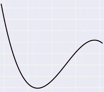
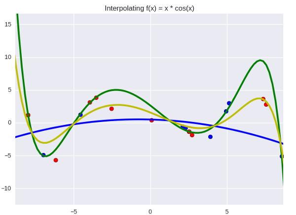
import numpy as np import matplotlib.pyplot as plt import seaborn as sns def add_powers(data, n=5): result = [data] for i in xrange(2, n + 1): poly = np.power(data, i) result.append(poly) return np.vstack(result).T def generate_data(n=20): x = np.linspace(-10, 10, 100) y = x * np.cos(x) max_y = np.max(y) y += np.random.random(y.shape) idx = np.random.choice(len(y), n) return x[idx], y[idx], max_y if __name__ == '__main__': original_data, target, max_y = generate_data(n=10) power = 5 data = add_powers(original_data, power) max_vals = np.array([max_y ** i for i in xrange(1, power + 1)]) data /= max_vals w = (np.random.random(power) - 0.5) * 1. b = -1. learning_rate = 0.1 for e in xrange(100000): h = data.dot(w) + b w -= learning_rate * ((h - target)[:, None] * data).mean(axis=0) b -= learning_rate * (h - target).mean() plt.title('Interpolating f(x) = x * cos(x)') x = add_powers(np.linspace(-10, 10, 100), power) x /= max_vals y = x.dot(w) + b plt.plot(x[:, 0] * max_vals[0], y, lw=3, c='g') plt.scatter(data[:, 0] * max_vals[0], target, s=50) plt.show() And we get something like this:
The function we are trying to push through the blue dots is right now given by a fifth-degree polynomial, and its coefficients are:
[0.5423 -3.2648 -16.5311 43.3645 25.6159 -51.2418] . What does this mean, just in case? This means that we suspect some pattern in the data, and this pattern is best expressed as Probabilistic interpretation
Okay, if we found the real parameters, why does the green line nevertheless pass through the blue points imperfectly? The standard deviation for this line is still not zero (in fact, it is about 0.97). Is this normal, or have we done something wrong? There are two answers to this question:
1. Our model is not steep enough and does not fully reflect the desired pattern. We can “enrich” it by adding more parameters — that is, increase the degree of the polynomial. For
... not exactly perfect, but why not? It looks even a little nicer, in my opinion. Let's leave as a working hypothesis.
2. Our model is pretty cool, the problem is in the data . There is some kind of noise in them, caused by the imperfection of our world (in this case, by the fact that I have treacherously added some randomness to the points, but let's imagine that these are some real data). Even if this noise is not truly random, but the truth is caused by factors that we did not take into account when formulating the problem, we can simulate it as random - and assume that the oscillations caused by the variations of all these factors might well fall into a normal distribution. .
I don’t know about you, but the second conclusion seems to me, if not even right, then at least a priority one. In the end, we can always suspect that there will be some noise in our data that interferes with our plans and deviates points from the desired value. We will first think about it, and then, if anything, you can twist the degree of the polynomial.
So, we make the second conclusion, pronounce the word "noise" and immediately transfer to the theory of probability. The most convenient way (in any case, to me) is to present it this way: our green line tries to “shoot through” all the blue dots that play the role of targets, while it can “miss the mark”, and the size of the slip is precisely that noise. Suppose that he is Gaussian (why not). Then the target shot will look like this:
This is all the same regression graph, only with zoom. The blue dot is the actual value from the dataset, the red dot is what the regression predicts. Small deviations of blue from red are more likely (lie near the center of the Gaussian), large deviations are less likely. It becomes clear that if we predict the “wrong center” (we place the red dot somewhere far away), the deviation for the blue dot will become large and therefore unlikely.
Translated into a slightly more generally accepted language, this probability is called likelihood and is written in our Gaussian case as
Now we can slightly reformulate the regression problem. In terms of targets and credibility, they will sound something like this: shoot so that the shooter does not look like a complete loser, that is, so that his misses look like misses and lie within the bounds of error. Adhering to the generally accepted statistical language, we need to maximize the likelihood .
The desired probability itself, as we assumed, is given by a normal distribution . We write down the formula from Wikipedia and multiply the probabilities for each point between each other (hence the index
Oookey, looks a little scary already. Let's make it a little easier, we fix
Heei, it became much more fun. Take from this thing logarithm. The maximum point is not going anywhere, but the product will turn into a sum, and the exponent will become its indicator:
And finally, we’ll remove the minus in the amount, replacing the maximum with the minimum:
Hmm, somewhere I have already seen such an expression ...
... and it turns out that the maximum likelihood is reached in the same place where the minimum of the standard deviation of the regression is. For some reason, such moments are always terribly disappointing - I was already sure that I would discover some new regression method, and we returned to where we started.
On the other hand, now we know the answer to the question “why do we use exactly standard deviation?” Previously, we mentally shrugged it off, but now we know that it corresponds to Gaussian noise. Bonus material - if an absolute error is used to optimize the regression (
Think bayes
Well, it was all fun, and quite common, in fact - we just re-invented the maximum likelihood method here at our leisure. It is time to step a little deeper and to another level of sleep.
... do you think the universe has any parameters ?
This is a serious question. We still know from school physics that some things seem to have exactly - acceleration of free fall, say, 9.8 meters per second squared, and if we want to find out how things fall, or say, to model a computer game with physics, we you have to twist this number there (or how computer games do, hmm? maybe the Earth’s attraction is done according to Newton's law? or, hell, taking into account the effects of the theory of relativity?). Or let's say space has three dimensions ( macroscopic dimensions , Martin Reese corrects me); not 3.1 and not 2.8, but exactly 3. If we suddenly decided to build a machine learning algorithm that would decide to measure the dimension of space, we would estimate its work the higher, the closer it would seem to number three.
On the other hand, is there any exact, fixed parameter for how much milk a baby should drink per month? How many songs should a bird sing to find a mate? In what proportion will the tumor decrease after the injection of substance X into the patient's body? How much water flows through the stream in three minutes? All these things, undoubtedly, have a certain regularity under them - the tumor will shrink, the child will drink milk, and the water will flow, but if we measure the exact values, they will constantly fluctuate, remaining at the same time in some interval. Where, in the case of physics, the use of more accurate tools gives us more and more exact value of magnitude ( “the second is the time equal to 9,192,631,770 periods of radiation corresponding to the transition between two superfine levels of the ground state of the cesium-133 atom” ) to measure the cancerous we would rather need a tumor in more experimental patients in order to delineate the upper and lower boundaries and be ready for different variants of the development of events.
This is generally a question from somewhere rather from philosophy - and somewhere here lies the dividing line between Bayesian and Orthodox (or frequency) statistics. If roughly (I’ll fix it a bit further), then the orthodox approach will say that at some level there are still real parameters (we just haven’t gotten to it yet, and someday it turns out that tumor growth, say, depends on the combination several well-defined factors). The Bayesian will say that there is no exact parameter - if not even at the level of the physical design of the universe, then at the level of the effects we observe - and that the parameters should be treated as random variables that can fluctuate in different directions.
In fact...
Both parties can now say that I am wrong, because there are a whole bunch of interpretations of this question. I’m referring to StackExchange , from where I borrowed a few examples like milk and a tumor, and the more correct answer for Bayesian statistics would rather be “we don’t know how the world really works there, and perhaps there are fixed parameters, but in our interactions with With them we invariably operate with a certain degree of uncertainty, and we model this uncertainty with the help of probability. ” Fuh. Urgently need a way to a smaller level of sleep.
2560000 regressions
Let's apply the Bayesian “Parameters are Random Variables” philosophy to the coefficients of our regression. To do this, write off the Bayes theorem:
Here
... in fact, there are even very un-very-complicated ways to express posterior for regression analytically - that is, to get a formula where only to substitute the values from the dataset, and you get the correct answer. But we will do everything in a razdolbaysky programming way - numerically, iteratively, and completely ineffective. But you don’t have to read about any inverted distributions of Wishart and other terrible things that don’t go to school (although you’ll have to do it anyway, so if you are for the hardcore way of knowing, then we ’re welcome ). The logic is as follows:
- we start with a state of complete ignorance, when we have only prior. That is, we believe that the regression coefficients can be anything. To limit the abyss of knowledge a bit, say "any from -10 to 10".
- we see some piece of data (one point from dataset, say). For every possible combination of parameters
- we sum up all the likelihood values calculated at the previous step and we get
- having processed one target, we got some ideas about how the parameters might look; now it becomes our new prior. We get the next point from the dataset and start with the second step.
It all looks pretty simple:
Spoiler header
from itertools import product def likelihood(x, mu, sigma=1.): return np.exp(-np.power(x - mu, 2.) / (2 * np.power(sigma, 2.))) frequency = 40 posterior = np.ones(frequency ** (power + 1)) / float(frequency) param_values = [np.linspace(-10, 10, frequency) for _ in xrange(power + 1)] for i, pt in enumerate(data): for j, params in enumerate(product(*param_values)): b = params[0] w = np.array(params[1:]) h = pt.dot(w) + b like = likelihood(pt[0], h) posterior[j] *= like posterior /= posterior.sum() (
itertools.product will help us to itertools.product through all possible combinations of coefficients)As a result, we get a joint distribution for our regression coefficients - all their possible values will be added to one. It turns out that for each set of coefficients there will be some probability, and the higher it is, the more correctly and the chop they set.
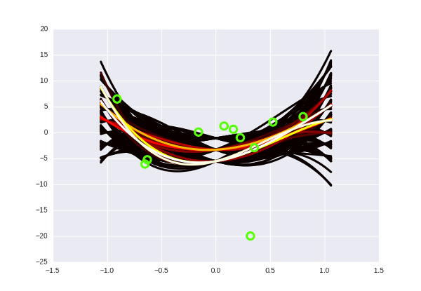
There is a question for a million - how to draw this garbage?
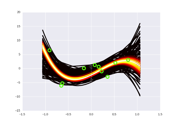
I tried something like this: I broke the spectrum of probabilities into ten equal segments, and from each segment I drew on the chart some curves with the corresponding color (from black to white - the higher the probability of the curve). There are obviously more “low-probability” curves than high-probability ones, so we had to limit their number to a random hundred or so that the pyplot would not finally die in torment, trying to draw ... how many curves, by the way? I temporarily lowered the degree of the polynomial to the third, each coefficient can take values from -10 to 10 in increments of 0.5 - so modest
Total, it looks like this:
And if you mark the data on the graph, then so (I apologize for the vivid green color):
Notice that the “hotter” curves, of course, have a higher probability, but in the Bayesian interpretation this does not mean that these curves are “correct” (that we should take them and throw away all the black ones). A slightly more intuitive way to think about these curves, in my opinion, is to imagine that you are looking, as it were, from above on a normal distribution, and you see that there is a certain probability peak in the center, but the probability of being at the point itself The peak is still very small. Only by gathering together some part of the distribution can one “dial” enough probability.
There is no retraining, Neo
If you are still wondering why we need this thing, then here is a small bonus: the Bayesian regression is invulnerable to overfitting. And I do not mean simply “stable” or “reliable” as a regression with regularization - to a certain extent it is invulnerable to it.
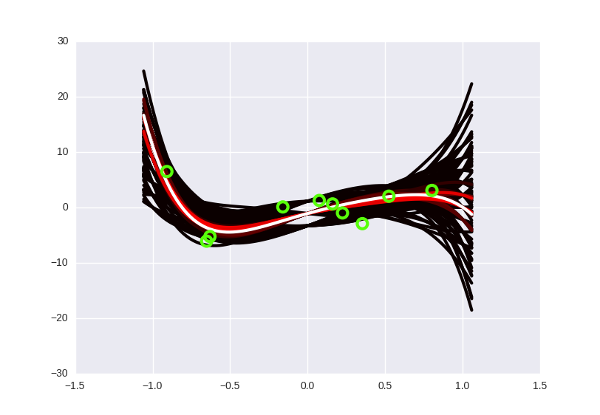
What is retraining, again? This is when we “over-fit” the model to the available data (for example, we select a curve that ideally passes through all points of the dataset, but shows poor predictions on new data). Translated into the philosophical language of the previous section, this means that when we were looking for the “correct” set of parameters, we found some kind of erroneous, incorrect. This is impossible to do with the Bayesian approach, because there is simply no concept of a “correct” set of parameters! The strange black and yellow cone in the pictures above tells us: “Yes, most likely, the following points will be somewhere in the middle along the white curves, but there may be no problems at the edge, and above, and below.” The degree of a polynomial can be increased as much as necessary: the number of possible curves will increase with it, and each of them will drop the probability separately. All the same, only those that lie close to the data in our orange-hot beam will “survive”. Do the fifth degree? No problem, Houston:
It looks a little more faded, but this is simply because I reduced the total number of curves — otherwise my laptop wouldn't wake up.
In fact, in such a context, the concept of retraining does not exist at all . It is impossible to incorrectly find a parameter, because a “parameter” is not a thing that can be “found”; it is a hefty cloud of probability that becomes “dense” only where the data lie next to it. There is no retraining, ladies and gentlemen, we disagree. Do not forget to inform all these important guys from machine learning that you can close the shop.
Just in case
This does not mean that Bayesian regression always gives correct predictions and cannot be wrong - of course it can. Suppose the next point in the dataset will have x = 3 and y = -20 and falls far below the orange beam — then our model will predict the wrong value. The trick is that in this place you would need to train from scratch and correct the parameters, while the Bayesian one just needs to “proapdeit” by putting a new point in the algorithm - and the beam will bend accordingly.
Something like this.
In addition, the Bayesian regression, as if to say, is “inert.” Having a dozen points along the white curve and one outlier, she is likely to bend in his direction a little, but not completely. And this, generally speaking, is good and right, because what if this is just another result of noise?
Why do ensembles work?
In machine learning there is such a very simple technique - when you have several models and they all work poorly, you can take and average (or even combine them) their predictions, and then they magically start to work well. In the right way it is called ensembles , and they can be found almost anywhere, especially in competitions.
And generally speaking, this is not an intuitive question: why do ensembles work at all? : , , . (-) , . - :
— «» ( ), — «» ( ). , — . — , , , , . ; , , , ( — , ).
, - , , — — . , . -10 10 0.5, -, . , …
«-- ?»
: , posterior, - . , , , . , ( /) 10485760000000000 .
- : , ( , ), . «» — ; ( ). : , posterior , ( ), — , - .
- . , , « »; , - , . , , , , ( , ).
, , ,
, -
: , «» . , , , , .
:
- (
, , . Nothing like? , , , ( - - , «, , -», ).
maximum a posteriori MAP-learning. «» , MAP , — «». , - , - « » — , , .
, haqreu , , . - , ?
Source: https://habr.com/ru/post/276355/
All Articles