The story of one progress bar
Probably, any programmer who develops a user interface in C # / XAML had to write non-standard controls. In our fun team 2GIS for Windows Phone, we often do this, and such tasks have become almost a chore. But I want to tell about one case in more detail. It all started with the fact that once we needed to write a very peculiar progress bar.
Problem
Once, a letter from our colleague, Woodroof, came to us on the team newsletter. Danil is well-known inside the company: he is a talented developer, wears a strange hairstyle and has turned the attention to detail to the maximum in pickyness. The content of his letter can be briefly summarized as follows.
')
- Daniel has a wife, her name is Sasha.
- Sasha uses a smartphone with Windows Phone, and she, of course, has 2GIS installed.
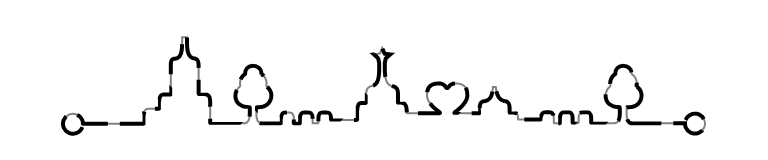
- In 2GIS, there is a start screen for loading a city with a progress bar.
- Sasha noticed that the animation of this progress bar does not look cool.
Actually, the animation then was like this:

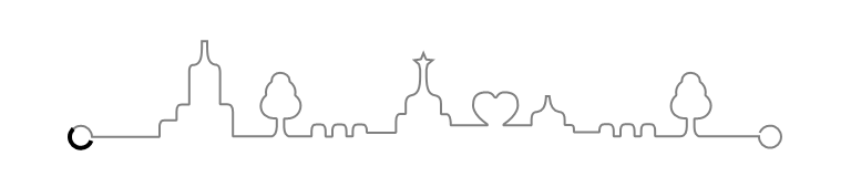
Such a progress bar is already quite unusual, but it can be done quite simply with the help of the usual mask shift. Here is the XAML markup, which conveys the main idea of the implementation.
<Grid> <Path Data="..." Stroke="Gray" /> <Path Data="..." Stroke="Black"> <Path.Clip> <RectangleGeometry Rect="0,0,100,50" /> </Path.Clip> </Path> </Grid> I deliberately do not provide the values of the Data properties of the Path element so as not to clutter up the code. But the point is that there are two absolutely identical vector paths, one above the other. At the same time, part of the top image is masked off (Path.Clip element). By programmatically changing the Rect of the mask, we thereby adjust the “progress” of the load. In the VS designer for this markup, you will see something like this.

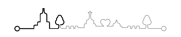
But the animation of the shift mask for such complex curves, as you might have noticed, does not look very appropriate. Danil wrote to us: “My wife looked at this loader, waited for him to reach the tree, and was very disappointed with the current behavior.”
We then agreed with the whole team that it would be much better to do this.

But how to do it?
Decision
We thought a little. At first glance, this behavior cannot be achieved by standard means. But our team has enough experienced developers, real professionals in their field, so after a while we still googled the solution . More precisely, not a ready-made solution, of course, but an idea that can be taken as a basis. The bottom line is this.
To begin with, we add hatching to our vector path.
<Grid> <Path Data="..." Stroke="Gray" StrokeThickness="1" StrokeDashCap="Flat" StrokeStartLineCap="Flat" StrokeEndLineCap="Flat"> </Path> <Path Data="..." StrokeThickness="2" StrokeDashCap="Flat" StrokeStartLineCap="Flat" StrokeEndLineCap="Flat" Stroke="Black" StrokeDashArray="9 3"> </Path> </Grid> For shading is the property StrokeDashArray. It takes values of type DoubleCollection, and in our case the first number is the length of the stroke, and the second is the length of the space between the strokes.
If you greatly increase the length of the gap between the strokes, for example, so StrokeDashArray = "9 99999 ″, then we get just such a picture.
Now it becomes clear that to achieve the desired effect, we need to change the length of the stroke. For example, for StrokeDashArray = "128 99999 ″ we get just such a picture.
For clarity, let's give our non-standard progress bar a name - ProgressPathControl and define its main characteristic - the Progress property.
public static readonly DependencyProperty ProgressProperty = DependencyProperty.Register( "Progress", typeof(double), typeof(ProgressPathControl), new PropertyMetadata(0.0, OnProgressValueChanged)); public double Progress { get { return (double)GetValue(ProgressProperty); } set { SetValue(ProgressProperty, Math.Min(1.0, Math.Max(0.0, value))); } } private static void OnProgressValueChanged(DependencyObject d, DependencyPropertyChangedEventArgs e) { if (e.NewValue != e.OldValue) { ((ProgressPathControl)d).OnProgressValueChanged((double)e.OldValue, (double)e.NewValue); } } Let Progress change from 0 to 1. Obviously, for Progress = 0, the stroke length will also be zero, and for Progress = 1, the stroke length will be equal to the length of the curve. This number should be equal to the gap between the strokes.
The length of the curve can be easily calculated by looking at the Path element. It has a Data property of type Geometry , and in our case it is a PathGeometry , which has a collection of Figures . Each element has a Segments collection containing elements of various types, including BezierSegment and LineSegment. It is necessary to go over all these pieces and sum up the lengths of the segments. I'm lazy, so I’ll confine myself only to BezierSegment and LineSegment, since in my case there are enough of them, and I’ll count the length of the Bezier curve in a completely simple way.
For example, so
private double GetGeometryLength(Geometry geometry) { double result = 0; var pathGeometry = geometry as PathGeometry; if (pathGeometry != null) { foreach (var figure in pathGeometry.Figures) { var currentPoint = figure.StartPoint; foreach (var segment in figure.Segments) { var bezier = segment as BezierSegment; var line = segment as LineSegment; if (bezier != null) { result += GetBezierLength(currentPoint, bezier.Point1, bezier.Point2, bezier.Point3); currentPoint = bezier.Point3; } else if (line != null) { result += GetLineLength(currentPoint, line.Point); currentPoint = line.Point; } } } } return result; } private double GetBezierLength(Point p0, Point p1, Point p2, Point p3) { double result = 0; Point lastPoint = p0; for (double t = 0.001; t <= 1; t += 0.001) { Point currentPoint; // // https://ru.wikipedia.org/wiki/_ currentPoint.X = Math.Pow(1 - t, 3) * p0.X + 3 * t * Math.Pow(1 - t, 2) * p1.X + 3 * t * t * (1 - t) * p2.X + Math.Pow(t, 3) * p3.X; currentPoint.Y = Math.Pow(1 - t, 3) * p0.Y + 3 * t * Math.Pow(1 - t, 2) * p1.Y + 3 * t * t * (1 - t) * p2.Y + Math.Pow(t, 3) * p3.Y; double dx = currentPoint.X - lastPoint.X; double dy = currentPoint.Y - lastPoint.Y; result += Math.Sqrt(dx * dx + dy * dy); lastPoint = currentPoint; } return result; } private double GetLineLength(Point p0, Point p1) { double dx = p0.X - p1.X; double dy = p0.Y - p1.Y; return Math.Sqrt(dx * dx + dy * dy); } Now that we know the length of the curve, we can determine the value of the StrokeDashArray property for any Progress values.
double strokeDashLength = progressPathLength / progressPath.StrokeThickness * Progress; double strokeDashOffset = progressPathLength / progressPath.StrokeThickness; progressPath.StrokeDashArray = new DoubleCollection { strokeDashLength, strokeDashOffset }; An attentive reader will notice that the length of the stroke, as well as the length of the gap between the strokes, are not specified in arbitrary units, as is customary in XAML, but in the widths of the stroke .
Now we have everything you need to write our non-standard progress bar. For completeness, the entire code of the ProgressPathControl, fairly simplified, but not bad illustrating the basic principles, I cite below.
ProgressPathControl.cs
public class ProgressPathControl : Control { #region ProgressProperty public static readonly DependencyProperty ProgressProperty = DependencyProperty.Register( "Progress", typeof(double), typeof(ProgressPathControl), new PropertyMetadata(0.0, OnProgressValueChanged)); public double Progress { get { return (double)GetValue(ProgressProperty); } set { SetValue(ProgressProperty, Math.Min(1.0, Math.Max(0.0, value))); } } private static void OnProgressValueChanged(DependencyObject d, DependencyPropertyChangedEventArgs e) { if (e.NewValue != e.OldValue) { ((ProgressPathControl)d).OnProgressValueChanged(); } } #endregion public ProgressPathControl() { DefaultStyleKey = typeof(ProgressPathControl); } protected override void OnApplyTemplate() { base.OnApplyTemplate(); progressPath = (Path)GetTemplateChild("ProgressPath"); progressPathLength = GetGeometryLength(progressPath.Data); OnProgressValueChanged(); } private double GetGeometryLength(Geometry geometry) { double result = 0; var pathGeometry = geometry as PathGeometry; if (pathGeometry != null) { foreach (var figure in pathGeometry.Figures) { var currentPoint = figure.StartPoint; foreach (var segment in figure.Segments) { var bezier = segment as BezierSegment; var line = segment as LineSegment; if (bezier != null) { result += GetBezierLength(currentPoint, bezier.Point1, bezier.Point2, bezier.Point3); currentPoint = bezier.Point3; } else if (line != null) { result += GetLineLength(currentPoint, line.Point); currentPoint = line.Point; } } } } return result; } private double GetBezierLength(Point p0, Point p1, Point p2, Point p3) { double result = 0; Point lastPoint = p0; for (double t = 0.001; t <= 1; t += 0.001) { Point currentPoint; // // https://ru.wikipedia.org/wiki/_ currentPoint.X = Math.Pow(1 - t, 3) * p0.X + 3 * t * Math.Pow(1 - t, 2) * p1.X + 3 * t * t * (1 - t) * p2.X + Math.Pow(t, 3) * p3.X; currentPoint.Y = Math.Pow(1 - t, 3) * p0.Y + 3 * t * Math.Pow(1 - t, 2) * p1.Y + 3 * t * t * (1 - t) * p2.Y + Math.Pow(t, 3) * p3.Y; double dx = currentPoint.X - lastPoint.X; double dy = currentPoint.Y - lastPoint.Y; result += Math.Sqrt(dx * dx + dy * dy); lastPoint = currentPoint; } return result; } private double GetLineLength(Point p0, Point p1) { double dx = p0.X - p1.X; double dy = p0.Y - p1.Y; return Math.Sqrt(dx * dx + dy * dy); } private void OnProgressValueChanged() { if (progressPath != null) { double strokeDashLength = progressPathLength / progressPath.StrokeThickness * Progress; double strokeDashOffset = progressPathLength / progressPath.StrokeThickness; progressPath.StrokeDashArray = new DoubleCollection { strokeDashLength, strokeDashOffset }; } } private double progressPathLength; private Path progressPath; } Generic.xaml
<ResourceDictionary xmlns="http://schemas.microsoft.com/winfx/2006/xaml/presentation" xmlns:x="http://schemas.microsoft.com/winfx/2006/xaml" xmlns:controls="using:DoubleGis.Controls"> <Style TargetType="controls:ProgressPathControl"> <Setter Property="Template"> <Setter.Value> <ControlTemplate TargetType="controls:ProgressPathControl"> <Grid> <Canvas Height="50" Width="323"> <Path Data="M10.7,45.6C10,47.5,8.1,48.9,6,48.9c-2.8,0-5-2.2-5-5s2.2-5,5-5s5,2.2,5,5l0,0h30.3c0.1,0,0.2-0.1,0.2-0.2v-4c0-1.4,0.2-2.3,0.7-2.8c0.3-0.3,0.7-0.5,1.3-0.5H49c0.1,0,0.2-0.1,0.2-0.2v-3.6c0-1.4,0.2-2.3,0.7-2.8c0.3-0.3,0.8-0.5,1.3-0.5h3.5c0.1,0,0.2-0.1,0.2-0.2V14.7c0-2.1,0.4-3.1,1.4-3.3c0.1,0,0.3,0,0.5,0l0.2,0c3.4-0.5,3.6-4,3.6-9.6V0.6H63l0,1.1c0,5.4,0.2,9,3.8,9.6c0,0,0.1,0,0.1,0c0.1,0,0.2,0,0.3,0l0.1,0c1.5,0.4,1.5,2.7,1.5,3.4V29c0,0.1,0.1,0.2,0.3,0.2h3.2c0.6,0,1.1,0.2,1.5,0.6c0.5,0.6,0.8,1.5,0.8,2.7l0,10.6l0,0.4c0,0.1,0.1,0.2,0.2,0.2h16.6c2.4,0,2.8-2.1,3-4.3l0-3.6c0-0.1,0-0.1-0.1-0.2c0,0-0.1-0.1-0.2-0.1l-0.8,0c-3.6,0-6.1-2.3-6.1-5.6c0-1.8,0.9-3.7,2.3-4.7c0.1-0.1,0.1-0.1,0.1-0.2c-0.1-0.5-0.1-0.9-0.1-1.4c0-1.8,0.9-3.5,2.5-4.6c0.1,0,0.1-0.1,0.1-0.2c0-0.1,0-0.3,0-0.4c0-2,1.7-3.5,3.9-3.5c2.3,0,4.2,1.6,4.2,3.5c0,0.2,0,0.3,0,0.4c0,0.1,0,0.2,0.1,0.2c1.6,1.1,2.5,2.8,2.5,4.6c0,0.5,0,0.9-0.1,1.4c0,0.1,0,0.2,0.1,0.2c1.5,1.1,2.4,2.8,2.4,4.5c0,3.4-2.6,5.9-6.1,5.9l-1.2,0c-0.1,0-0.2,0.1-0.2,0.2l0,3.6c0.1,2.2,0.6,4.3,2.9,4.3h9.3c0.1,0,0.2-0.1,0.2-0.2v-2.1c0-1.3,0.2-2.2,0.7-2.7c0.3-0.3,0.7-0.4,1.2-0.4h2.5c1.9,0,1.9,2.3,1.9,3l0,2.2c0,0.1,0,0.1,0.1,0.2c0,0,0.1,0.1,0.2,0.1h2.5c0.1,0,0.1,0,0.2-0.1c0,0,0.1-0.1,0.1-0.2l0-2.2c0-0.7,0-3,1.9-3h2.5c0.5,0,0.9,0.1,1.2,0.4c0.5,0.5,0.7,1.3,0.7,2.7v2.1c0,0.1,0.1,0.2,0.2,0.2h2.5c0.1,0,0.2-0.2,0.2-0.3l0-2c0-1.3,0.2-2.2,0.7-2.7c0.3-0.3,0.7-0.4,1.2-0.4h2.5c0.5,0,0.9,0.1,1.2,0.4c0.5,0.5,0.7,1.3,0.7,2.7l0,0.4c0,0.1,0.1,0.2,0.2,0.2H148c0.1,0,0.2-0.1,0.2-0.3l0-4.6c0-1.5,0.2-2.5,0.7-3.1c0.3-0.3,0.8-0.5,1.3-0.5h2.2c0.1,0,0.2-0.1,0.2-0.2v-4.6c0-2.4,1.3-3.4,2.5-3.6c3.9-0.6,4.1-4.9,4-11.3l0-0.3l-0.5-2.4c0-0.1,0-0.1-0.1-0.1l-2-1.8l2.8-0.4c0.1,0,0.2-0.1,0.2-0.1l1.1-2.7l1.1,2.7c0,0.1,0.1,0.1,0.2,0.2l2.8,0.3l-2.2,1.9c0,0-0.1,0.1-0.1,0.1l-0.5,2.4c0,0,0,0,0,0.1l0,0.7c0,6.2,0.2,10.2,4.2,10.8c0.6,0.1,2.4,0.5,2.4,3.6v4.6c0,0.1,0.1,0.2,0.2,0.2h2.2c0.4,0,0.7,0.1,1,0.4c0.9,0.9,1,3.1,1,4.3v0.2c0,0.1,0.1,0.2,0.2,0.2h16.2c0.1,0,0.2-0.1,0.2-0.2c0-0.1,0-0.2-0.1-0.3c-1.1-0.8-2.5-1.9-3.6-3c-2.3-2.4-2.8-4.3-2.8-5.5c0-2.8,0.7-6,6-6c1.6,0,2.8,0.7,3.5,2c0.1,0.2,0.4,0.4,0.6,0.4c0.3,0,0.5-0.1,0.6-0.4c0.7-1.3,1.9-2,3.5-2c5.3,0,6,3.2,6,6c0,1.2-0.5,3-2.8,5.5c-1,1.1-2.5,2.2-3.6,3c-0.1,0.1-0.1,0.2-0.1,0.3c0,0.1,0.1,0.2,0.2,0.2l12.2,0c0.1,0,0.2-0.1,0.2-0.2l0-2.3c0.1-2.2,0.6-3.2,1.7-3.5l0.1,0l0.8-0.1c2.5-0.4,3.7-2.3,4-6.4l0-0.7h1.5l0.1,0.7c0.4,3.9,1.8,6,4.4,6.4l0.6,0.1l0.1,0c1.1,0.3,1.8,1.6,1.7,3.5v2.1c0,0.1,0.1,0.2,0.2,0.2h2.2c0.7,0,1.1,0.1,1.4,0.4c0.3,0.3,0.4,0.9,0.4,2.4c0,0,0,0,0,0.1l0,0.1l0,0.1c0,0.1,0.1,0.2,0.3,0.2h11c0.1,0,0.2-0.1,0.2-0.2l0-0.8c0-0.9,0.3-1.7,0.8-2.2c0.3-0.3,0.7-0.4,1.2-0.4c0,0,2.5,0,2.5,0c1.9,0,1.9,2.3,1.9,3l0,2.2c0,0.1,0,0.1,0.1,0.2c0,0,0.1,0.1,0.2,0.1h2.5c0.1,0,0.1,0,0.2-0.1c0,0,0.1-0.1,0.1-0.2l0-2.2c0-0.7,0-3,1.9-3h2.5c0.5,0,0.9,0.1,1.2,0.4c0.5,0.5,0.7,1.3,0.7,2.7v2.1c0,0.1,0.1,0.2,0.2,0.2h2.5c0.1,0,0.2-0.2,0.3-0.3l0-2c0-1.3,0.2-2.2,0.7-2.7c0.3-0.3,0.7-0.4,1.2-0.4h2.5c0.5,0,0.9,0.1,1.2,0.4c0.5,0.5,0.7,1.3,0.7,2.7v2.1c0,0.1,0.1,0.2,0.2,0.2h11.2l0.1,0c2.3-0.1,2.7-2.2,2.8-4.3l0-3.6c0-0.1-0.1-0.2-0.2-0.2c0,0-0.8,0-0.8,0c-3.6,0-6.1-2.3-6.1-5.6c0-1.8,0.9-3.7,2.3-4.7c0.1-0.1,0.1-0.1,0.1-0.2c-0.1-0.5-0.1-0.9-0.1-1.4c0-1.8,0.9-3.5,2.5-4.6c0.1,0,0.1-0.1,0.1-0.2c0-0.1,0-0.3,0-0.4c0-2,1.7-3.5,3.9-3.5c2.3,0,4.2,1.6,4.2,3.5c0,0.2,0,0.3,0,0.4c0,0.1,0,0.2,0.1,0.2c1.6,1.1,2.5,2.8,2.5,4.6c0,0.5,0,0.9-0.1,1.4c0,0.1,0,0.2,0.1,0.2c1.5,1.1,2.4,2.8,2.4,4.5c0,3.4-2.6,5.9-6.1,5.9l-1.2,0c-0.1,0-0.2,0.1-0.2,0.2l0,3.6c0.1,2.2,0.6,4.3,2.9,4.3H312l0,0.1c0,2.8,2.2,5,5,5c2.8,0,5-2.2,5-5s-2.2-5-5-5c-2.1,0-4,1.4-4.7,3.2" Height="50" StrokeThickness="1" StrokeDashCap="Flat" StrokeStartLineCap="Flat" StrokeEndLineCap="Flat" Stroke="{TemplateBinding Background}" Canvas.Left="0" Stretch="None" Canvas.Top="0" Width="323" /> <Path Data="M10.7,45.6C10,47.5,8.1,48.9,6,48.9c-2.8,0-5-2.2-5-5s2.2-5,5-5s5,2.2,5,5l0,0h30.3c0.1,0,0.2-0.1,0.2-0.2v-4c0-1.4,0.2-2.3,0.7-2.8c0.3-0.3,0.7-0.5,1.3-0.5H49c0.1,0,0.2-0.1,0.2-0.2v-3.6c0-1.4,0.2-2.3,0.7-2.8c0.3-0.3,0.8-0.5,1.3-0.5h3.5c0.1,0,0.2-0.1,0.2-0.2V14.7c0-2.1,0.4-3.1,1.4-3.3c0.1,0,0.3,0,0.5,0l0.2,0c3.4-0.5,3.6-4,3.6-9.6V0.6H63l0,1.1c0,5.4,0.2,9,3.8,9.6c0,0,0.1,0,0.1,0c0.1,0,0.2,0,0.3,0l0.1,0c1.5,0.4,1.5,2.7,1.5,3.4V29c0,0.1,0.1,0.2,0.3,0.2h3.2c0.6,0,1.1,0.2,1.5,0.6c0.5,0.6,0.8,1.5,0.8,2.7l0,10.6l0,0.4c0,0.1,0.1,0.2,0.2,0.2h16.6c2.4,0,2.8-2.1,3-4.3l0-3.6c0-0.1,0-0.1-0.1-0.2c0,0-0.1-0.1-0.2-0.1l-0.8,0c-3.6,0-6.1-2.3-6.1-5.6c0-1.8,0.9-3.7,2.3-4.7c0.1-0.1,0.1-0.1,0.1-0.2c-0.1-0.5-0.1-0.9-0.1-1.4c0-1.8,0.9-3.5,2.5-4.6c0.1,0,0.1-0.1,0.1-0.2c0-0.1,0-0.3,0-0.4c0-2,1.7-3.5,3.9-3.5c2.3,0,4.2,1.6,4.2,3.5c0,0.2,0,0.3,0,0.4c0,0.1,0,0.2,0.1,0.2c1.6,1.1,2.5,2.8,2.5,4.6c0,0.5,0,0.9-0.1,1.4c0,0.1,0,0.2,0.1,0.2c1.5,1.1,2.4,2.8,2.4,4.5c0,3.4-2.6,5.9-6.1,5.9l-1.2,0c-0.1,0-0.2,0.1-0.2,0.2l0,3.6c0.1,2.2,0.6,4.3,2.9,4.3h9.3c0.1,0,0.2-0.1,0.2-0.2v-2.1c0-1.3,0.2-2.2,0.7-2.7c0.3-0.3,0.7-0.4,1.2-0.4h2.5c1.9,0,1.9,2.3,1.9,3l0,2.2c0,0.1,0,0.1,0.1,0.2c0,0,0.1,0.1,0.2,0.1h2.5c0.1,0,0.1,0,0.2-0.1c0,0,0.1-0.1,0.1-0.2l0-2.2c0-0.7,0-3,1.9-3h2.5c0.5,0,0.9,0.1,1.2,0.4c0.5,0.5,0.7,1.3,0.7,2.7v2.1c0,0.1,0.1,0.2,0.2,0.2h2.5c0.1,0,0.2-0.2,0.2-0.3l0-2c0-1.3,0.2-2.2,0.7-2.7c0.3-0.3,0.7-0.4,1.2-0.4h2.5c0.5,0,0.9,0.1,1.2,0.4c0.5,0.5,0.7,1.3,0.7,2.7l0,0.4c0,0.1,0.1,0.2,0.2,0.2H148c0.1,0,0.2-0.1,0.2-0.3l0-4.6c0-1.5,0.2-2.5,0.7-3.1c0.3-0.3,0.8-0.5,1.3-0.5h2.2c0.1,0,0.2-0.1,0.2-0.2v-4.6c0-2.4,1.3-3.4,2.5-3.6c3.9-0.6,4.1-4.9,4-11.3l0-0.3l-0.5-2.4c0-0.1,0-0.1-0.1-0.1l-2-1.8l2.8-0.4c0.1,0,0.2-0.1,0.2-0.1l1.1-2.7l1.1,2.7c0,0.1,0.1,0.1,0.2,0.2l2.8,0.3l-2.2,1.9c0,0-0.1,0.1-0.1,0.1l-0.5,2.4c0,0,0,0,0,0.1l0,0.7c0,6.2,0.2,10.2,4.2,10.8c0.6,0.1,2.4,0.5,2.4,3.6v4.6c0,0.1,0.1,0.2,0.2,0.2h2.2c0.4,0,0.7,0.1,1,0.4c0.9,0.9,1,3.1,1,4.3v0.2c0,0.1,0.1,0.2,0.2,0.2h16.2c0.1,0,0.2-0.1,0.2-0.2c0-0.1,0-0.2-0.1-0.3c-1.1-0.8-2.5-1.9-3.6-3c-2.3-2.4-2.8-4.3-2.8-5.5c0-2.8,0.7-6,6-6c1.6,0,2.8,0.7,3.5,2c0.1,0.2,0.4,0.4,0.6,0.4c0.3,0,0.5-0.1,0.6-0.4c0.7-1.3,1.9-2,3.5-2c5.3,0,6,3.2,6,6c0,1.2-0.5,3-2.8,5.5c-1,1.1-2.5,2.2-3.6,3c-0.1,0.1-0.1,0.2-0.1,0.3c0,0.1,0.1,0.2,0.2,0.2l12.2,0c0.1,0,0.2-0.1,0.2-0.2l0-2.3c0.1-2.2,0.6-3.2,1.7-3.5l0.1,0l0.8-0.1c2.5-0.4,3.7-2.3,4-6.4l0-0.7h1.5l0.1,0.7c0.4,3.9,1.8,6,4.4,6.4l0.6,0.1l0.1,0c1.1,0.3,1.8,1.6,1.7,3.5v2.1c0,0.1,0.1,0.2,0.2,0.2h2.2c0.7,0,1.1,0.1,1.4,0.4c0.3,0.3,0.4,0.9,0.4,2.4c0,0,0,0,0,0.1l0,0.1l0,0.1c0,0.1,0.1,0.2,0.3,0.2h11c0.1,0,0.2-0.1,0.2-0.2l0-0.8c0-0.9,0.3-1.7,0.8-2.2c0.3-0.3,0.7-0.4,1.2-0.4c0,0,2.5,0,2.5,0c1.9,0,1.9,2.3,1.9,3l0,2.2c0,0.1,0,0.1,0.1,0.2c0,0,0.1,0.1,0.2,0.1h2.5c0.1,0,0.1,0,0.2-0.1c0,0,0.1-0.1,0.1-0.2l0-2.2c0-0.7,0-3,1.9-3h2.5c0.5,0,0.9,0.1,1.2,0.4c0.5,0.5,0.7,1.3,0.7,2.7v2.1c0,0.1,0.1,0.2,0.2,0.2h2.5c0.1,0,0.2-0.2,0.3-0.3l0-2c0-1.3,0.2-2.2,0.7-2.7c0.3-0.3,0.7-0.4,1.2-0.4h2.5c0.5,0,0.9,0.1,1.2,0.4c0.5,0.5,0.7,1.3,0.7,2.7v2.1c0,0.1,0.1,0.2,0.2,0.2h11.2l0.1,0c2.3-0.1,2.7-2.2,2.8-4.3l0-3.6c0-0.1-0.1-0.2-0.2-0.2c0,0-0.8,0-0.8,0c-3.6,0-6.1-2.3-6.1-5.6c0-1.8,0.9-3.7,2.3-4.7c0.1-0.1,0.1-0.1,0.1-0.2c-0.1-0.5-0.1-0.9-0.1-1.4c0-1.8,0.9-3.5,2.5-4.6c0.1,0,0.1-0.1,0.1-0.2c0-0.1,0-0.3,0-0.4c0-2,1.7-3.5,3.9-3.5c2.3,0,4.2,1.6,4.2,3.5c0,0.2,0,0.3,0,0.4c0,0.1,0,0.2,0.1,0.2c1.6,1.1,2.5,2.8,2.5,4.6c0,0.5,0,0.9-0.1,1.4c0,0.1,0,0.2,0.1,0.2c1.5,1.1,2.4,2.8,2.4,4.5c0,3.4-2.6,5.9-6.1,5.9l-1.2,0c-0.1,0-0.2,0.1-0.2,0.2l0,3.6c0.1,2.2,0.6,4.3,2.9,4.3H312l0,0.1c0,2.8,2.2,5,5,5c2.8,0,5-2.2,5-5s-2.2-5-5-5c-2.1,0-4,1.4-4.7,3.2" x:Name="ProgressPath" StrokeThickness="2" StrokeDashCap="Flat" StrokeStartLineCap="Flat" StrokeEndLineCap="Flat" Stroke="{TemplateBinding Foreground}" Height="50" Canvas.Left="0" Stretch="None" Canvas.Top="0" Width="323" /> </Canvas> </Grid> </ControlTemplate> </Setter.Value> </Setter> </Style> </ResourceDictionary> Profit
Let's sum up. Our task was to make an unusual progress bar. To achieve the desired effect, we used a vector curve hatching and a stroke length animation. If this decision seems strange to you, know that you are not alone in your feelings. I think so too. But at the same time, it impresses with its simplicity and brevity.
If desired, the ProgressPathControl code can be further developed so that it learns to animate arbitrary curves. For example, you can do so.

This is a fairly popular progress bar in mobile interfaces, which is out of the box in the Windows Phone SDK. A similar control in 2GIS for WP is used, for example, when adding user photos to geo objects, and now you also know how to write one yourself.
Source: https://habr.com/ru/post/275489/
All Articles