Work of the Tor infrastructure: detailed visualization in the TorFlow project
Tor is surprisingly “transparent” for a tool that should provide anonymity of a user on the network. As you know , with the help of Tor, users can maintain anonymity on the Internet when visiting websites, blogging, sending instant and mail messages, as well as when working with other applications that use the TCP protocol. Anonymization of traffic is provided by using a distributed network of servers - nodes. Tor technology also provides protection against traffic analysis mechanisms that threaten not only privacy on the Internet, but also the confidentiality of trade secrets, business contacts and communication secrets in general.
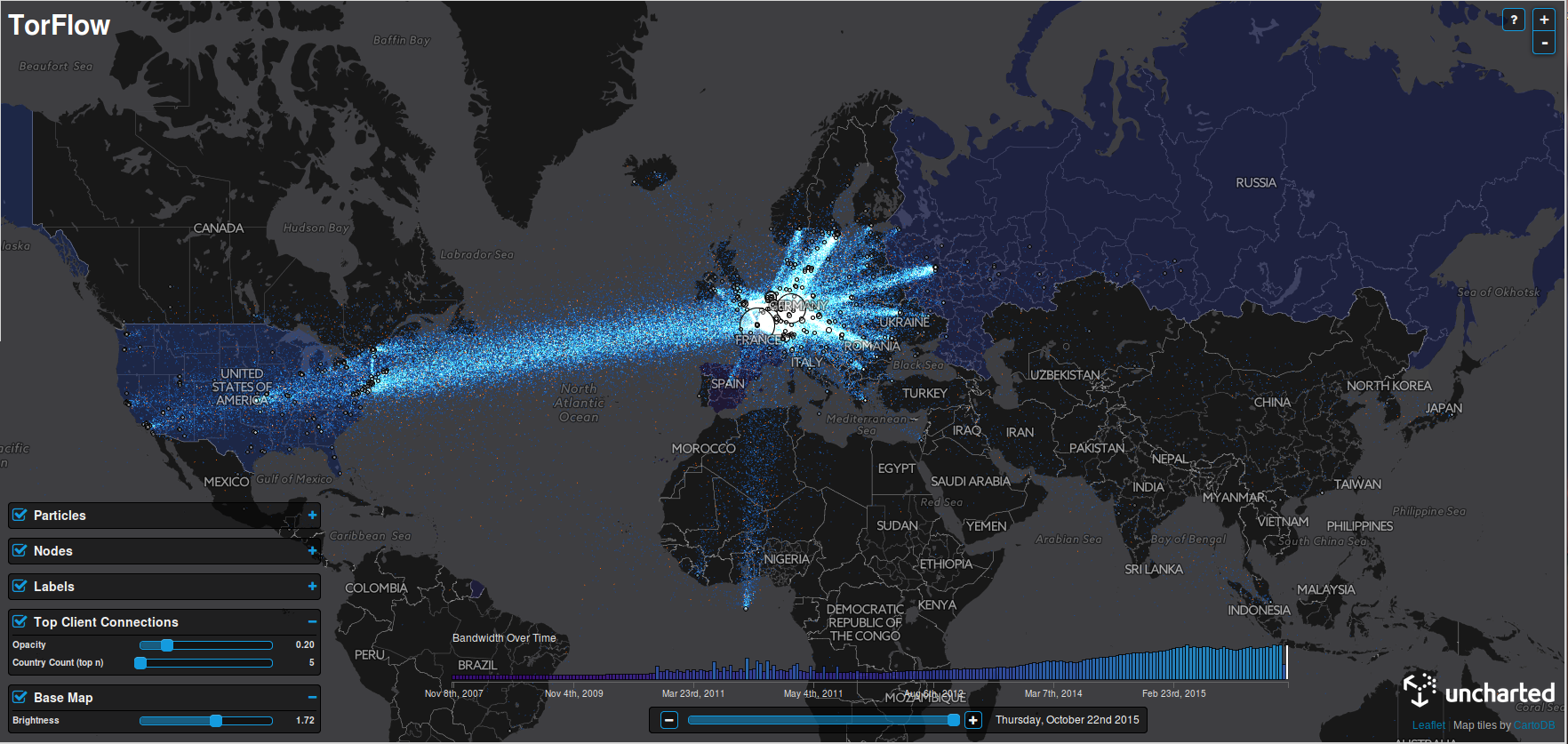
The company, which is engaged in data visualization, has now collected information available on the Web about the placement of Tor nodes, serving servers, bandwidth of some networks and data centers involved in the Tor system. This information was visualized and presented in an accessible form for understanding.
The project was named TorFlow, and it was prepared using Uncharted. The company's specialists mapped network nodes and data traffic based on IP addresses and the work of "buffer" servers, ensuring the anonymity of users. “Tor’s main task is to ensure the anonymity of the participants,” said David Schroh, one of the project participants. “By visualizing this, you can see patterns that you did not expect to see.”
')
By the way, despite the fact that in the USA there are 1,300 of 6000 Tor nodes, we see the most hubs on the map in Germany, France, the Netherlands and the UK. TorFlow shows Tor hubs in unexpected places, including Libya and Liberia. The map shows the growth of the network over the past 8 years - the development took place through expansion from the West to the East. TorFlow is mainly intended for displaying the operation of the Tor infrastructure, but there is additional information here, including the number of users in a particular country. In order to view such data, you need to click on the outlines of the country on the map.
The visualization itself is available here .
Source: https://habr.com/ru/post/275289/
All Articles