How I did a web store template in Sketch.app for Themeforest. Part 1: Letter, Idea, Prototype
It began like this: they wrote to me from Envato that they are launching a section with the Sketch templates in Themeforest, and since I am such an ideological user, it would be nice if I would draw a template for the opening. Naturally, I did not refuse.
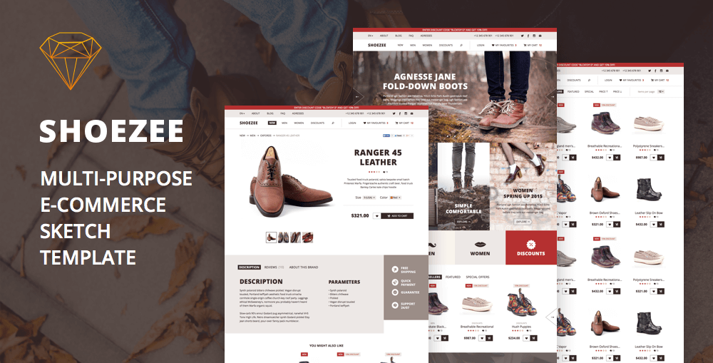
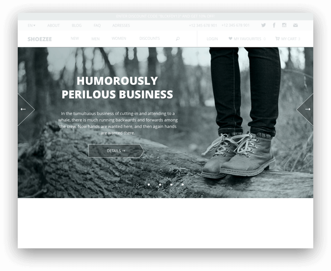
The template turned out like this .
')
Then I will describe what and how I did in the process. The article will traditionally be in several parts.
Concept
I decided to make a web store template. I didn’t want to draw a mobile application, because for iOS there is a lot of everything everywhere and so. I had another option to make designer landings, but this is for later.
Foray into exploration
Before that, I did not sell templates in “Forest” (but I bought a couple), so I had to go see how it happens in the “eCommerce” category. How do the templates look and what pages they are made of. It is clear that it will be necessary to make some kind of general catalog, product page, basket and something to build for the start page. But I needed to make a list of specific screens that I would do. In this case, remember that the template should not be very specialized - it should be suitable for clothing, and technology, and for food.

The list of screens I got is this:
- Starting
- Catalog
- Starting directory
- Category page with filter
- Category page without filter
- Product page with description
- Product Comment Page
- Manufacturer Information Page
- Basket
- List of products in the cart
- Billing Information Form
- Deferred goods
- Search results page
- Contact page
- Blog
- Blog start
- Article page
- Popup windows
- Level 2 menu (i.e. embedded in the main)
- Quick view of goods
- Enlarged product photo
- “Item added to cart”
- Quick basket view
- Login
- check in
- Newsletter Subscription
Prototype
Paper
I decided to do a type of shoe store, and therefore in the design there will be big photos and large headlines - show the goods face and immediately to the forehead. To begin, I draw everything on a piece of paper. I always think the design is on paper, so as not to get carried away with buttons and fonts. And so you can work on the couch.
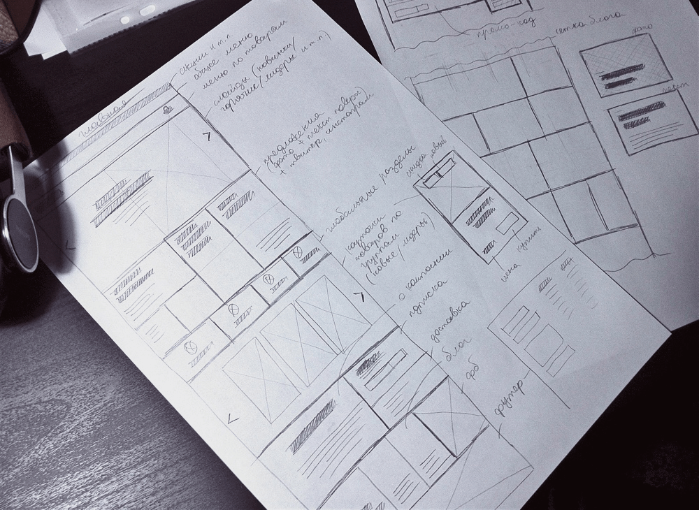
I draw the most basic - to understand the idea in general terms. Then you can think out on your computer.
Prototype in sketch
No matter how hard I try any tools for prototyping, I haven’t yet found anything for my case. First of all, most of them are web applications, and I need the opportunity to work in the fields without wifi. Secondly, these programs are usually made to create sophisticated prototypes (for guys who have a straight job, make prototypes and nothing else), but I need to be quick and easy, so I used only a small part of their resource. I got one good thing - wireframe.cc , but my point with the fields does not pass. Thirdly, there is a completely working version of doing the prototype right away in Sketch - you can immediately gradually overtake it in the final design, and it is more convenient than to draw a “purebred” from scratch (though not in all projects).
Grid
At the stage of prototyping there is no mesh at all. I also sometimes turn off smart guides so that the blocks do not stick to each other. I draw, so to speak, in free flight.
I stick to it myself and advise everyone: in the prototype, draw all the main blocks first, and then adjust the grid for them. The grid should help organize what is already there.
Width of the layout I take 1280 px. Less is now almost a tablet version, and I only do a desktop.
Resources
I make a prototype manually from scratch. I have no prototype UI-whales. I tried to collect prototypes from templates a couple of times, but in the end it all came down to the fact that I changed all buttons, colors, objects and text styles to fit my needs, and in such a situation it is easier to start from scratch. I understand that the workpieces still need at least some, so I started making my own template for assembling prototypes, but I won’t finish it. Once - be sure to lay out in open access.
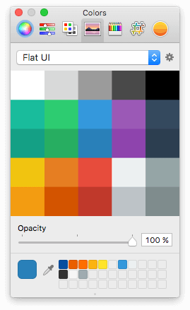
I have a palette with which I paint prototypes. It’s just not interesting to do b / w, I usually have such “bluish” b / w.
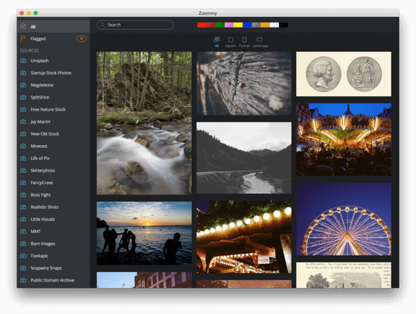
To search for free photos came in handy very good program - Zoommy (advertising for free). Looking for free drains, simple and convenient.
For the company with Zoommy well goes Yoink . This is such a buffer panel where you can drag something, and then drag it further.
GIF with office. the site
To insert all arrows and icons, the system toolbar works well (Ctrl + Cmd + Space).
I do not use any special fonts in prototypes. What came first, and in the work. Usually comes across Helvetica.
For nakidat-in-a-quick icons, I have an old folder with Windows icons in svg. Search Finder write a keyword, and choose from the search results. I do not remember exactly, but it seems I was shaking from here . Recently, a good application IconJar was found , now I keep icons there.

Plugins will describe in the course of the process.
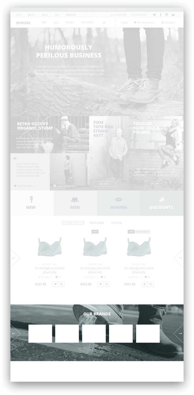
start page
I will begin in detail from the starting page, in the next part I will quickly go through the internal ones.
I look at paper sketches with one eye and draw everything gradually from top to bottom. There is nothing unusual - colored rectangles and on top of the text. I do not save text styles, graphic styles, or (for now) objects - while it’s permissible to do everything “by eye”, and with styles there is a risk of breaking something somewhere by chance.
Layers along the way group, and leave the names as they are (so mess, but quickly). To edit text block styles I sometimes use the Select Similar Text Layers plugin to select layers of the same type. Another useful “Select Group Layers” (inside the “ Sketch Mate ” plugin), if necessary, for example, is to select all the text layers within the group.
Cap
I take the menu items roughly suitable for everyone (I open several web stores and rewrite the most common links), Windows icons from the above folder in Finder. And I make up the name of the site on the go - I just distort the “shoes”.

I save the cap to the object, because it will be on all pages.
Slides
The idea is this: a big beautiful picture, on top of the product name in the picture, a small description and a link to the catalog.
I do a picture like this:
- draw a rectangle;
- I open the fill panel;
- I change the fill to "Pattern Fill";
- as a pattern I throw a photo;
- changing the size of the pattern from “Tile” to “Fill”;
- I make a gray fill over in the “Color” mode.
Sometimes it is necessary to put a picture on top of the mask and adjust the size and location a bit to get a better view of the product. The case is particular, depends on the specific photo in a particular slide.
To make the text read well on top of a photo, it is always better to put an almost imperceptible layer between them with a gradient from dark or light (depending on the color of the photo) into full transparency. You can also add a faint shadow to the text layer, but this is if the first option does not work.
Banners and links to categories
Large and simple - so noticeable and understandable.

Text
The text of the paragraph is made in the size of 18px (for modern desktop monitors I mostly have 16-18), headlines are by the eye. In the prototype in the size of the text for paragraphs or headings, I may even have an error of 1-2 px on different pages. Headlines do “uppercase” to look “more premium” (God-forgive me).
Cards of goods
I make a slider and three categories - "Best selling", "Special" and "Special". The names, of course, are about nothing, but I expect that the buyer of the template will write himself what he needs, so it will go like that.
I make a product card more or less standard: photo, category, product name, rating, comments, price, “postpone”, “add to cart”. Just in case, two badges - about the newly received goods and about the discount. We save as a symbol - there will be a lot of cards later, so it will come in handy.
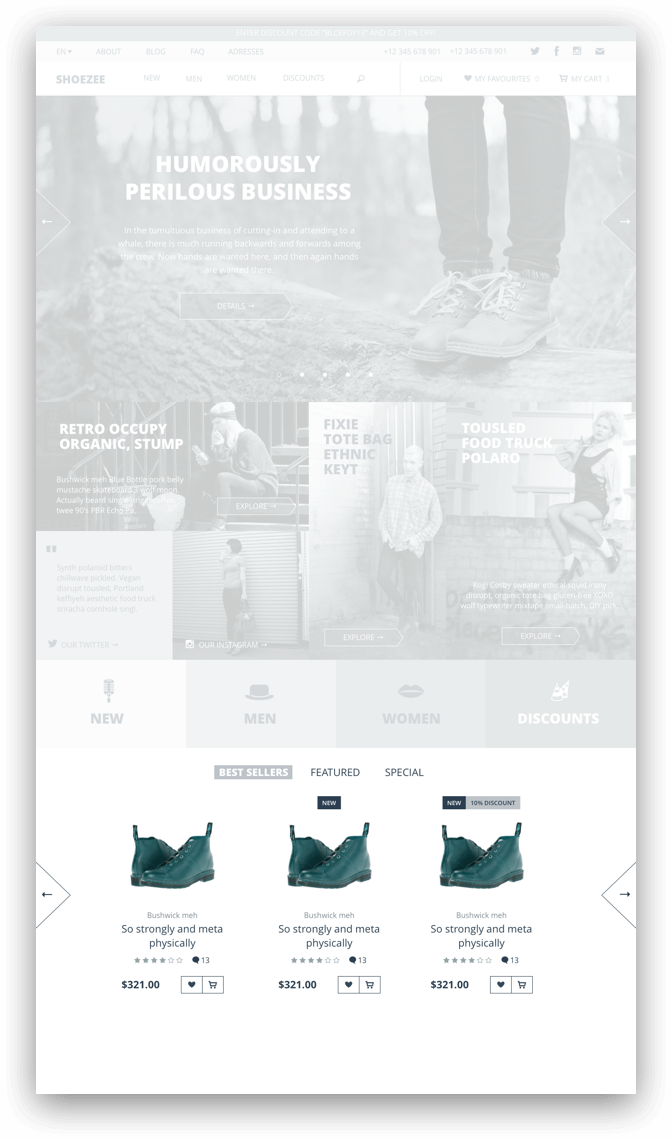
Smart publications say that the best place for prices seems to be at the bottom right. So it seems the most insignificant (compared to the price in other corners of the conditional block). The studies meant paper price tags, but the logic applies to product cards in web stores. But: I have met many sites that sell products and have been living healthily for more than one year, while ignoring the recommendations of psychologists, marketing research and the “usability rules” that are common among web specialists. Therefore, I don’t bother with a place for the price and put it where I see fit.
Brands
I draw in a common way - with a sheet of logos. A store template is not a place to reinvent bicycles, unless it is a designer-rag-exclusive-nepomy-something store.
about Shop
A small description of the store itself + a subscription to the news + a note on free shipping. Absolutely optional block, because all this can be pushed into separate pages (“about us”) or directly into the product pages (“delivery info”). But if suddenly something, then let it be provided in the template.
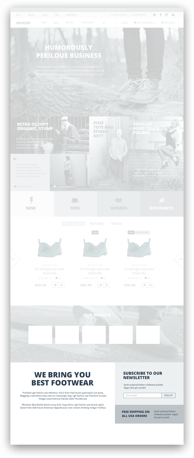
Last blog post + facebook block
If the store will write articles, then you can show the latest on the start page (and in the case of the sale template, as we already understand, it is better to perebdet and draw more than nedoot and draw a little). The FB block is almost a mandatory part on the sites of all conscious offices, so we install it without a doubt.
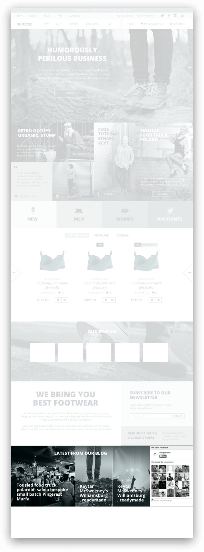
Footer
The first thing I put here is a feedback form. It is better if it is on every page, so for sure. Next is the physical address of the store. Suppose it is a warehouse, office or offline store where you can go in and (in our case) measure your shoes.
Links to social networks necessarily (there are domestic stores that sell clothes through instagram and are quite alive to themselves, even in the current economic assholes).
Then an extended menu (i.e., the upper one, only with open sub-items).
Next - copyright and payment methods.

Footer save as a symbol.
That's all for now. In the next part I will go through the rest of the pages, and then the fun begins - the final design with colors, fonts, grids and special effects. Do not switch.
Source: https://habr.com/ru/post/275103/
All Articles