How to design for people with color blindness
Approximately 8-10% of men and 0.5% of women have some form of color blindness. That is, for every 100 visitors to your site there will be 10 who see colors differently. And how to make sure that your interface is equally accessible to all users? There is a lot of conflicting information on what should be a design for color-blind people. We made a squeeze with the basic principles that should be taken into account in the design in order to achieve color consistency of the interface.
What is color blindness?
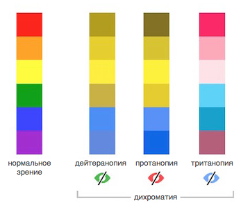
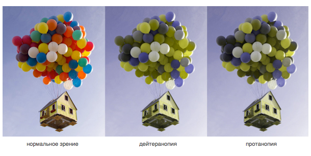
Color blindness is the inability to distinguish certain shades of the spectrum, and men rather than women are susceptible to it, since this disorder arises as a result of the X chromosome mutation. There are 3 main types of color blindness: deuteranopia (green), protanopia (red) and tritanopia (blue). The most common form is deuteranopia, the next is protanopia, and tritanopia at the very end. The picture below shows what a rainbow will look like for people with different forms of color blindness.
')
There are tests for color blindness (links will be at the end) and examples that show how people with color blindness see. But they cannot be 100% reliable.
How to make a design with better color distinguishability?
You might think: “Why should I even be guided by such a narrow group of users?” The fact is that elements suitable for color blind people can be considered well-designed for a wider audience. And if the design of your site is made with high quality, it is suitable for any users.
If you make a design universal, it does not mean that its aesthetic appearance should suffer. Here are 5 basic principles that will help make the layout accessible to color blindness.
1. Use colors and graphics at the same time.
Do not rely only on color to indicate some state. For example, in some forms of color blindness, it is difficult or even impossible to see the usual red error messages. One approach is to use both color and a graphic symbol when you need to attract the user's attention. A good solution is the Facebook form fields and the error message.
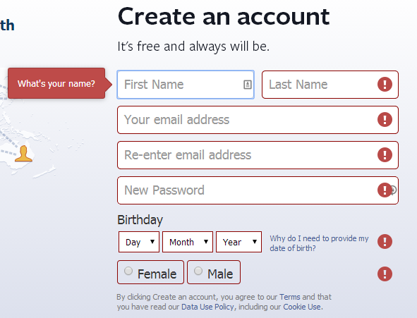
Interesting fact: the Facebook logo and the famous blue color scheme were chosen because Mark Zuckerberg does not distinguish between red and green shades and sees blue best. “Blue is the most intense color for me. I can distinguish any of his shades. ”
2. Choose minimalism
Limit the palette you use for the site. The fewer colors in a design, the better the interface is visible to users with color blindness. Minimalism is not only a trend, but also a useful tool for color distinction.

3. Use patterns and textures to show the contrast.
To highlight the elements, instead of solid colors, use contrasting patterns or textures. For example, users with color blindness may find it difficult to distinguish between graphics. In this case, it would be better to take a contrasting pattern, especially if the color palette is limited.
Here is a good example of creating contrast with a pattern.

4. Use contrasting colors and shades.
You should not rely only on black and white as the only contrasting pair. Have to take a few contrasting colors and shades for your design. For example, when you insert a text link, it is better to select it with a different shade to show the contrast.
The page below is an example of the correct use of contrast. Here, the user with color blindness will understand which item is currently selected.

5. Do not use dangerous color combinations.
You must understand the colors to choose the right combination. Since color blindness is different in different people, it is difficult to determine which colors are “safe” for web design. Here are a few color combinations that should not be used - for color blind, they can be a real nightmare:
Green + Red
Green + brown
Blue + purple
Green + Blue
Light green + yellow
Blue + gray
Green + Gray
Green + black
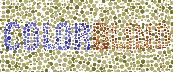
How to find out that you do not have color blindness?
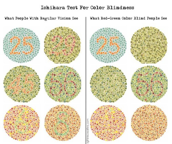
Well ... Many people for years have not been aware of their color blindness, since the consequences of this deviation are quite invisible until someone else points to them. The picture below is usually used as a test for color blindness - try it! (The link to the full test is at the end of the article.)
Still in doubt?
Ishihara test : you pass the test of 38 questions and get the result.
Color Blind Check : an application on Android from Colorblindor, with which you can find out in a minute whether you have color blindness.
Coblis : you upload an image and see how people with different forms of color blindness see it.
Applications : 3 applications for iOS and Android, created specifically for color blind.
Basically, the UX designer creates websites that are comfortable and pleasing to any users. Unfortunately, there is no universal solution that needs to be used in a color blind design, but there are a few principles to consider. Most likely, this will be enough:
- Do not rely only on color to indicate status.
- Limit the color palette to 2-3 colors
- Use texture and patterns to show contrast.
- Use contrasting colors and shades to highlight text links.
- Do not use dangerous color combinations: green with red, green with blue, blue with gray, etc.
PS If you know:
- successful design solutions for color blind
- ways to check the design for color distinguishability
Share links in the comments. Thank you in advance! (approx. translator)
Source: https://habr.com/ru/post/275001/
All Articles