Thematic cartography: one-dimensional maps

Hello!
This is a translation of the second part of the thematic mapping guide from the guys from axismaps .
First part: Thematic cartography: general questions .
I recommend reading to information designers, journalists (data), analysts, novice cartographers, as well as anyone who wants to learn how to read thematic maps and distinguish a good map from a bad one, which misleads the reader. I invite everyone who is interested.
Preface from the translator
There is a lot of material, so I broke it into several parts. The translation preserves the original, “American” style of presentation, when important conclusions are returned several times. Despite the fact that the manual describes only the basic principles of thematic cartography, and some aspects are intentionally simplified, this knowledge will be sufficient to visualize the data in most cases.
')
Choroplets (background cartograms)
When to use
You can use choroplets when your data is (1) assigned to a list of units (districts, provinces, countries), (2) normalized to show levels and ratios (never use a horoplet with raw data), and (3) you have there is a continuous statistical coverage, that is, you can measure the phenomenon at any point in space (zero is also a measurement). For example, the number of people is not a normalized value, therefore it is not suitable for a choropleth; the number of people per square kilometer is a ratio, and each location has its own value (even if it is zero), therefore it is suitable for a choropleth.
Examples of datasets suitable for choroplets:
- world income tax map by country
- map showing population growth per 100,000 inhabitants
- map showing change in the incidence of skin cancer
- world map showing the percentage of people under 18 by country
- card showing the percentage increase in property value
Causes of prevalence
Horoplety very popular, probably the most common type of thematic maps today. And this is good, which means with a high degree of probability your readers already understand how to use them. One of the reasons for such popularity is that most geodata are collected for specific territories, so we initially divide the world into spatial units, such as districts, counties, and provinces. However, many cartographers do not agree with this situation and believe that horoplets are often used inappropriately, because many phenomena cannot be tied to artificial boundaries. For example, diseases, soil types, demographic indicators do not care about administrative boundaries and postal codes, and rarely when they change dramatically when crossing these human boundaries. On the other hand, tax rates are very much tied to administrative boundaries, so using a choropleth makes sense. The less visualized the phenomenon associated with administrative boundaries, the less sense in the horror.
Not sure whether to use a chopper? Good alternatives are point density cartogram, proportional and graded symbol maps, areal cartogram. In addition, the choropleth requires normalized data, and the listed alternatives can be used with the original data.
Group choropleth (classified)
Below is a 5-grade choropleth using a continuous color scheme (from light to dark) and dividing into equal intervals.

On continuous color schemes, traditionally dark / strong colors are used for larger values. Note that the perception of the choropleth's color scheme also depends on the rest of the map colors, such as the color of the water or the color of the signatures. Border colors (county and state lines on an example) also have a strong influence on the appearance of the map, so experiment with combinations of fill colors and lines. You can even refuse to draw borders, but in this case your readers will find it harder to navigate on the map. For a more detailed study of the topic of using color in thematic cartography, read ColorBrewer materials.
Number of classes
If you are not sure, then create a map with 3–7 data classes . Of course, your goals and the data themselves should influence decision making, for example, the US political map usually has only 2 classes (the well-known maps of red-blue states). Maps showing deviations from the average will also have only 2 classes (below average and above average).
The more classes you use, the more details will be visible on the map (which is good), but this will increase the difficulty of perception of the map and, as a result, the risk of incorrect interpretation of data, since more colors are more difficult to distinguish (and even harder to print such card). The key question is how many details do you want to show? A map with 3 classes / colors will be very easy to read, but it can hide some important aspects of the data from the reader, and at the same time it can create artificial geographic patterns due to the fact that different territories are combined. The only true number of classes for the map does not exist, so experiment.
Not sure how many classes to use? Look at the distribution of your data in the histogram: are there any obvious clusters within your data, are there any large gaps that form natural groups? If so, select the number of classes accordingly.
Classification method
Just as there is no only right amount of classes, there is no only right way to split the data into intervals. Look at the histogram (or scatter diagram) to determine the “shape” of your data. Try to determine values with similar frequencies in one class, and values with strongly differing frequencies should be separated by different classes.

The shape of these histograms can be assumed that 3 or 4 classes would be a good choice.
In the absence of other conclusions, natural “drops / breaks” are a good basis for the formation of intervals.
EQUAL INTERVALS break up data into classes of equal size (for example, 0-10, 10-20, 20-30, etc.) and work best on evenly distributed data. ATTENTION: Avoid using the split into equal intervals, if the histogram shows a clear skew (asymmetry), or there are large outliers. Emissions will produce empty classes, and distortions will lead to a large variation within the classes. Since there are no obvious outliers in hotel data, the use of equal intervals is permissible here.
Quantiles will help create a map with an equal number of observations in each class: if you have 30 regions and 6 data classes, then there will be 5 regions in each class. The lack of quantiles is that they can lead to very different intervals for different classes (for example, 1-4, 4-9, 9-250 ... the last class is huge). Emissions can also divide areas with very close frequencies and lead to the merging of areas with different frequencies, which is highly undesirable, so always look at the splitting on the histogram. ATTENTION: In the example with the data on hotels, the use of quantiles leads to the fact that part of the third cluster falls into the second class, although much closer to observations from the third class.
NATURAL Gaps are in some sense an “optimal” solution because they initially minimize the variation within the classes and maximize the differences between them. One of the drawbacks of this method is that each data set is unique and, accordingly, the partitioning too. This makes it impossible to compare similar maps of different data sets, for example, in map atlases or series of maps showing the dynamics over time. In such cases, it is better to use a different breakdown scheme.
MANUALLY have to set the boundaries of classes in many cases. The reasons may be different: it is necessary to take into account the critical point in the data, make one of the boundaries an average value, make the map a part of a series / atlas (so that the continuity of colors and ranges in the series is preserved). If the splitting of other methods can be improved with minor edits, then do not be afraid to correct them manually.
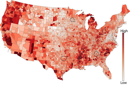
Unclassified choropleth
Unclassified choropleth is an attractive alternative to the traditional classified choropleth, although their qualities have been hotly debated by the cartographer community, over 30 years their advantages and disadvantages have been revealed. They were first proposed by Waldo Tobler in the early 1970s, and supporters of these cards love them for the opportunity to avoid being divided into classes (almost always suboptimal). Critics of traditional, classified choroplets believe that classification is a very powerful way to filter data, able to drown out important details and easily change the perception of a map, while it is often perceived as a given by readers. Unclassified choropleths bypass this problem by allowing “data to speak for themselves,” and even small differences can be identified on the map.
On unclassified choroplets, each unique value receives a unique color. For example, unemployment rates for the 50 US states will be ranked from smaller to larger and located along a continuous color scale (see example below). If, for example, there is a large numerical gap between the states with 3rd and 2nd place in the ranking, then the corresponding gap in colors will also be large.
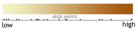
Example of unclassified choropleth
In the example above, notice how easily the overall pattern of unemployment is visible. But at the same time, it is very difficult to compare or rank unemployment rates in different districts: try to rank California counties in ascending order ... it is almost impossible.
Restrictions
There are at least three major flaws in unclassified choroplets. First, although the idea of letting the data speak for itself is very tempting, it often turns out that they have too much to say. Cartographers have long relied on classification to suppress random noise or minor variations and highlight key differences. For example, a very simple choropleth with 2 classes (two colors) will very quickly show areas with unemployment above and below the national average, and more details may not be necessary. Secondly, extensive research shows that users can hardly match colors on an unclassified choroplete with the colors of the legend (scale), since they can contain hundreds of slightly different colors that are easily confused. This makes estimating values very difficult (is Belgium darker than Syria?). Thirdly, unclassified cards with many similar colors are usually of little use for printing, especially on conventional printers. Although the card can use 50 different shades of red, your printer (and perhaps even the monitor) cannot reproduce such diversity. Unfortunately, due to the effect of contrast , even your eyes are not capable of it.
Our recommendations on unclassified choropleth
We use unclassified horoplets when we want to show minimally modified data, when we cannot find an acceptable classification scheme, and when we need to show general geographic patterns. However, we do not use them if it is necessary to clearly read the numbers from the map or carefully compare the locations with each other. If you need to read accurate data from the map, and your map is static and, accordingly, you can not get a value on a click, then it is better to use a classified choropleth.
Our recommendations on classified chopper
We use classified choroplets, when the data correspond to administrative boundaries, it is necessary to show general geographic patterns and make it relatively easy to read specific values from the map. And although the classification introduces subjectivity to our work (after all, there is not the only correct way to classify) and reduces the detailedness of the map, classified choppers are still a very popular and reliable way of representing the world.
Proportional and Graded Character Cards

When to use
Proportional character maps scale the size of a simple character (usually a circle or square) in proportion to the value in this location. The principle is very simple: the larger the symbol, the greater the value of the indicator in this location. The most basic method is to scale the circles in proportion to the data , for example, if the population of Toronto is twice the size of the population of Vancouver, then the symbol of the size of the population for Toronto will have twice the area . However, you can also group observations into categories or numeric ranges (intervals) and create graded character maps . Such maps can, for example, have only three sizes of symbols, corresponding to three categories of cities (cities less than 1 million, 1-4 million and more than 4 million inhabitants). The advantages and disadvantages of both types of cards are discussed in detail below.
Also study the topic of data classification before reading on.
Another note: for two-dimensional symbols, such as circles and squares, it is their area that encodes the data, not their height or length .
How are they good
Proportional character cards are very flexible, because you can use them both with numerical data (income, age), and with ordinal categorical data (small, medium and high bankruptcy risk). They can also be used with both point data and area data.
One of the advantages of proportional character maps over dot density cartograms is that they are much easier to read and extract numbers from the map, since estimating the size of a character is much easier than counting many small points. Unlike a choropleth, character maps can show the value associated with a territorial unit, regardless of the area of this territory. That is, if a small country in size, such as the Netherlands, has a large indicator value, then it will correspond to a large symbol. On horoplets, small territories are easily drowned out by large ones, and countries, like Canada, dominate regardless of their color. Although this is a controversial point, we can assume that proportional symbol maps “allow data to speak for themselves,” since the size of the symbols is directly related to thematic data and is not tied to the geometry of the territory. The latter, unlike choroplets, symbol maps can be used with both raw data (amounts, quantities), and with normalized data (percentages, ratios); choroplets should be used only with normalized data.
Examples of data suitable for proportional symbol maps:
- amount of coffee consumed per capita by country
- earthquake epicenters and magnitudes
- earthquake probability for cities
- population of 50 largest cities in China
An example of a one-dimensional proportional symbol map.
The proportional symbol map above encodes the height above the sea level of California cities: the larger the square, the greater the height. Squares and circles are very convenient, because they are compact, and the simplicity of the form makes it easy to evaluate and compare sizes. Experiment with the fill, stroke and transparency of characters, different options are possible: only fill, only stroke - depending on the importance of the rest of the contents of the map.

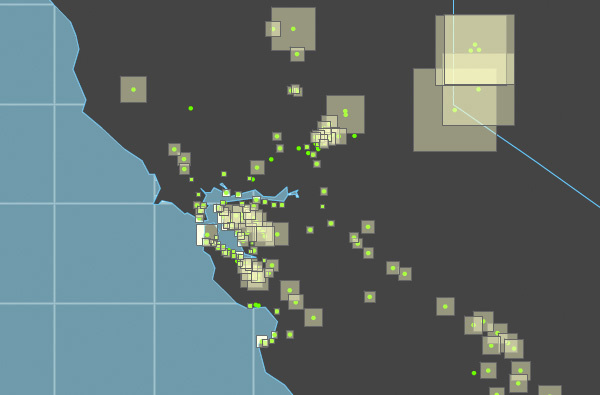
An example of a multidimensional proportional symbol map
One of the advantages of proportional symbol maps is that they are well suited for encoding many variables with one composite symbol (see also the section “One-dimensional maps and multidimensional.” In the example below, we show three different numbers for each US state: the size of a semi-transparent green circle encodes one variable, the size of the opaque circle is the second, and the color of the opaque circle is the third variable.
Experimenting with (1) the sequence of layers, (2) transparency, (3) filling (or its absence) and (4) size, you can create surprisingly rich cards like this one. The main thing is to make sure that the variables that you show it makes sense to show together, in other words, they are linked conceptually or logically. For example, income + duration of training + risk of a heart attack are partially interrelated (correlated), so an interesting multidimensional map can be obtained.
Restrictions
A common problem with proportional symbol maps is overcrowding and overlapping characters, especially if the size range is very large, or if many locations are located close to each other (as on the map of California at the beginning). Using symbol transparency partially solves the problem, allowing overlapping characters to shine through. Another way is the physical movement of characters, placing them manually so that there are no heaps. But this approach increases the risk of the user losing the connection between the symbol and the location (which is much worse than crowding).
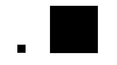
If a small square represents 1000 people, then how many people represent a large one?
The answer may surprise you (answer below)
Another common problem with proportional character maps is that users usually cannot correctly estimate the area of characters . In fact, most of us are terribly bad at it. Extensive studies show that most people systematically underestimate the difference in area, and the greater the difference, the greater the error. In our example, a large square is 36 times larger than a small square, that is, it represents 36,000 people.
Solutions? A carefully designed legend can help, but perhaps it is better to simply classify your data and use only a few discrete sizes of characters, for example, small, medium, large circles, easily distinguishable by size. Summing up the years of research on this topic: the loss of details in the data when grouped by class is compensated by a decrease in map reading errors. Of course, classification introduces an element of subjectivity in our work, because we have to make two interrelated decisions (1) how many classes to use and (2) how to group our data (equal intervals? Natural breaks?).
For further study of the question of grouping and classifying observations, see the Basis for Data Classification section.
Not sure whether to use a proportional symbol map? Possible alternatives include the choropleth (if your data can be normalized), the dot density cartogram, and the areal cartogram.
Our recommendations
Proportional character maps (unclassified data) and graded character maps (classified data) are a very flexible way of representing a wide range of data types. They also sidestep some of the problems of the choreoplets. However, they can also become very congested and crowded characters (hard to read), in which case you can resort to alternatives in the form of choroplets, point density cartograms or areal cartograms, based on your goals, data and audience.
Dot density maps
When to use
Dot density cartograms are simple and very effective in displaying differences in the density of geographic phenomena on a map. This type of map has been popular for 150 years now, because such maps are easy to read and they show clusters or clusters on an intuitive level. There are two main types of point density cartograms: one to one (one point represents one object or indicator) and one to many , on which one point corresponds to many things or values (for example, 1 point = 1,000 acres of sown area).
NOTE: All density point cartograms must use (equal-sized) projections that preserve areas . This is a key point - the use of projection, non-preserving area, will lead to distortions in the perception of density. Equal-conic Albers projection , Sinusoidal projection and Cylindrical equal-projection are good choices in this case.
How are they good
There are at least three serious advantages of point density cartograms over choropleths: (1) on a point cartogram, you can visualize both pure data (without normalization) and frequencies and ratios (normalized data); (2) your data does not need to be tied to any administrative boundaries (except when they were originally linked to territorial units); and (3) dot density cartograms work well in black and white when the use of color is not available.
Examples of data suitable for point density cartograms:
- distribution of representative offices in the region (1 point = 1 representative office)
- earthquake epicenters (1 point = 1 epicenter)
- population by country (1 point = 10,000 inhabitants)
- the number of hectares of uncultivated fertile land (1 point = 500 hectares)
Sample Dot Scatter Chart
Below is a dot density map showing the number of sheep in New Zealand (by province). This map shows that sheep are common everywhere in New Zealand, but sheep are bred more in the eastern part of the islands than in the west.

Restrictions
Although the versatility and simplicity of perception of density dot cartograms is tempting, they have one fundamental flaw: they are terrible for extracting accurate values from a map. For example, few people will count hundreds (or thousands) of points to find out the exact number of sheep in New Zealand. By comparing the territories on the map, you can easily find out in what places the number of sheep is greater, but you cannot figure out how much more it is. To solve this problem, you can add values directly to the map or accompany the map with a table.
Also, although most point density cartograms distribute points randomly, there is a chance that readers may perceive the location of the point literally (as the exact location of the phenomenon). To avoid this, do not do point cartograms on too large scales. Further, in order to avoid misconceptions, the points should be distributed only in areas where the phenomenon actually exists (for example, there should not be points in the lakes on the population density map).
Not sure whether to use dot density cartogram? Possible alternatives include a horoplet (if your data can be normalized), a graded / proportional symbol map, and an area cartogram.
Point size and point value
On the map of New Zealand above, one dot represents 27,500 sheep, this correspondence is called the point value of the map. How much one point should represent, you define yourself, and there is no one correct solution. Experiment with the value and strive for balance when the most rarefied areas are denoted by several points, and in the densest areas, the points barely start to stick together. , — , . , , . : , , .
. , .
: , , , . , , .
, , (Arthur Robinson) ( ), . , . , , .
. , , — . , . , , , , (, ), : . , , .
, . , . , , .
( !) , , , , (), . , , . , .
. , ( ). , ( ). . , , , . .

#1
( ), . , , , , .: , .
#2
, , «» «». / , , . , , , . , , .
: , , .
? , .
, . , (, , ), . , , «» - . , , .
Axis Maps . : Creative Commons Attribution-NonCommercial 4.0 International License .
: KoGor. Creative Commons Attribution-NonCommercial 4.0 International License .
Source: https://habr.com/ru/post/274937/
All Articles