Happiness chart with python, pandas and matplotlib
Winter is truly a wonderful time of the year. But it is in winter that I always think about getting up and leaving for work, and then returning from work without seeing the sunlight. Today I wanted to visualize the data on the rising and setting of the sun and correlate it with the routine of the day (working hours and waking time), which is so usual for many people. For work we will use Python (pandas + matplotlib). Let's see what came of it.
First we need data that can be visualized. I found a suitable set here . On the page we see two tables containing data on the date, sunrise and sunset, the zenith and the duration of daylight hours, as well as data on civilian, navigational and astronomical twilight. For work, we need time of sunrise and sunset, information about civilian twilight, and, of course, the date that we can present on the timeline.
For convenience, create a project folder / sumerki, inside it, create a folder / input and application script sumerki.py. In the input folder, we put 2 files sumerki_1.txt and sumerki_2.txt, where we just copy the tables from the site. The first rows of the tables look like this:
')
  January 1 09:00:39 12:33:54 16:07:09 07:06:29 +1: 16
 08:14:08 07:25:39 06:40:27 18:27:20 17:42:09 16:53:40
Data from external sources is quite enough for us, now it remains to indicate wakefulness time and working time. Without further ado, I decided to take the following time intervals: 07:00:00 - 20:00:00 to be awake and 09:00:00 - 18:00:00 work day.
The structure is clear. Let's now have some Python code.
First, we will do all the necessary imports and make small adjustments.
import os import datetime import pandas as pd import matplotlib.pyplot as plt import matplotlib.dates as mdates from matplotlib import rc # def stn(dstr): return mdates.datestr2num(dstr.tolist()) # matplotlib font = {'family': 'Verdana', 'weight': 'normal'} rc('font', **font) DIR = os.path.dirname('__File__') Let's form data in pandas (at the output we get 2 data frames with which we will work - S, W):
# s1 = open(os.path.join(DIR, 'input', 'sumerki_1.txt'), 'r').read().split('\n') s2 = open(os.path.join(DIR, 'input', 'sumerki_2.txt'), 'r').read().split('\n') oday = datetime.datetime.strptime('01.01.2016', '%d.%m.%Y') dates = [oday + datetime.timedelta(days=dt) for dt in range(len(s1))] # (0, 24) s = [[dates[i[0]]] + s1[i[0]].split('\t') + s2[i[0]].split('\t') + ['00:00:01', '23:59:59'] for i in enumerate(s1)] columns = ['datetime', 'date', 'voshod', 'zenit', 'zahod', 'dolgota', 'cng', 'sum1_from', 'sum2_from', 'sum3_from', 'sum3_to', 'sum2_to', 'sum1_to', '0', '24'] S = pd.DataFrame(s, columns=columns) # , / () w = [[dt, '07:00:00', '09:00:00', '18:00:00', '20:00:00'] for dt in dates] columns = ['datetime', 'life_from', 'work_from', 'work_to', 'life_to'] W = pd.DataFrame(w, columns=columns) Now we just have to display all the data obtained on the graph. For convenience, I tried to pick colors - yellow for the daylight, orange for twilight, and bluish with the stars for the dark.
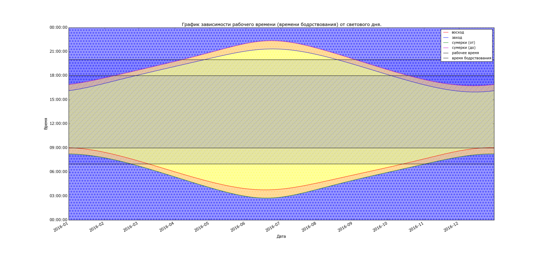
# fig, ax = plt.subplots() plt.gca().xaxis.set_major_formatter(mdates.DateFormatter('%Y-%m')) plt.gca().xaxis.set_major_locator(mdates.MonthLocator()) plt.gcf().autofmt_xdate() # l1, = ax.plot(S['datetime'], stn(S['voshod']), 'r-', label='') l2, = ax.plot(S['datetime'], stn(S['zahod']), 'b-', label='') l3, = ax.plot(S['datetime'], stn(S['sum1_from']), 'g-', label=' ()') l4, = ax.plot(S['datetime'], stn(S['sum1_to']), 'm-', label=' ()') l5, = ax.plot(W['datetime'], stn(W['work_from']), 'k-', label=' ') l6, = ax.plot(S['datetime'], stn(W['work_to']), 'k-', label=' ') l7, = ax.plot(S['datetime'], stn(W['life_from']), 'k-', label=' ') l8, = ax.plot(S['datetime'], stn(W['life_to']), 'k-', label=' ') # # - plt.fill_between(S['datetime'].tolist(), stn(S['voshod']), stn(S['zahod']), alpha=0.4, color='yellow', hatch='.') # C plt.fill_between(S['datetime'].tolist(), stn(S['sum1_from']), stn(S['voshod']), alpha=0.4, color='orange', hatch='.') plt.fill_between(S['datetime'].tolist(), stn(S['zahod']), stn(S['sum1_to']), alpha=0.4, color='orange', hatch='.') # plt.fill_between(S['datetime'].tolist(), stn(S['0']), stn(S['sum1_from']), alpha=0.4, color='blue', hatch='*') plt.fill_between(S['datetime'].tolist(), stn(S['sum1_to']), stn(S['24']), alpha=0.4, color='blue', hatch='*') # plt.fill_between(W['datetime'].tolist(), stn(W['work_from']), stn(W['work_to']), alpha=0.1, color='blue', hatch='/') plt.fill_between(W['datetime'].tolist(), stn(W['life_from']), stn(W['life_to']), alpha=0.1, color='blue', hatch='/') # , ax.yaxis_date() ax.xaxis_date() ax.set_xlabel("") ax.set_ylabel("") plt.title(' ( ) .') plt.legend(handles=[l1, l2, l3, l4, l6, l8], loc=1, fontsize=11) fig.autofmt_xdate() # plt.show() UPD (01/13/2016)
At the request of myxo, I cite several graphs for different latitudes. In the original article schedule Moscow (UTC +3).
Kaliningrad (UTC + 2)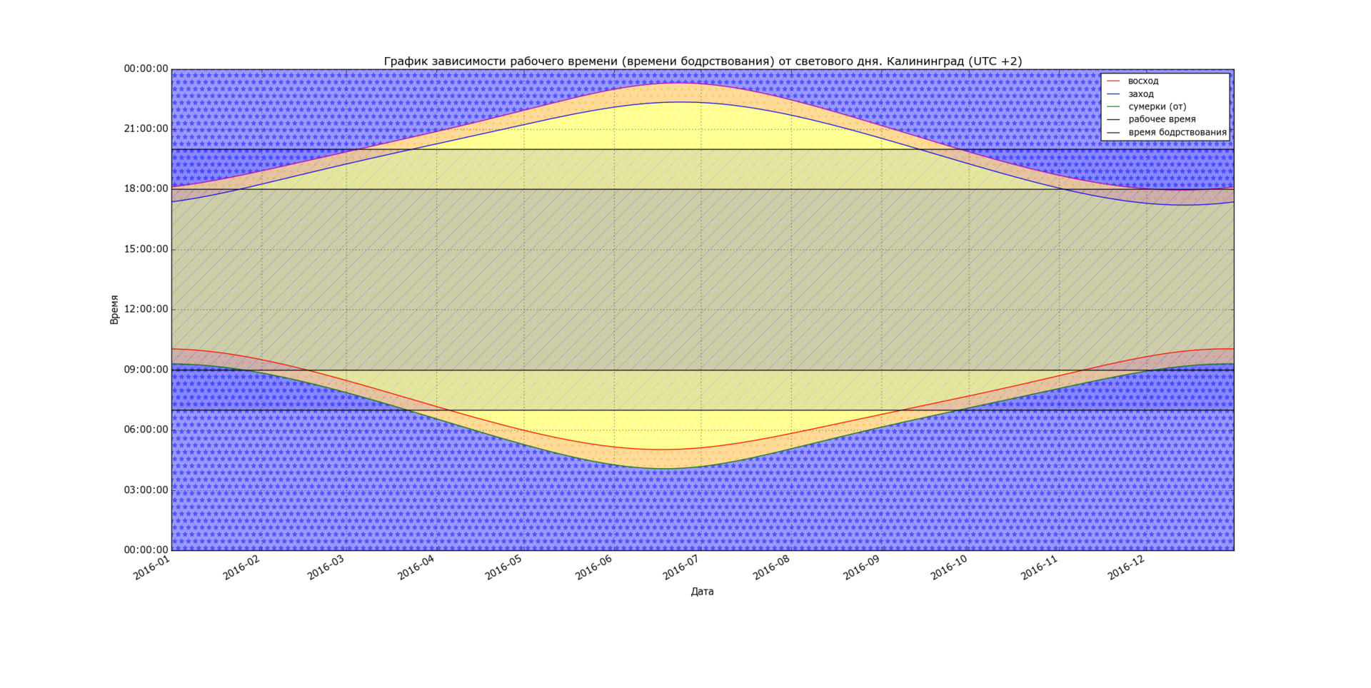
St. Petersburg (UTC + 3)
Yekaterinburg (UTC + 5)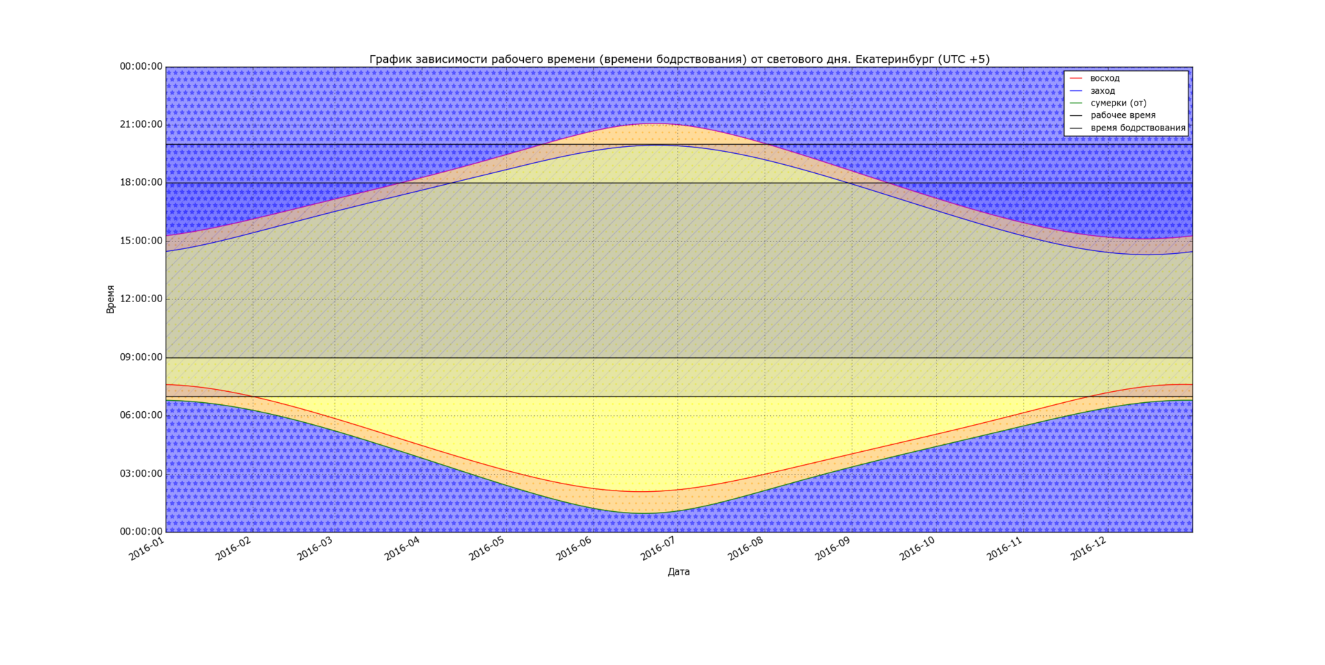
Novosibirsk (UTC + 6)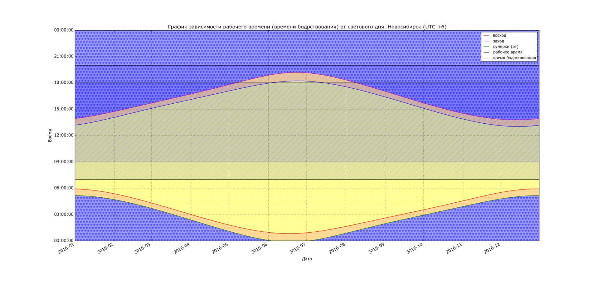
Looking through these graphs, the conclusions suggest themselves:
- The east is the city, the earlier it gets light and darker before
- The north is the city, the more extended daylight
Along with the conclusions come and thoughts about which city is more suitable for a person. For example, I am impressed by Yekaterinburg most of all - it’s very nice to get up during the whole year at the already bright time of the day, especially if you have a habit of getting up early, like mine. St. Petersburg, beloved by me, has its own charm, which impresses me not only with its “white nights”, but also with its atmosphere and its incomparable charm.
Thank you for your attention and comments!
Source: https://habr.com/ru/post/274927/
All Articles