Custom rounded view
Introduction
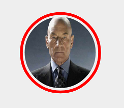
Nowadays there are many users on whose mobile devices the Instagram application is installed. In this application, there is a great feature - share your favorite image. And when choosing a user to whom we wish to send to the post we liked, we see a rounded avatar, with a click on which the animation is displayed and the selection is made. I wanted to repeat the implementation of this element.
First stage
Create a new class, the heir of android.widget.ImageView.
public class MyView extends ImageView { public MyView(Context context, AttributeSet attrs) { super(context, attrs); } } Create an init () method in which we initialize Paint objects to draw graphic objects.
public MyView(Context context, AttributeSet attrs) { super(context, attrs); init(); } private void init() { redBorder = new Paint(); redBorder.setAntiAlias(true); redBorder.setColor(Color.RED); redBorder.setStrokeWidth(redStrokeWidth); redBorder.setStyle(Paint.Style.STROKE); imgPaint = new Paint(); imgPaint.setAntiAlias(true); imgPaint.setFilterBitmap(true); imgPaint.setDither(true); } The Paint redBoard object is responsible for drawing the red frame, which will be displayed when selected. The setAntiAlias (true) flag provides anti-aliasing. Then set red color (setColor (Color.RED)), setStrokeWidth (redStrokeWidth) outline width, redStrokeWidth normal variable (private int redStrokeWidth = 10;) and set the setStyle drawing style (Paint.Style.STROKE) to draw the outlines of the graphic primitive.
')
The Paint object imgPaint is responsible for rounding the user's avatar. The setFilterBitmap (true) flag states that filtering will affect the bitmap during transformation. The setDither (true) flag is used to smooth the colors, allows to reduce visual artifacts.
Image conversion
We receive the image over which we will do all necessary transformations.
@Override protected void onSizeChanged(int w, int h, int oldw, int oldh) { super.onSizeChanged(w, h, oldw, oldh); decrement = (w * decrementFactor)/100; bitmapPosition = decrement /2; Drawable drawable = getDrawable(); if (drawable != null) { Bitmap bitmap = ((BitmapDrawable)drawable).getBitmap(); roundBitmap = getRoundedCroppedBitmap(bitmap, getWidth() - decrement); } else { Bitmap bitmap = BitmapFactory.decodeResource(getResources(), R.mipmap.ic_launcher); roundBitmap = getRoundedCroppedBitmap(bitmap, getWidth() - decrement); } } Since when selecting, you need to draw a red frame and an indent from the image, enter the variable decrementFactor which, as in this case, will be 15% of the entire size of the element (private int decrementFactor = 15;). Those. the element itself has the size w, and the image inside it will be 15% smaller. We also calculate the value for the bitmapPosition variable, which will be used when positioning the image. We carry out checking for the presence of the image. If the image is set, do the transformations above it (getRoundedCroppedBitmap () method) otherwise, take the logo.
The getRoundedCroppedBitmap () method is responsible for image rounding.
private Bitmap getRoundedCroppedBitmap(Bitmap bitmap, int radius) { Bitmap finalBitmap = bitmap.createScaledBitmap(bitmap, radius , radius, false); Bitmap output = Bitmap.createBitmap(finalBitmap.getWidth(), finalBitmap.getHeight(), Bitmap.Config.ARGB_8888); Rect rect = new Rect(0, 0, output.getWidth(), output.getHeight()); Canvas canvas = new Canvas(output); canvas.drawCircle( finalBitmap.getWidth() / 2, finalBitmap.getHeight() / 2, finalBitmap.getWidth() / 2, imgPaint); imgPaint.setXfermode(new PorterDuffXfermode(PorterDuff.Mode.SRC_IN)); canvas.drawBitmap(finalBitmap, rect, rect, imgPaint); return output; } Using the createScaledBitmap () method, we change the size of the image, based on the scaled image, we create a new one, which will be the result of the work of the method. Create a rect object Rect, on the basis of which we will draw bitmap. We get a canvas, paint a circle and change the Xfermode mode for the Paint object, which affects the way new colors are superimposed over the ones already drawn.
Those. we changed the size of the image to the one we need. We drew a circle above this image and superimposed a circle on the image, saying that what is included in the circle will be visible.
Draw the resulting element:
@Override protected void onDraw(Canvas canvas) { canvas.drawBitmap(roundBitmap, bitmapPosition, bitmapPosition, null); if (imgSelected) { canvas.drawCircle(getWidth() / 2, getHeight() / 2, getWidth() / 2 - redStrokeWidth, redBorder); } } In order for our element to start responding to clicks, let's redefine the method:
@Override public boolean onTouchEvent(MotionEvent event) { switch (event.getAction()) { case MotionEvent.ACTION_DOWN: Animation scale = AnimationUtils.loadAnimation(getContext(), R.anim.scale); startAnimation(scale); break; case MotionEvent.ACTION_UP: imgSelected = !imgSelected; invalidate(); Animation scale2 = AnimationUtils.loadAnimation(getContext(), R.anim.scale_2); startAnimation(scale2); break; } return true; } When pressed, we will slightly reduce the element. Load the xml file in which the animation is described to reduce:
<scale xmlns:android="http://schemas.android.com/apk/res/android" android:fromXScale="1.0" android:toXScale="0.9" android:fromYScale="1.0" android:toYScale="0.9" android:duration="200" android:pivotX="50%" android:pivotY="50%" android:fillAfter="true"> </scale> And when the user releases the finger, draw a red frame and slightly increase the element:
<scale xmlns:android="http://schemas.android.com/apk/res/android" android:fromXScale="1.0" android:toXScale="1.1" android:fromYScale="1.0" android:toYScale="1.1" android:duration="200" android:pivotX="50%" android:pivotY="50%" android:fillAfter="true"> </scale> Conclusion
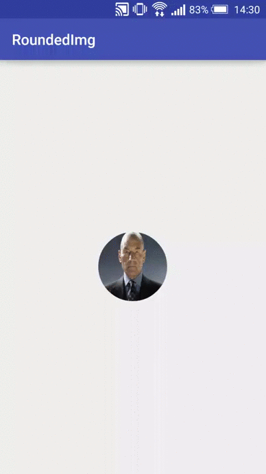
The result is a cute element with simple animation.
The project code is available on git .
I would welcome comments. Thank.
Source: https://habr.com/ru/post/274801/
All Articles