IBDesignable magic or extend Interface Builder functionality in Xcode
The interface builder in Xcode saves me a lot of time in working with the standard layout of interface elements and sometimes helps with the prototyping task. Since version 6, Xcode has added the ability to render custom views marked with the IBDesignable attribute, as well as the display of class fields marked with the IBInspectable attribute in the builder.
Since Xcode 7, this feature has become more or less possible to use, so I wanted to test its capabilities.
')
You can read about IBDesignable / IBInspectable here and here .
Standard case
Let's create a custom button with the ability to customize the color, thickness and border radius, moreover, so that all these parameters can be controlled through the Interface Builder.
@IBDesignable class BorderedButton : UIButton { /// @IBInspectable var borderWidth: CGFloat { set { layer.borderWidth = newValue } get { return layer.borderWidth } } /// @IBInspectable var borderColor: UIColor? { set { layer.borderColor = newValue?.CGColor } get { return layer.borderColor?.UIColor } } /// @IBInspectable var cornerRadius: CGFloat { set { layer.cornerRadius = newValue } get { return layer.cornerRadius } } } extension CGColor { private var UIColor: UIKit.UIColor { return UIKit.UIColor(CGColor: self) } } 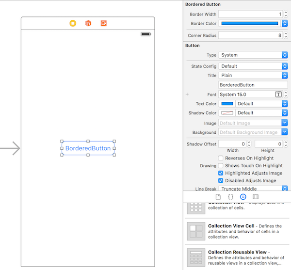
Everything works, the builder updates the render when the parameters change.

But after all such parameters probably can be not only at our class of a button, and at any other buttons. Why not make an extension to the base class UIButton.
extension UIButton { /// @IBInspectable var cornerRadius: CGFloat { set { layer.cornerRadius = newValue } get { return layer.cornerRadius } } /// @IBInspectable var borderWidth: CGFloat { set { layer.borderWidth = newValue } get { return layer.borderWidth } } /// @IBInspectable var borderColor: UIColor? { set { layer.borderColor = newValue?.CGColor } get { return layer.borderColor?.UIColor } } } Let's create IBInspectable fields of the custom button class, since they are already registered in the extension. As a result, the class will remain empty.
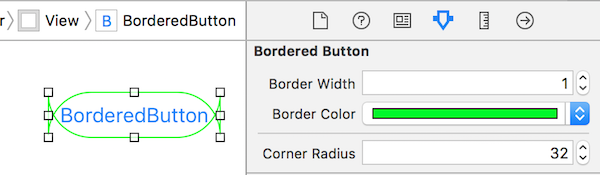
@IBDesignable class BorderedButton : UIButton {} Add another button next to our custom button, but we will not assign it a class (it will be a standard UIButton).
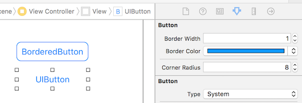
As can be seen from the result, Interface Builder retains the ability to enter IBInspectable fields even for the UIButton base class, but does not render it, since it is not marked with the IBDesignable attribute.
We expand further
Similarly, you can extend the base class UIView.
extension UIView { /// @IBInspectable var cornerRadius: CGFloat { set { layer.cornerRadius = newValue } get { return layer.cornerRadius } } /// @IBInspectable var borderWidth: CGFloat { set { layer.borderWidth = newValue } get { return layer.borderWidth } } /// @IBInspectable var borderColor: UIColor? { set { layer.borderColor = newValue?.CGColor } get { return layer.borderColor?.UIColor } } /// @IBInspectable var shadowOffset: CGSize { set { layer.shadowOffset = newValue } get { return layer.shadowOffset } } /// @IBInspectable var shadowOpacity: Float { set { layer.shadowOpacity = newValue } get { return layer.shadowOpacity } } /// @IBInspectable var shadowRadius: CGFloat { set { layer.shadowRadius = newValue } get { return layer.shadowRadius } } /// @IBInspectable var shadowColor: UIColor? { set { layer.shadowColor = newValue?.CGColor } get { return layer.shadowColor?.UIColor } } /// @IBInspectable var _clipsToBounds: Bool { set { clipsToBounds = newValue } get { return clipsToBounds } } } 
Now the parameters of the layer of any view can be controlled through the builder. To enable live rendering, there is only one condition - the view in the builder must have a custom class with the attribute IBDesignable.
Custom case
Let's say we have light and dark themes in the application. Let's try to stylize the buttons using the enumeration.
/// enum ButtonStyle: String { /// case Light = "light" /// case Dark = "dark" /// var tintColor: UIColor { switch self { case .Light: return UIColor.blackColor() case .Dark: return UIColor.lightGrayColor() } } /// var borderColor: UIColor { return tintColor } /// var backgroundColor: UIColor { return UIColor.clearColor() } /// var borderWidth: CGFloat { return 1 } /// var cornerRadius: CGFloat { return 4 } } Let's write the appropriate extension for the UIButton class, which allows you to select and apply styles to the buttons:
extension UIButton { /// @IBInspectable var style: String? { set { setupWithStyleNamed(newValue) } get { return nil } } /// private func setupWithStyleNamed(named: String?){ if let styleName = named, style = ButtonStyle(rawValue: styleName) { setupWithStyle(style) } } /// func setupWithStyle(style: ButtonStyle){ backgroundColor = style.backgroundColor tintColor = style.tintColor borderColor = style.borderColor borderWidth = style.borderWidth cornerRadius = style.cornerRadius } } Now we add two more buttons to the builder, and in the Style field we prescribe the styles “dark” and “light”, respectively.
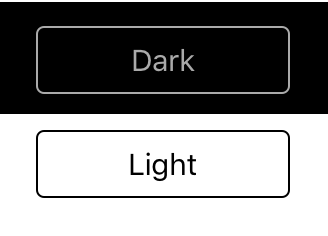

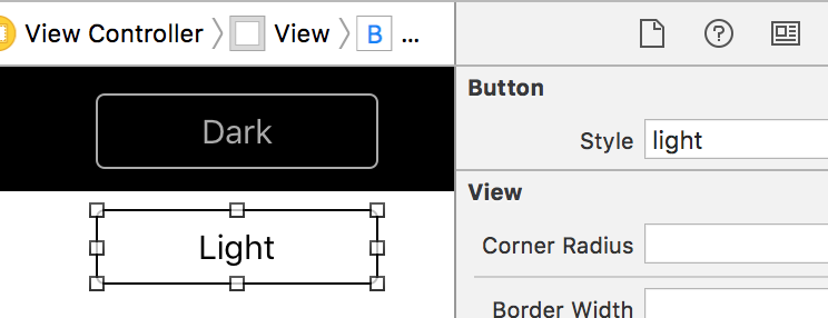
Now we can apply the styles to the buttons with one field in the builder and observe their actual display. If we restrict ourselves only to the first, then we will not even have to create our own IBDesignable class (which is essentially empty). Nothing prevents you from adding a few more styles, as well as expanding the style type and making a dynamic choice of the applied values depending on the class of the view.
Summary
In the article, I did not try to present a new way of stylizing interface elements. However, it is possible that this approach will push someone to another original application of this feature.
Source codes can be found on gita .
Source: https://habr.com/ru/post/274687/
All Articles