WEB-Olivier: a small mix of the dangers and mistakes of the developer
It so happens that 2015 was the first year of the commercial life of our still very young project Bonjoin . Despite the fact that we scored about 85 000000 partners who completed most of the orders, it is clear that we grow and grow. We have already talked about some of the throes of development, and today we decided to make an old New Year post about cones of web developers: as popular and inevitable as the Olivier on our New Year's tables. Some of them we stuffed ourselves, some carefully collected from familiar and not quite familiar developers. In the best traditions of the preparation of the not yet fully gone away New Year's mood, we will tell about everything in a row, at odds with the comics that we translated specially for the occasion. In general, help yourself!
No validation of user input on the site. As a rule, frameworks initially deliver such checks, but here lies the danger - the developer’s approach can be formal. In addition, the algorithm for checking the framework may be well known to attackers. Do not be lazy to write extra code to protect your site (portal) from troubles, among which a steady SQL injection holds a strong lead.
Monosyllabic authorization. What is the difference between authentication and authorization? Authentication tells us who logged into the site and with what data (we recognize the user), authorization gives the user the right to perform some actions on the site. Sometimes it happens that the developer provides only authorization, without prior authentication, and this is fraught with the fact that it is not he who hides under the stolen username and password. Consider the mechanism of combining authentication and authorization on the site, and if your web service involves serious work with user data, implement additional user authentication (for example, periodic confirmation of e-mail).
')
If we are talking about fraudsters, another mistake is inattention to security, if payment is provided through the site . Use reliable payment gateways (payment systems or banks), avoid paying through a receipt or into the account of a private wallet. Firstly, an unreliable payment system can be phishing, and secondly, users have become advanced and the use of payment on the principle of "wallet number for payment" dramatically reduces the level of trust in the site.
Poorly predicted site load and future project development plans. This is practically a test of optimism - the developer believes in the project or predetermined him the height of growth. But seriously, at the development stage, many companies do not think about future growth (often due to the rush before a public launch) and, as a result, the site does not even withstand average loads. The same story with scalability - initially illiterately designed web service and database create a narrow framework for the site and in the case of expansion you have to rewrite everything from scratch. Meanwhile, the market is not waiting. Believe me, you can enter the market with a minimum set of functionality, but at the same time have a powerful foundation and develop on it. Our Bondjoyn is exactly the same: we started with a small set of sections and features, but a well-designed backend gives you more flexibility, the ability to quickly release releases and, later on, unleash your hands for both functional content and design changes.

Oddly enough, but many do not think about SEO at the initial stage of development. Maybe earlier, when promoting purchased links, this time saving was justified, but today, with increasing weight of behavioral factors and the role of quality and organization of content, it is better to think about search engine promotion right away. Then, at the stage of creating a website or portal, you can track duplicate content, build the correct site architecture (with maximum ease of navigation for users, not robots), work on download time (this is critical!), Work out the mechanism for returning to the previous page, searching On the site, initially decide the linking issue.
Heavy content is a serious mistake of developers, especially if it has already missed the scale of the future site. Huge photos, videos, heavy background images are certainly beautiful, but their users may not leave when they leave the site, which is slowly loading. As a rule, the site is tested on the local network and there are no issues with uploading a large amount of content. However, despite now the second week of 2016, for many users the connection speeds remain very modest. Add to this the 3G on mobile and tablets - and now you have already lost your segment. So, doing the bells and whistles, remember the users. But at the same time, consider where the content will be placed and whether it is enough, for example, for the numerous user galleries of the capacity of your own server.
Speaking of 3G. Until now, many developers turn a blind eye to the mobile version of the site and completely ignore responsiveness . If you doubt the need to adapt the site for mobile devices, go to any gadget shop and look at the extent of the screen sizes - all these devices are already in the hands of your future customers. There are many models for the responsiveness of web services and practices for creating relevant web applications, there are common ones, there are platform specific ones. From popular and simple, it is probably worth highlighting Twitter Bootstrap, open-source HTML, CSS, JavaScript framework running on all platforms. With it, you get a well-adapted site without unnecessary overhead.
However, you need to adapt not only to the size of the screen, but also to the zoo browsers. Often, developers ignore cross-browser compatibility or refuse to support older versions. If you personally spend 90% of your time in Google Chrome, this does not mean that the others do the same - after launching, this hypothesis is easily verified using Yandex.Metrics and Google Analytics. In fact, there are many opinions that you need to develop for a single browser or only for the most popular ones, but this is not entirely true. Before launching the project, it is necessary to test cross-browser compatibility, and then act according to circumstances: either prescribe the rules of behavior for individual browsers, or exclude unsupported functionality for them. The main thing is not to the detriment of users.

A site can be a business application (for example, for a building materials seller - this is a catalog and price online), it can be part of a business (technical support and sales through the CRM vendor site), or it can be a business itself (media, services, the same Bonjoin ). And if, in the first variant, poor-quality work with the site will lead to the attenuation of one of the sales channels, in the other two it is quite capable of paralyzing the business. Therefore, it is necessary to regard the project as a business, which many people forget.
Invalid project cost. Often, when ordering a website or hoping to make it by employees, companies forget that getting their pages in their domain is the beginning of the journey. Unforeseen and quite ordinary expenses can expect you from the very beginning: the work of a designer, the purchase of photographs and fonts, payment for hosting for media content, SEO-optimization, contextual advertising, etc. Not to mention that the project cost may change due to changes in requirements.
Requirements are also often forgotten. And they are divided into those that are presented to the resource by the business and those that come from the users. The latter may change almost every six months, which means that the cost of potential changes must be laid in the project. Inactivity is a bad ally for a business tied to the Internet or e-commerce. Therefore, be prepared to invest in product development at every stage of its existence. Otherwise, you can lose the market.
Finally, the largest block of risks is the risks associated with usability and site design. There are infinitely many of them and almost no site is complete without its own stories related to incorrect or overly clever design. We consider the most common cases.
The site is popular with the designer and reflects the full measure of his talent. The site should appeal to users and solve its problems. Priority should be given to practical use and usability, and then to designer finds. The interface must meet the needs of visitors and help find the shortest path to the desired information, but overly creative design can confuse the user and take time to search for the desired content.
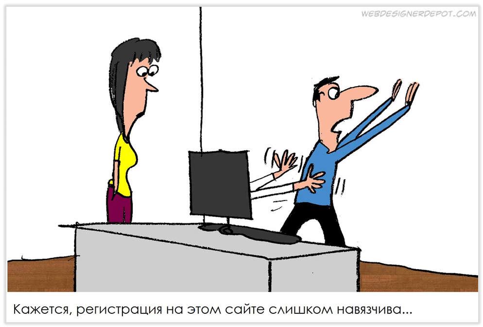
Sophisticated registration forms. Before you embed a form on the site with a couple of dozens of required fields or, kindly, also with a questionnaire, think about what information is truly valuable for you. Usually, after thinking, he begins to miss his name, phone and email. If a purchase from the site is foreseen, the remaining data can be obtained upon registration with the service or during the ordering process. If the fields are required, mark them with a familiar asterisk - they should not be a surprise after filling out the entire form and entering a breathtaking captcha (people need to stay with it too!).
There is no search on the site. If your site has quite a lot of content, then a search on the site is required. To solve this problem, you can use the Yandex API or Google Custom Search - forms are added to several lines of code and solve many problems, including freeing up space from obsolete tag clouds.
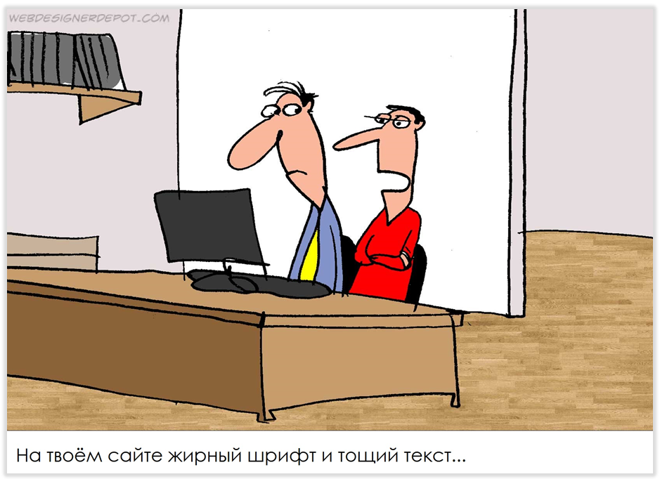
Site is unreadable. If the inspiration for organizing the text obtained in the vast web is not enough for you, refer to the most popular place of residence of the text - books. Pay attention to the division into paragraphs and chapters, layout, initial letters, kerning, and so on. Here and on the site it is worth getting rid of mixing fonts of various types, fancy letters, to avoid games with sizes. Do not forget about color schemes. A couple of proven tips: use Adobe Kuler for testing color schemes, and choose sans serif fonts for sans serif.
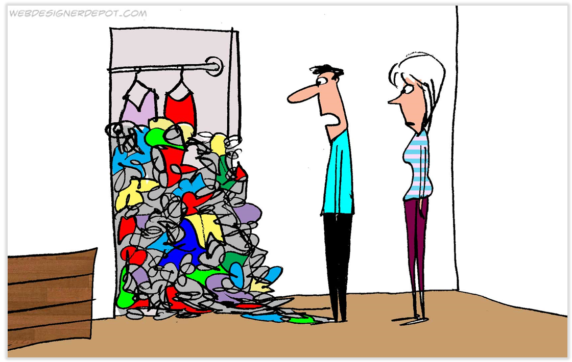
Content is organized illogically, there are hidden blocks. You should not avoid headings, subtitles and paragraphs (if they are needed), get rid of outdated content in time. No need to strive to fill in the text and media with all the volume provided - saving the “paper” on the site always looks stuffy, leave blank spaces for switching attention.
Poor navigation is fraught with not only inconvenience for the user, but also problems with behavioral factors in SEO. It is believed that if the user does not find the information for three clicks, he is likely to leave the site. Links and transitions should be obvious and logical, if there is an insoluble problem of discrepancies, it is better to add a tooltip with a hint to a menu item or link.

Horizontal scrolling is a design solution that has not found itself on the web. It clearly refers to the non-standard behavior of the user and may even confuse an experienced visitor. The recipe is simple: use a horizontal solution, with anchors, scrolls and other effects.
Small, but significant things that should be remembered at the start of any web-project.
It seems that quite obvious things are stated. But they are repeated on various sites with an enviable frequency. We hope that our checklist will help developers who are launching another web-project. The past year for the Bongjoy team was intense and we are happy to share the experience just a few days after it. We wish you successful projects, user-friendly interfaces, smart and beautiful solutions, the right scrolling and the groundwork for growth! Thank you for being with us, scolding, inspiring and changing us. Happy New Year, Habr!
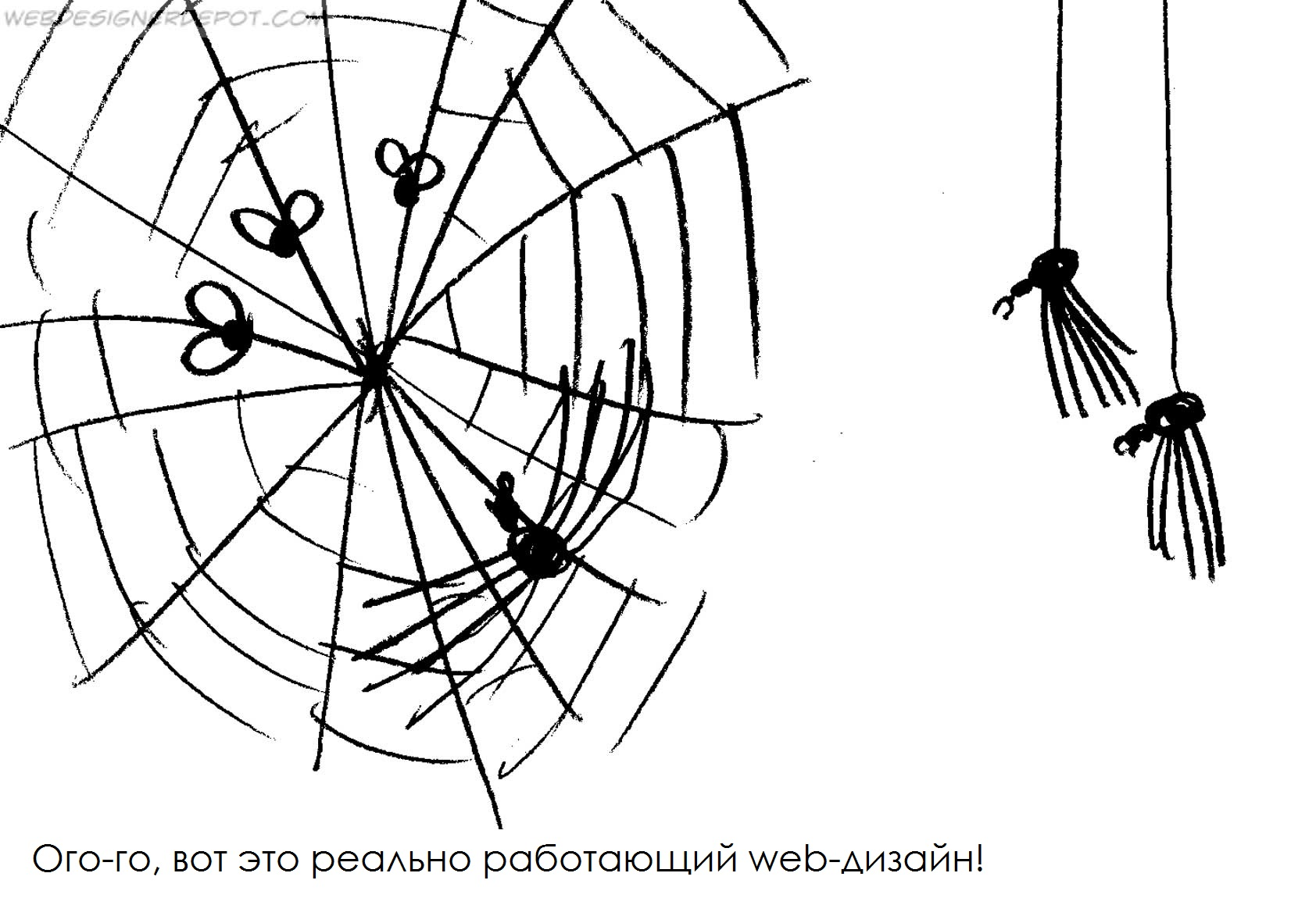
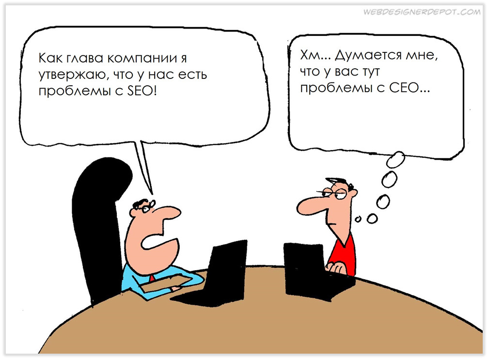
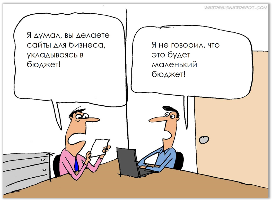
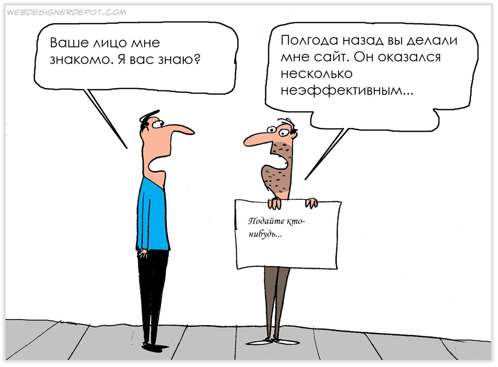
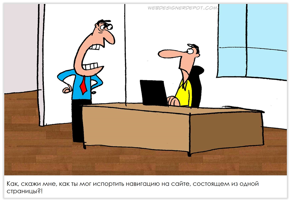
PS: The comics are based on the work of designer Jerry King (Jerry King). If you value humor in English and love web design, you can check out other comics at www.webdesignerdepot.com . Well, in general there is a lot of useful material - just in time for the beginning of the new working year.
User risks
No validation of user input on the site. As a rule, frameworks initially deliver such checks, but here lies the danger - the developer’s approach can be formal. In addition, the algorithm for checking the framework may be well known to attackers. Do not be lazy to write extra code to protect your site (portal) from troubles, among which a steady SQL injection holds a strong lead.
Monosyllabic authorization. What is the difference between authentication and authorization? Authentication tells us who logged into the site and with what data (we recognize the user), authorization gives the user the right to perform some actions on the site. Sometimes it happens that the developer provides only authorization, without prior authentication, and this is fraught with the fact that it is not he who hides under the stolen username and password. Consider the mechanism of combining authentication and authorization on the site, and if your web service involves serious work with user data, implement additional user authentication (for example, periodic confirmation of e-mail).
')
If we are talking about fraudsters, another mistake is inattention to security, if payment is provided through the site . Use reliable payment gateways (payment systems or banks), avoid paying through a receipt or into the account of a private wallet. Firstly, an unreliable payment system can be phishing, and secondly, users have become advanced and the use of payment on the principle of "wallet number for payment" dramatically reduces the level of trust in the site.
Poorly predicted site load and future project development plans. This is practically a test of optimism - the developer believes in the project or predetermined him the height of growth. But seriously, at the development stage, many companies do not think about future growth (often due to the rush before a public launch) and, as a result, the site does not even withstand average loads. The same story with scalability - initially illiterately designed web service and database create a narrow framework for the site and in the case of expansion you have to rewrite everything from scratch. Meanwhile, the market is not waiting. Believe me, you can enter the market with a minimum set of functionality, but at the same time have a powerful foundation and develop on it. Our Bondjoyn is exactly the same: we started with a small set of sections and features, but a well-designed backend gives you more flexibility, the ability to quickly release releases and, later on, unleash your hands for both functional content and design changes.
Oddly enough, but many do not think about SEO at the initial stage of development. Maybe earlier, when promoting purchased links, this time saving was justified, but today, with increasing weight of behavioral factors and the role of quality and organization of content, it is better to think about search engine promotion right away. Then, at the stage of creating a website or portal, you can track duplicate content, build the correct site architecture (with maximum ease of navigation for users, not robots), work on download time (this is critical!), Work out the mechanism for returning to the previous page, searching On the site, initially decide the linking issue.
Heavy content is a serious mistake of developers, especially if it has already missed the scale of the future site. Huge photos, videos, heavy background images are certainly beautiful, but their users may not leave when they leave the site, which is slowly loading. As a rule, the site is tested on the local network and there are no issues with uploading a large amount of content. However, despite now the second week of 2016, for many users the connection speeds remain very modest. Add to this the 3G on mobile and tablets - and now you have already lost your segment. So, doing the bells and whistles, remember the users. But at the same time, consider where the content will be placed and whether it is enough, for example, for the numerous user galleries of the capacity of your own server.
Speaking of 3G. Until now, many developers turn a blind eye to the mobile version of the site and completely ignore responsiveness . If you doubt the need to adapt the site for mobile devices, go to any gadget shop and look at the extent of the screen sizes - all these devices are already in the hands of your future customers. There are many models for the responsiveness of web services and practices for creating relevant web applications, there are common ones, there are platform specific ones. From popular and simple, it is probably worth highlighting Twitter Bootstrap, open-source HTML, CSS, JavaScript framework running on all platforms. With it, you get a well-adapted site without unnecessary overhead.
However, you need to adapt not only to the size of the screen, but also to the zoo browsers. Often, developers ignore cross-browser compatibility or refuse to support older versions. If you personally spend 90% of your time in Google Chrome, this does not mean that the others do the same - after launching, this hypothesis is easily verified using Yandex.Metrics and Google Analytics. In fact, there are many opinions that you need to develop for a single browser or only for the most popular ones, but this is not entirely true. Before launching the project, it is necessary to test cross-browser compatibility, and then act according to circumstances: either prescribe the rules of behavior for individual browsers, or exclude unsupported functionality for them. The main thing is not to the detriment of users.
Business risks
A site can be a business application (for example, for a building materials seller - this is a catalog and price online), it can be part of a business (technical support and sales through the CRM vendor site), or it can be a business itself (media, services, the same Bonjoin ). And if, in the first variant, poor-quality work with the site will lead to the attenuation of one of the sales channels, in the other two it is quite capable of paralyzing the business. Therefore, it is necessary to regard the project as a business, which many people forget.
Invalid project cost. Often, when ordering a website or hoping to make it by employees, companies forget that getting their pages in their domain is the beginning of the journey. Unforeseen and quite ordinary expenses can expect you from the very beginning: the work of a designer, the purchase of photographs and fonts, payment for hosting for media content, SEO-optimization, contextual advertising, etc. Not to mention that the project cost may change due to changes in requirements.
Requirements are also often forgotten. And they are divided into those that are presented to the resource by the business and those that come from the users. The latter may change almost every six months, which means that the cost of potential changes must be laid in the project. Inactivity is a bad ally for a business tied to the Internet or e-commerce. Therefore, be prepared to invest in product development at every stage of its existence. Otherwise, you can lose the market.
Design Risks
Finally, the largest block of risks is the risks associated with usability and site design. There are infinitely many of them and almost no site is complete without its own stories related to incorrect or overly clever design. We consider the most common cases.
The site is popular with the designer and reflects the full measure of his talent. The site should appeal to users and solve its problems. Priority should be given to practical use and usability, and then to designer finds. The interface must meet the needs of visitors and help find the shortest path to the desired information, but overly creative design can confuse the user and take time to search for the desired content.
Sophisticated registration forms. Before you embed a form on the site with a couple of dozens of required fields or, kindly, also with a questionnaire, think about what information is truly valuable for you. Usually, after thinking, he begins to miss his name, phone and email. If a purchase from the site is foreseen, the remaining data can be obtained upon registration with the service or during the ordering process. If the fields are required, mark them with a familiar asterisk - they should not be a surprise after filling out the entire form and entering a breathtaking captcha (people need to stay with it too!).
There is no search on the site. If your site has quite a lot of content, then a search on the site is required. To solve this problem, you can use the Yandex API or Google Custom Search - forms are added to several lines of code and solve many problems, including freeing up space from obsolete tag clouds.
Site is unreadable. If the inspiration for organizing the text obtained in the vast web is not enough for you, refer to the most popular place of residence of the text - books. Pay attention to the division into paragraphs and chapters, layout, initial letters, kerning, and so on. Here and on the site it is worth getting rid of mixing fonts of various types, fancy letters, to avoid games with sizes. Do not forget about color schemes. A couple of proven tips: use Adobe Kuler for testing color schemes, and choose sans serif fonts for sans serif.
Content is organized illogically, there are hidden blocks. You should not avoid headings, subtitles and paragraphs (if they are needed), get rid of outdated content in time. No need to strive to fill in the text and media with all the volume provided - saving the “paper” on the site always looks stuffy, leave blank spaces for switching attention.
Poor navigation is fraught with not only inconvenience for the user, but also problems with behavioral factors in SEO. It is believed that if the user does not find the information for three clicks, he is likely to leave the site. Links and transitions should be obvious and logical, if there is an insoluble problem of discrepancies, it is better to add a tooltip with a hint to a menu item or link.
Horizontal scrolling is a design solution that has not found itself on the web. It clearly refers to the non-standard behavior of the user and may even confuse an experienced visitor. The recipe is simple: use a horizontal solution, with anchors, scrolls and other effects.
Salt, pepper in the norm
Small, but significant things that should be remembered at the start of any web-project.
- Do not use pictures, carousels, animation, and Flash without need.
- Do not use sound effects on the site, if this is not a direct necessity - it can annoy the user.
- Build advertising blocks and banners organically - if you do not visit your site because of spam overload, you will not earn more.
- Provide a means of playing video and audio, do not leave the user a chance to go to a third-party site.
- Make areas to click on a link or menu item wider: it's easy to miss with your finger and cursor.
- Leave contacts, feedback forms and respond to feedback.
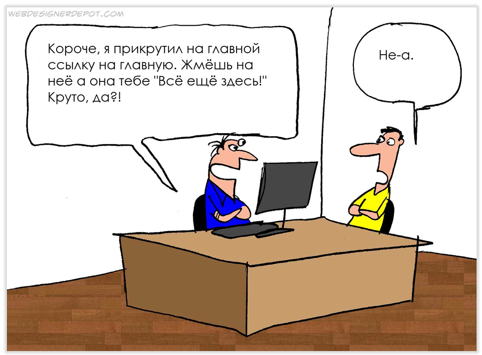
- Do not forget to make the transition to the main page of the site by clicking on the logo or company name on the page.
- Watch out for download speeds.
- Watch the site statistics, especially in the context of the technologies used.
It seems that quite obvious things are stated. But they are repeated on various sites with an enviable frequency. We hope that our checklist will help developers who are launching another web-project. The past year for the Bongjoy team was intense and we are happy to share the experience just a few days after it. We wish you successful projects, user-friendly interfaces, smart and beautiful solutions, the right scrolling and the groundwork for growth! Thank you for being with us, scolding, inspiring and changing us. Happy New Year, Habr!
PS: The comics are based on the work of designer Jerry King (Jerry King). If you value humor in English and love web design, you can check out other comics at www.webdesignerdepot.com . Well, in general there is a lot of useful material - just in time for the beginning of the new working year.
Source: https://habr.com/ru/post/274221/
All Articles