Product Design Digest, December 2015
For five years now I have been publishing regular reviews of fresh articles on the topic of interfaces, new tools and collections of patterns, interesting cases and historical stories. From the tapes of several hundred thematic subscriptions, approximately 5% of the worthwhile publications are selected that are interesting to share. Previous materials: April 2010-November 2015 .

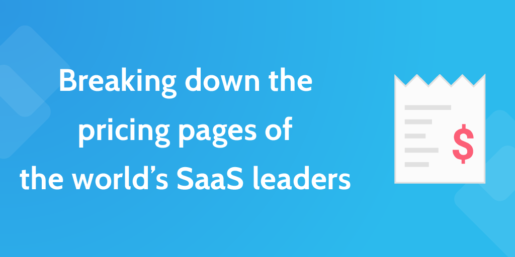
I Analyzed 250 SaaS Pricing Pages - Here's What I Found
Benjamin Brandall walked through the tariffs pages of 250 cloud services and wrote out the main approaches to their creation. The peculiarity of sales to big business is personal negotiations on the conditions, so many do not indicate the price on the site at all.
')
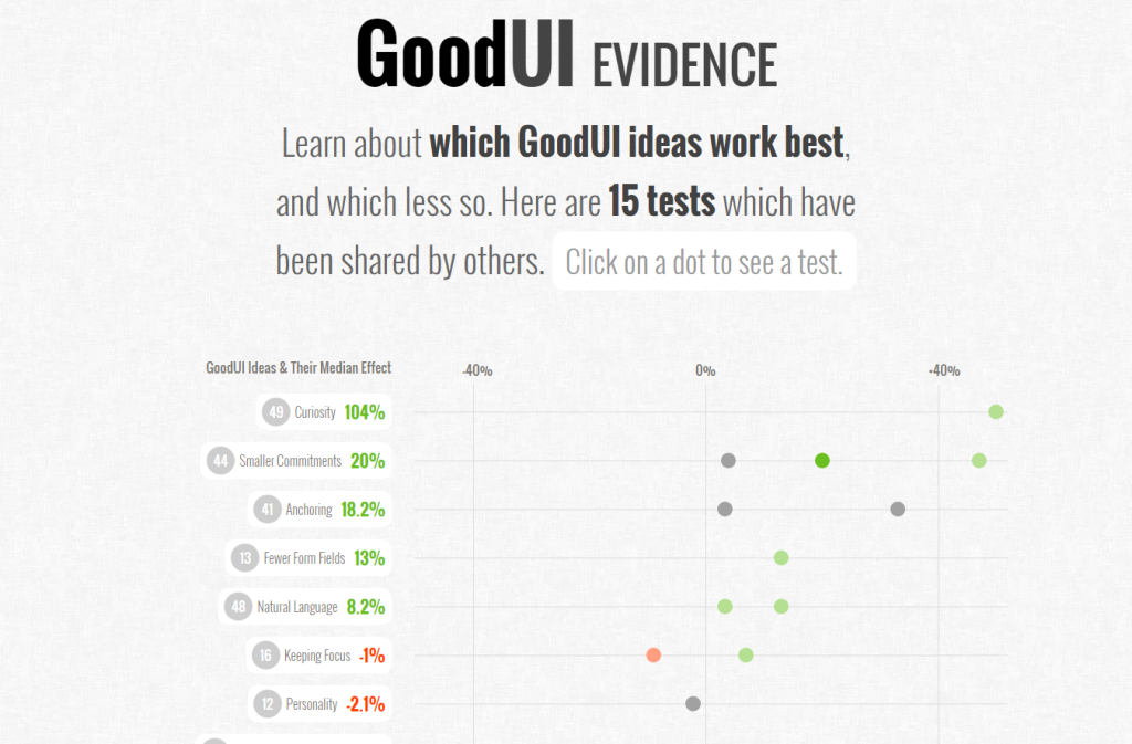
GoodUI Evidence
The authors of the GoodUI project added an excellent dashboard with examples from readers, showing how much specific conversion conversion techniques helped. These are simple examples and descriptions that also work as a collection of heuristics, and now with confirmation of effectiveness.
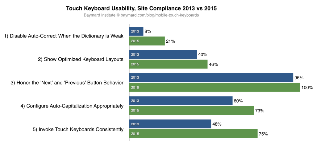
“Touch Keyboard” Implementations Have Improved Just 9% Since 2013 (60% Still Get it Wrong)
Baymard Institute has updated its large-scale research of mobile online stores on input methods. It describes the ideal behavior of the telephone keypad, depending on the input data. Progress for two years is extremely insignificant - the total improvement in usability by 9%.
A little more fresh from Baymard:
Mailing letters

Link Design
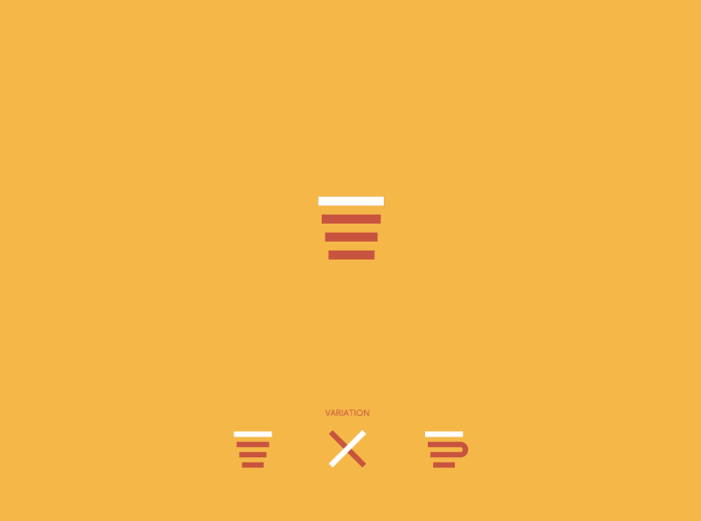
Burger icon
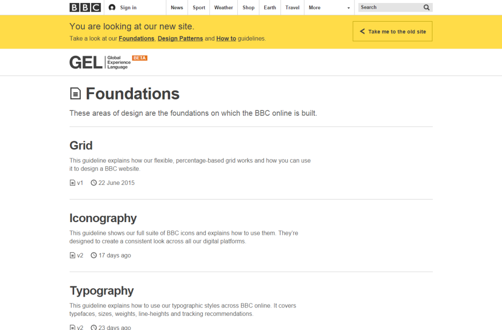
BBC GEL
Apple iOS 9
Material design
Android phone templates

Apple Watch
Design Principles
Unified animation language
Design of state systems
AIC, Artem Geller's Laboratory and SmartTeleMax marked the beginning of an open and systematic work on a radical improvement in state representation and public services on the network. The blog has several posts with useful templates.

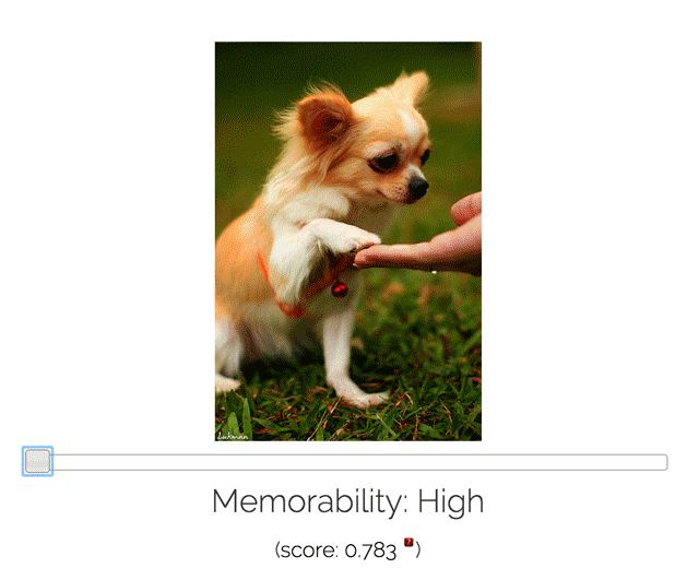
Large-Scale Image Memorability
An interesting MIT study of what a good, catchy illustration means. They provide a tool and API for checking pictures for memorability. A small review .
U mad bro? Researchers measure emotion with your mouse clicks
An interesting study - Brigham Young University studied the movement of the mouse cursor and clicks in order to determine the user's emotions. Found out that people in the angry state are doing less and less accurately.

Interface speed
Micro-moments - Are you designing for them?
Muriel Garreta Domingo on how to use the idea of micro moments from Google in practice. The article has an interesting reference to the study of one of the restaurants, which compared the recordings of surveillance cameras of 2004 and 2014 - the phones delay the process twice.
How to Train Your Human - Designing for Healthier Habits
Another sensible material on the theme of the involvement model of the user Nir Eyal.

Jobs-to-be-done
Design for children
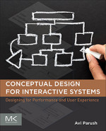 Avi Parush - Conceptual Design for Interactive Systems, 1st Edition
The Avi Parush book "Conceptual Design for Interactive Systems" was published, which is dedicated to conceptual models in interface design and high-level design in general. UXMatters publishes chapter number 9 of it .
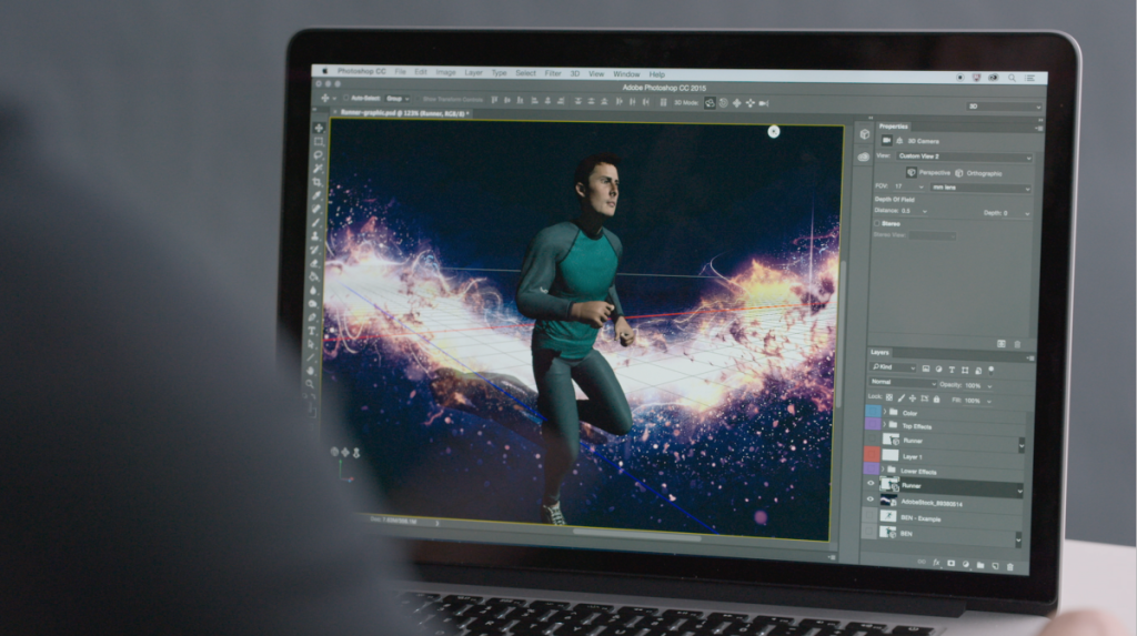
Adobe CC 2015
Figma - The collaborative interface design tool
One of the most interesting prototyping tools that has appeared recently. This is Google Docs for designers - several people can work on the interface at the same time. A small announcement from the authors . A little more about him:
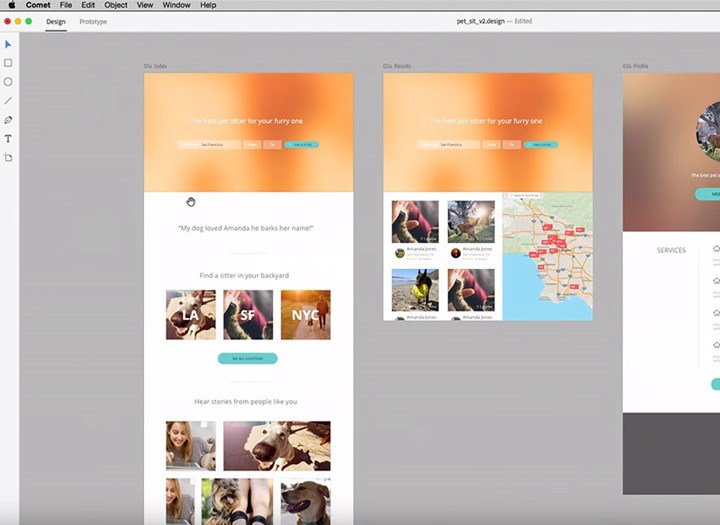
Adobe comet
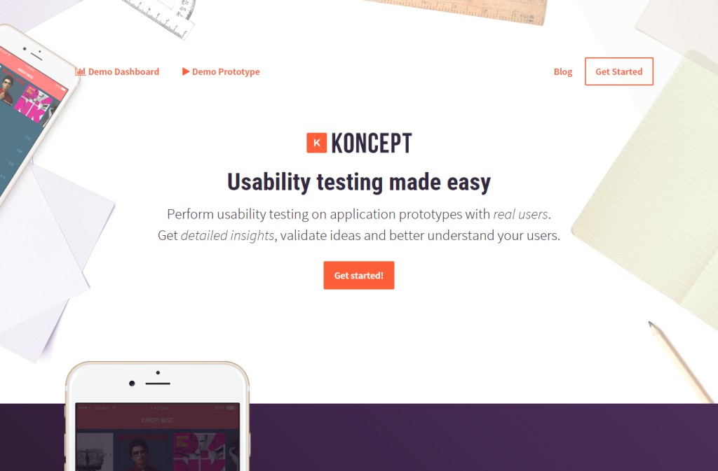
Koncept - Usability testing for real users & High-fidelity application prototypes
The new Koncept tool tries to combine prototyping and usability testing out of the box. About what happens to the prototype after creation, a lot was said at the panel discussion of the Google SPAN conference - this is one of the main directions of development.
Tumult hype pro
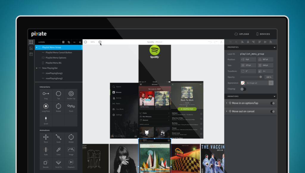
Pixate
Marvel
Sketch
Uxpin
Generators avatars and names
Reviews and comparisons of prototyping tools
Atomic
Holding Off on High Fidelity
Memo team Salesforce to gradually increase the degree of study design from sketches to interactive prototypes.
Publishing Tools
Flawless app
Uncovering user goals with the Episodic Interview
Memo David Travis from UserFocus on conducting user interviews outside the real context of the respondents.
Expert review
Apps Force
Another remote usability service. Web, mobile web, applications.

A Guide To Simple And Painless Mobile User Testing
A little instruction from Colman Walsh on mobile testing with Reflector.
Can You Code This UI Concept?
Recently, concepts with Dribbble and Behance are increasingly turning into real scripts on CodePen and other resources with code examples. The MaterialUp blog has assembled five such pieces. Similar examples:
Pull Down to Refresh (Paper Plane) by Nikolay Talanov ( @suez ) on CodePen .
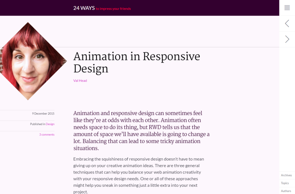
Animation in Responsive Design
Val Head raises another important question about animation on the web - its work in responsive design. She describes two main approaches - revising the logic of the animation for different contexts and rearranging blocks with new triggers.
Live guidelines and component systems
New scripts
Form
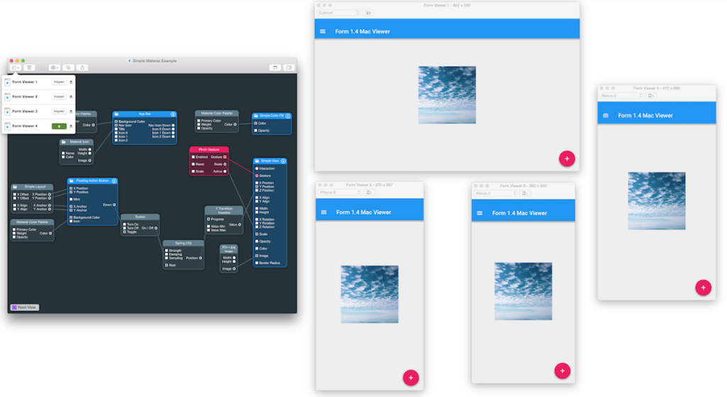
Framer
Webflow

Web typography
Work with color
Work with SVG
Nets
Flexbox
The unluckiest paragraphs
Nick Santos from the Medium team on how ad blockers may mistakenly cut pieces of the interface. He shares experiences on how to avoid problems.
Icon Fonts
An Introduction To PostCSS
Drew Minns story about PostCSS, an alternative to pre-processors for extending the capabilities of basic CSS with JavaScript.
 Jamie Levy - UX Strategy
O'Reilly released the book Jamie Levy "UX Strategy - How to Devise Innovative Digital Products that People Want". UXMatters publishes a piece of the second chapter . In December, Richard Banfield's Design Leadership was also released.
How is your omni-channel content strategy?
Peter Bogaards offers a maturity model for content strategy. An excellent systematic approach to assess the current situation and plan development.
Building a design culture
Getting Back Into The (Right) Deliverables Business
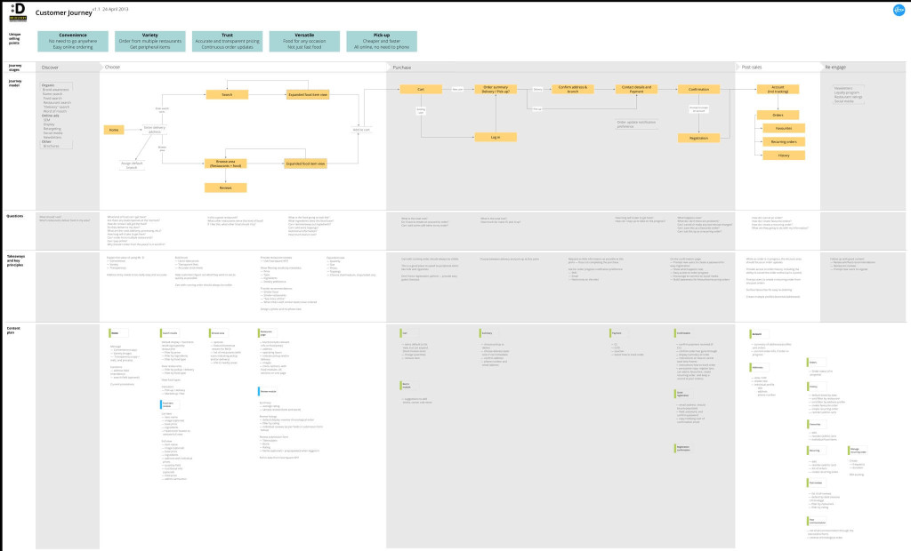
Rian van der Merwe writes that the pendulum of a general rejection of documentation and design artifacts should swing in the opposite direction - instead of reducing the truly redundant specifications, many have completely stopped the pre-project work. He offers two documents that allow you to keep a balance - extended customer journey maps and content structure.
The Next Feature Fallacy (or, the case for simple, working systems)
Joshua Porter talks about the problem of falsely waiting for a “function that will save a product.” Instead of paying attention to the problems in the key mechanics of the service, product managers and designers believe in the saving power of "this missing opportunity here." He advises concentrating on simple working systems (a little more about what he understands by this ).

Road maps
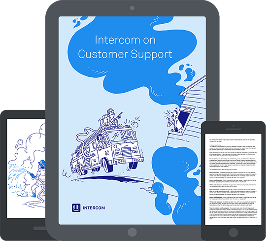
Intercom on Customer Support book
The third book of the Intercom team, dedicated to user support.
Graphic and User Interface Designer
The professional standard “Graphic and User Interface Designer” was approved. Our profession has become much more mature.

Announcement says:
Redesign Cases

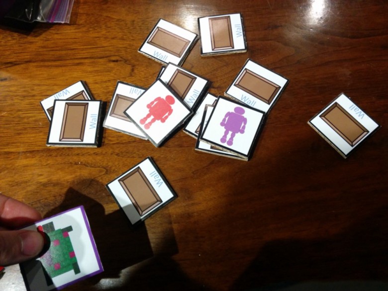
Prototyping Secret Hitler
Max Temkin's story about working on Secret Hitler card game. It is not entirely on the blog, but it contains an interesting selection of prototypes of many well-known card games - very useful.
oldweb.today
Vintage Internet emulator that allows you to see archive sites in retro browsers. True, their server power is weak, it works with delays.

Stories about old sites:
Proceed to Checkout: Ecommerce Started
Shopify shot a video about the history of e-commerce. There are two main options and both from 1994 - Pizza Hut and NetMarket, which sold the Sting CD. Article Fast Company with the material in text form .
Ralph Baer History
Trends 2016
The curators of the site uxdesign.cc analyzed all the links published during the year, and made a forecast for 2016 . Very competent and balanced material, and the most pleasant thing is from people who really understand the interfaces, and not just the visual. Other forecasts:
Why The Great App Unbundling Trend Is Already In Trouble
Fast Company writes that the budding trend did not take off. Carbox and Dropbox's Mailbox recently closed, as well as experimental Facebook apps. At the same time, the new mobile Outlook, which is the classic, fierce universal combine, turned out to be wildly popular. Although this is more of a thoughtless riveting of satellites - the same Foursquare did it good, Facebook Messenger is also doing well.

After that, sensible thoughts of Sebastien Gabriel about closing Mailbox, Carousel, Rooms and other applications that were considered a good example of high-quality design . This is sobering those who believe that quality UX is enough for the success of the product (the same story was with Path) - this is an important, but not the key part.
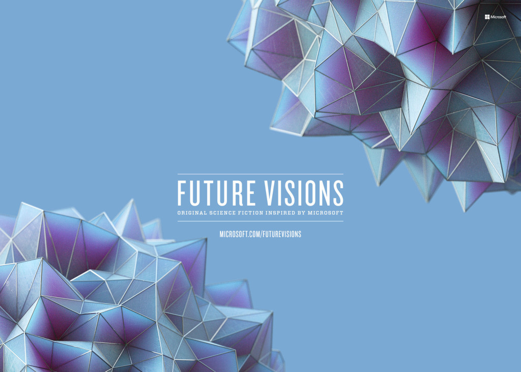
Microsoft Future Visions
Microsoft launched the Future Visions mini-site dedicated to the vision of the future. This is a series of stories from science fiction writers reflecting on the future of technology. They took as a basis the groundwork of the Microsoft research lab and fantasized about them. At the same time, it’s funny that many of these technologies were inspired by science fiction themselves. An overview of the main topics .
The New Story Of Computing: Invisible And Smarter Than You
Another term in addition to “NoUI”, “anticipatory computing” and “Zero UI” is Cognitive Computing. The essence is approximately the same - less manual control, more than shifting everything onto the shoulders of computers.

Trends in the media
Car Interfaces

Smart watches and bracelets
The virtual reality

Interfaces to the cinema
Microsoft HoloLens
Bulletin "Ergonomist" № 43 (December 2015)
In this issue: articles about the availability of the metro for low-mobile passengers, about ergonomic events in 2015, about Vladimir Mikhailovich Munipov and his contribution to ergonomics, news, annotations of publications on ergonomic themes, successful experience and ergonomic sabotage, and much more.
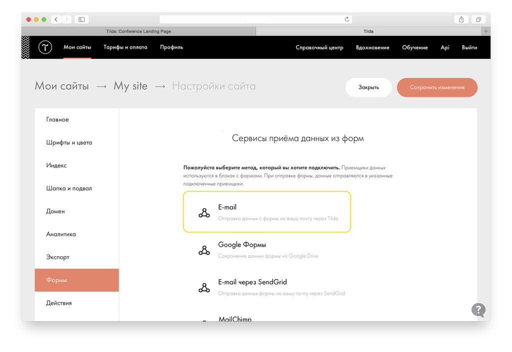
Tilda education
Product Designers
Designing Women
A series of interviews Fast Co Design with women in design. There are already 4 materials about design leaders.
Designers in Venture Funds
Ivan Pupyrev

Fresh links can also be tracked in the Facebook group of the same name or received once a month by mail . Thanks to everyone who also publishes links in it, especially Gennady Dragun, Pavel Skripkin, Dmitry Podluzhny, Anton Artyomov, Denis Efremov, Alexey Kopylov, Taras Brizitsky and Yevgeny Sokolov. More and more materials in reviews appear thanks to them.
Subscribe to the newsletter ! A letter arrives once a month.
Patterns and Best Practices
I Analyzed 250 SaaS Pricing Pages - Here's What I Found
Benjamin Brandall walked through the tariffs pages of 250 cloud services and wrote out the main approaches to their creation. The peculiarity of sales to big business is personal negotiations on the conditions, so many do not indicate the price on the site at all.
')
GoodUI Evidence
The authors of the GoodUI project added an excellent dashboard with examples from readers, showing how much specific conversion conversion techniques helped. These are simple examples and descriptions that also work as a collection of heuristics, and now with confirmation of effectiveness.
“Touch Keyboard” Implementations Have Improved Just 9% Since 2013 (60% Still Get it Wrong)
Baymard Institute has updated its large-scale research of mobile online stores on input methods. It describes the ideal behavior of the telephone keypad, depending on the input data. Progress for two years is extremely insignificant - the total improvement in usability by 9%.
A little more fresh from Baymard:
- In addition to this, they launched a cheat sheet on input fields on mobiles, including code examples .
- Research of ordering interfaces on mobile .
Mailing letters
- Zurb will soon launch the second version of its Foundation for Email framework. Previously, it was called Ink .
- Lauren Smith examines ten important changes in the market of mail clients and their influence on the designers of mailing lists .
Link Design
Burger icon
Guidelines for platforms and companies
BBC GEL
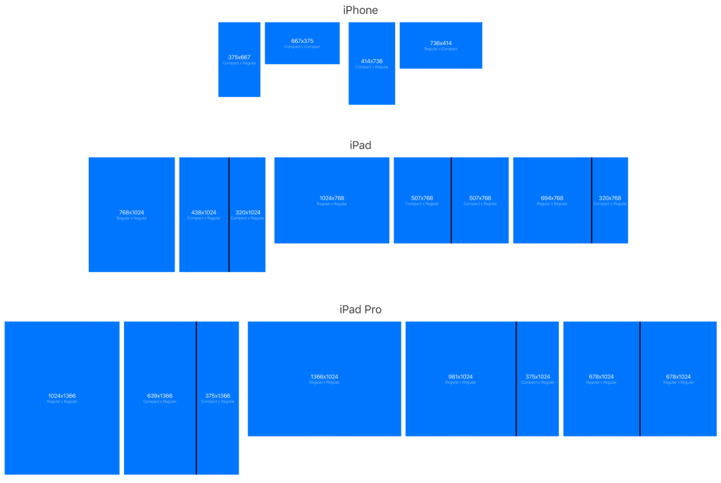
Apple iOS 9
- Luke Wroblewski clearly showed how much more difficult the initial iPhone setup process was .
- Tyler Howarth from the Medium team put together a cheat-sheet-sized area for displaying interfaces on the iPhone and iPad — full-screen and as part of multitasking panels .
- IPhone 6 templates for Photoshop .
Material design
Android phone templates
Apple Watch
Design Principles
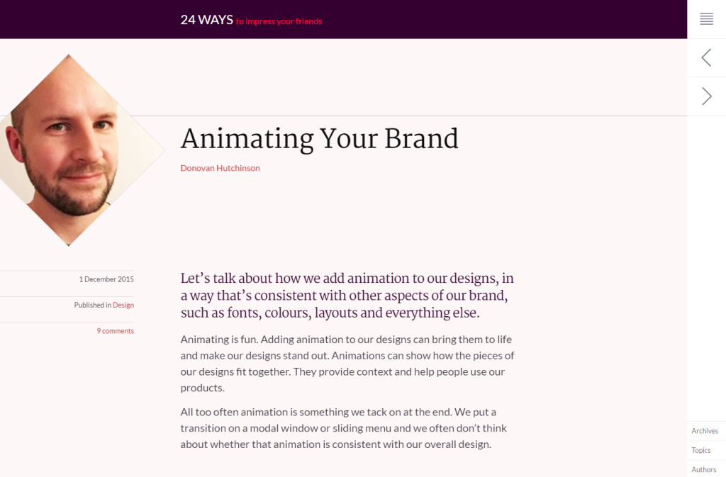
Unified animation language
- Article Donovan Hutchinson on the description of the language of animation and guidelines for it . Explains the need and offers its categorization.
Design of state systems
AIC, Artem Geller's Laboratory and SmartTeleMax marked the beginning of an open and systematic work on a radical improvement in state representation and public services on the network. The blog has several posts with useful templates.
Understanding the user
Large-Scale Image Memorability
An interesting MIT study of what a good, catchy illustration means. They provide a tool and API for checking pictures for memorability. A small review .
U mad bro? Researchers measure emotion with your mouse clicks
An interesting study - Brigham Young University studied the movement of the mouse cursor and clicks in order to determine the user's emotions. Found out that people in the angry state are doing less and less accurately.
Interface speed
- The third part of the article by Denis Mishunov about the speed of the interfaces . He gives 10 principles from psychology that affect the perception of time, and gives advice on the processing of each of them in the interface.
Micro-moments - Are you designing for them?
Muriel Garreta Domingo on how to use the idea of micro moments from Google in practice. The article has an interesting reference to the study of one of the restaurants, which compared the recordings of surveillance cameras of 2004 and 2014 - the phones delay the process twice.
How to Train Your Human - Designing for Healthier Habits
Another sensible material on the theme of the involvement model of the user Nir Eyal.
Jobs-to-be-done
- Luke Wroblewski was at a talk by Bob Moesta, author of the concept of jobs to be done . He outlined the main theses of the story.
Design for children
- The American Academy of Pediatrics conducted a series of studies and suggests that tablets can be used for babies, albeit with caution . It's just part of the modern environment of the house, the continuation of the analog world.
Information architecture, conceptual design, content strategy
Avi Parush - Conceptual Design for Interactive Systems, 1st EditionThe Avi Parush book "Conceptual Design for Interactive Systems" was published, which is dedicated to conceptual models in interface design and high-level design in general. UXMatters publishes chapter number 9 of it .
Design and design of interface screens
Adobe CC 2015
- November update Photoshop CC 2015 . Improved artboards, export to SVG, the development of the touch interface and the Creative Cloud libraries.
Figma - The collaborative interface design tool
One of the most interesting prototyping tools that has appeared recently. This is Google Docs for designers - several people can work on the interface at the same time. A small announcement from the authors . A little more about him:
- Fast Co Design talked to Dylan Field and Evan Wallace, the tool makers .
- On the approach of the tool to work with grids .
Adobe comet
- Latest news about the tool . Began recording on the beta version - you need to pass a small survey . True, initially will be available only for Mac.
- What will be included in the beta version and the first update after it .
Koncept - Usability testing for real users & High-fidelity application prototypes
The new Koncept tool tries to combine prototyping and usability testing out of the box. About what happens to the prototype after creation, a lot was said at the panel discussion of the Google SPAN conference - this is one of the main directions of development.
Tumult hype pro
- Hype 3.5 has been released . And then an educational book came out.
Pixate
- Pixate Studio 2.0 has been released . Acceleration of work, the possibility of using video and audio, many improvements on the interface. But the other day there was a rumor that the instrument was turned off, but in the end it turned out much better than with Form, which the year did not update.
Marvel
- The authors announced Canvas, a new generation of tools with the possibility of design and animation right inside the service .
- A detailed step-by-step guide to creating a prototype in Marvel by Marc Andrew ( translation ). In the first part of the article the same analysis of creating source layouts in Sketch .
Sketch
- Sketch leaves the AppStore and will be distributed and updated from the Bohemian Coding website .
- Plugin to synchronize styles between multiple designers .
- The plugin quickly inserts into the layout of the photo from the stock Unsplash .
- Translation of the complete iOS 9 design guide to Meng To Sketch .
Uxpin
Generators avatars and names
Reviews and comparisons of prototyping tools
- Carol Liao made a very good comparison of seven popular tools for prototyping and animation for different types of tasks . InVision, Pixate, Principle, Form, Origami, Framer, Xcode.
Atomic
Holding Off on High Fidelity
Memo team Salesforce to gradually increase the degree of study design from sketches to interactive prototypes.
Publishing Tools
Flawless app
User research and testing, analytics
Uncovering user goals with the Episodic Interview
Memo David Travis from UserFocus on conducting user interviews outside the real context of the respondents.
Expert review
Apps Force
Another remote usability service. Web, mobile web, applications.
A Guide To Simple And Painless Mobile User Testing
A little instruction from Colman Walsh on mobile testing with Reflector.
Visual programming and browser design
Can You Code This UI Concept?
Recently, concepts with Dribbble and Behance are increasingly turning into real scripts on CodePen and other resources with code examples. The MaterialUp blog has assembled five such pieces. Similar examples:
- Pavel Laptev, a participant of the Russian Design Cup 2015, gathered an animation of his decision . And one more animation from it - the appearance of the menu using CSS3 and the library GSAP .
Pull Down to Refresh (Paper Plane) by Nikolay Talanov ( @suez ) on CodePen .
Animation in Responsive Design
Val Head raises another important question about animation on the web - its work in responsive design. She describes two main approaches - revising the logic of the animation for different contexts and rearranging blocks with new triggers.
Live guidelines and component systems
New scripts
- Jump.js library for soft scrolling .
- An excellent site showing the capabilities of modern browsers and the availability of specific in the current .
- As a CSS function, calc () can replace part of the work of preprocessors .
- Ways of styling sliders in forms .
- Animated map navigation for long-reads .
- Updated JSFiddle .
- How to make the correct tabs in the interface and not screw it up .
Form
Framer
Webflow
Web typography
Work with color
Work with SVG
- The history of the development of the SVG format and the interest of the industry to it .
- Animation using masks .
- An alternative to the SMIL specification for SVG animation, which goes into oblivion .
- Maps of Russia and the world in SVG from the State Systems Design team .
Nets
- Super-compact grid system Gridly .
- Rachel Andrew compares CSS Grid and Flexbox .
- Comparison of Flexbox and Susy by Zell Liew .
Flexbox
- Flexbox Froggy online game for learning how to work with flexbox .
- Heydon Pickering on how to get rid of one element in the last line .
The unluckiest paragraphs
Nick Santos from the Medium team on how ad blockers may mistakenly cut pieces of the interface. He shares experiences on how to avoid problems.
Icon Fonts
An Introduction To PostCSS
Drew Minns story about PostCSS, an alternative to pre-processors for extending the capabilities of basic CSS with JavaScript.
UX strategy and management
Jamie Levy - UX StrategyO'Reilly released the book Jamie Levy "UX Strategy - How to Devise Innovative Digital Products that People Want". UXMatters publishes a piece of the second chapter . In December, Richard Banfield's Design Leadership was also released.
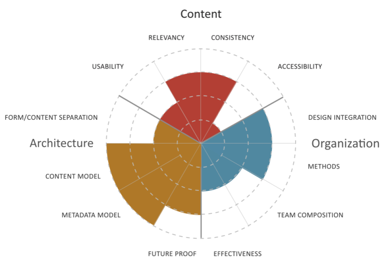
How is your omni-channel content strategy?
Peter Bogaards offers a maturity model for content strategy. An excellent systematic approach to assess the current situation and plan development.
Building a design culture
Getting Back Into The (Right) Deliverables Business
Rian van der Merwe writes that the pendulum of a general rejection of documentation and design artifacts should swing in the opposite direction - instead of reducing the truly redundant specifications, many have completely stopped the pre-project work. He offers two documents that allow you to keep a balance - extended customer journey maps and content structure.
Product management and analytics
The Next Feature Fallacy (or, the case for simple, working systems)
Joshua Porter talks about the problem of falsely waiting for a “function that will save a product.” Instead of paying attention to the problems in the key mechanics of the service, product managers and designers believe in the saving power of "this missing opportunity here." He advises concentrating on simple working systems (a little more about what he understands by this ).
Road maps
- Jared Spool offers the notion of “themes” for road maps . They focus the team not on functionality, but on user problems that can be solved.
Intercom on Customer Support book
The third book of the Intercom team, dedicated to user support.
Methodologies, procedures, standards
Graphic and User Interface Designer
The professional standard “Graphic and User Interface Designer” was approved. Our profession has become much more mature.
Announcement says:
The functions of these specialists include design, graphic design and usability-research of interactive user interfaces that provide high operational (ergonomic) characteristics of software products and systems.
Education requirements for this profession: secondary vocational education - training programs for qualified workers (employees), or higher education - bachelor's degree, specialty, magistracy. Additional vocational education - advanced training programs, professional retraining programs, advanced training programs.
There are also requirements for the experience of practical work in the relevant field of activity.
Cases
Redesign Cases
- A story about how the Xbox One dashboard was redesigned .
- About work on the Uber application interface for drivers .
Prototyping Secret Hitler
Max Temkin's story about working on Secret Hitler card game. It is not entirely on the blog, but it contains an interesting selection of prototypes of many well-known card games - very useful.
Story
oldweb.today
Vintage Internet emulator that allows you to see archive sites in retro browsers. True, their server power is weak, it works with delays.
Stories about old sites:
- December 20 marked the 25th anniversary of the first site from Tim-Bernes Lee .
- New Year's sites, applications and illustrations of the 80s and 90s .
- A selection of old sites from The Telegraph .
Proceed to Checkout: Ecommerce Started
Shopify shot a video about the history of e-commerce. There are two main options and both from 1994 - Pizza Hut and NetMarket, which sold the Sting CD. Article Fast Company with the material in text form .
- And another interesting article Fast Company about the origins of the Internet . In the '80s-'90s, telephone services based on numbers 1-900 were wildest in the USA, allowing you to get short news from the stars (pre-Twitter), listen to fresh music (pre-Spotify) and have easy access to a bunch of other useful information inaccessible to pre-Internet times. Ruined everything, as usual, porn.
Ralph Baer History
Trends
Trends 2016
The curators of the site uxdesign.cc analyzed all the links published during the year, and made a forecast for 2016 . Very competent and balanced material, and the most pleasant thing is from people who really understand the interfaces, and not just the visual. Other forecasts:
- Forecast for 2016 from J. Walter Thompson Intelligence .
- The results of the year from the creators of the Atomic tool who are trying to keep up with content marketing InVision .
- Forecasts of industry experts collected by Econsultancy .
- 10 predictions from Fjord . They are in the form of presentations and articles .
- Forecast from frog design .
Why The Great App Unbundling Trend Is Already In Trouble
Fast Company writes that the budding trend did not take off. Carbox and Dropbox's Mailbox recently closed, as well as experimental Facebook apps. At the same time, the new mobile Outlook, which is the classic, fierce universal combine, turned out to be wildly popular. Although this is more of a thoughtless riveting of satellites - the same Foursquare did it good, Facebook Messenger is also doing well.
After that, sensible thoughts of Sebastien Gabriel about closing Mailbox, Carousel, Rooms and other applications that were considered a good example of high-quality design . This is sobering those who believe that quality UX is enough for the success of the product (the same story was with Path) - this is an important, but not the key part.
Microsoft Future Visions
Microsoft launched the Future Visions mini-site dedicated to the vision of the future. This is a series of stories from science fiction writers reflecting on the future of technology. They took as a basis the groundwork of the Microsoft research lab and fantasized about them. At the same time, it’s funny that many of these technologies were inspired by science fiction themselves. An overview of the main topics .
The New Story Of Computing: Invisible And Smarter Than You
Another term in addition to “NoUI”, “anticipatory computing” and “Zero UI” is Cognitive Computing. The essence is approximately the same - less manual control, more than shifting everything onto the shoulders of computers.
Trends in the media
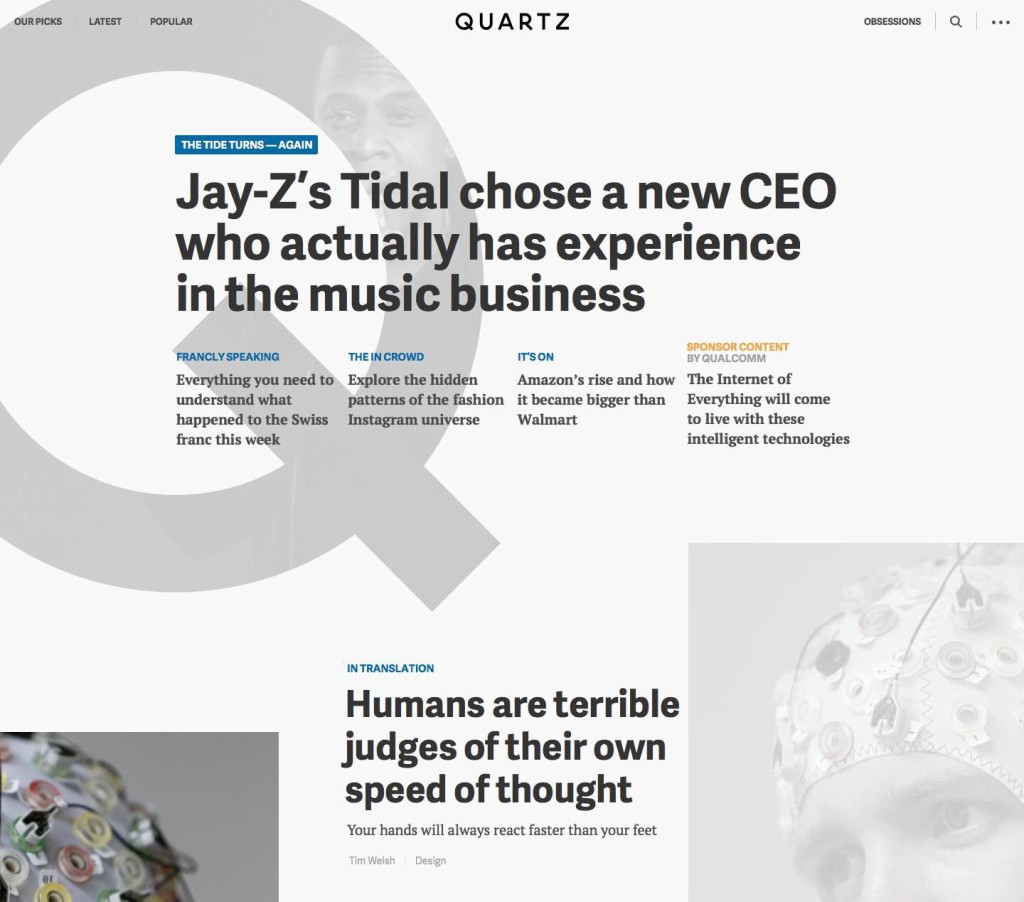
- The story about the redesign of Quartz, which confirms the gradual dying of the main pages of the media .
- Google News Lab is now engaged in the company's annual search trends report . They described the key findings for the media from the behavior of users and their consumption of content.
Car Interfaces
- A small review of the conference Connected Car Expo, held recently in Los Angeles in terms of attention to interfaces .
- A concept from Volvo, which represents the very distant future of autonomous cars, where they have lost their status value . Just a mirror cube.
Smart watches and bracelets
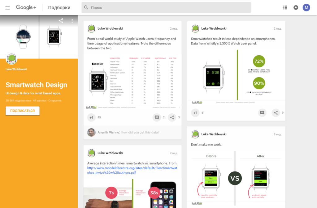
- Luke Wroblewski gathered his thoughts and tweets on smart watches on Google+ . There are other collections of it .
- A very interesting study of a group of Swedish scientists on the use of smart watches in real life . They selected 12 respondents who walked for a long time with the Apple Watch and a camera that recorded all the interactions with the clock. It is difficult to say about representativeness, but there are many interesting facts.
The virtual reality
- A collection of experiments with animation in virtual reality for Google Cardboard .
- A-Frame framework for creating simple virtual reality interfaces on the web . Supported by Mozilla’s recently announced MozVR initiative.
- Laura Keller on UX journalism in virtual reality on the example of the NY Times material on refugees .
Interfaces to the cinema
- All 169 James Bond gadgets .
- The story about the company Perception , which made the interfaces to Iron Man 2, Avengers 2 and other films, and then joined the work on concepts for Microsoft, Samsung and Ford.
Microsoft HoloLens
- Autodesk and Microsoft are working on tools for a bunch of Hololens-based engineers and industrial designers .
- Volvo talks about how to use HoloLens in work .
For general and professional development
Bulletin "Ergonomist" № 43 (December 2015)
In this issue: articles about the availability of the metro for low-mobile passengers, about ergonomic events in 2015, about Vladimir Mikhailovich Munipov and his contribution to ergonomics, news, annotations of publications on ergonomic themes, successful experience and ergonomic sabotage, and much more.
Tilda education
Product Designers
People and companies in the industry
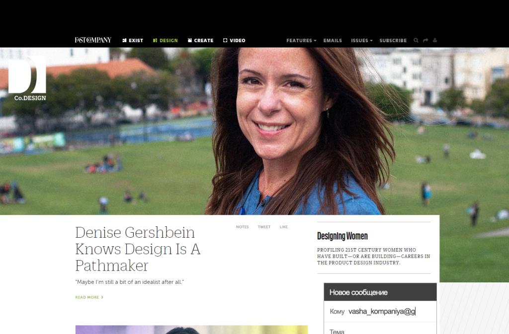
Designing Women
A series of interviews Fast Co Design with women in design. There are already 4 materials about design leaders.
Designers in Venture Funds
- Accel Partners hired Jason Mayden from Nike . He talks about what he will look for young professionals in atypical places.
Ivan Pupyrev
Fresh links can also be tracked in the Facebook group of the same name or received once a month by mail . Thanks to everyone who also publishes links in it, especially Gennady Dragun, Pavel Skripkin, Dmitry Podluzhny, Anton Artyomov, Denis Efremov, Alexey Kopylov, Taras Brizitsky and Yevgeny Sokolov. More and more materials in reviews appear thanks to them.
Subscribe to the newsletter ! A letter arrives once a month.
Source: https://habr.com/ru/post/274147/
All Articles