How to "animate" the product? Lettering
Watching films about the future, we very often see this picture: the same people, as if cloned, are in the same clothes. They are surrounded by the same cars and houses on the same streets. People work for the benefit of huge corporations, making monotonous gestures in front of computers or shifting papers from place to place. Everything around is heartless and dull, dominated by blue, gray and white shades with small inserts of bright colors for the key characters of the film. Surely this is done to give a greater irony to the plot of the film. And, of course, I am aware that this is a utopia and this will not happen in the foreseeable future. But one thing I know for sure. I and the vast majority of people would never want to live in such a world.
But some echoes of such a picture can be observed today. When solving many problems, we use templates: frameworks, designers, template sites, interfaces, logos, household items, and so on. Everything is aimed at reducing the cost of production and rapid entry into the market. The economic advantage is, of course, obvious. But from the consumer becomes boring and monotonous.
')
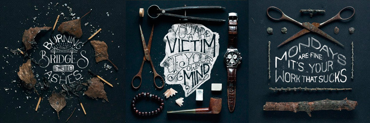
There are many ways to "animate" a product: to invent a little animal symbol, use images of people, photos, illustrations. I will tell you about the lettering. Caution - a lot of pictures!
First of all, you need to distinguish 3 concepts.
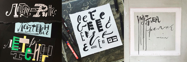
A font is a set of characters that can be used in any order and are used to write large words, sentences and texts.
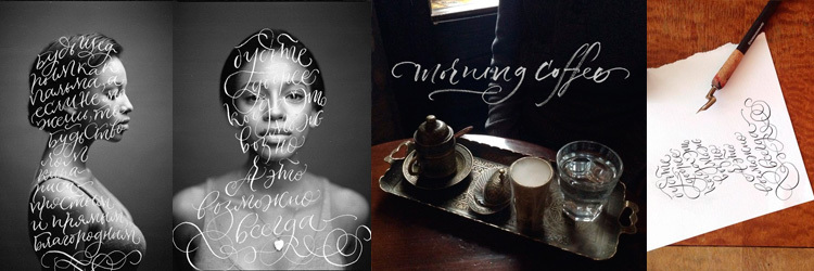
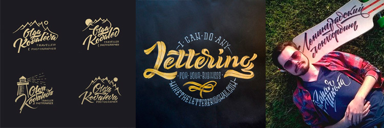
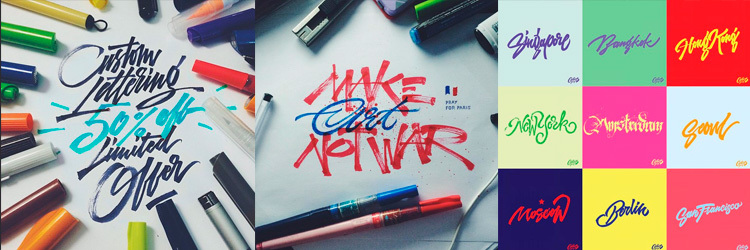
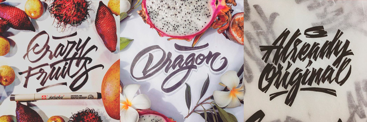
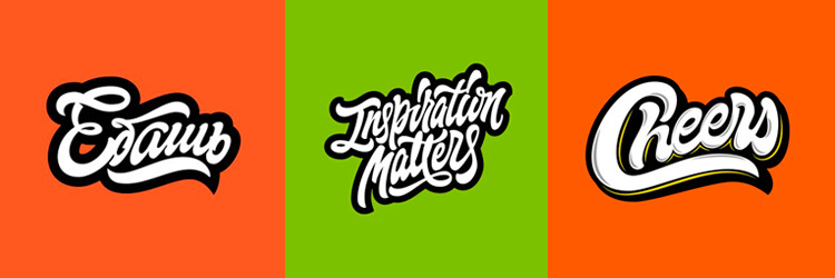
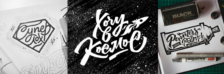
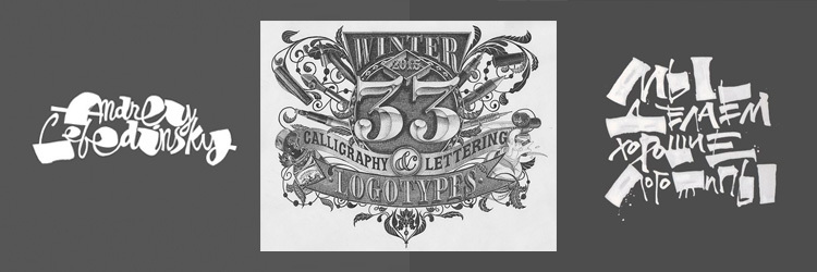
Lettering is a unique drawing of a word or phrase, rarely whole phrases, which makes up a single composition and is intended for a specific situation.
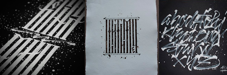
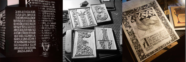
Calligraphy (from the Greek “beautiful handwriting”) is also a hand-written inscription, but, unlike lettering, all letters must adhere to a single style and form a readable block of text. Calligraphy can write large texts, such as letters or letters.
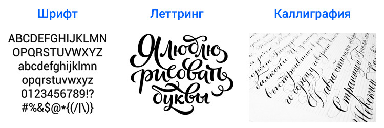
Both lettering and calligraphy are created by the long and painstaking work of the master. But only lettering is based on drawing letters and searching for a unique unique combination of characters, while calligraphy is a huge number of repetitions of the same letters for the purpose of writing text in the same style.
A bit of history
First there were cave paintings, in Ancient Egypt there were various symbols, then letters and numbers appeared - the humanity learned to write. Manual writing was everywhere: personal letters, books, orders and laws. Everything was written with the help of feathers: calligraphy was born. With the advent of printing machines and, after them, computers, fonts began to appear. This greatly contributed to raising the level of education. Books became more accessible, even simple peasants and workers, over time, learned to read and write. Meanwhile, writing with the advent of writing has evolved constantly. It was necessary to somehow make out signs, posters, labels, covers.
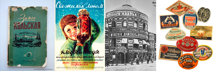
Vkontakte has a pub " Soviet lettering ". There are many examples of the wonderful works of the bygone era.
Nice trend
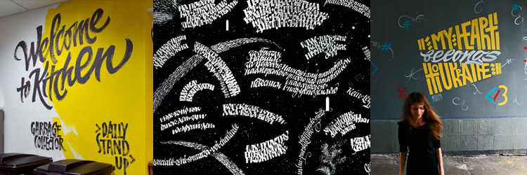
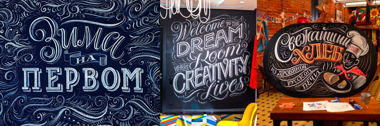
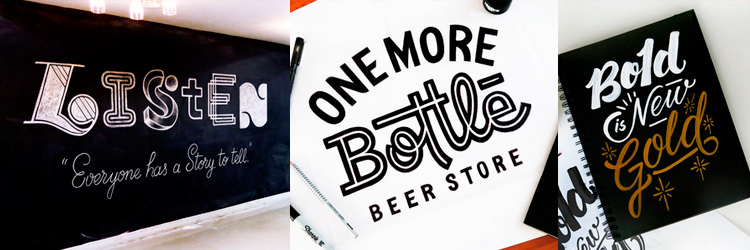
I believe that today, if not the peak, then the growth of the use of lettering is accurate. Today, many companies are trying to make their brands "alive". There are not shops and boutiques, but shops: creative, meat, bakeries, sewing and others. This is, to some extent, a return to the past. Logos of such institutions are made exactly by lettering. Inside, you can often find chalk walls with a menu or just a picture of the products. Because it creates an atmosphere of warmth and comfort. And I like it.
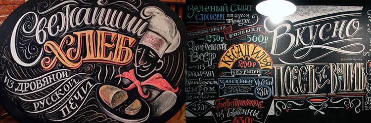
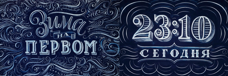
Exactly a year ago, on New Year's Day, on the first channel, cool inserts created with the help of blackboard and chalk were broadcast.
The creation process can be viewed on the website of Igor Mustaev . Very interesting.

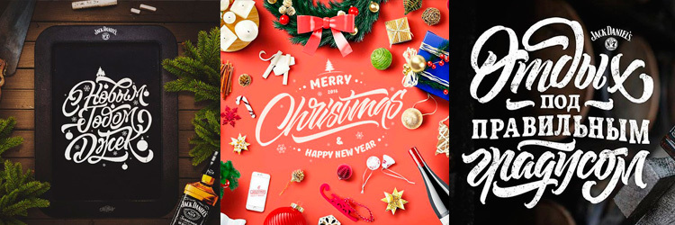
World media and print media such as Time, Esquire, Vogue, Forbes make full use of this tool.

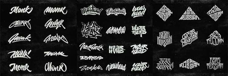
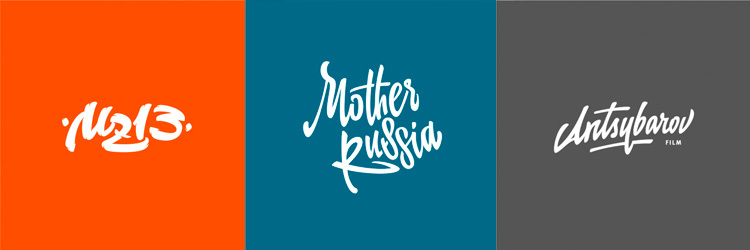
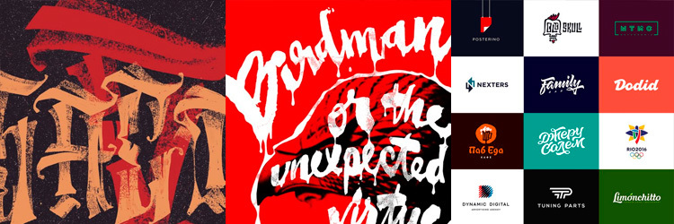
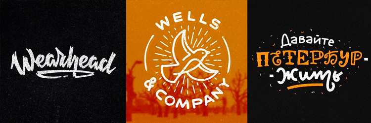
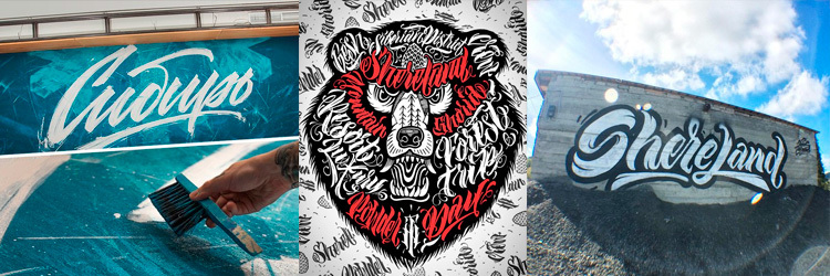
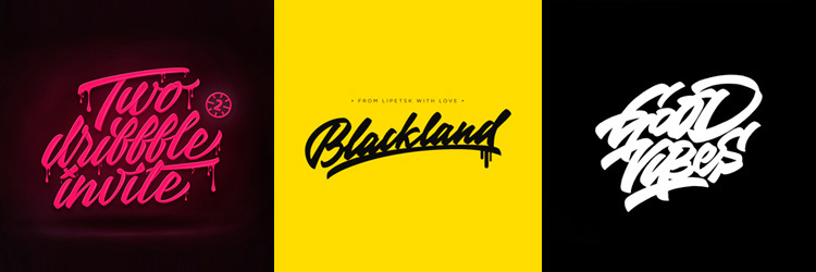
A huge number of logos created using lettering. Of course, you can say that they are much smaller than the classic logos, typed in any font. And you will be absolutely right. Many want to look serious and in some cases it is even necessary. But a very large number of companies would be in place just a “hand-made” logo.
And do not think that I urge to drop everything and use hand-drawn letters everywhere. I just ask you to pay attention to this, as at the reception of the impact on the consumer. But if, after all, lettering is interesting to you, scroll further.
Who will help with lettering?
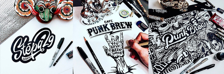
Some time ago, having become interested in lettering, I needed a place where I could store all the interesting things found. I threw everything in this public .
I came across many “foreign” masters, but I decided to concentrate on Russian-speaking calligraphers, letterters, designers and illustrators. They are, for the most part, in Russia and in the post-Soviet space. There were people of different qualifications. Below I give a list of all 226 people. But first of all 30 of those who, in my opinion, are cooler.
Obviously, someone could not catch my eye, if there are additions, feel free to write in the comments.
1. Alexander Stan
2. Andrei Martynov
3. Andrei Hobb
4. Victor Pushkaryov
5. Victor Sevryukov
6. Victoria and Vitalina Lopukhins
7. Vladimir Egoshin
8. Gosh Bondarev
9. Dasha Levchuk

10. Dmitry Tkachev

11. Evgenia Pestova
12. Ivan TAKNADO Fans
13. Igor Vetoshkin
14. Igor Mustaev
15. Katerina Rakhmanova
16. Kirill Plotnikov

17. Max Brice
18. Maria Skopina
19. Mikhail Levchenko
20. Misha Novozhilov
21. Nazim Ismagilov
22. Nikita Raizvikh
23. Olga Vasik
24. Rodion Ilyukhin
25. Sergey Shapiro

26. Stas Kurap
27. Eric Musin
28. Julia Tacito

29. Evgeny Tkhorzhevsky
30. Kirill Richert Mihailovich

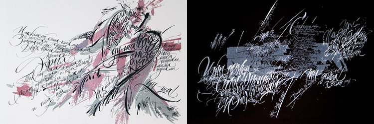
There is one more master whom I didn’t want to include in the list at first, but then decided to mention it. Because his works, as a rule, are decorative, and have no practical application. His work is an art, despite which you can only get aesthetic pleasure. It is about Pokras Lampas .
The remaining 196 people can be viewed in blog entries. I was too lazy to copy such a huge number of links.
Below you can vote for any Letterov you like. Thanks for attention. Have a great New Year's Eve weekend.
Source: https://habr.com/ru/post/274143/
All Articles