Sberbank shares the experience of creating an application in Material Design: styles and themes
Hi, Habrahabr! Not so long ago, we summed up the contest for Material Design , and in the comments we were asked to show really popular and beautiful Material applications. Well, meet: "Sberbank Online" in a new, modern interface. About the process of creating an application is more interesting to learn from the creators themselves.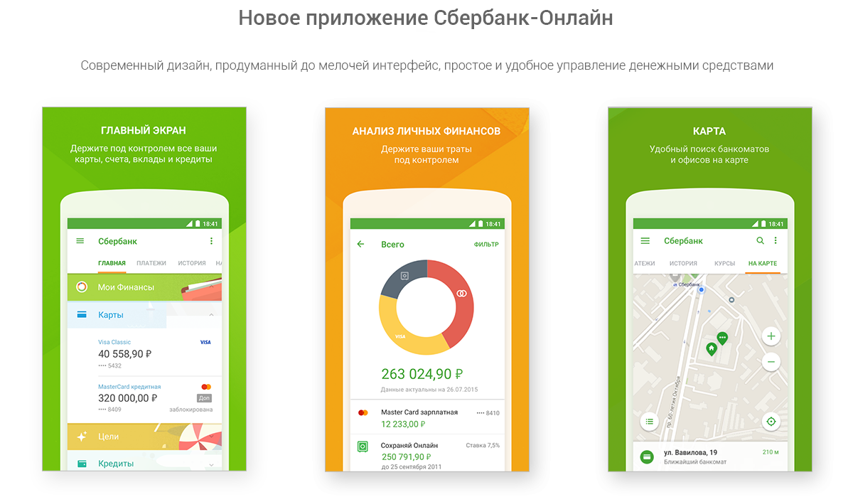
We give the floor to the team of developers of the Sberbank Android application, so that you hear about the experience of creating such a complex thing, like the UI of a mobile bank-client, from the first mouth. Most of the post was written by a freeuser , so say thanks to him. ;)
Android 5, based on Material Design, has been available to users for a year and a half. 18 months is a long time, and now we can confidently say that both users and developers liked the philosophy of the visual language for presenting information from Google.
Today we will tell how in our expanding and evolving team the process of transition of the Sberbank Online application for Android to Material Design proceeded and we will cover the related technical aspects. The process of directly creating the interface will be described in detail in the next article.
')
Our main task is to make a convenient and understandable application that would be pleasant to use. At the same time, the transition to Material Design would allow for a qualitative improvement in the development process. That is, programmers and designers will be less distracted by the "process", more - by the result.
The unified visual language that was developed by Google made it possible to think less about “what to do”, focusing on the question “how to do”. And if the previous attempt (Holo) did not stop tracing the interfaces with iOS or inventing bicycles, then the new system (MD) almost completely “killed” the zoo of designer delights. Applications have not become duller or more monotonous, but they have become more uniform: MD allows you to use the available tools and features of the visual language in an extremely free way, while maintaining the continuity of interfaces, which is convenient for both users and developers. When all applications work in the same way and the various interface elements work in the same way in them, you do not need to get used to new applications. Take and use.
Simplicity, user-friendliness and efficiency - these are the key concepts that we repelled in working on a new application.
Common development problems are almost always the same:
At the root of these "common" problems are quite specific trouble, which, alas, is very difficult to resolve. Designers and programmers speak their own languages and do not understand each other. What is the misunderstanding?
Consider a special case of a typical workflow:
To avoid all this mess, you need to establish a healthy atmosphere in the working team:
A peculiar "first bridge" in building communication between programmers and designers was the Google Material Guidelines . Guidelines are flexible enough to not hamper the creative thought of the designer and at the same time they define patterns that are convenient for modeling by the programmer.
For scalable layout in Android OS, a tool such as styles is used. Styles are a set of attribute-value pairs. Attribute values can be colors, ColorStateList, Drawable, text, dimensions, and other styles.
When exploring the latest platform resources and the AppCompat library, you may find that styles are divided into the following groups:
In our case, a normally built workflow looks like this:
Before we tackle the styles, let's take a closer look at the properties of this tool — to use it with maximum efficiency.
Styles can be inherited from each other in two ways. Here is the first:
Theme.Material will then inherit the value of the isLightTheme attribute from the parent Theme theme and override the colorBackground value.
The second way is to specify the parent explicitly.
In this case, Theme.Material.Sbrf will inherit the value of the isLightTheme attribute on Theme.AppCompat.Light.NoActionBar.
Low-level styles (TextAppearance and Widget-styles) can refer to the attribute value set by the theme.
Consider the attributes that indicate the primary colors of the application.
Sberbank has a brand book, according to which you need to arrange everything: printed materials, online advertising, websites, business cards, packages, etc. Official colors are regulated, their "closest analogues" - too. In accordance with the brand book, the main color (colorPrimary) for our application has become green, and Accent (colorAccent) - orange. In addition, colorPrimary referred to positive actions (confirmation, purchase), and colorAccent, as a rule, referred to negative actions (cancellation).
It is time to deal with the colors for the texts that are offered by the AppCompat library. In total there are two themes (dark and light), each of which has two groups of colors: standard and inverted. For a dark theme (the successor of Theme.AppCompat) light shades will be standard, inverted ones will be dark. For a light theme (which also inherits values from Theme.AppCompat), respectively, vice versa.
The colors specified by the library have their own “names” and functional purposes:
In addition, there are colors with “eerie” names such as textColorPrimaryDisableOnly (used for CompoundButton text: radio buttons, checkboxes), or textColorPrimaryNoDisable, textColorSecondaryDisableOnly, textColorSecondaryNoDisable actess of a way out of a way out of a way out of a way out of a way out of a way out of a way out of a way out of them in a text or a text.
We have compiled a table of colors used in the application. For each attribute we set the value ColorStateList - a pair of colors for the available element and the inaccessible:
For visual display of textual information, AppCompat works not only with colors, but also with the font size and style. This set of parameters is called TextAppearance.
Although this is not specified in the table, the inverted Text Appearance is also defined for the Title and for the Menu.
Visual examples of well-formed Text Appearance can be seen in the specification of Google Material Design guidelines . Based on these styles and information from the guidelines, the developers, together with the designers, created the following Text Appearance family:
From each TextAppearance above (except for the Button), we create Inverse, Primary, and Accent variants (for the text color, the previously set values of the textColor * Inverse, colorPrimary, colorAccent) attributes are used.
When designers send us layouts, then opposite text fields (TextView) they indicate the abbreviated name “Title Default” corresponds to TextAppearance.Material.Sbrf.Title, and “Subheader Inverse” corresponds to TextAppearance.Material.Sbrf.Subheader.Inverse.
We have more or less dealt with the colors and design of the text, and there is still one more place to put everything in order: we are talking about the EditText and TextInputLayout elements. The problem is that the “default theme” looks sloppy, and it should be brushed along with a feng shui. :)
For the inattentive we will explain:
Inside the AppCompat library, we found that when creating a View from the AppCompatActivity markup, it replaces certain widgets with their AppCompat heirs. This is done, apparently, to support background tinting and pull-up styles from AppCompat themes. In particular, EditText is replaced by AppCompatEditText. (Therefore, if you need a custom widget, then you need to create a subclass not directly from EditText, but from AppCompatEditText).
The AppCompatEditText style is specified in the theme via the editTextStyle attribute. The default style is Widget.AppCompat.EditText, which defines a specific TextAppearance, background and text color (that is, the color from TextAppearance is ignored).
Let's take a look at the EditText background layout for version 5.0 (for older versions, the background is generally similar, the only difference is in where tinting takes place — in the markup itself, as in 5.x, or in the widget's designer in earlier versions ).
But the textfield_default_mtrl_alpha and textfield_activated_mtrl_alpha resources themselves:


As can be seen from the markup, the thin line is colored by the color, which is the value of the colorControlNormal attribute. Replace this color.
ColorControlActivated is responsible for the focused state (as well as for the color of the cursor and text-select-handle-s) - let’s change it, let it have the same meaning as colorPrimary:
The font size of EditText is set via TextAppearance.
Result:
EditText styling is over. The time has come TextInputLayout. By default, it applies the Widget.Design.TextInputLayout style to itself, extracting the following attributes from it:
Let's make a table of TextAppearance properties of auxiliary TextView. All of them are inherited from TextAppearance.AppCompat.Caption (textColorSecondary, 12sp, regular), only the color changes.
Then everything is simple: let's replace the text color with colorAccent:
Apply this TextAppearance in the TextInputLayout style:
Apply the newly created style to the TextInputLayout in the markup. Here's what we got:

Finally, we will make an important improvement. Usually for each widget there is an attribute in the theme, according to which it can take on its actual style for its designer. TextInputLayout (like other widgets in the Design library) does not have such an attribute in the theme. We introduce it on the application side:
Embed it in the topic:
Now we can pull up the widget style in the markup using this attribute:
We coped with text fields, fonts and colors. There are still a couple of important elements in which you need to restore order: AppBar and Toolbar. In a typical Activity when using Material-design, the top panel differs in style from the content of the Activity: it differs in a different background, a different text color. Google assumes that we will use the actionBarTheme attribute for this. We will work with him.
The actionBarTheme attribute refers to ThemeOverlay - a kind of mini-theme applied to a particular ViewGroup, its children, their children, and so on. When applying ThemeOverlay, the same attributes of the Activity theme get a new value. For greater clarity, consider 3 screenshots: on the first, neither the style nor ThemeOverlay is applied to the top bar and widgets, the second is green and ThemeOverlay with white text, the third is white and ThemeOverlay with green text.
AppBarLayout background color. The Design library resources indicate that the Background of this widget is painted in the primary color of the application (colorPrimary). Create styles for AppBarLayout:
By analogy with TextInputLayout, we will create an appBarLayoutStyle attribute in the theme in order to get the current style of the widget in the markup.
TabLayout style. Solved similarly to the problem with AppBarLayout.
The color of the icons in the toolbar is specified by the colorControlNormal attribute. However, there are some problems that need to be addressed. We used colorControlNorman for the EditText line in the unfocused state (the color was also used for the unfilled progress color in the deterministic ProgressBar and in the SeekBar). ThemeOverlay with white text overrides colorControlNormal as #FFFFFF (white). ThemeOverlay with green redefines colorControlNormal as? Attr / colorPrimary (we have it, as you remember, green).
Define ThemeOverlay.
And apply them in the markup:
Indent text in the toolbar from the left margin. Google Material Guidelines require it to be set to 72dp if there is an Up button, and 16dp if it doesn’t. Alternatively, we can in two different themes for such an Activity put down two different toolbar styles with two different indents. We decided not to change the whole style because of one insignificant parameter, but to change this parameter itself.
Let's get a new attribute in the topic:
Define a new toolbar style:
We define a new attribute in 2 themes, in the parent theme we will redefine the toolbar style.
Now, depending on the specified topic, the text will have a different indent from the left edge. What was required to be done on the guidelines.
The text color in the toolbar. In AppCompat styles, the default color is set for text: textColorPrimary. In the theme itself, textColorPrimary is set to 90% black. green ThemeOverlay overrides textColorPrimary as 100% white. White ThemeOverlay overrides it as? Attr / colorPrimary.
Limitations ThemeOverlay. Do not apply to View fragments inside AppBarLayout.
The application became available on Google Play the other day, and it's time to take stock of our reforms.
We have significantly reduced the time required for the layout of the application: thanks to the unified TextAppearance, indents and styles, the creation of new screens and editing old ones happens quickly and efficiently. No more senseless waste of time on manual measurement of indents, on checking colors in ColorPicker (from there, also get an alpha channel for color): looked at the resource alias in the layout, chose the appropriate resource, work on.
Programmers understand what they repel and what designers mean when solving UX-problems. They take this into account when styling the widget. For example, if the designer renders a green button on the layout, then the application should not be a faceless brick-stub, but a button that reacts to pressing. Designers are aware of which element is native for the Android platform, and which is required to be highly developed and difficult to maintain.
The well-established mutual understanding between programmers and designers made it possible to produce results faster and more reliably. Edits to the layout were made at the click of the fingers: what is it all about replacing the green appbar with white (just add the new AppBarLayout style, the new ThemeOverlay, connect them in one theme and designate it as the main project).
Naturally, some ideas were unsuccessful. We made the wrong assumption that we have enough 5 minimum cell heights; in practice, it turned out that when designing, designers do not use such a characteristic, but are repelled directly from content. The indentation naming system was unsuccessful and not visual.
Despite this, the bulk of the adopted rules proved to be extremely effective in practice. With the help of new tools we have created a harmonious application in the style of Material. We invite everyone to Google Play , where you can actually evaluate the results of our work.
Thank you for your attention, in the next issue we will talk about the process of creating the interface of our application.
We give the floor to the team of developers of the Sberbank Android application, so that you hear about the experience of creating such a complex thing, like the UI of a mobile bank-client, from the first mouth. Most of the post was written by a freeuser , so say thanks to him. ;)
Prehistory
Android 5, based on Material Design, has been available to users for a year and a half. 18 months is a long time, and now we can confidently say that both users and developers liked the philosophy of the visual language for presenting information from Google.
Today we will tell how in our expanding and evolving team the process of transition of the Sberbank Online application for Android to Material Design proceeded and we will cover the related technical aspects. The process of directly creating the interface will be described in detail in the next article.
')
Formulation of the problem
Our main task is to make a convenient and understandable application that would be pleasant to use. At the same time, the transition to Material Design would allow for a qualitative improvement in the development process. That is, programmers and designers will be less distracted by the "process", more - by the result.
The unified visual language that was developed by Google made it possible to think less about “what to do”, focusing on the question “how to do”. And if the previous attempt (Holo) did not stop tracing the interfaces with iOS or inventing bicycles, then the new system (MD) almost completely “killed” the zoo of designer delights. Applications have not become duller or more monotonous, but they have become more uniform: MD allows you to use the available tools and features of the visual language in an extremely free way, while maintaining the continuity of interfaces, which is convenient for both users and developers. When all applications work in the same way and the various interface elements work in the same way in them, you do not need to get used to new applications. Take and use.
Simplicity, user-friendliness and efficiency - these are the key concepts that we repelled in working on a new application.
Existing problems
Common development problems are almost always the same:
- Programmers are not always attentive to layouts;
- Designers are poorly aware of how labor-intensive for a programmer to implement one or another type of layout;
- Changes in one markup (layout) are not scaled automatically by the other.
At the root of these "common" problems are quite specific trouble, which, alas, is very difficult to resolve. Designers and programmers speak their own languages and do not understand each other. What is the misunderstanding?
- The programmer cannot simulate the designer’s thinking, because of which he cannot determine what to make him start in the layout;
- The designer does not know what kind of information to give to the programmer in order to be folded out scalable and with exact match to the layout.
Consider a special case of a typical workflow:
On the layouts of the application screens, the designer should note the size and color of the text, the width and height of the elements. In case of zero communication (and, therefore, zero understanding of the needs and capabilities of each other), the problem is solved head-on: on the mock-ups, values are directly sewn up - size, color.
Further, the layout artist either rigidly clogs the values in the markup, or starts a new resource (size, color), or tries to find the existing resource by value.
Hard stitching of values in the markup or unsystematic institution of resources entails the impossibility of reusing the same values: the principle of DRY is violated, and in general the very logic of separating the structure and its styles. Working on such an application is about as “pleasant” as it is on a web page, in which half of the style values are listed right inside the divs.
If there is a need to change the color of the text on the information cells, then you need to go through each markup (in this case there is a non-zero chance to skip any file). The cost of the operation increases many times during the experiments “Sequentially check several colors / indents”.
Finally, if a pseudonym is set up for a resource in a non-systemic way, then, most likely, its name is irrelevant for the new screen, and the programmer, instead of using the finished resource, will create a new entity.
To avoid all this mess, you need to establish a healthy atmosphere in the working team:
- Communication should be established between programmers and designers: they should understand and accept the needs and capabilities of each other;
- The list of required data for building a universal and scalable layout of the application should be clearly fixed: so programmers will get all the necessary values for them, and designers will be able to build on the existing values when building new screens.
Doing it right way
A peculiar "first bridge" in building communication between programmers and designers was the Google Material Guidelines . Guidelines are flexible enough to not hamper the creative thought of the designer and at the same time they define patterns that are convenient for modeling by the programmer.
For scalable layout in Android OS, a tool such as styles is used. Styles are a set of attribute-value pairs. Attribute values can be colors, ColorStateList, Drawable, text, dimensions, and other styles.
When exploring the latest platform resources and the AppCompat library, you may find that styles are divided into the following groups:
- TextAppearance - the appearance of the text field. Defines the colors of text and links, hints in the text field, the background of the selected text, the style and typeface of the font;
- Widget-style - View style. Define widget-specific attributes (for example, progressDrawable for ProgressBar), the TextView widget-style and its heirs can indicate the TextAppearance used;
- Theme is a theme. Themes are a kind of “styles of styles,” styles of activism; Define key attributes specific to this screen, widget styles. Properly composing the theme, we avoid direct references to the colors and styles of the widgets inside the layout, establish a uniform appearance for the View within the application;
- ThemeOverlay - occupy an intermediate position between widget-styles and themes. If the usual widget-style is applied to only one View, the theme to all View within the screen, then ThemeOverlay is placed on a specific container (ViewGroup) in the markup. Later we will show exactly where it is used and how.
In our case, a normally built workflow looks like this:
- Programmers and designers, based on the Google Material Guidelines, form uniform resource tables (you'll see them later in the article);
- Each resource (size, style, color) is assigned a pseudonym;
- The designer in the layout indicates the pseudonym. According to this alias, the programmer finds the resource (size, style) and indicates it in the markup.
Style properties
Before we tackle the styles, let's take a closer look at the properties of this tool — to use it with maximum efficiency.
Style inheritance
Styles can be inherited from each other in two ways. Here is the first:
<style name="Theme"> <item name="android:isLightTheme">false</item> <item name="android:colorBackground">@color/bright_foreground_dark</item> </style> <style name="Theme.Material"> <item name="android:colorBackground">@color/foreground_material_dark</item> </style> Theme.Material will then inherit the value of the isLightTheme attribute from the parent Theme theme and override the colorBackground value.
The second way is to specify the parent explicitly.
<style name="Theme.Material"> <item name="android:isLightTheme">false</item> </style> <style name="Theme.AppCompat.Light.NoActionBar"> <item name="android:isLightTheme">true</item> </style> <style name="Theme.Material.Sbrf" parent="Theme.AppCompat.Light.NoActionBar"> </style> In this case, Theme.Material.Sbrf will inherit the value of the isLightTheme attribute on Theme.AppCompat.Light.NoActionBar.
References to attribute values
Low-level styles (TextAppearance and Widget-styles) can refer to the attribute value set by the theme.
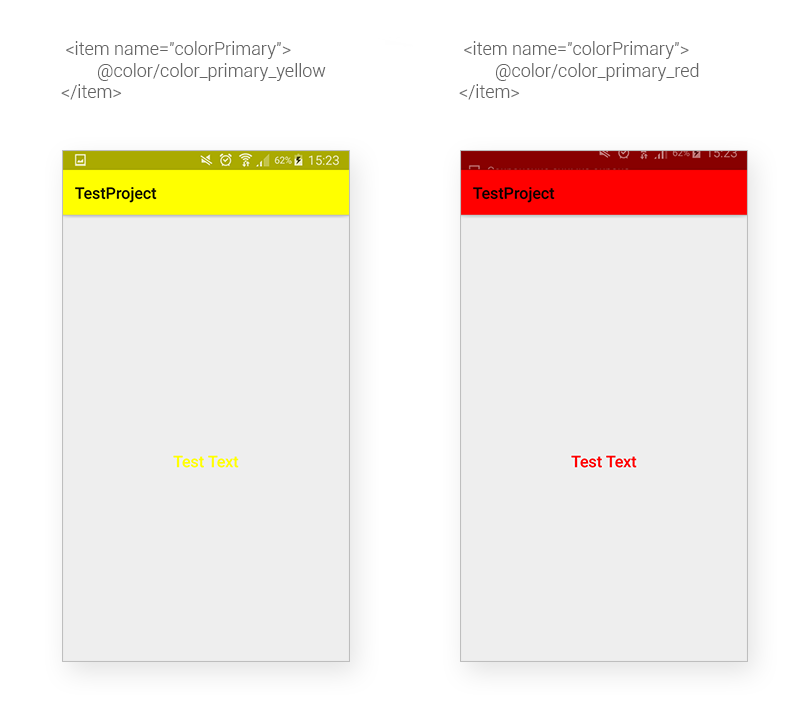
Suppose there are 2 themes in the application: red and yellow. We need to have some TextAppearance on the screens with the yellow theme set a yellow background for its TextView, and on the screens with the red theme - a red background.
<style name="TextAppearance.Example" parent="TextAppearance.AppCompat.Title"> <item name="android:textColor">?attr/colorPrimary</item> </style> <style name="Theme.Example" parent="Theme.AppCompat.Light.NoActionBar"> </style> <style name="Theme.Example.Red"> <item name="colorPrimary">@color/color_primary_red</item> <item name="colorPrimaryDark">@color/color_primary_red_dark</item> </style> <style name="Theme.Example.Yellow"> <item name="colorPrimary">@color/color_primary_yellow</item> <item name="colorPrimaryDark">@color/color_primary_yellow_dark</item> </style> Let TextAppearance.Example be affixed to some TextView.
<TextView android:layout_width="wrap_content" android:layout_height="wrap_content" android:layout_gravity="center" android:textAppearance="@style/TextAppearance.Example" android:text="Test Text"/> Then, when using TextAppearance for this widget, Android will substitute for the textColor value exactly that colorPrimary value, which is written in this topic.
Customize styles and themes
Primary colors of the application
Consider the attributes that indicate the primary colors of the application.
| Attribute | Purpose |
| colorPrimary | The main color of the application. Usually they paint it with AppBar |
| colorPrimaryDark | Darker version of the main color - used for the status bar |
| colorAccent | Accent color application. Used indirectly for buttons, SeekBar, ProgressBar |
| android: colorBackground | Default background color |
| android: colorForeground | The opposite of the secondary background color |
| android: colorForegroundInverse | Secondary background color |
| dividerHorizontal | Horizontal splitter color |
| dividerVertical | Vertical spacer color |
Sberbank has a brand book, according to which you need to arrange everything: printed materials, online advertising, websites, business cards, packages, etc. Official colors are regulated, their "closest analogues" - too. In accordance with the brand book, the main color (colorPrimary) for our application has become green, and Accent (colorAccent) - orange. In addition, colorPrimary referred to positive actions (confirmation, purchase), and colorAccent, as a rule, referred to negative actions (cancellation).
Stylization TextView
It is time to deal with the colors for the texts that are offered by the AppCompat library. In total there are two themes (dark and light), each of which has two groups of colors: standard and inverted. For a dark theme (the successor of Theme.AppCompat) light shades will be standard, inverted ones will be dark. For a light theme (which also inherits values from Theme.AppCompat), respectively, vice versa.
The colors specified by the library have their own “names” and functional purposes:
- textColorPrimary is the most "juicy" form of color.
- textColorSecondary is a slightly paler color.
- textColorTertiary is an even paler form.
- textColorHint - color of hints in EditText.
- textColorLink - color links.
- textColorHighlight - the background color of the selected text.
- textColorPrimaryActivated - in the normal state, the same as textColorPrimary, in the activated state - textColorPrimaryInverse
- textColorSecondaryActivated - similar to textColorPrimaryActivated, with only a secondary color.
In addition, there are colors with “eerie” names such as textColorPrimaryDisableOnly (used for CompoundButton text: radio buttons, checkboxes), or textColorPrimaryNoDisable, textColorSecondaryDisableOnly, textColorSecondaryNoDisable actess of a way out of a way out of a way out of a way out of a way out of a way out of a way out of a way out of them in a text or a text.
We have compiled a table of colors used in the application. For each attribute we set the value ColorStateList - a pair of colors for the available element and the inaccessible:
| Attribute | Normal color | Color of inaccessible state (disabled elements) |
| textColorPrimary | # E6000000 (90% black) | # 44000000 (26% black) |
| textColorSecondary | # CC000000 (80% black) | # 44000000 (26% black) |
| textColorTertiary | # 88000000 (53% black) | # 44000000 (26% black) |
| textColorHint | # 61000000 (38% black) | # 19000000 (10% black) |
| textColorPrimaryInverse | #FFFFFFFF (100% white) | # 44FFFFFF (26% white) |
| textColorSecondaryInverse | # E8FFFFFF (91% white) | # 44FFFFFF (26% white) |
| textColorTertiaryInverse | # 96FFFFFF (59% white) | # 44FFFFFF (26% white) |
| textColorHintInverse | # 61FFFFFF (38% white) | # 19FFFFFF (10% white) |
For visual display of textual information, AppCompat works not only with colors, but also with the font size and style. This set of parameters is called TextAppearance.
| Title | Text color | Font size | Font typeface |
| Caption | Secondary | 12sp | Regular |
| Body1 | Primary | 14sp | Regular |
| Body2 | Primary | 14sp | Medium |
| Button | Primary | 14sp | Medium |
| Subhead | Primary | 16sp | Regular |
| Menu | Primary | 16sp | Medium |
| Title | Primary | 20sp | Medium |
| Headline | Primary | 24sp | Regular |
| Display1 | Secondary | 34sp | Regular |
| Display2 | Secondary | 45sp | Regular |
| Display3 | Secondary | 56sp | Regular |
| Display4 | Secondary | 112sp | Light |
Although this is not specified in the table, the inverted Text Appearance is also defined for the Title and for the Menu.
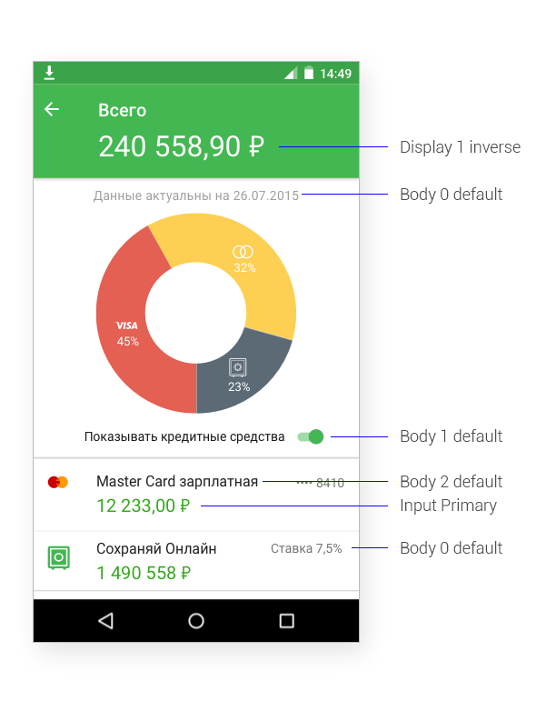
Visual examples of well-formed Text Appearance can be seen in the specification of Google Material Design guidelines . Based on these styles and information from the guidelines, the developers, together with the designers, created the following Text Appearance family:
| Title | Text color | Font size | Font typeface |
| Caption | Tertiary | 12sp | Regular |
| Hint | Hint | 14sp | Regular |
| Subheader | Tertiary | 14sp | Medium |
| Button | Primary | 14sp | Medium |
| Body0 | Tertiary | 14sp | Regular |
| Body1 | Secondary | 14sp | Regular |
| Body2 | Primary | 16sp | Regular |
| Body3 | Secondary | 16sp | Medium |
| Input1 | Primary | 20sp | Regular |
| Input2 | Tertiary | 20sp | Regular |
| Title | Primary | 20sp | Medium |
| Headline | Primary | 24sp | Regular |
| Display1 | Primary | 32sp | Regular |
| Display2 | Tertiary | 32sp | Regular |
From each TextAppearance above (except for the Button), we create Inverse, Primary, and Accent variants (for the text color, the previously set values of the textColor * Inverse, colorPrimary, colorAccent) attributes are used.
When designers send us layouts, then opposite text fields (TextView) they indicate the abbreviated name “Title Default” corresponds to TextAppearance.Material.Sbrf.Title, and “Subheader Inverse” corresponds to TextAppearance.Material.Sbrf.Subheader.Inverse.
Styling EditText
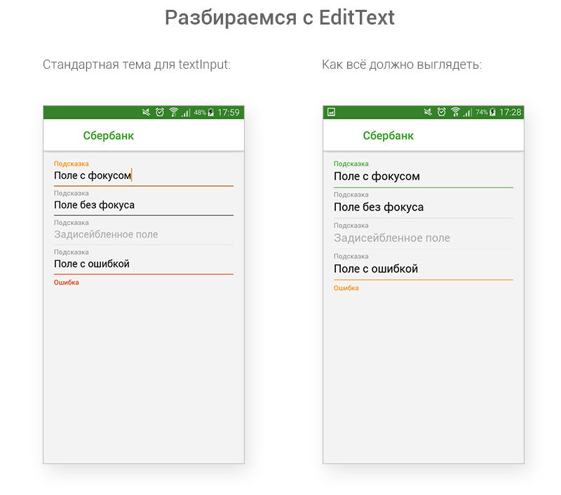
We have more or less dealt with the colors and design of the text, and there is still one more place to put everything in order: we are talking about the EditText and TextInputLayout elements. The problem is that the “default theme” looks sloppy, and it should be brushed along with a feng shui. :)
For the inattentive we will explain:
- The EditText line in the unfocused and zapped condition should be fainter;
- The focused EditText line should be solid green (colorPrimary), not black-orange;
- The error is highlighted in orange (colorAccent), and not red ;.
- The font size of the EditText should be larger.
Inside the AppCompat library, we found that when creating a View from the AppCompatActivity markup, it replaces certain widgets with their AppCompat heirs. This is done, apparently, to support background tinting and pull-up styles from AppCompat themes. In particular, EditText is replaced by AppCompatEditText. (Therefore, if you need a custom widget, then you need to create a subclass not directly from EditText, but from AppCompatEditText).
The AppCompatEditText style is specified in the theme via the editTextStyle attribute. The default style is Widget.AppCompat.EditText, which defines a specific TextAppearance, background and text color (that is, the color from TextAppearance is ignored).
Let's take a look at the EditText background layout for version 5.0 (for older versions, the background is generally similar, the only difference is in where tinting takes place — in the markup itself, as in 5.x, or in the widget's designer in earlier versions ).
<inset xmlns:android="http://schemas.android.com/apk/res/android" android:insetLeft="@dimen/edit_text_inset_horizontal_material" android:insetRight="@dimen/edit_text_inset_horizontal_material" android:insetTop="@dimen/edit_text_inset_top_material" android:insetBottom="@dimen/edit_text_inset_bottom_material"> <selector> <item android:state_enabled="false"> <nine-patch android:src="@drawable/textfield_default_mtrl_alpha" android:tint="?attr/colorControlNormal" android:alpha="?attr/disabledAlpha" /> </item> <item android:state_pressed="false" android:state_focused="false"> <nine-patch android:src="@drawable/textfield_default_mtrl_alpha" android:tint="?attr/colorControlNormal" /> </item> <item> <nine-patch android:src="@drawable/textfield_activated_mtrl_alpha" android:tint="?attr/colorControlActivated" /> </item> </selector> </inset> But the textfield_default_mtrl_alpha and textfield_activated_mtrl_alpha resources themselves:
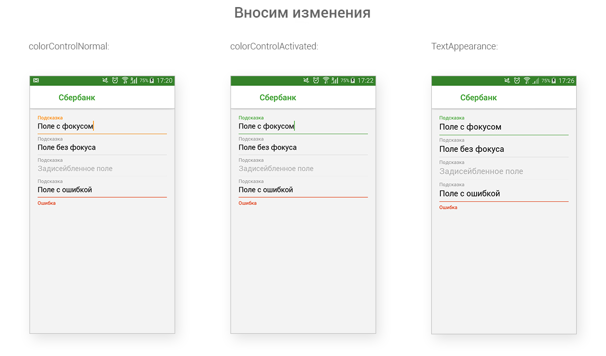
As can be seen from the markup, the thin line is colored by the color, which is the value of the colorControlNormal attribute. Replace this color.
<color name="color_control_normal">#1A000000</color> <style name="Theme.Material.Sbrf" parent="@style/Theme.AppCompat.Light.NoActionBar"> <item name="colorControlNormal">@color/color_control_normal</item> </style> ColorControlActivated is responsible for the focused state (as well as for the color of the cursor and text-select-handle-s) - let’s change it, let it have the same meaning as colorPrimary:
<style name="Theme.Material.Sbrf" parent="@style/Theme.AppCompat.Light.NoActionBar"> <item name="colorControlActivated">?attr/colorPrimary</item> </style> The font size of EditText is set via TextAppearance.
<style name="TextAppearance.Material.Sbrf.EditText" parent="@style/TextAppearance.Material.Sbrf.Input1"> </style> <style name="Widget.Material.Sbrf.EditText" parent="@style/Widget.AppCompat.EditText"> <item name="android:textAppearance">@style/TextAppearance.Material.Sbrf.EditText</item> </style> <style name="Theme.Material.Sbrf" parent="@style/Theme.AppCompat.Light.NoActionBar"> <item name="editTextStyle">@style/Widget.Material.Sbrf.EditText</item> </style> Result:
EditText styling is over. The time has come TextInputLayout. By default, it applies the Widget.Design.TextInputLayout style to itself, extracting the following attributes from it:
- hintTextAppearance - TextAppearance of the floating label (the word “Hint” is written on our screen) in a focused state;
- android: textColorHint - the color of the floating label in the unfocused state, the color of the tooltip in EditText. If the attribute value of TextInputLayout is not specified, the value of the same attribute in EditText will be tightened;
- android: hint - the actual text of the floating label, overloads the hint of the EditText itself;
- hintAnimationEnabled - whether to use animation when “moving” hints from the EditText to the floating label.
- errorTextAppearance - TextAppearance label with an error. In this case, the EditText line is tinted;
- errorEnabled - whether when drawing a TextInputLayout, it is necessary to preset a place under the label with an error;
- counterTextAppearance - TextAppearance of the text length counter.
- counterEnabled - whether to draw a text length counter when drawing a TextInputLayout.
- counterMaxLength - the maximum length of the text.
- counterOverflowTextAppearance - TextAppearance of the text length error indicator.
Let's make a table of TextAppearance properties of auxiliary TextView. All of them are inherited from TextAppearance.AppCompat.Caption (textColorSecondary, 12sp, regular), only the color changes.
| Title | Text color |
| TextAppearance.Design.Hint | ? attr / colorControlActivated |
| TextAppearance.Design.Error | # FFDD2C00 |
| TextAppearance.Design.Counter | ? attr / colorControlActivated |
| TextAppearance.Design.Counter.Overflow | # FFDD2C00 |
Then everything is simple: let's replace the text color with colorAccent:
<style name="TextAppearance.Material.Sbrf.Error" parent="@style/TextAppearance.Material.Sbrf.Caption"> <item name="android:textColor">?attr/colorAccent</item> </style> Apply this TextAppearance in the TextInputLayout style:
<style name="Widget.Material.Sbrf.TextInputLayout" parent="@style/Widget.Design.TextInputLayout"> <item name="errorTextAppearance">@style/TextAppearance.Material.Sbrf.Error</item> </style> Apply the newly created style to the TextInputLayout in the markup. Here's what we got:
Finally, we will make an important improvement. Usually for each widget there is an attribute in the theme, according to which it can take on its actual style for its designer. TextInputLayout (like other widgets in the Design library) does not have such an attribute in the theme. We introduce it on the application side:
<declare-styleable name="Theme.Material.Sbrf"> <attr name="textInputLayoutStyle" format="reference"/> </declare-styleable> Embed it in the topic:
<style name="Theme.Material.Sbrf" parent="@style/Theme.AppCompat.Light.NoActionBar"> <item name="textInputLayoutStyle">@style/Widget.Material.Sbrf.TextInputLayout</item> </style> Now we can pull up the widget style in the markup using this attribute:
<android.support.design.widget.TextInputLayout style="?attr/textInputLayoutStyle" android:layout_width="match_parent" android:layout_height="wrap_content"> AppBar styling
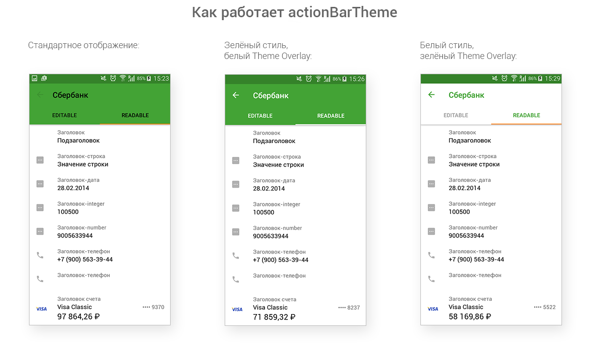
We coped with text fields, fonts and colors. There are still a couple of important elements in which you need to restore order: AppBar and Toolbar. In a typical Activity when using Material-design, the top panel differs in style from the content of the Activity: it differs in a different background, a different text color. Google assumes that we will use the actionBarTheme attribute for this. We will work with him.
The actionBarTheme attribute refers to ThemeOverlay - a kind of mini-theme applied to a particular ViewGroup, its children, their children, and so on. When applying ThemeOverlay, the same attributes of the Activity theme get a new value. For greater clarity, consider 3 screenshots: on the first, neither the style nor ThemeOverlay is applied to the top bar and widgets, the second is green and ThemeOverlay with white text, the third is white and ThemeOverlay with green text.
AppBarLayout background color. The Design library resources indicate that the Background of this widget is painted in the primary color of the application (colorPrimary). Create styles for AppBarLayout:
<style name="Widget.Material.Sbrf.AppBarLayout" parent="@style/Widget.Design.AppBarLayout"> </style> <style name="Widget.Material.Sbrf.AppBarLayout.Colored"> </style> <style name="Widget.Material.Sbrf.AppBarLayout.White"> <item name="android:background">?android:attr/colorForegroundInverse</item> </style> By analogy with TextInputLayout, we will create an appBarLayoutStyle attribute in the theme in order to get the current style of the widget in the markup.
TabLayout style. Solved similarly to the problem with AppBarLayout.
The color of the icons in the toolbar is specified by the colorControlNormal attribute. However, there are some problems that need to be addressed. We used colorControlNorman for the EditText line in the unfocused state (the color was also used for the unfilled progress color in the deterministic ProgressBar and in the SeekBar). ThemeOverlay with white text overrides colorControlNormal as #FFFFFF (white). ThemeOverlay with green redefines colorControlNormal as? Attr / colorPrimary (we have it, as you remember, green).
Define ThemeOverlay.
<style name="Theme.Material.Sbrf" parent="@style/Theme.AppCompat.Light.NoActionBar"> <item name="colorControlNormal">@color/color_control_normal</item> <item name="appBarLayoutStyle">@style/Widget.Material.Sbrf.AppBarLayout</item> </style> <style name="Theme.Material.Sbrf.Colored"> <i></i> <item name="actionBarTheme">@style/ThemeOverlay.Material.Sbrf.ActionBar.Colored</item> <item name="appBarLayoutStyle">@style/Widget.Material.Sbrf.AppBarLayout.Colored</item> </style> <style name="Theme.Material.Sbrf.WhiteActionBar"> <i></i> <item name="actionBarTheme">@style/ThemeOverlay.Material.Sbrf.ActionBar.White</item> <item name="appBarLayoutStyle">@style/Widget.Material.Sbrf.AppBarLayout.White</item> </style> <style name="ThemeOverlay.Material.Sbrf" parent="@style/ThemeOverlay.AppCompat.Light"> <item name="colorControlNormal">@color/color_control_normal</item> </style> <style name="ThemeOverlay.Material.Sbrf.ActionBar"> <i></i> <item name="searchViewStyle">@style/Widget.AppCompat.SearchView.ActionBar</item> </style> <style name="ThemeOverlay.Material.Sbrf.ActionBar.Colored"> <i></i> <item name="colorControlNormal">?android:attr/textColorPrimaryInverse</item> </style> <style name="ThemeOverlay.Material.Sbrf.ActionBar.White"> <i></i> <item name="android:colorForeground">@color/color_foreground</item> <item name="android:colorForegroundInverse">@color/color_foreground_inverse</item> <item name="colorControlNormal">?attr/colorPrimary</item> </style> And apply them in the markup:
<android.support.design.widget.AppBarLayout android:id="@+id/app_bar_layout" style="?attr/appBarLayoutStyle" android:layout_width="match_parent" android:layout_height="wrap_content" app:theme="?attr/actionBarTheme"> <android.support.v7.widget.Toolbar android:id="@+id/toolbar" android:layout_width="match_parent" android:layout_height="wrap_content"/> <i></i> <android.support.design.widget.TabLayout android:id="@+id/tab_layout" style="?attr/tabLayoutStyle" android:layout_width="match_parent" android:layout_height="wrap_content" android:clipToPadding="false" android:paddingLeft="0dp" app:tabMode="fixed"/> </android.support.design.widget.AppBarLayout> Indent text in the toolbar from the left margin. Google Material Guidelines require it to be set to 72dp if there is an Up button, and 16dp if it doesn’t. Alternatively, we can in two different themes for such an Activity put down two different toolbar styles with two different indents. We decided not to change the whole style because of one insignificant parameter, but to change this parameter itself.
Let's get a new attribute in the topic:
<<b>declare-styleable name="Theme.Material.Sbrf"</b>> <<b>attr name="toolbarContentInsetStart" format="dimension"</b>/> </<b>declare-styleable</b>> Define a new toolbar style:
<style name="Widget.Material.Sbrf.Toolbar" parent="@style/Widget.AppCompat.Toolbar"> <item name="contentInsetLeft">?attr/toolbarContentInsetStart</item> <item name="contentInsetStart">?attr/toolbarContentInsetStart</item> </style> We define a new attribute in 2 themes, in the parent theme we will redefine the toolbar style.
<style name="Theme.Material.Sbrf" parent="@style/Theme.AppCompat.Light.NoActionBar"> <item name="toolbarContentInsetStart">72dp</item> <item name="toolbarStyle">@style/Widget.Material.Sbrf.Toolbar</item> </style> <style name="Theme.Material.Sbrf.Colored"> <i><!-- , --></i> </style> <style name="Theme.Material.Sbrf.Colored.IconlessList"> <i></i> <item name="toolbarContentInsetStart">16dp</item> </style> Now, depending on the specified topic, the text will have a different indent from the left edge. What was required to be done on the guidelines.
The text color in the toolbar. In AppCompat styles, the default color is set for text: textColorPrimary. In the theme itself, textColorPrimary is set to 90% black. green ThemeOverlay overrides textColorPrimary as 100% white. White ThemeOverlay overrides it as? Attr / colorPrimary.
Limitations ThemeOverlay. Do not apply to View fragments inside AppBarLayout.
Conclusion
The application became available on Google Play the other day, and it's time to take stock of our reforms.
We have significantly reduced the time required for the layout of the application: thanks to the unified TextAppearance, indents and styles, the creation of new screens and editing old ones happens quickly and efficiently. No more senseless waste of time on manual measurement of indents, on checking colors in ColorPicker (from there, also get an alpha channel for color): looked at the resource alias in the layout, chose the appropriate resource, work on.
Programmers understand what they repel and what designers mean when solving UX-problems. They take this into account when styling the widget. For example, if the designer renders a green button on the layout, then the application should not be a faceless brick-stub, but a button that reacts to pressing. Designers are aware of which element is native for the Android platform, and which is required to be highly developed and difficult to maintain.
The well-established mutual understanding between programmers and designers made it possible to produce results faster and more reliably. Edits to the layout were made at the click of the fingers: what is it all about replacing the green appbar with white (just add the new AppBarLayout style, the new ThemeOverlay, connect them in one theme and designate it as the main project).
Naturally, some ideas were unsuccessful. We made the wrong assumption that we have enough 5 minimum cell heights; in practice, it turned out that when designing, designers do not use such a characteristic, but are repelled directly from content. The indentation naming system was unsuccessful and not visual.
Despite this, the bulk of the adopted rules proved to be extremely effective in practice. With the help of new tools we have created a harmonious application in the style of Material. We invite everyone to Google Play , where you can actually evaluate the results of our work.
Thank you for your attention, in the next issue we will talk about the process of creating the interface of our application.
Source: https://habr.com/ru/post/273945/
All Articles