What is landing
 In due time, when I started working with CRM systems, I had to indirectly and directly deal with the Landing Page: what it is; what are the Landing Page; why they are used; what benefits they bring, what harm; What is the difference between them and the site? These and many other questions were before me. I think that many people who have heard something about the Landing Page and decided to make it for themselves or their company are faced with it.
But on the Internet at the request of the Landing Page there are a lot of advertising information and offers, and there are very few cataloged and structured data. That's why I decided to write this article. I hope I will clarify this issue.
')
What is Landing Page
Landing Page is always a one-page site that calls for any one action.
If you are carrying out an advertising campaign with a clear message, come up with a specific offer to consumers, and you need the person to quickly perform the actions you need, then you should use the Landing Page.
Let's say you sell Christmas trees and you need a person to quickly buy your Christmas tree. In addition, you sell more dishes, toys, stationery, but at the moment (season, New Year's Eve) your campaign is aimed specifically at selling Christmas trees. And you create a Landing Page, specify all the necessary information about your product, launch an advertising campaign and people, following the link, can quickly buy your product.
That is, on the Landing Page you do not generally advertise yourself, your company, goods and services, but a specific product with a specific purpose.
You may ask, what is the difference between Landing Page and the same page on the site?
- First, on the Landing Page, visitors very concisely see the information needed to make a decision (if the Landing Page is properly done).
- Secondly, you can add specific information if your CMS does not allow
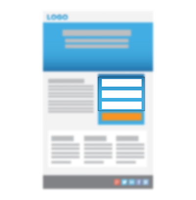
What should the Landing Page consist of?
Landing Page has its own structure and a certain standard set of elements. Let us consider in detail all the components of the Landing Page, and what nuances should be paid attention to when developing:

1. Title
The heading should contain the most concise information that clearly expresses the essence of your sentence. This is the first thing that the user will read on your Landing Page. You can call it an advertising slogan. If the heading does not contain all the necessary information, write a subtitle. Suppose if we sell some kind of inventory management program, then the title should look something like this:
Any inventory problems?
Buy a solution to your problem!
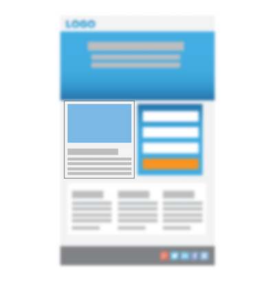
2. Picture
A picture is worth a thousand words. It is needed to attract the attention of the visitor, to create a visual positive image of your product.
In this image, if we are talking about the program, there should be the most successful screenshots, for example, mobile version, iPad version and computer. With this picture, we tell the visitor that the program is supported on various devices.
3. Offer description
Of course, the Landing Page should contain textual information about your offer. This may be a single paragraph, or a detailed description, it all depends on your goals. Here the main thing - do not get involved in the description of the goods. Your task is not to go into all the details of the product, but to incline the buyer to action by various methods (be it a discount, a trial product, etc.)
For example, if we talk about the aforementioned program, its description on the Landing Page might be:
Get the program in three clicks:
1. Register
2. Receive an email with a link to download
3. Use the program and be effective
4. Reviews
Reviews are one of the essential elements of the Landing Page. This information is necessary to call the trust of a potential client. If a visitor wants to buy your product and sees that other customers have already taken advantage of it and are satisfied - his confidence level increases, and the likelihood that he will buy increases.
5. Logo
Your company logo must be present on the Landing Page necessarily, but it should not “lead” to the main site. There should be just a picture, not a link, it is important to understand.
6. Icons of social networks in the basement
These icons should also not be links to your profiles on social networks. These should be forms of adding a visitor as a friend to you on these resources. Why should this be so? So that the person does not leave the page of your Landing Page focused only on your specific product and offer.
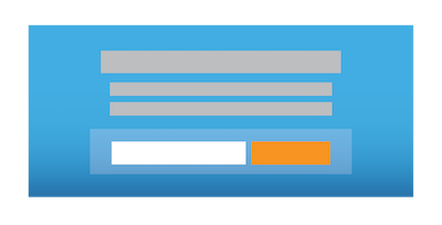
7. Form to fill in the information
The entry form contains fields for entering information that you want to receive from the client, for further processing and storage in your database.
8. Button
This is what ends the work in the system - the visitor must click on the Approve, Send, Book, Buy, etc. button when filling out the form. Only after clicking you will receive information completed by the client in the form.
9. Form after sending the application by the client
After completion of the basic actions by the client, he should see the alert form. There may already be a link to download any book, or a link to a coupon with a 15% discount on the next purchase - it all depends on the product being sold and your goals.
There are several rules regarding the elements that make up the Landing Page:
1. None of the links, buttons should not lead to another resource
The Landing Page itself is the final stop of the user. The client must perform the action and should not go to another site or in the social network. Focus, focus and more focus!
2. Arrangement of elements is a creative approach.
Some adhere to the order of the elements on sites like AIDA (Attention, Interest, Desire, Action) - Attention, interest, desire, action. But if you have some kind of proposal that does not fit into the standard framework, then do not suffer, but implement your order of elements.
3. What to do if you have no reviews
If you are selling a new product, and you do not have reviews on it yet, then you have two options:
- do not include reviews on the site
- post customer reviews that relate to your company as a whole or to you (such reviews may contain information about your competencies, services, etc.)
Landing Page Types
We considered what elements the Landing Page consists of, now let's see what types of “landing pages” are, what elements they contain, what structures they have and how they differ from each other. There are 5 main types of Landing Page:
1. Lead Generation (Lead Generation Landing Page)
The purpose of this type of Landing Page is to collect information about leads - potential customers. For example, name, phone, email - the minimum necessary information on which you can later contact the lead (call, send a letter, based on the context of the proposal).
Lead Generation Landing Page always has a form and a button to send the completed information to the server to the seller, the owner of the Landing Page.

2. Landing Page for click (click-through page)
The goal of this type of page is to collect clicks. It is used to ensure that a person goes to the product purchase page. You advertise a product or service on the Landing Page and you have only one button to Buy or Go to the product page.
Your Landing Page does not have a basket and the ability to pay, but can direct the visitor to the product page, where he can already order it.
Why use this type of Landing Page? In order to “warm up” a visitor for a purchase, quickly inform him about your offer and product, without distracting to other products and services of your company, cause a desire to press a button.
For example, in search results (using Yandex Direct), you have a purchased phrase, according to which a client goes to your Landing Page, where he becomes familiar with the product, without dispelling attention to other products, “matures” for purchase. And when he is ready to make a purchase, he clicks a button and already goes to the product order page located on your main website.
On the pages of this type there is no form to fill in the data by the client, there is only a button that directs the prepared client to the product order page.
3. Compressed Page (Squeeze Page)
 The main purpose of this type of page is to collect email addresses for future newsletters.
As a rule, such pages contain a large image, a header, a form for collecting email and brief information about the competencies with which your company can be useful to its potential customers. Therefore, this type is called the Compressed Page — here some elements of the Landing Page may be omitted.
Suppose you plan to conduct a webinar and collect addresses for distribution. It is necessary that potential webinar visitors leave only their email, for this you only need to enter the email address. You put a big picture, the name and information about the webinar, a field for entering an email and a button with a motivating text. For example, I want to see or I go.
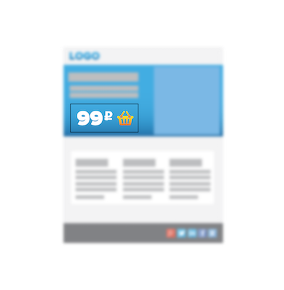
4. Sales page
This type of page is used to sell items. How does it differ from other types? On this page there is always detailed information about the product, service necessary for the client to make a decision. These are usually large pages.
Here we are talking about the price. The visitor, having pressed the button, gets on the form of payment. This Landing Page does not lead to the online store page, it leads directly to the form of payment, or the form of payment is located directly on the page. The visitor enters the data of his bank card, for example, and pays for the goods or services. Here, the main focus is on the fact that people instantly buy goods. And here you need more information to make a decision, especially if the product is not cheap.
5. Bright pages (Splash page)
 This page with a “bright” feed. Here the emphasis is on the product, not on filling out the form. If the rest of the pages are focused on the form (Buy, Register, etc.), then the product and its advantages are in the spotlight. In this case, it is important that the customer learn about the product, remember it. It can leave the page in several ways, but after learning about your product, about how great it is.
Work process Landing Page and recommendations on work
Now consider how the site works. The process of working Landing Page can be divided into four stages:
- Receive inbound traffic
- Conduct A / B testing
- Visitor's work on the Landing Page
- Processing the request after reaching the goal - post-conversion processing
I will give my recommendations on each of these stages, based on the experience of my and my clients.
1. Receive incoming traffic
You receive incoming traffic on advertising in Yandex Direct, through banners on websites, via email-newsletter or through social networks.
I recommend dividing users by transition source. Try to make separate pages for email-mailing, separately for Yandex Direct, separately for search engines or social media. Why is this necessary to do?
- First, it will measure and identify the most effective source of leads.
- Secondly, because people perceive and expect information from different sources of search differently.
A person who logs in from an email list is one consumer; The person who came to you through search engines is a different type of consumer. Even if there will be the same offer and the same product, these should be two different ways of presenting information, and accordingly two different Landing Page.
You can bring much more information in the newsletter than in the search engine ad. If a person has passed through the mailing list, then he has already read a lot, and in this case it is important not to repeat in the Landing Page. And if a person has moved through advertising from a search engine, then he needs to show more information to him, since in the ad you will not fit much.
2. A / B testing
After we split the traffic, we have to do A / B testing. What it is? This means that we show different forms of the page to different customers. For example, one form is a long Landing Page, the other is a short Landing Page. And we look, which of them will be more effective. The “length” of a page is determined by the size of the product description.
Suppose there are 60 people visiting our site: 30 for one form, 30 for another. Their conversion is different, and depending on the effectiveness of the forms, we will choose the one that attracted more customers. If from the first thirty came 5 people, and from the second 15 people, then, of course, we will use the second version of the Landing Page.
3. Visitor Work on Landing Page
What are the nuances here to consider? The user's future work is “predicted” when developing the Landing Page. Therefore, when designing a page, of course, you need to consider the location and the presence of elements. But no one has canceled creative work. It is important not to forget that there is still no specific pattern here, everything depends on the context: you need to understand what you are selling and to whom you are selling.
Here I highly recommend to use exactly the specialized knowledge of designers. First of all, think about how to interest your client, and not how to follow the rules.
When designing the Landing Page, you need to remember: the longer the page, the greater will be the trust of the client, but the less focus he has. Therefore, the shorter the better. Here it is necessary to take into account that a person has a limit of attention.
After the visitor has worked on your page, completed the actions, he can go to the fourth level - post-conversion processing.
4. Postconversion processing
What to do if the visitor pushed the target button? Working with him should not end there.
If he filled out and sent the form, we can give him the opportunity to download any file, give a link to go to the next step, to profiles in social networks, etc ... And if he does not fill out the form, but presses a button (page type - Click -through Page), then we can transfer it to the basket of our website (online store) or to the registration form.
Errors when starting the Landing Page
I want to warn you about the mistakes that I often encountered in practice with my clients.
1. Landing Page is not a Landing Page
Some try to give as much information as possible about their company, their products and benefits, and call it the Landing Page. But this is not a Landing Page in fact.
Landing Page means precisely compressed information on one topic. If you start specifying contacts, your services, a large number of reviews, customers - this is not a Landing Page, this is a one-page site, because you do not comply with the restrictions that the “landing” page implies.
On the Landing Page is not necessary to post information about the company. The main thing is your product and your advantageous offer.
2. Too detailed product description
At some of my clients, Landing Page was created under the guidance of technical specialists, engineers. Such specialists, as a rule, are very scrupulous and scrupulous in their presentation of information. As a result, such descriptions could contain detailed specifications and operating instructions.
Yes, they talked about a single technology and a single product, but they were not Landing Page, they were huge one-page sites that simply frightened their size.
It is important to remember that the client does not need to tell about the product, but to incline him to the action that you need.
3. Do not use A / B testing
I advise: use A / B testing, try different versions of pages. People often think: if every lead is worth my weight in gold, then I will use the option that I like best, which I consider to be the most successful.
No, you may not know it. Some things work unexpectedly, regardless of your thoughts on this. You just may not know something.
Source: https://habr.com/ru/post/273917/
All Articles