Creating a website. Course young fighter
Somehow I was asked to hold a small seminar at the lyceum, where I once studied, to create a website. In the process of writing a speech, I thought that it could turn into material that may be useful to many beginners in the field of web design, web page layout, etc. I do not pretend to truth in the first instance and everything stated is purely personal. to work with design and code. The article gives a superficial look at the concepts and tools that, in my opinion, can be a good start for someone who is ready to go further.
Conventionally, the process of creating a website (web project) can be divided into 3 stages:
This stage can be divided into several sub-steps:
At this stage, we need to decide on the subject of the project (site, service). Further, in accordance with the chosen topic, it is necessary to collect the relevant materials: text, graphic.
')
When we decided on the theme of the project, selected the necessary material, the next step would be to develop the structure of the project. The project structure implies the sections of the site, according to which the navigation menu will be formed and the design of the project will be built. At this stage, it is possible to classify the material by topics and sections.
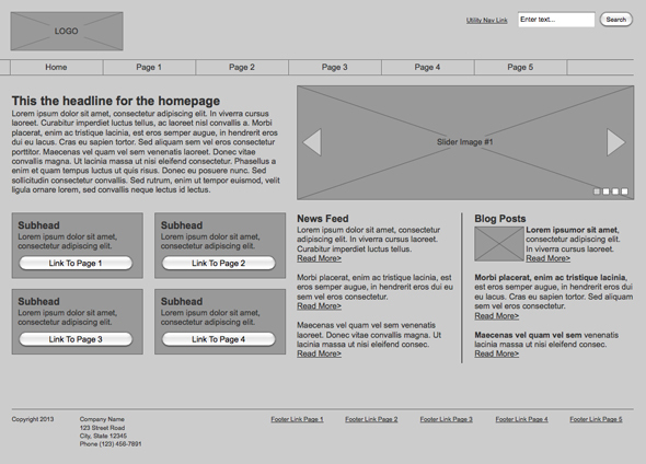
Once we have decided on the structure of the project, it is possible to make a model of the project (schematically).
To draw a sketch, you can use paper and pen, Photoshop, any other graphics editor (previously used by Adobe Fireworks). It is important to note that this stage is not a rendering of the finished design layout, but only a schematic sketch, made to understand how the main information blocks, graphics and other design elements will be located on the site.
Often, the main elements of the page are: containing a block (wrapper, container) , logo , navigation , content , footer , free space (in fact, free space is not a design element, but a concept, remembering which when designing the page, our project will not look like a jumble of blocks).
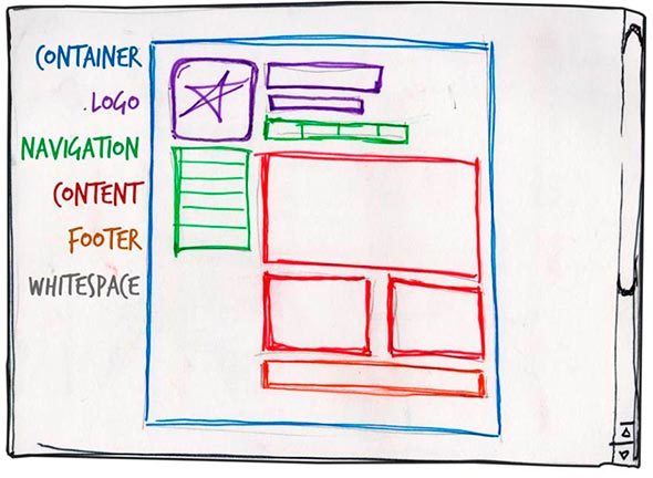
The role of the container on the page can be performed directly by the body element or the div. The width of the containing block can be rubber (fluid), or it can be fixed (fixed).
Text or graphic component of the project and distinguishing it from others. The logo is most often located in the upper left corner of the page or in the middle (depending on the idea, layout).
The main navigation bar contains links to the main sections of the site. The navigation bar is often located at the top of the page (regardless of whether the navigation elements are vertically or horizontally arranged).
Content is the main component of a web page. It occupies a leading role in the design of the page, so it occupies a larger space, supported by graphics, in addition to text.
This element is located at the bottom of the page and usually contains information about the copyright holder, contact and legal data, links to the main sections of the site (often duplicates the main navigation), links to social networks, feedback form, etc.
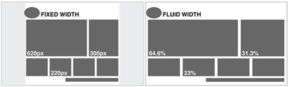
A fixed layout implies that regardless of the user's screen resolution, your site will always occupy the same width.
The "rubber" layout implies that the page of the site will try to occupy all the available space on the user's screen, adjusting to the resolution.
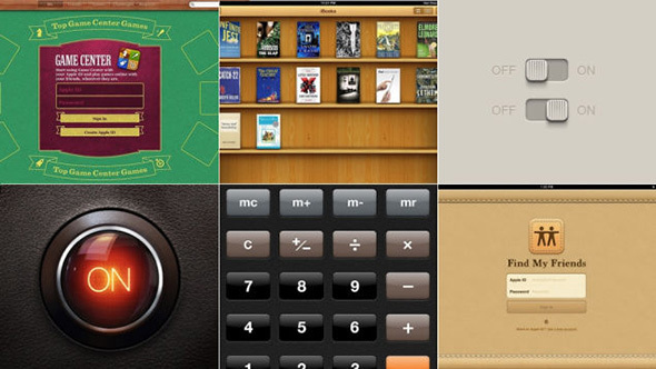
In this context, it is worth understanding such concepts as responsive web design (Responsive Web Design aka. RWD) and responsive web design (Adaptive Web Desing aka. AWD) . The first concept fits into the concept of “rubber” and means that when you change the screen size your website adapts to it, the second concept implies that during development you determine the basic resolutions (screen sizes) that your content will adapt to (adapt). In both cases, you should develop not one, but several layouts that will correspond to different screen resolutions. Often, 3 layouts are created for iPhone (Android Phone), iPad (Android Tablet) and Desktop permissions.

This image shows both approaches. From above, the block “responds” to any changes in the size of the container, from the bottom it “adapts” to a certain width.
Useful links on the topic:
When developing a mobile version of the site, they try to bring the main content to the forefront, so the navigation menu often hides, large banners and decorative elements are hidden, content blocks are usually placed under each other. On a pre-compiled layout, it is just possible to decide which elements we leave on the mobile, and which we hide.
Before drawing up the draft scheme, it is also necessary to understand the concept of a modular grid. The modular grid implies the division of the page into separate columns vertically and the alignment of content, while developing the design of the layout, precisely for this grid.
The most popular system is the modular grid 960 Grid System ( http://960.gs ), which maximally divides the page into 12, 16 and 24 columns. The maximum width of the grid is 960 pixels. This decision is based on the fact that most modern monitors, at the time of the grid, had a resolution of at least 1024 by 768 pixels. Creating a layout based on this grid, in the future, will help speed up the development process (layout).
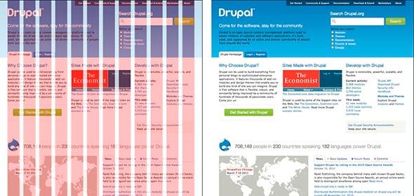
It is also worth noting that when developing a “rubber” page layout, there is the concept of maximum width. This statement is based on the convenience of perception of information. If we assume that our site does not have a maximum value for width, then on large monitors the information will be very stretched and will be inconvenient to read. Most often limited to a width of 1280 pixels.
The 960GS modular grid meets the concept of a “fixed” design; for a “rubber” design, you can pay attention to adapting the same grid on the website http://www.designinfluences.com/fluid960gs/ or use the grid offered by the Bootstrap framework ( http: // getbootstrap.com/css/#grid ).
Thanks to the modular grid, the content blocks and elements will be located at a certain distance from each other, will have a digestible width, which in future will be visually pleasing to the user and will not cause him any inconvenience in the perception of the site.
A modular grid, in essence, is a kind of visual abstraction, a visual division of a page into equal width columns with equal spaces between them. This model can be visualized by means of guides or a separate layer on which these columns will be displayed. This is the solution you will find in the 960gs grid patterns.
Useful links and materials:
Among the variety of web page layout, there are four most common:
But this list of layout types cannot be called exhaustive, so before developing the layout and design of the page, you can also walk on various sites with examples of other works, as well as on sites similar to your subject matter:
On the first two sites you can see what colors were used in the design.
Taking into account the trends of recent years, this approach is densely occupying its niche in the development and design of sites. The trend is that almost 60% of Internet users use mobile devices to access the network, so the development of not only the desktop version of the site, but also the mobile version becomes the good tone rule. When using this approach, the development of the site layout, design and layout starts from the mobile version, and then the layouts for other resolutions are being worked out: blocks, banners, additional design elements, etc. are added.
This approach takes into account almost the entire development cycle, so we will come back to it.
Having mastered all of the above, you can proceed to the next stage - Design.
After creating a project layout, you can proceed directly to creating a design layout. At this stage, it is worth starting with the definition of the color scheme of the project.
One of the ways to determine the main color in a project is to create a mood board. To do this, you need to write out for yourself all the synonyms associated with the theme of the project, and then type each synonym in the search using Google or Yandex pictures. On the basis of the images found write out the colors that are most often found on them (which colors are more). The colors found will constitute the visual perception of our project and cause the user to have corresponding feelings.
You can use the following tools to work with the selected color and create the color palette of our site:
It is important to note that when choosing colors for a palette you should always choose at least 2 contrasting colors. Achieving the desired contrast between the colors is a necessary condition for you to have a good interactive design.
When working on the design of the main and inner pages, it is worth remembering some basic principles.
The concept of a call to action refers to the interactive elements of the site: buttons, banners, etc. These elements are designed in such a way that the user should definitely want to click on them. For example, it can be a call-to-action button (Click, Buy, Save), a bright banner with a tempting offer, a bright picture, etc.
This concept fits well with the principle of AIDA (Attraction Interest Desire Action).
This concept is used more often in the design of the main pages, pages of shares, etc., where it is necessary to push the user to a particular action: subscription, purchase, etc. If we translate this acronym into Russian, we will get the following concepts:
Thus, the principle of constructing a design based on this concept becomes clear: for example, a bright picture, a banner should attract the user's attention, the accompanying message in the text should arouse interest and desire in it, and the call-to-action button should become the final chord.
But this principle does not work by itself without some others: the page view scheme (the most, the natural way of eye movement on the page), visual guides .
Quite often found Z-scheme page view. In accordance with this, elements of the page are usually placed as follows: a logo at the upper left, a menu at the upper right, informational blocks, pictures at the lower left, a button with a call to action at the lower right.

Visual guides are decorative page elements that redirect the user’s look to certain design elements, shapes, buttons, etc. The arrow, the direction of a person’s gaze on an image, the direction of the index finger, in general, everything that can then point in one direction or another.

In the first image, the gaze involuntarily follows the man’s index finger, and his straight gaze involuntarily draws attention to itself at the first glance at the page.
The same effect is demonstrated in the second image with a superimposed heat map: in the first case, we are attracted mainly by the child’s direct look (straight into the eyes), in the second case, the direction of the child’s look and posture involuntarily draws the user’s view of the block to the right.
It is also worth noting that sometimes, when designing a page, use the frameworks Bootstrap , Foundation , Material Design Lite , which, in addition to ready-made design elements (buttons, input forms, etc.), offer their modular grid, CSS snippets (part of the code, markup, which can be used repeatedly) to insert elements into the page (the same buttons, form elements, etc.) and markup classes, as well as JS scripts for the corresponding interactive elements.
Using these libraries can significantly save time when developing a project (design, layout), although at the same time it can make your website look like others, if you use the design elements of frameworks as they are. On the basis of each framework, you can find a huge number of paid and free themes and pages, as well as develop your own.
Ready-made design elements from Bootstrap, Foundation and Material Design Lite (MDL)
It is impossible not to mention some emerging trends of recent times as the layout and design of pages.
First, it is worth mentioning the so-called landing pages, which imply a long page, divided into relevant sections and introducing the user to the main content of the site. Landing is often the only page where you can immediately show all the necessary information without forcing the user to navigate through the pages. Landing pages are usually accompanied by a good design, verified and thoughtful presentation of information, elements of call-to-action, interactivity (counters, animation, etc.).

It should also be said about the appearance of the pages and recall such concepts as skevomorphism and flat design.
Skevomorphism has long given way to a flat design. This concept means endowing the interactive elements with real qualities. For example, the design of the page with books in the form of a bookshelf, the design of a button on the similarity of the present with the corresponding imitation of pressing, the use of real textures, etc. This principle was actively used to create pages a couple of years ago, but then the trends changed and the flat design came to the fore (Flat, Material).
Flat design uses a minimum of textures and design, creating a design based on the concepts of contrast, color ratio and size.
The development of mobile operating systems has played an important role in trends in web design. Most often, the engine of progress is solutions from Apple, which in its design solutions, iOS first used imitations of real objects, and then simplified everything to a flat design (Flat UI). Now the web is dominated by Flat design and Material design, which Google is actively developing.
A good site is a comparison of two concepts: http://www.flatvsrealism.com/
On the basics of web design and prototyping this book can be a good help: Jason Bird: Web design. Developer's Guide .
So, the page layout design process smoothly flows into the “revitalization” process done in the previous steps. Before you start writing HTML, CSS, and JS right away, you should talk a bit about code editors and project structure.
Of the most popular code editors for today, there are three:
In part, all these editors are similar in principle of operation, when during installation we receive an editor, to which we can then “deliver” the necessary modules and plugins, so to speak, “editors on steroids”. The only difference is in the technologies that were used when writing editors, if Sublime Text is written using C ++ and Python, then 2 others use JavaScript, HTML, CSS (Less). Due to this difference, Sublime Text can work a little faster than its colleagues.
There are also more advanced IDE (studios) such as Web Storm, PHP Storm, etc., but the code editor is quite suitable for the project layout, and not the whole studio (IDE).
To decide what suits you personally for the development, it is necessary to delve into the variety of means by yourself and choose the one that best suits your needs.
Text editors reviews:
The structure of the project is the storage of project files in its directory. Often you have to see when all the files are “dumped” together, the names of the files are given by “caps”, numbers or Russian letters, etc. Firstly, this is a banal disrespect for who will work with your project further, secondly, the more if your project will be there, the more files will become and, in the end, you will simply get confused about what is needed and what is needed and what is not.
It is best to place certain categories of files in their folders: images in the image s folder or img , css in the css folder, javascript folder in the js folder. At the root will be only index.html and site pages, or only index.html, and the pages in a separate pages folder. Following these rules you will never get lost in the project.
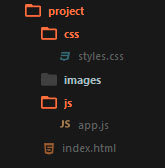
It is also worth mentioning about the naming of the project files. Most commonly, the following names are used: the main page is index.html , stylesheet styles.css styles, scripts.js or app.js scripts , minimized versions of files have the prefix .min, the pictures are not long names in Russian or a set of numbers, but reflect what they depict, for example, button.png , download-icon.png , logo.png , etc.
So, having defined the code editor, the structure we can begin to develop. First of all, it should be noted that the page layout is done in stages: first, the HTML structure is written (HTML code), then styles are added, and then, if necessary, scripts are written (JS), the necessary plug-ins and libraries are added.
Given the above, we can conditionally divide the work on the project into the following stages:
Now, when writing HTML code, it is already safe to use tags and markup elements that appeared along with the HTML5 standard, if you need to support older browsers, you can use, for example, the html5shiv plugin ( https://github.com/afarkas/html5shiv ), which provides support for new standards in old browsers or the Modernizr library ( https://modernizr.com/ ) (html5shiv is included in the Modernizr assembly), which determines the capabilities of the browser with which the site is viewed.
At site layout at the present time, a priori, a block approach is used, no tables, iframes, etc. Tables perform only their direct role - the presentation of information in the form of a table. In the layout table are used only when working with emails.
At the stage of writing HTML, we, as it were, create the skeleton of a page, its abstract model with the help of tags (HTML markup language). It is worth noting that the structure may be easier to write if we have a prototype drawn up at the first stage or, if we ourselves, looking at the design layout, have schematically painted all the page blocks on paper.
When writing markup, we can also immediately assign elements and identifiers to elements.
There should be order in everything in the project: from the project structure to class names, markup and code writing. If it is important to keep track of the type of information and its placement in the relevant blocks (heading, list, link, line element, paragraph, etc.) when marking, then it is important to follow common sense when naming classes and identifiers. Classes should give an abstract concept of the block to which they belong, so that the code is easier to read and then write styles. In principle, there should not be anything complicated, if we label the menu, then it is logical for the containing block to give the class .nav or .navigation, if it is a block with text, then we can give it the class .block-text, etc.
Today there is one popular approach that concerns the principles of building a project as a whole, but at this stage we are interested in the naming of classes. The approach is called BEM and stands for Block Element Modifier .
In short, this approach can be described as a kind of convention for naming classes and representing page markup. Each element of the page is an entity that can exist independently of the context, then we speak about the Block ( .block ) or only in the context of another entity, then we speak about the Element ( .block__element ). Each Block or Element can have different presentation models: color, shape, transparency, etc. The Modifier ( .block__element_mod ) will be responsible for such properties.
Thus, we present our code as a composition of blocks, elements and their modifications.
More complete information on the methodology: https://ru.bem.info/
There is also an SMACSS approach (this acronym stands for Scalable and Modular Architecture for CSS - Scalable and Modular Archiecture for CSS), which divides the concept of classes and markup into several levels: basic, layout, module, state, theme.
This approach uses the following naming conventions. Levels are defined using prefixes and the corresponding letter designation:
.
: https://smacss.com/
SMACSS: https://github.com/andrew--r/smacss
, , .
HTML:
. html , CSS .
2- CSS -: normalize.css reset.css.
reset.css , . – , . reset.css , « » .
Normalize.css , « », , - .
, normalize.css. , , .
, , « », * {margin: 0; padding: 0}. . , , ( ).
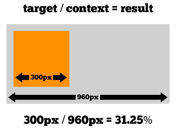
, -. «» ( c Adobe Photoshop), . , , «», . – , ( ). , , 400px , 340px , (340 / 400) * 100% , 85% .
, , , , : .main –nav ul li a , .main-nav a . «» , , CSS , , (a), , li .. .
, . , , .block span ( .block span {background-color: blue} ), div, , div .block. , . ( ), .
– , , div.block {display: block}. span, span.block {display: block} span.block, div.block {display: block}, .
? -, , -, 10000 , , , , , , .
, , CSS3, http://caniuse.com .
Mobile First, , , , . , , , : .
:
, JS . , , jQuery, web- (DOM ), , , . , JavaScript , jQuery. , jQuery, , JavaScript.
, JavaScript jQuery: http://youmightnotneedjquery.com/ , https://developer.mozilla.org/ru/ , , JavaScript, ( , JavaScript).
, JavaScript , DOM ( ) CSS JavaScript, . , CSS - (, , , .) .
, .list__item , , ( ) , ( .list__item--active ), , JS:
A small example of the possible ways of assigning a class (the assignment of a modifier occurs when you click on the green square): http://jsbin.com/ .
It is not recommended to solve tasks that are clearly related to the CSS level using JavaScript, trying to somehow align the object or add styles to it when hovering, etc.
Again, returning to the Mobile First theme, one can not fail to mention the 2 concepts that correlate with this technique. Progressive Enhacement and Graceful Degradation, which translates as a progressive improvement and consistent deterioration. These principles describe 2 different approaches to development: in the first case, we develop our website, write scripts taking into account old browsers and systems, or define behavior when it is impossible to run scripts, and then gradually improve the script, introducing modern functions and methods, so we get A site that will work equally well in old and new browsers and environments (the same goes for css).
With Graceful Degradation, the approach is the opposite - we develop for modern browsers and, only, then we begin to make improvements and changes taking into account old versions.
Mobile First's approach is somewhat similar to Progressive Enhacement.
After writing html, css and js for our page, you need to check whether everything is done correctly. To do this, you can use online tools:
Thanks to these services, you can check if you forgot to close the tag somewhere, if you use parameters and attributes correctly, if everything is in order with your styles and rules in them, as well as to check your code for correctness of writing functions, methods, etc.
Articles with recommendations for writing JS, HTML and CSS:
Today, almost all routine development processes (with the exception of design) can be automated to one degree or another.
We already talked about this development tool in the section about modular grids and design. It must be said that 960GS offers not only layouts for creating a design, but also its own class naming system. Using the proposed classes with the layout and when the css file of the system is connected to the project, the site blocks will be aligned along this grid, which will save time on writing almost the same thing yourself.
Emmet is a tool for working with html and css ( http://emmet.io/ ). The plugin for working with this tool can be installed, for example, in Sublime Text, then you have the opportunity not to write cumbersome pieces of code in html and css, and write them in a line, then expanding into a full markup. For example, the string .block> ul.list> li.list__item * 3 , can be expanded into full code:
Then you just need to enter text values in the list items. The same applies to css: the string w: 100px + h: 150px + bgc: # ff0 expands to:
Thanks to these tools, writing code becomes faster and more enjoyable, as you spend less time writing the closing blocks, navigating through the lines, and also decreases the possibility regarding html not to close one or another markup element. In terms of CSS, for example, it becomes easier to work with browser prefixes, since a single line with the CSS3 property can be expanded into a few with the addition of the necessary prefixes.
Further it is worth mentioning such a language for working with templates as jade ( http://jade-lang.com/ ). Again, using jade to write html becomes faster and more convenient, and it also becomes possible to create reusable blocks of code and mixins, passing to which these or other parameters we will receive the necessary markup. Thanks to jade in the project, regarding markup and writing pages, modularity can be maintained, and frequently used names and code blocks can be transferred as variables (names, names of pages, etc.) or mixins into separate settings files and files, respectively. To work with jade, or rather to convert the written code from jade to html, you need to use the command line, as well as install the nodejs platform on your computer ( https://nodejs.org/en/ , http://nodejs.ru/ ).
Working on the command line can also speed up some stages of working on a project, for example, creating folders and files. By running the console in the project directory and typing in it just one line:
After pressing enter, we will get the project folder in which the css, images, js folders will be located, the styles.css and app.js files in the css and js folders, respectively, and the index.html file in the project root. Thus, we saved time on creating a folder, writing its name, creating files, etc. The command line is also used to work with other automation tools.
Next is to talk about a language like Sass ( http://sass-lang.com/ ). This language simplifies working with css. Thanks to Sass, you can write nested classes, perform mathematical calculations directly in the code, put the reused values as variables into separate files or at the beginning of the file, which greatly simplifies further work with styles and simplifies the change of certain values, since they will all stored in one place and will not need to "walk" around the project and make the appropriate changes. Also, thanks to Sass, you can follow the principle of modularity in the project, store the markup parts in the corresponding files and connect them all to the main one, then you can use the console command to collect all the code into one css file, as well as building the resulting file on the fly as you write styles. Again, you need a command line to work with Sass. The installation package can be studied here: http://sass-lang.com/install .
HTML5Boilerplate ( https://html5boilerplate.com/ ) is a pre-packaged project that already has index.html, normalize.css, etc. The index.html, for example, already has the basic pieces of code that are required when writing html pages. The project allows you to download the archive with all the files as is or use the custom assembly: http://www.initializr.com/ . Again, the principle is simple: why waste time writing the same lines or doing the same manipulations if we can immediately concentrate directly on working with the project.
Gulp ( http://gulpjs.com/ ) and Grunt ( http://gruntjs.com/ ) are task launch services, which are described in the main files of these services, are executed using compatible modules and are launched for execution using the console.
These services help to use in development, for example, the Jade and Sass tools described above, automatically convert them to the corresponding html and css files, compress them if necessary, and also check, for example css properties, the need to use browser prefixes and substitute them automatically. mode.
Both services use a different approach in describing the execution of tasks, but the essence of their work is the same. This comparison will be useful: http://frontender.info/gulp-grunt-whatever/
Also, many services like autoprefixer (automatic browser prefixing), jshint (checking JS code for validity) can be installed as third-party plugins in a text editor (Sumblime Text, Atom, Brackets) and initialized when you press a certain key combination.
These frameworks have already been mentioned in the section on design. But it is worth remembering about them again, as they, to a certain extent, help automate the process of marking a web page and working with it.
When connecting framework files in a project, we can use the classes and markup snippets defined in them, which will work according to the rules already described and have an established appearance (for example, buttons, input fields, tables, etc.). Thus, we save time, for example, on the description of the location of design blocks, their sizes depending on the resolution, the appearance of form fields, buttons and their state.
All features and examples can be found on the relevant sites:
This description is not exhaustive and represents only a superficial look at some technologies. But before embarking on everything serious, using automation tools, libraries, frameworks, ready-made code, etc., it is worth learning the basics of working with html, css and js.
I hope that all the described things will be useful to you in studying the topic of web design and front-end development.
Conventionally, the process of creating a website (web project) can be divided into 3 stages:
Planning
This stage can be divided into several sub-steps:
- Idea creation
- Project structure development
- Elaboration of the project layout
Idea creation
At this stage, we need to decide on the subject of the project (site, service). Further, in accordance with the chosen topic, it is necessary to collect the relevant materials: text, graphic.
')
Project structure development
When we decided on the theme of the project, selected the necessary material, the next step would be to develop the structure of the project. The project structure implies the sections of the site, according to which the navigation menu will be formed and the design of the project will be built. At this stage, it is possible to classify the material by topics and sections.
Elaboration of the project layout
Once we have decided on the structure of the project, it is possible to make a model of the project (schematically).
To draw a sketch, you can use paper and pen, Photoshop, any other graphics editor (previously used by Adobe Fireworks). It is important to note that this stage is not a rendering of the finished design layout, but only a schematic sketch, made to understand how the main information blocks, graphics and other design elements will be located on the site.
The main elements of the page
Often, the main elements of the page are: containing a block (wrapper, container) , logo , navigation , content , footer , free space (in fact, free space is not a design element, but a concept, remembering which when designing the page, our project will not look like a jumble of blocks).
Containing block (container)
The role of the container on the page can be performed directly by the body element or the div. The width of the containing block can be rubber (fluid), or it can be fixed (fixed).
Logo
Text or graphic component of the project and distinguishing it from others. The logo is most often located in the upper left corner of the page or in the middle (depending on the idea, layout).
Navigation
The main navigation bar contains links to the main sections of the site. The navigation bar is often located at the top of the page (regardless of whether the navigation elements are vertically or horizontally arranged).
Content
Content is the main component of a web page. It occupies a leading role in the design of the page, so it occupies a larger space, supported by graphics, in addition to text.
Footer
This element is located at the bottom of the page and usually contains information about the copyright holder, contact and legal data, links to the main sections of the site (often duplicates the main navigation), links to social networks, feedback form, etc.
Rubber and fixed layout
Fixed layout
A fixed layout implies that regardless of the user's screen resolution, your site will always occupy the same width.
Rubber layout
The "rubber" layout implies that the page of the site will try to occupy all the available space on the user's screen, adjusting to the resolution.
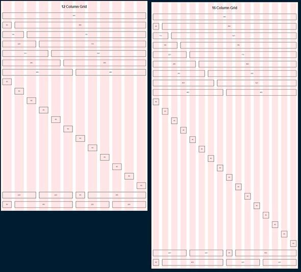
In this context, it is worth understanding such concepts as responsive web design (Responsive Web Design aka. RWD) and responsive web design (Adaptive Web Desing aka. AWD) . The first concept fits into the concept of “rubber” and means that when you change the screen size your website adapts to it, the second concept implies that during development you determine the basic resolutions (screen sizes) that your content will adapt to (adapt). In both cases, you should develop not one, but several layouts that will correspond to different screen resolutions. Often, 3 layouts are created for iPhone (Android Phone), iPad (Android Tablet) and Desktop permissions.
This image shows both approaches. From above, the block “responds” to any changes in the size of the container, from the bottom it “adapts” to a certain width.
Useful links on the topic:
- An example of a site that uses the concept of responsive web design.
- An article that understands this concept (eng.)
- The book is about responsive web design by the author of the article
Why does a “rubber” design create several layouts instead of using one?
When developing a mobile version of the site, they try to bring the main content to the forefront, so the navigation menu often hides, large banners and decorative elements are hidden, content blocks are usually placed under each other. On a pre-compiled layout, it is just possible to decide which elements we leave on the mobile, and which we hide.
Modular grid
Before drawing up the draft scheme, it is also necessary to understand the concept of a modular grid. The modular grid implies the division of the page into separate columns vertically and the alignment of content, while developing the design of the layout, precisely for this grid.
The most popular system is the modular grid 960 Grid System ( http://960.gs ), which maximally divides the page into 12, 16 and 24 columns. The maximum width of the grid is 960 pixels. This decision is based on the fact that most modern monitors, at the time of the grid, had a resolution of at least 1024 by 768 pixels. Creating a layout based on this grid, in the future, will help speed up the development process (layout).
It is also worth noting that when developing a “rubber” page layout, there is the concept of maximum width. This statement is based on the convenience of perception of information. If we assume that our site does not have a maximum value for width, then on large monitors the information will be very stretched and will be inconvenient to read. Most often limited to a width of 1280 pixels.
The 960GS modular grid meets the concept of a “fixed” design; for a “rubber” design, you can pay attention to adapting the same grid on the website http://www.designinfluences.com/fluid960gs/ or use the grid offered by the Bootstrap framework ( http: // getbootstrap.com/css/#grid ).
Thanks to the modular grid, the content blocks and elements will be located at a certain distance from each other, will have a digestible width, which in future will be visually pleasing to the user and will not cause him any inconvenience in the perception of the site.
A modular grid, in essence, is a kind of visual abstraction, a visual division of a page into equal width columns with equal spaces between them. This model can be visualized by means of guides or a separate layer on which these columns will be displayed. This is the solution you will find in the 960gs grid patterns.
Useful links and materials:
- Adaptive Grid Patterns
- Prototype creation based on 960gs (eng.)
- Using 960gs mesh as a basis for design (eng.)
Web page layouts
Among the variety of web page layout, there are four most common:
- Navigation in the left column
- Navigation in the right column
- Navigation in three columns
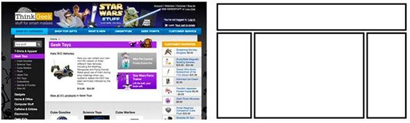
- Horizontal navigation . At this stage, sites with this type of navigation constitute the majority. The convenience of this approach is easily explained by the fact that in this case we have more space for the content that makes up our site.
But this list of layout types cannot be called exhaustive, so before developing the layout and design of the page, you can also walk on various sites with examples of other works, as well as on sites similar to your subject matter:
- http://unmatchedstyle.com/gallery
- http://cssdrive.com
- http://foundation.zurb.com/templates.html
- http://zurb.com/patterntap
On the first two sites you can see what colors were used in the design.
Mobile first
Taking into account the trends of recent years, this approach is densely occupying its niche in the development and design of sites. The trend is that almost 60% of Internet users use mobile devices to access the network, so the development of not only the desktop version of the site, but also the mobile version becomes the good tone rule. When using this approach, the development of the site layout, design and layout starts from the mobile version, and then the layouts for other resolutions are being worked out: blocks, banners, additional design elements, etc. are added.
This approach takes into account almost the entire development cycle, so we will come back to it.
Having mastered all of the above, you can proceed to the next stage - Design.
Design
After creating a project layout, you can proceed directly to creating a design layout. At this stage, it is worth starting with the definition of the color scheme of the project.
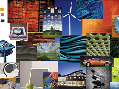
One of the ways to determine the main color in a project is to create a mood board. To do this, you need to write out for yourself all the synonyms associated with the theme of the project, and then type each synonym in the search using Google or Yandex pictures. On the basis of the images found write out the colors that are most often found on them (which colors are more). The colors found will constitute the visual perception of our project and cause the user to have corresponding feelings.
You can use the following tools to work with the selected color and create the color palette of our site:
- Color Scheme Designer 3 ( http://colorschemedesigner.com/csd-3.5/ ). In addition to choosing a color scheme, this service allows you to see an example of how the selected colors will look on the site.
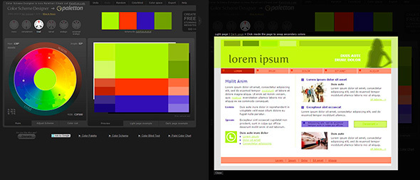
- Adobe Color CC ( https://color.adobe.com/ru/ ). This resource, in contrast to Color Scheme Designer 3, allows you to create palettes also on the basis of downloaded images (which, for example, could have appeared at the stage of drawing up the mood board). Also, this service has a large archive of palettes of other users.
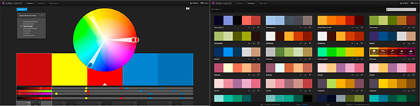
- COLORlovers ( http://www.colourlovers.com/ ). Extensive community where you can pick up a variety of palettes.
It is important to note that when choosing colors for a palette you should always choose at least 2 contrasting colors. Achieving the desired contrast between the colors is a necessary condition for you to have a good interactive design.
When working on the design of the main and inner pages, it is worth remembering some basic principles.
Elements of Call to Action
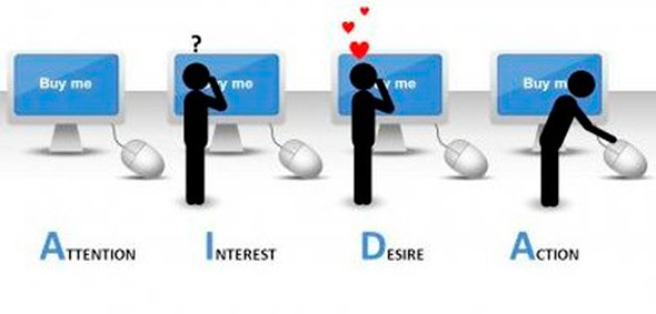
The concept of a call to action refers to the interactive elements of the site: buttons, banners, etc. These elements are designed in such a way that the user should definitely want to click on them. For example, it can be a call-to-action button (Click, Buy, Save), a bright banner with a tempting offer, a bright picture, etc.
This concept fits well with the principle of AIDA (Attraction Interest Desire Action).
AIDA
This concept is used more often in the design of the main pages, pages of shares, etc., where it is necessary to push the user to a particular action: subscription, purchase, etc. If we translate this acronym into Russian, we will get the following concepts:
- To attract attention
- Interest
- A wish
- Act
Thus, the principle of constructing a design based on this concept becomes clear: for example, a bright picture, a banner should attract the user's attention, the accompanying message in the text should arouse interest and desire in it, and the call-to-action button should become the final chord.
But this principle does not work by itself without some others: the page view scheme (the most, the natural way of eye movement on the page), visual guides .
Page view
Quite often found Z-scheme page view. In accordance with this, elements of the page are usually placed as follows: a logo at the upper left, a menu at the upper right, informational blocks, pictures at the lower left, a button with a call to action at the lower right.
Visual guides
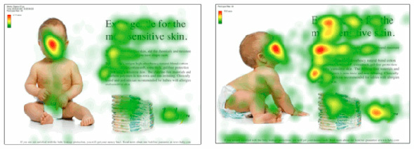
Visual guides are decorative page elements that redirect the user’s look to certain design elements, shapes, buttons, etc. The arrow, the direction of a person’s gaze on an image, the direction of the index finger, in general, everything that can then point in one direction or another.
In the first image, the gaze involuntarily follows the man’s index finger, and his straight gaze involuntarily draws attention to itself at the first glance at the page.
The same effect is demonstrated in the second image with a superimposed heat map: in the first case, we are attracted mainly by the child’s direct look (straight into the eyes), in the second case, the direction of the child’s look and posture involuntarily draws the user’s view of the block to the right.
Frameworks
It is also worth noting that sometimes, when designing a page, use the frameworks Bootstrap , Foundation , Material Design Lite , which, in addition to ready-made design elements (buttons, input forms, etc.), offer their modular grid, CSS snippets (part of the code, markup, which can be used repeatedly) to insert elements into the page (the same buttons, form elements, etc.) and markup classes, as well as JS scripts for the corresponding interactive elements.
Using these libraries can significantly save time when developing a project (design, layout), although at the same time it can make your website look like others, if you use the design elements of frameworks as they are. On the basis of each framework, you can find a huge number of paid and free themes and pages, as well as develop your own.
Ready-made design elements from Bootstrap, Foundation and Material Design Lite (MDL)
Trends
It is impossible not to mention some emerging trends of recent times as the layout and design of pages.
First, it is worth mentioning the so-called landing pages, which imply a long page, divided into relevant sections and introducing the user to the main content of the site. Landing is often the only page where you can immediately show all the necessary information without forcing the user to navigate through the pages. Landing pages are usually accompanied by a good design, verified and thoughtful presentation of information, elements of call-to-action, interactivity (counters, animation, etc.).
It should also be said about the appearance of the pages and recall such concepts as skevomorphism and flat design.
Skevomorphism
Skevomorphism has long given way to a flat design. This concept means endowing the interactive elements with real qualities. For example, the design of the page with books in the form of a bookshelf, the design of a button on the similarity of the present with the corresponding imitation of pressing, the use of real textures, etc. This principle was actively used to create pages a couple of years ago, but then the trends changed and the flat design came to the fore (Flat, Material).
Flat design
Flat design uses a minimum of textures and design, creating a design based on the concepts of contrast, color ratio and size.
The development of mobile operating systems has played an important role in trends in web design. Most often, the engine of progress is solutions from Apple, which in its design solutions, iOS first used imitations of real objects, and then simplified everything to a flat design (Flat UI). Now the web is dominated by Flat design and Material design, which Google is actively developing.
A good site is a comparison of two concepts: http://www.flatvsrealism.com/
On the basics of web design and prototyping this book can be a good help: Jason Bird: Web design. Developer's Guide .
Development
So, the page layout design process smoothly flows into the “revitalization” process done in the previous steps. Before you start writing HTML, CSS, and JS right away, you should talk a bit about code editors and project structure.
Code editors
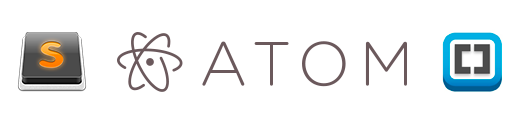
Of the most popular code editors for today, there are three:
- Sublime Text ( http://www.sublimetext.com/3 )
- Atom ( https://atom.io/ )
- Brackets ( http://brackets.io/ )
In part, all these editors are similar in principle of operation, when during installation we receive an editor, to which we can then “deliver” the necessary modules and plugins, so to speak, “editors on steroids”. The only difference is in the technologies that were used when writing editors, if Sublime Text is written using C ++ and Python, then 2 others use JavaScript, HTML, CSS (Less). Due to this difference, Sublime Text can work a little faster than its colleagues.
There are also more advanced IDE (studios) such as Web Storm, PHP Storm, etc., but the code editor is quite suitable for the project layout, and not the whole studio (IDE).
To decide what suits you personally for the development, it is necessary to delve into the variety of means by yourself and choose the one that best suits your needs.
Text editors reviews:
Project structure
The structure of the project is the storage of project files in its directory. Often you have to see when all the files are “dumped” together, the names of the files are given by “caps”, numbers or Russian letters, etc. Firstly, this is a banal disrespect for who will work with your project further, secondly, the more if your project will be there, the more files will become and, in the end, you will simply get confused about what is needed and what is needed and what is not.
It is best to place certain categories of files in their folders: images in the image s folder or img , css in the css folder, javascript folder in the js folder. At the root will be only index.html and site pages, or only index.html, and the pages in a separate pages folder. Following these rules you will never get lost in the project.
It is also worth mentioning about the naming of the project files. Most commonly, the following names are used: the main page is index.html , stylesheet styles.css styles, scripts.js or app.js scripts , minimized versions of files have the prefix .min, the pictures are not long names in Russian or a set of numbers, but reflect what they depict, for example, button.png , download-icon.png , logo.png , etc.
Project work
So, having defined the code editor, the structure we can begin to develop. First of all, it should be noted that the page layout is done in stages: first, the HTML structure is written (HTML code), then styles are added, and then, if necessary, scripts are written (JS), the necessary plug-ins and libraries are added.
Given the above, we can conditionally divide the work on the project into the following stages:
HTML writing
Now, when writing HTML code, it is already safe to use tags and markup elements that appeared along with the HTML5 standard, if you need to support older browsers, you can use, for example, the html5shiv plugin ( https://github.com/afarkas/html5shiv ), which provides support for new standards in old browsers or the Modernizr library ( https://modernizr.com/ ) (html5shiv is included in the Modernizr assembly), which determines the capabilities of the browser with which the site is viewed.
At site layout at the present time, a priori, a block approach is used, no tables, iframes, etc. Tables perform only their direct role - the presentation of information in the form of a table. In the layout table are used only when working with emails.
At the stage of writing HTML, we, as it were, create the skeleton of a page, its abstract model with the help of tags (HTML markup language). It is worth noting that the structure may be easier to write if we have a prototype drawn up at the first stage or, if we ourselves, looking at the design layout, have schematically painted all the page blocks on paper.
When writing markup, we can also immediately assign elements and identifiers to elements.
Class Naming Rules
There should be order in everything in the project: from the project structure to class names, markup and code writing. If it is important to keep track of the type of information and its placement in the relevant blocks (heading, list, link, line element, paragraph, etc.) when marking, then it is important to follow common sense when naming classes and identifiers. Classes should give an abstract concept of the block to which they belong, so that the code is easier to read and then write styles. In principle, there should not be anything complicated, if we label the menu, then it is logical for the containing block to give the class .nav or .navigation, if it is a block with text, then we can give it the class .block-text, etc.
BEM
Today there is one popular approach that concerns the principles of building a project as a whole, but at this stage we are interested in the naming of classes. The approach is called BEM and stands for Block Element Modifier .
In short, this approach can be described as a kind of convention for naming classes and representing page markup. Each element of the page is an entity that can exist independently of the context, then we speak about the Block ( .block ) or only in the context of another entity, then we speak about the Element ( .block__element ). Each Block or Element can have different presentation models: color, shape, transparency, etc. The Modifier ( .block__element_mod ) will be responsible for such properties.
Thus, we present our code as a composition of blocks, elements and their modifications.
More complete information on the methodology: https://ru.bem.info/
SMACSS
There is also an SMACSS approach (this acronym stands for Scalable and Modular Architecture for CSS - Scalable and Modular Archiecture for CSS), which divides the concept of classes and markup into several levels: basic, layout, module, state, theme.
- Everything related to the html tags will be related to the base level.
- By the level of the layout, we will refer everything related to the main components of the page: section.
- By the level of the module, we will refer everything related to reused page elements: banners, navigation, lists, blocks of information, etc.
- The Status level describes how modules and sections will look in one or another state: displayed or not displayed, compressed or opened, active or inactive, etc.
- The theme level is somewhat similar to the State level and reflects how modules or sections may look.
This approach uses the following naming conventions. Levels are defined using prefixes and the corresponding letter designation:
- Layout: .l- or .layout-
- , module- . , : .example { }, .afisha {} .
- .is- , .is-hidden {}
- .
.
: https://smacss.com/
SMACSS: https://github.com/andrew--r/smacss
, , .
HTML:
CSS
. html , CSS .
2- CSS -: normalize.css reset.css.
Reset.css
reset.css , . – , . reset.css , « » .
Normalize.css
Normalize.css , « », , - .
, normalize.css. , , .
, , « », * {margin: 0; padding: 0}. . , , ( ).
, -. «» ( c Adobe Photoshop), . , , «», . – , ( ). , , 400px , 340px , (340 / 400) * 100% , 85% .
, , , , : .main –nav ul li a , .main-nav a . «» , , CSS , , (a), , li .. .
, . , , .block span ( .block span {background-color: blue} ), div, , div .block. , . ( ), .
– , , div.block {display: block}. span, span.block {display: block} span.block, div.block {display: block}, .
? -, , -, 10000 , , , , , , .
, , CSS3, http://caniuse.com .
Mobile First, , , , . , , , : .
:
JS
, JS . , , jQuery, web- (DOM ), , , . , JavaScript , jQuery. , jQuery, , JavaScript.
, JavaScript jQuery: http://youmightnotneedjquery.com/ , https://developer.mozilla.org/ru/ , , JavaScript, ( , JavaScript).
, JavaScript , DOM ( ) CSS JavaScript, . , CSS - (, , , .) .
, .list__item , , ( ) , ( .list__item--active ), , JS:
document.querySelector('.list__item').style.color = 'red'; A small example of the possible ways of assigning a class (the assignment of a modifier occurs when you click on the green square): http://jsbin.com/ .
It is not recommended to solve tasks that are clearly related to the CSS level using JavaScript, trying to somehow align the object or add styles to it when hovering, etc.
Again, returning to the Mobile First theme, one can not fail to mention the 2 concepts that correlate with this technique. Progressive Enhacement and Graceful Degradation, which translates as a progressive improvement and consistent deterioration. These principles describe 2 different approaches to development: in the first case, we develop our website, write scripts taking into account old browsers and systems, or define behavior when it is impossible to run scripts, and then gradually improve the script, introducing modern functions and methods, so we get A site that will work equally well in old and new browsers and environments (the same goes for css).
With Graceful Degradation, the approach is the opposite - we develop for modern browsers and, only, then we begin to make improvements and changes taking into account old versions.
Mobile First's approach is somewhat similar to Progressive Enhacement.
Code check
After writing html, css and js for our page, you need to check whether everything is done correctly. To do this, you can use online tools:
- To check html: https://validator.w3.org /
- To check CSS: http://jigsaw.w3.org/css-validator/
- To check JS: http://www.jslint.com/
Thanks to these services, you can check if you forgot to close the tag somewhere, if you use parameters and attributes correctly, if everything is in order with your styles and rules in them, as well as to check your code for correctness of writing functions, methods, etc.
Articles with recommendations for writing JS, HTML and CSS:
- 10 Tips for Writing Native JavaScript Without jQuery
- Site collection of recommendations for JS, HTML and CSS
Automation Tools
Today, almost all routine development processes (with the exception of design) can be automated to one degree or another.
960GS
We already talked about this development tool in the section about modular grids and design. It must be said that 960GS offers not only layouts for creating a design, but also its own class naming system. Using the proposed classes with the layout and when the css file of the system is connected to the project, the site blocks will be aligned along this grid, which will save time on writing almost the same thing yourself.
<div class="container_12"> <div class="grid_7 prefix_1"> <div class="grid_2 alpha"> ... </div> <div class="grid_3"> ... </div> <div class="grid_2 omega"> ... </div> </div> <div class="grid_3 suffix_1"> ... </div> </div> Emmet
Emmet is a tool for working with html and css ( http://emmet.io/ ). The plugin for working with this tool can be installed, for example, in Sublime Text, then you have the opportunity not to write cumbersome pieces of code in html and css, and write them in a line, then expanding into a full markup. For example, the string .block> ul.list> li.list__item * 3 , can be expanded into full code:
<div class="block"> <ul class="list"> <li class="list__item"></li> <li class="list__item"></li> <li class="list__item"></li> </ul> </div> Then you just need to enter text values in the list items. The same applies to css: the string w: 100px + h: 150px + bgc: # ff0 expands to:
width: 100px; height: 150px; background-color: #ff0; Thanks to these tools, writing code becomes faster and more enjoyable, as you spend less time writing the closing blocks, navigating through the lines, and also decreases the possibility regarding html not to close one or another markup element. In terms of CSS, for example, it becomes easier to work with browser prefixes, since a single line with the CSS3 property can be expanded into a few with the addition of the necessary prefixes.
Jade
Further it is worth mentioning such a language for working with templates as jade ( http://jade-lang.com/ ). Again, using jade to write html becomes faster and more convenient, and it also becomes possible to create reusable blocks of code and mixins, passing to which these or other parameters we will receive the necessary markup. Thanks to jade in the project, regarding markup and writing pages, modularity can be maintained, and frequently used names and code blocks can be transferred as variables (names, names of pages, etc.) or mixins into separate settings files and files, respectively. To work with jade, or rather to convert the written code from jade to html, you need to use the command line, as well as install the nodejs platform on your computer ( https://nodejs.org/en/ , http://nodejs.ru/ ).
Command line
Working on the command line can also speed up some stages of working on a project, for example, creating folders and files. By running the console in the project directory and typing in it just one line:
mkdir project && cd project && mkdir css && touch css/styles.css && mkdir images && mkdir js && touch js/app.js && touch index.html After pressing enter, we will get the project folder in which the css, images, js folders will be located, the styles.css and app.js files in the css and js folders, respectively, and the index.html file in the project root. Thus, we saved time on creating a folder, writing its name, creating files, etc. The command line is also used to work with other automation tools.
Sass
Next is to talk about a language like Sass ( http://sass-lang.com/ ). This language simplifies working with css. Thanks to Sass, you can write nested classes, perform mathematical calculations directly in the code, put the reused values as variables into separate files or at the beginning of the file, which greatly simplifies further work with styles and simplifies the change of certain values, since they will all stored in one place and will not need to "walk" around the project and make the appropriate changes. Also, thanks to Sass, you can follow the principle of modularity in the project, store the markup parts in the corresponding files and connect them all to the main one, then you can use the console command to collect all the code into one css file, as well as building the resulting file on the fly as you write styles. Again, you need a command line to work with Sass. The installation package can be studied here: http://sass-lang.com/install .
HTML5Boilerplate
HTML5Boilerplate ( https://html5boilerplate.com/ ) is a pre-packaged project that already has index.html, normalize.css, etc. The index.html, for example, already has the basic pieces of code that are required when writing html pages. The project allows you to download the archive with all the files as is or use the custom assembly: http://www.initializr.com/ . Again, the principle is simple: why waste time writing the same lines or doing the same manipulations if we can immediately concentrate directly on working with the project.
Gulp and Grunt
Gulp ( http://gulpjs.com/ ) and Grunt ( http://gruntjs.com/ ) are task launch services, which are described in the main files of these services, are executed using compatible modules and are launched for execution using the console.
These services help to use in development, for example, the Jade and Sass tools described above, automatically convert them to the corresponding html and css files, compress them if necessary, and also check, for example css properties, the need to use browser prefixes and substitute them automatically. mode.
Both services use a different approach in describing the execution of tasks, but the essence of their work is the same. This comparison will be useful: http://frontender.info/gulp-grunt-whatever/
Also, many services like autoprefixer (automatic browser prefixing), jshint (checking JS code for validity) can be installed as third-party plugins in a text editor (Sumblime Text, Atom, Brackets) and initialized when you press a certain key combination.
Bootrstrap, Foundation, Material Design Lite
These frameworks have already been mentioned in the section on design. But it is worth remembering about them again, as they, to a certain extent, help automate the process of marking a web page and working with it.
When connecting framework files in a project, we can use the classes and markup snippets defined in them, which will work according to the rules already described and have an established appearance (for example, buttons, input fields, tables, etc.). Thus, we save time, for example, on the description of the location of design blocks, their sizes depending on the resolution, the appearance of form fields, buttons and their state.
All features and examples can be found on the relevant sites:
- Bootstrap: http://getbootstrap.com/
- Foundation: http://foundation.zurb.com/
- Material Design Lite: http://www.getmdl.io/
This description is not exhaustive and represents only a superficial look at some technologies. But before embarking on everything serious, using automation tools, libraries, frameworks, ready-made code, etc., it is worth learning the basics of working with html, css and js.
I hope that all the described things will be useful to you in studying the topic of web design and front-end development.
Source: https://habr.com/ru/post/273795/
All Articles