Interview at UX Designer
Soon the new year is the best occasion to start a new life. Well, or find a new job. Or try yourself in a new role. In this article I will tell you about the test task for a new position for me UX designer. And also ask for advice on how to improve the design process and comments in general.
The position is new, but the main responsibilities largely overlap with my current work as a product manager: problem analysis, user understanding and design itself, but not in .PSD, but in words - user-stories + some wireframes.
I got a little vague task: to design an application to search for restaurants in the nearby office. IOS is desirable, but Android can be in compliance with the latest platform guides. And the latest trends. As well as a list of functions that is not required to comply.
In my experience, having received a problem, it is better to think about it from all sides and only then take on specific functions, or even more so design. Many people, including myself, love to “think with their hands”, but this is a very risky approach - once having found an interesting solution, it will be very difficult to refuse it. In addition, you unconsciously focus not on the problem, but on a specific solution.
In all the books and tips, product managers and designers are always very strongly advised to “think about the client (user)” and, even better, “think like a client (user)”. Easy to say and hard to do. Although many say they allegedly "understand the user and his problems." This is all nonsense. In fact, you have some kind of image of a user in your head, and under this image you adjust thinking. It depends on the completeness and accuracy of the image whether your product will hit the target or not. Armed with this wisdom, I try not to lie to myself and design for myself first, that is, what problems I want to solve myself, and how to prioritize functions. Well, then adjust the product to a specific target; more precisely, for business tasks: monetization, promo of another product, etc.
')
So, work on the task. Here I will describe everything in detail to show the process more clearly. The only problem the application should solve is to find a good restaurant in the vicinity of the office. First of all, I re-read the task and nakidal the main scenarios and some functions to them (I apologize in English):

The problem with these scenarios is that there are too many of them and they overlap. For example, I almost always go to dinner with colleagues. I made the second version only for myself:
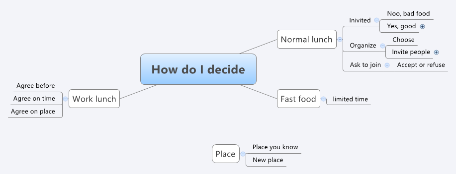
It's time to remember the screen size and the principle of Keep It Simple, Stupid. If you need a very quick lunch, then I just go to the nearest fast food and buy takeaway food. When I plan a working lunch, I arrange for a few days. Only the usual, daily lunch with colleagues remained. Excellent, the name of the application immediately appeared - “We have lunch together.” Since the application turns social, it would be good to connect social networks. I drew the first screen like this:

We turn to the search and selection of a restaurant. For me personally, the priorities are:
1. Menu - what dishes today.
2. Distance to the restaurant.
3. The price is not on the “cheaper” principle, but in order not to fall into too expensive a place.
Since the main priority is the menu, I decided to organize the main screen accordingly:

I did the default sorting by distance, because You can sort by menu only by specific kitchens or dishes - and this is a completely different scenario. Each restaurant has a photo of the main dish of the day, the best three dishes with a price, a rating and who of my colleagues goes there. Directly from the main screen, you can join them by clicking the "Mee too" button. All major functions are ready. Time to test on users. The experimental user was selected wife. Who immediately discovered a serious shortcoming - I do not want to have dinner with that harmful aunt from the neighboring department! For such difficult cases, I came up with a simple dialogue:

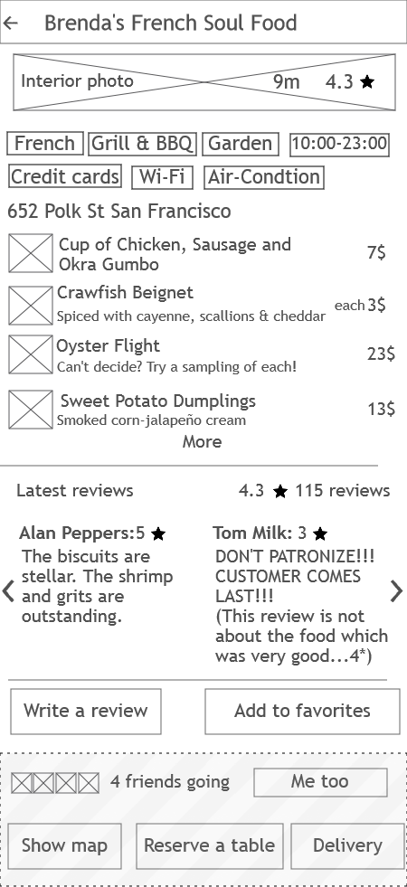
If you click on a particular restaurant, all dishes with photos, reviews, as well as additional information will appear: type of cuisine, air conditioning, working hours, etc. Plus, here came the card, the ability to order a table and order delivery.
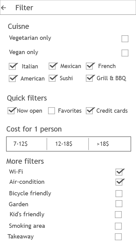
Filters by type of kitchen, price and other parameters I rendered in a separate screen.
Well, different little things on a separate screen.

I took the lyrics from Yelp (I don't like Lorem ipsum), and did the prototypes in NinjaMock. NinjaMock can not really make an interactive prototype with which you can play on the phone. Therefore, I stuffed all the screens in InVision, and began to suffer with the status line and the floating part of the screen. It turned out almost an application . The page should be opened in chrome on Android or in safari on iOS and add it to the home screen. Navigation through the hardware button "back" does not work, but otherwise only the download speed gives a fake application.
And here my article comes to an end. I was not taken to work as a UX designer, motivating this with weak prototyping skills and poorly understood mobile UI patterns. To improve your skills and generally hear the reaction of the habr-community, I ask you to vote and / or comment in the comments. Thank!
The position is new, but the main responsibilities largely overlap with my current work as a product manager: problem analysis, user understanding and design itself, but not in .PSD, but in words - user-stories + some wireframes.
I got a little vague task: to design an application to search for restaurants in the nearby office. IOS is desirable, but Android can be in compliance with the latest platform guides. And the latest trends. As well as a list of functions that is not required to comply.
In my experience, having received a problem, it is better to think about it from all sides and only then take on specific functions, or even more so design. Many people, including myself, love to “think with their hands”, but this is a very risky approach - once having found an interesting solution, it will be very difficult to refuse it. In addition, you unconsciously focus not on the problem, but on a specific solution.
In all the books and tips, product managers and designers are always very strongly advised to “think about the client (user)” and, even better, “think like a client (user)”. Easy to say and hard to do. Although many say they allegedly "understand the user and his problems." This is all nonsense. In fact, you have some kind of image of a user in your head, and under this image you adjust thinking. It depends on the completeness and accuracy of the image whether your product will hit the target or not. Armed with this wisdom, I try not to lie to myself and design for myself first, that is, what problems I want to solve myself, and how to prioritize functions. Well, then adjust the product to a specific target; more precisely, for business tasks: monetization, promo of another product, etc.
')
So, work on the task. Here I will describe everything in detail to show the process more clearly. The only problem the application should solve is to find a good restaurant in the vicinity of the office. First of all, I re-read the task and nakidal the main scenarios and some functions to them (I apologize in English):
The problem with these scenarios is that there are too many of them and they overlap. For example, I almost always go to dinner with colleagues. I made the second version only for myself:
It's time to remember the screen size and the principle of Keep It Simple, Stupid. If you need a very quick lunch, then I just go to the nearest fast food and buy takeaway food. When I plan a working lunch, I arrange for a few days. Only the usual, daily lunch with colleagues remained. Excellent, the name of the application immediately appeared - “We have lunch together.” Since the application turns social, it would be good to connect social networks. I drew the first screen like this:
We turn to the search and selection of a restaurant. For me personally, the priorities are:
1. Menu - what dishes today.
2. Distance to the restaurant.
3. The price is not on the “cheaper” principle, but in order not to fall into too expensive a place.
Since the main priority is the menu, I decided to organize the main screen accordingly:
I did the default sorting by distance, because You can sort by menu only by specific kitchens or dishes - and this is a completely different scenario. Each restaurant has a photo of the main dish of the day, the best three dishes with a price, a rating and who of my colleagues goes there. Directly from the main screen, you can join them by clicking the "Mee too" button. All major functions are ready. Time to test on users. The experimental user was selected wife. Who immediately discovered a serious shortcoming - I do not want to have dinner with that harmful aunt from the neighboring department! For such difficult cases, I came up with a simple dialogue:
If you click on a particular restaurant, all dishes with photos, reviews, as well as additional information will appear: type of cuisine, air conditioning, working hours, etc. Plus, here came the card, the ability to order a table and order delivery.
Filters by type of kitchen, price and other parameters I rendered in a separate screen.
Well, different little things on a separate screen.
I took the lyrics from Yelp (I don't like Lorem ipsum), and did the prototypes in NinjaMock. NinjaMock can not really make an interactive prototype with which you can play on the phone. Therefore, I stuffed all the screens in InVision, and began to suffer with the status line and the floating part of the screen. It turned out almost an application . The page should be opened in chrome on Android or in safari on iOS and add it to the home screen. Navigation through the hardware button "back" does not work, but otherwise only the download speed gives a fake application.
And here my article comes to an end. I was not taken to work as a UX designer, motivating this with weak prototyping skills and poorly understood mobile UI patterns. To improve your skills and generally hear the reaction of the habr-community, I ask you to vote and / or comment in the comments. Thank!
Source: https://habr.com/ru/post/273711/
All Articles