Apple guidelines for iOS apps are out of date
Without Steve Jobs, Apple began to compromise often. And this is what happens when a person leaves the company who is able to say “No” to incompletely worked out decisions:

But today I want to draw attention to the UI / UX problem of iPhone 6 and 6 Plus, which has existed for more than 2 years and which most UI / UX designers ignore.
')
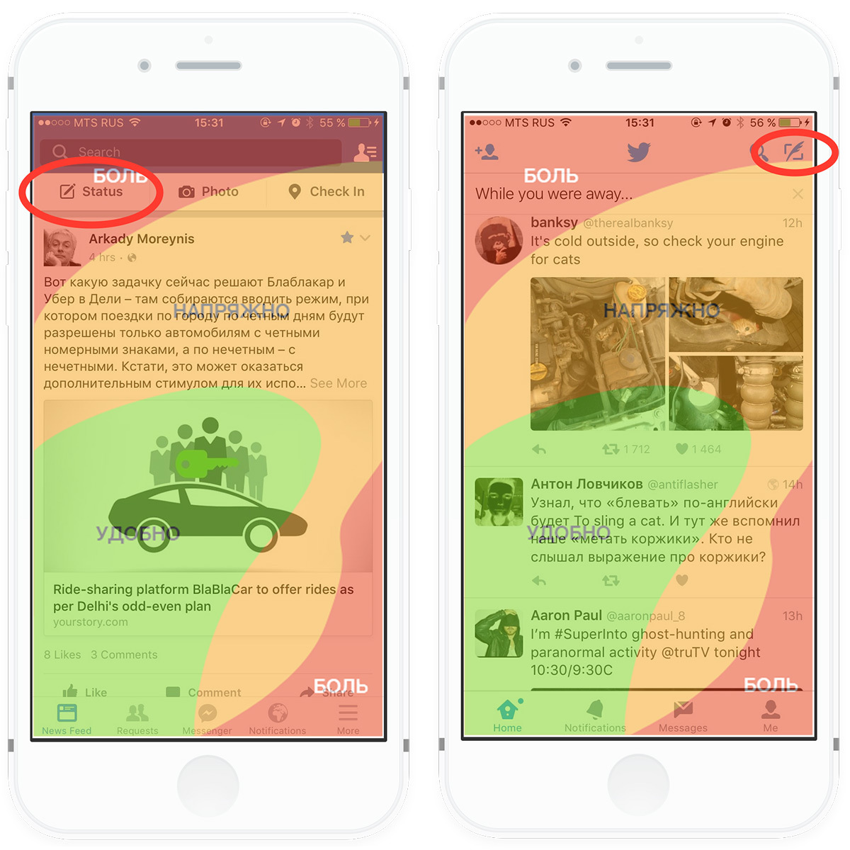
To reach the post creation button (see picture above), you can easily drop an already slippery phone. If with the iPhone 5 I could, while standing on the escalator, share my thoughts with Facebook, then with the iPhone 6 I have the maximum that I can - it is flipping through the tape. Now the reader must object, appealing to the “beautiful” feature of the iPhone - Reachability:
But, unfortunately, Reachability is not a solution to the problem, but a work round (in the common “crutch”). Instead of refining the guidelines and removing the tips on placing controls in the Navigation Bar, Apple designers shifted their UX / UI problems to users. Judge for yourself, now to write a post, you will need to make three tapas, instead of one (two on the Home button, and one on the "Create Post"). Given that the function “Write a post” on Facebook, Twitter, Vkontakte and others is one of the top priorities after reading the tape. This is not to change the gender in the profile settings, for this function and 5 tapes do not mind. As a result, we conclude that Reachability is another compromise from Apple.
IOS designers also follow the outdated guidelines by inertia and often have the main functions of the application in the Navigation Bar.
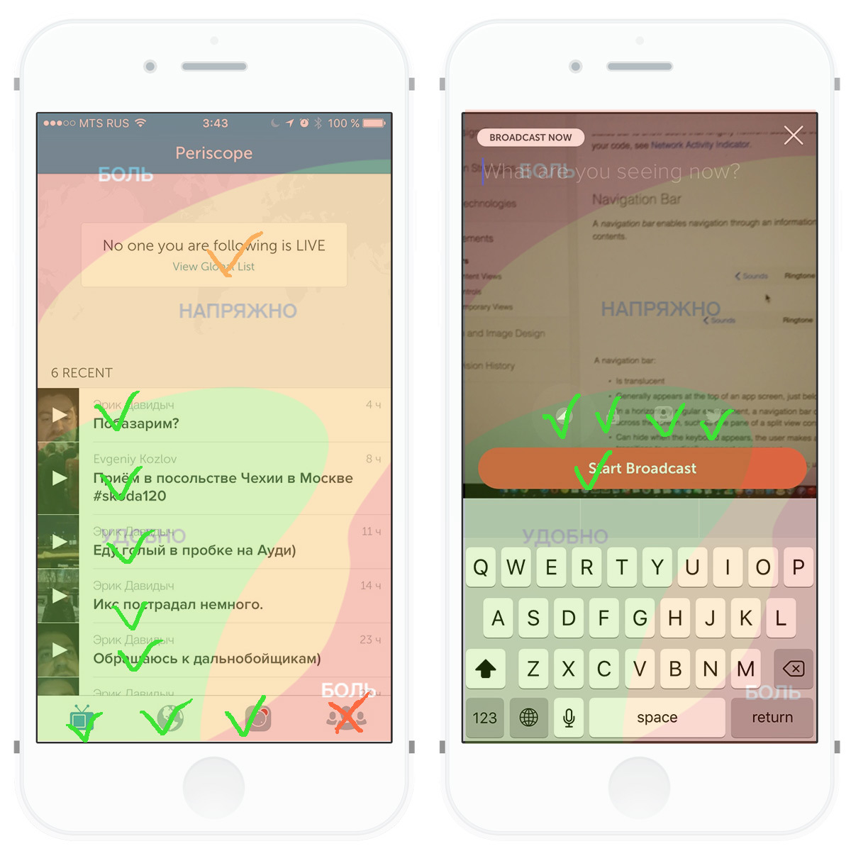
Of course, there are pleasant exceptions among the relatively new applications, the designers were able to harmoniously move all the important interactive elements closer to the bottom and center of the screen (such as Periscope, Tinder, and many others).
For skeptics who believe that “normal” people use the phone with two hands, I’ll give the 2014 survey data:
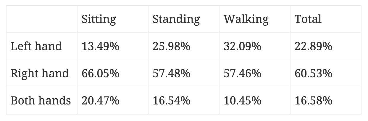
The result of the study showed that people in the absolute majority (~ 83.5%) use smartphones with one hand. A full study can be found here: "Which hand people interact with smartphones . "
Designers love your users.

But today I want to draw attention to the UI / UX problem of iPhone 6 and 6 Plus, which has existed for more than 2 years and which most UI / UX designers ignore.
')
To reach the post creation button (see picture above), you can easily drop an already slippery phone. If with the iPhone 5 I could, while standing on the escalator, share my thoughts with Facebook, then with the iPhone 6 I have the maximum that I can - it is flipping through the tape. Now the reader must object, appealing to the “beautiful” feature of the iPhone - Reachability:
But, unfortunately, Reachability is not a solution to the problem, but a work round (in the common “crutch”). Instead of refining the guidelines and removing the tips on placing controls in the Navigation Bar, Apple designers shifted their UX / UI problems to users. Judge for yourself, now to write a post, you will need to make three tapas, instead of one (two on the Home button, and one on the "Create Post"). Given that the function “Write a post” on Facebook, Twitter, Vkontakte and others is one of the top priorities after reading the tape. This is not to change the gender in the profile settings, for this function and 5 tapes do not mind. As a result, we conclude that Reachability is another compromise from Apple.
IOS designers also follow the outdated guidelines by inertia and often have the main functions of the application in the Navigation Bar.
Of course, there are pleasant exceptions among the relatively new applications, the designers were able to harmoniously move all the important interactive elements closer to the bottom and center of the screen (such as Periscope, Tinder, and many others).
For skeptics who believe that “normal” people use the phone with two hands, I’ll give the 2014 survey data:
The result of the study showed that people in the absolute majority (~ 83.5%) use smartphones with one hand. A full study can be found here: "Which hand people interact with smartphones . "
Morality. Priority functions should be available in one comfortable tap
Designers love your users.
Source: https://habr.com/ru/post/273527/
All Articles