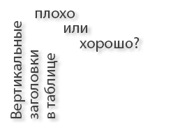
Vertical headers: who is right?
 In this publication, I would like to find out which of us is right, the employer or me is an applicant for the vacancy "Interface Developer". I sent my resume to the employer and solved the tasks that he proposed, among them was this:
It is necessary to draw a table with a large number of columns. To fit the table into the screen, the column headers decided to display vertically.
Design and implement a cross-browser solution for displaying vertical headers. Browsers: IE6 +, FF3.0 +, Opera 9.5+, Chrome 4.0+.
By the way, the employer is the Yandex company. At first I thought: how can this be done? But then I remembered that when I went to the subway, it was always a problem for me and my friends to read the vertical text of the name of the stations in the new Rusich carriages, which is located above the improvised progress bar of LEDs above the car doors.
')
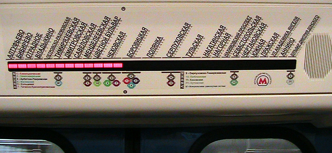
1. On the Lyublinsko-Dmitrovskaya (green) line, the horror is generally horrible: as you can see, here the developer of this interface (and was it?) Did not think much about how the passengers would read this text: pale letters, and with tracking too:
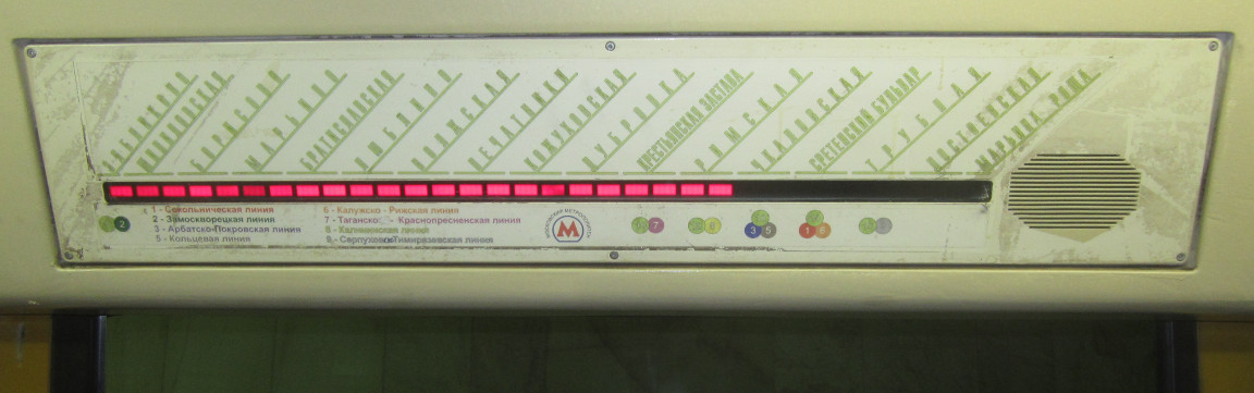
2. Serpukhovsko-Timiryazevskaya (gray) line. In this case, the inscriptions are written in dark color, but the names of the stations “Petrovsko-Razumovskaya”, “Nakhimovsky Prospect”, “Dmitry Donskoy Boulevard” are written in small size and with small kerning, which is not convenient.
3. The staff of the studio Artemy Lebedva solved this problem as follows:
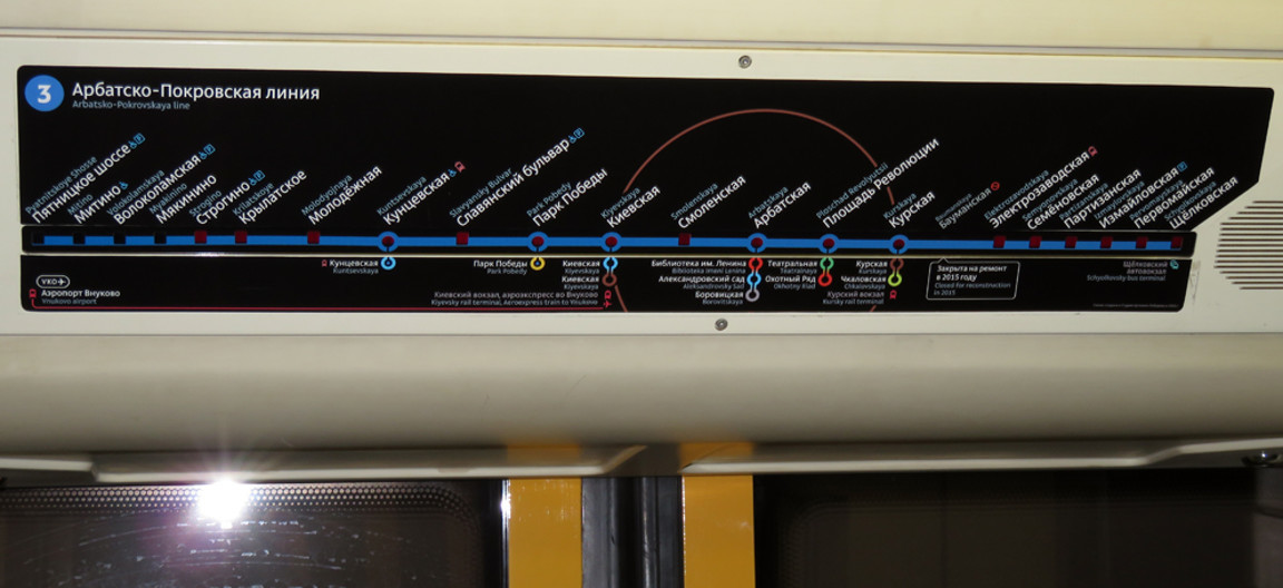
But on this thread (Arbatsko-Pokrovskaya) there are not as many stations as Serpukhovsko-Timiryazevskaya (gray), besides the font size is smaller, which means the inscription is smaller, and I, for example, cannot read them sitting on the seat, since I have poor eyesight. Here they have already turned the text not by 60 ° as in the second case, but by 45 °.
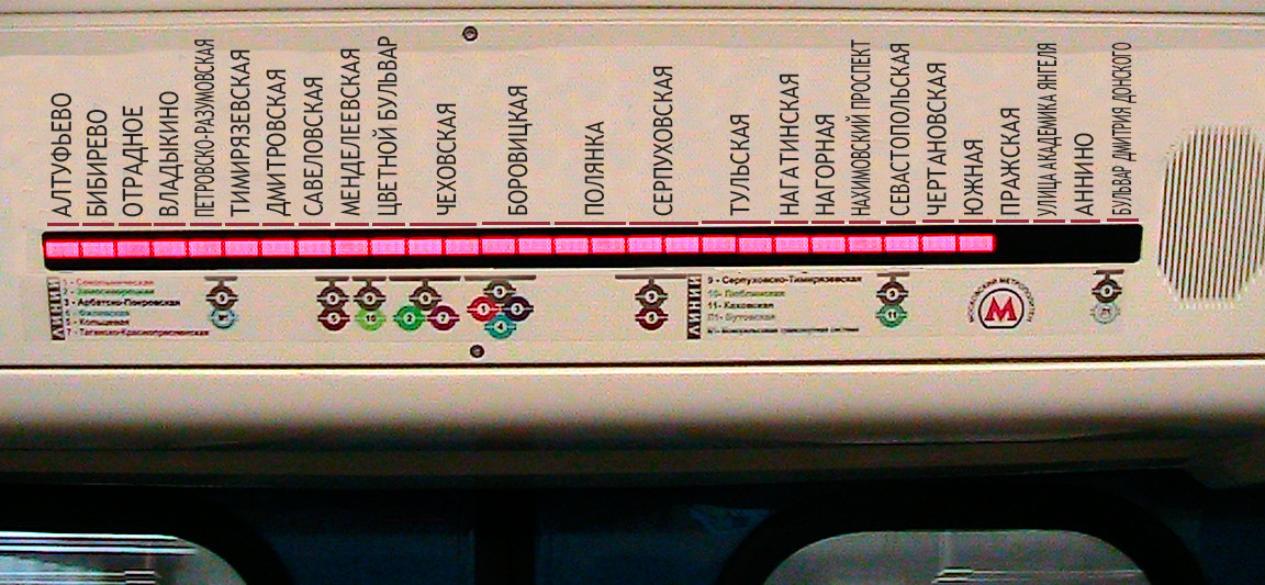
Now let's rotate the station names as suggested in the job of the “Interface Developer” job - that is, vertically:
Poll:
Is the vertical way of signing station names convenient?
* Yes, I do not have to strain and turn my head to the side, it is convenient for me to read vertical signatures.
* No, it would be better to turn the signatures at least under 60 °, otherwise I have to strain and turn my head to the side.
Let's return to the task
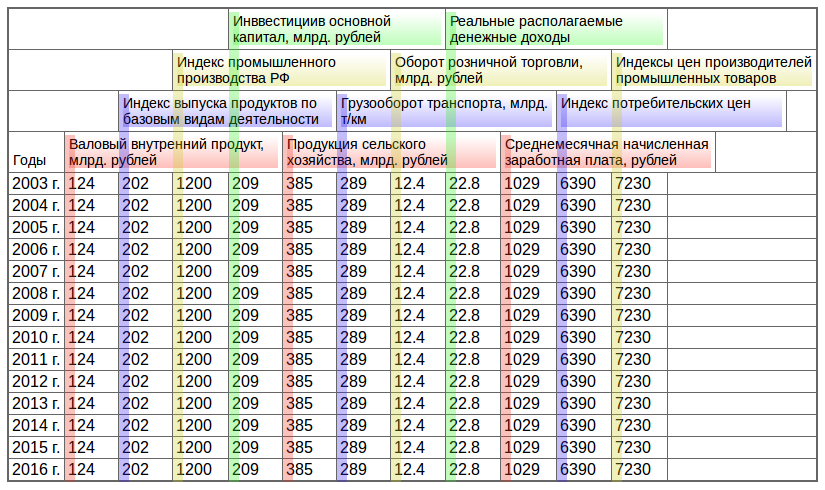
Now back to our task, firstly, if we search the Internet for the first sentence “We need to draw a table with a large number of columns. In order for the table to fit into the screen, the column headers decided to display vertically. ” We will see that many employers already offer such a task and many applicants are likely to perform such a task. Well, let's try to make a table with vertically arranged columns, so that it works at least in Firefox and Chrome. In theory, this should be done with the help of writing-mode , but this cannot be done, so I used transform: rotate (-90deg), and this is what happened:
Is it convenient to read such headlines? Do you turn your head to the side when you read such headings in a table? And if you need a horizontal rubber table? What will happen and what should happen with vertical headers? What are the options?
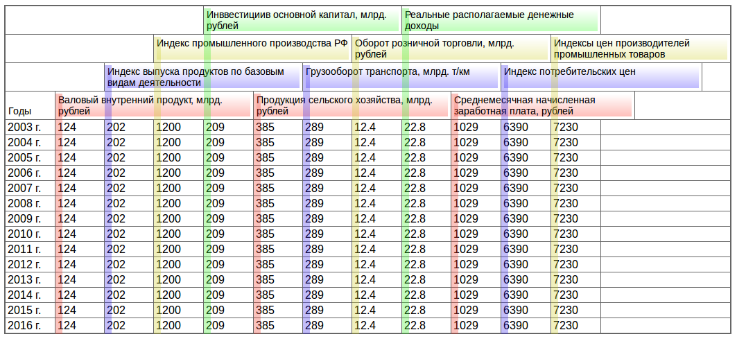
1. Cells with headings remain the same height and when stretched, words are not transferred to the next line and do not fill the entire width of the cell:
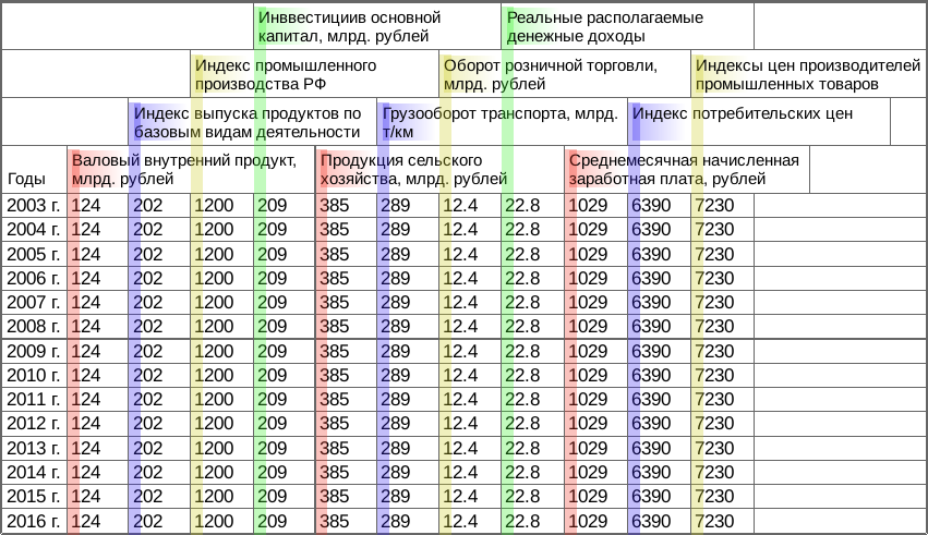
2. Cells with headers reduce their height and, when stretched, words are transferred to the next line and fill the entire width of the cell:
In my opinion, both are not very good.
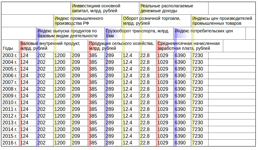
I offered the employer the following solution:
This is a rubber width table, when stretching the header cells behave like ordinary table cells, this is a cross-browser solution, and there is no need to pile up a bunch of css code and unnecessary nested html elements:
Poll:
Which table is better: with vertical headers or with horizontal headers?
* With vertical
* With horizontal
* Own version (in comments)
It seems to me that the only correct solution is not to make a table with vertical columns, using all sorts of perversions and cumbersome css and html code, but to approach the task with common sense and make it convenient for people.
After all, this is the primary task of the interface developer - to make the interfaces convenient for people.
Update: Salas user suggested a better solution :
So some color-blind people see the table:
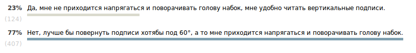
Voting results at 17:00, December 18, 2015:
Is the vertical way of signing station names convenient?
23% (124 people): Yes, I do not have to strain and turn my head to the side, it is convenient for me to read vertical signatures.77% (407 people): No, it would be better to turn the signatures at least under 60 °, otherwise I have to strain and turn my head to the side.
Voted 531 people. Abstained 98 people.
Which table is better: with vertical headers or with horizontal headers?
21% (114 people): With vertical75% (393 people): With horizontal
4% (20 people): Own variant (in comments)
527 people voted. Abstained 110 people.

It turns out that the table with horizontal headings won by a factor of 3.5.
Source: https://habr.com/ru/post/273381/
All Articles