Look in both or a little about infographics.

Today, in the age of information technology and communications, people stop reading. People stop reading fiction, newspapers, magazines, and even more scientific publications. If suddenly someone wanted to learn something new, he climbed into the Internet, opened the article and did not read it in the full sense of the word. A person “scans” information with his eyes, finds interesting moments for himself, reads them fluently, runs further and soon all forgets. How to help a person learn something new? How to make it more interesting? And how to help remember at least something from what he saw? About this further, but for a start a small video.
')
What we have? Never mind. There are no titles, no names, no characteristics, no numbers, no value in the video. But at the same time, we understand that it is fast, spectacular, stylish, bright, cool, loud, expensive.
Why? Vision is the main channel of perception. What our eyes perceive is only part of the overall process. Images entering the brain are modified and interpreted. You can rightly say that the brain "sees."
Infographics is ...
If we divide this term into 2 components, then it is obvious that “infographics” is information and some kind of graphics. This is not entirely true.

Infographics - this information is presented using graphics.
Another couple of definitions:
Infographics - is a graphical way of presenting information, data and knowledge, the purpose of which is to quickly and clearly present complex information.
Infographics shows the hidden, explains the confusing and adapts the incomprehensible.
Some historical examples:

The first example of infographics in the media
USA TODAY, 1982

Cholera map
John Snow, 1854

Commercial and Political Atlas
William Playfair, 1786
Why use infographics?
The first picture shows the amount of information coming through the senses.
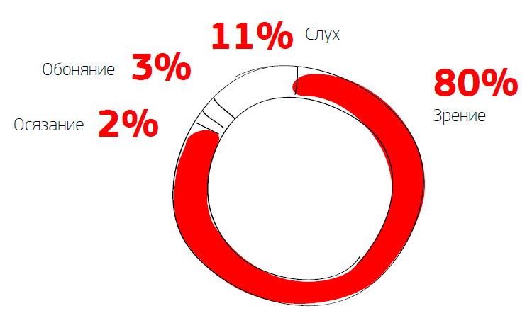
The second is the brain's perception of images and text.

As can be seen from the picture, the number of actions performed when reading and viewing the same information in the form of an image is very different.
A few more points:
- 94% increase in the number of views of the content with the prevailing visual component.
- Visual content is 40 times more common on social networks.
- Man thinks in images. Images have a visual form.
- Information presented visually is perceived faster and causes increased attention.
- Information presented visually is more easily perceived, since it constitutes a complex of ready-made images.
Types of infographics
According to the presentation format:
- Static
- Dynamic
- Interactive
By way of presentation:
- Comparison
- Development trend
- Share
- Space
- Algorithm
- Device
Who is extreme?
- Analyst Collects information, then analyzes and processes it, leads to one denominator - usually these are unformed graphs, histograms
- Journalist Writes texts, comes up with a conva
- Designer . Compiles the resulting material, leads marafet
- Programmer . Works on interface and dynamic elements.
How to do?
1. Collection of information
Not a single infographic, even with the most beautiful design and perfectly matched colors, will be able to interest without corresponding text content.
No matter what type of infographic you are going to create, text content will always come first.
2. Create a story
Tips - a story about how to act in one way or another. Designed for a certain category of readers, differ in that they do not become obsolete over time.
Facts you didn’t know - infographics present new or little-known facts in interesting
light You can also combine known facts and present them in a new way.
Comparison - mainly used to highlight the advantages of one product over another.
sources of inspiration
3. Sketches / storyboard
Online information is presented in stages - in parts. The degree of detail in the sketches or storyboards depends on the depth of the topic.
Sketches are used in print infographics, and storyboards are in online infographics.
4. Primary and secondary objects
The main object in print media is the central image. It should attract the attention of the reader.
In an Internet project, the position of one or another argument does not depend on the size of the element, but on its position in the chain of logical representations, since the order of presentation of information follows the principles of digital presentation.
5. Layout
For print media at this stage, the designer smoothes all the elements into one “layer” and begins to create an information composition from them, placing the text.
A web infographic designer puts everything together, animates elements, superimposes text or sound, if necessary.
Services for creating infographics
- And all ?!
The principles are clear, instructions are given, tools are listed. It would seem to make masterpieces. But that is not all. Today, many people and companies create infographics. Someone is good, someone is not very. But in order not to get lost in this crowd, their work must be promoted. How? About this next time.
And in the end, the same information in the form of a presentation with a large number of pictures.
Source: https://habr.com/ru/post/273291/
All Articles