The button bar in the elevator: the door, do not rush to close
I do interfaces and I like to notice the details that surround us. Especially those that can be done better.
You know, I would like to start with the secret. I want to share the fear of pushing buttons in the elevator! No, not all. Only two of them, the icons to which seem to me, at least, strange.

If you already understand what I mean, then nod quietly.
')
And now the case of life. Shopping center. The elevator, inside which there are already a lot of people, but there is still room. I enter the last and appear next to the panel. The elevator doors are on the verge of closing, and I see a running man who really wants to jump on the "running board of the moving train." I understand that the whole situation is in my hands. I look closely at these two buttons, automatically raising my hand to make this important press, but ... I do not know how to help a person! I'm hanging up. I have a total of 4 triangles in my eyes on two pictograms. My brain begins to analyze the situation: what triangles should I choose in order to save a person from being “massaged” by elevator doors.
Those that are turned inside? Or out? While precious milliseconds are spent on analyzing the situation, naturally, a person finds himself between the elevator doors, which safely trigger the opening. A man has time to the cabin, and it only remains for me to lower the eyes to the floor.
By the way, besides jokes, but once in a similar situation after a similar “lag” in the elevator, I even apologized and made a remark to a third person that some developers are clearly not growing from the right place.
Probably, the industry is not keeping pace with the familiar to us, the users, icons that accompany us every day on mobile devices. Or is it a very expensive process - “rebranding” only two icons on the elevator control panel.
Honestly, I would be happy to see such familiar two characters on it ...

The logic is elementary and clear: a check - “everything is fine, let's go,” a cross - “something went wrong, cancel the doors”. And the icons are visually distinct, which is an advantage.
A bit of elementary visualization as a draft:

The maximum effect can be achieved by introducing colors and an explanatory icon:
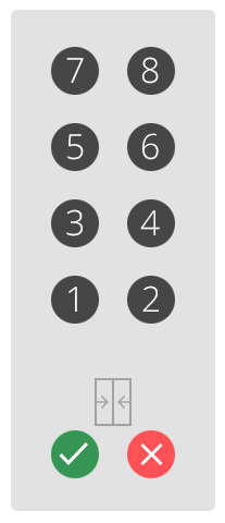
And the final result:

Or in this version:

I would gladly save people from “attacking” the doors in such elevators. And what do you think?
You know, I would like to start with the secret. I want to share the fear of pushing buttons in the elevator! No, not all. Only two of them, the icons to which seem to me, at least, strange.
If you already understand what I mean, then nod quietly.
')
And now the case of life. Shopping center. The elevator, inside which there are already a lot of people, but there is still room. I enter the last and appear next to the panel. The elevator doors are on the verge of closing, and I see a running man who really wants to jump on the "running board of the moving train." I understand that the whole situation is in my hands. I look closely at these two buttons, automatically raising my hand to make this important press, but ... I do not know how to help a person! I'm hanging up. I have a total of 4 triangles in my eyes on two pictograms. My brain begins to analyze the situation: what triangles should I choose in order to save a person from being “massaged” by elevator doors.
Those that are turned inside? Or out? While precious milliseconds are spent on analyzing the situation, naturally, a person finds himself between the elevator doors, which safely trigger the opening. A man has time to the cabin, and it only remains for me to lower the eyes to the floor.
By the way, besides jokes, but once in a similar situation after a similar “lag” in the elevator, I even apologized and made a remark to a third person that some developers are clearly not growing from the right place.
Probably, the industry is not keeping pace with the familiar to us, the users, icons that accompany us every day on mobile devices. Or is it a very expensive process - “rebranding” only two icons on the elevator control panel.
Honestly, I would be happy to see such familiar two characters on it ...
The logic is elementary and clear: a check - “everything is fine, let's go,” a cross - “something went wrong, cancel the doors”. And the icons are visually distinct, which is an advantage.
A bit of elementary visualization as a draft:
The maximum effect can be achieved by introducing colors and an explanatory icon:
And the final result:
Or in this version:
I would gladly save people from “attacking” the doors in such elevators. And what do you think?
Source: https://habr.com/ru/post/273087/
All Articles