Why do we need plain-text letters, and how they should be done: 6 tips
In recent years, marketers of many companies have become addicted to using HTML when creating their mailing lists . However, many experts forget that simple text letters can sometimes work even better than beautifully laid out templates. Today we will talk about the benefits of using plain-text letters, as well as consider a few expert tips to help avoid mistakes when working with this tool.
When plain-text letters are irreplaceable
As Erez Zuckerman writes in the Mad Mimi blog, there are at least two cases when it is better to use text letters.
')
When adaptability is important
In the event that there are many users of various devices and mail clients among the readers, it is necessary to make letters adaptive so that all subscribers can comfortably interact with them. However, ensuring adaptability is not such a simple thing, so when you need to make sure that letters look good on as many devices and mail programs as possible, you should look at plain-text.
Using the text version allows you to get rid of the dances with CSS, media queries (although the text can be styled or use different fonts ) and be sure that the message will be rendered normally wherever possible.
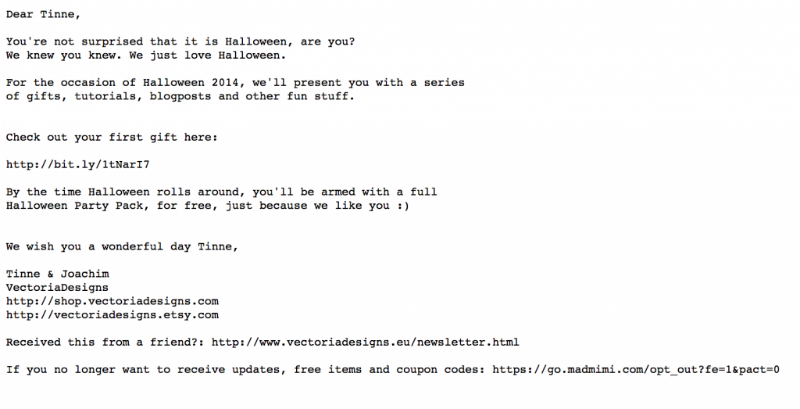
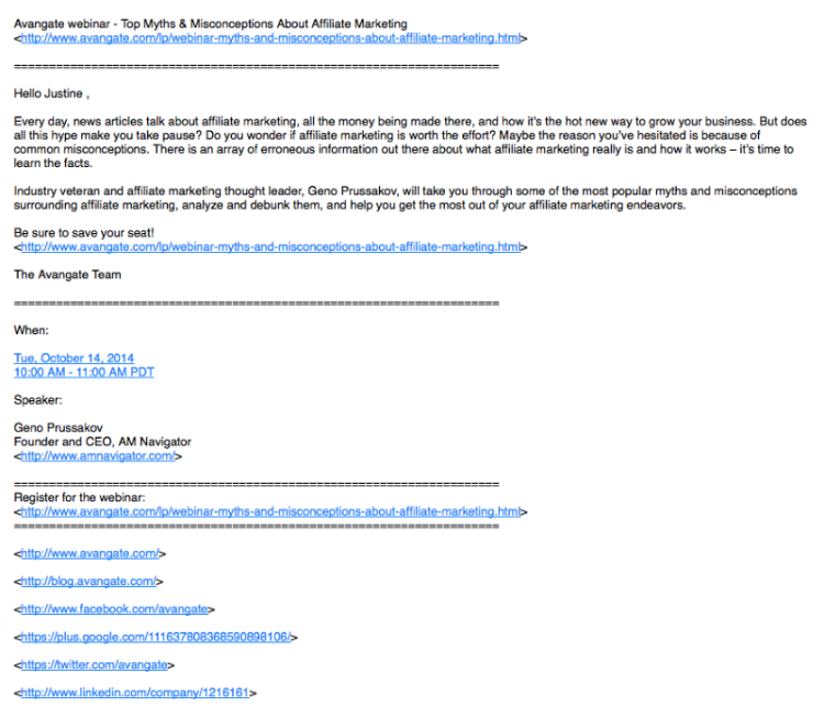
Below is an example of email messages from the mailing list in plain-text: there are both links and a personalized call to the client, while the recipient will be able to read it precisely, no matter what device and email program he uses.
When naturalness is important
If a company wants to establish a personal relationship with a current or potential client, then an HTML letter is not the best option to do so. People do not write HTML-letters to each other - there is no such thing as you receive a letter from the boss with the subject “It's important to be in time by Monday”, open it and see a beautifully laid out template there.
People do not do that, we just open the mail program window and type the text. This is one of the basic signals of the body language of mail messages - plain-text = humanity.
With proper use of this knowledge in combination with good text and the right time to send a letter, the company can achieve extremely high results of their mailings. Here is an example of what a letter might look like:
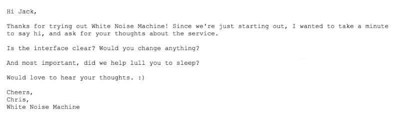
Hello Jack,
Thanks for trying to work with the White Noise Machine! Since we recently started up, I just wanted to say hello and ask if you liked our service?
Is everything clear in the interface? Would you like to change something?
And most importantly - did we manage to help you fall asleep better?
I will be glad to hear your thoughts
Always yours,
Chris, White Noise Machine
Why plain-text is still important
In addition to the situations listed above, there are more general reasons for using this format when creating mailing lists:
- Spam filters - when a company produces an email list, plain-text and HTML versions of the letter are “glued together” using the MIME format. If the letter does not have a text version, for spam filters it will be a disturbing bell indicating that the message may be spam.
- User Tastes - Some people prefer to read the text, rather than looking at HTML letters. Many email clients (the same Gmail and Outlook) make it easy to switch to viewing text versions of letters.
- Mail clients - despite the fact that "legally" almost all modern mail programs support HTML, in fact the situation is not so rosy. In addition, some new devices (for example, Apple Watch) by default display plain-text versions of letters, because it is more convenient on a small screen (we wrote about the layout of letters according to Watch in one of the past topics ).
When using email marketing tools like MailChimp , CampaignMonitor , Pechkin-mail.ru and others, a plain-text version of the letter will be created automatically.
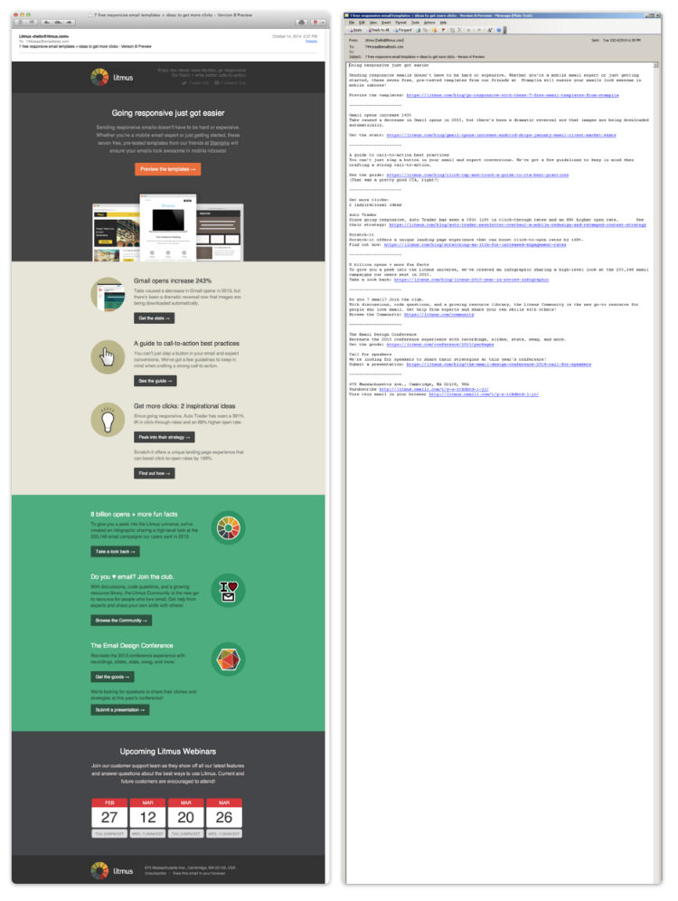
Litmus published HTML and plain-text versions of the same letter on its blog.
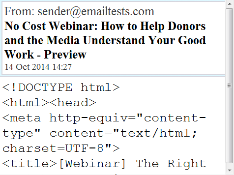
If a company sends an email to its subscribers in HTML without its text version, in the case when the user cannot read such a template, this can lead to a very “crooked” display. In the example below, the email was not created in a multi-aprt MIME format, with the result that the Blackberry client rendered the message code:
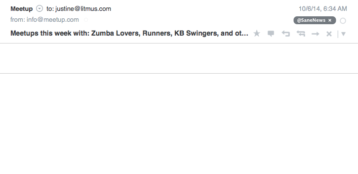
Sometimes it also happens that companies send "technical", that is, empty text copies of letters. In this case, it is not surprising that the email client, which by default shows exactly the text, will display to the recipient an empty letter, with which he will not know what to do:
Than some marketing specialists are not satisfied with plain-text letters
By and large, there are only two reasons why many companies and marketers love HTML templates, rather than text messages:
- Lack of branding opportunities - indeed, if you put a lot of effort into creating a bright and attractive corporate identity, it is quite difficult to abandon it in marketing materials (which certainly are the mailing lists).
- Limited statistics collection capabilities — do not insert a tracking pixel into a plain-text letter to determine how many users opened a letter (although clicks can be measured using tagged links).
How to optimize plain-text letters
Despite the simplicity of the text format, especially in comparison with the creation of HTML-letters, you can make mistakes when working with it. Below are some tips to help you avoid this.
Be careful with line breaks and centering.
The “ultimate” way to defuse a plain-text letter is to use manually inserted line breaks. As a result, on the sender's computer such an email might look great, but for someone with another email client, everything can
be
far from it
great
In order for the letter to be clearly divided into paragraphs without unexpected surprises, the practice of using manually inserted hyphenation should be avoided.
The letter should be clearly structured.
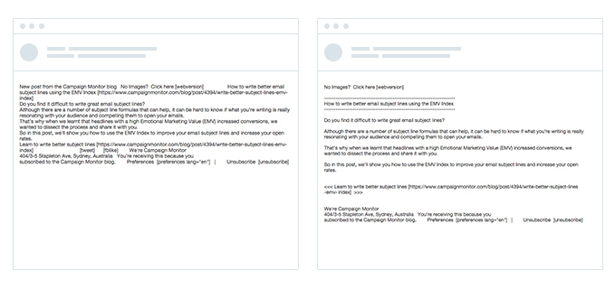
When a user receives a text message, he most often just goes over his eyes to see if he should spend his time on it. Therefore, if at the time of such a “screening” the user sees a sheet of text from which nothing can be isolated by a quick glance, then this may scare him away. To avoid this, it is worth breaking the letter into sections and choosing talking subtitles. (Here and further examples from this material from the Litmus blog):
For example, if you subtitle the subtitles with asterisks and type them in capital letters, then reading the letter is already much easier:

Spacebar - best friend when creating text letters.
Empty space around important elements of the letter - headings, or calls to action, improves their overall visibility in the message. In addition to simple formatting elements, such as asterisks or equal signs, used to highlight titles and calls to action, free space allows you to create a message hierarchy:
Good looking and bulleted lists
A good tool to create a hierarchy of email-messages in text format are bulleted lists. To create them, you can use minus, plus or asterisk symbols:
Calls to action need to highlight
In text letters, highlighting calls to action is more difficult than in an HTML template — you cannot put a large button on the letter that says “click here”. But you can still draw the attention of readers to these appeals, highlighting them from the general mass of the text. In the example below, the call to make a purchase (Shop Now) is highlighted with “corners” (>>):
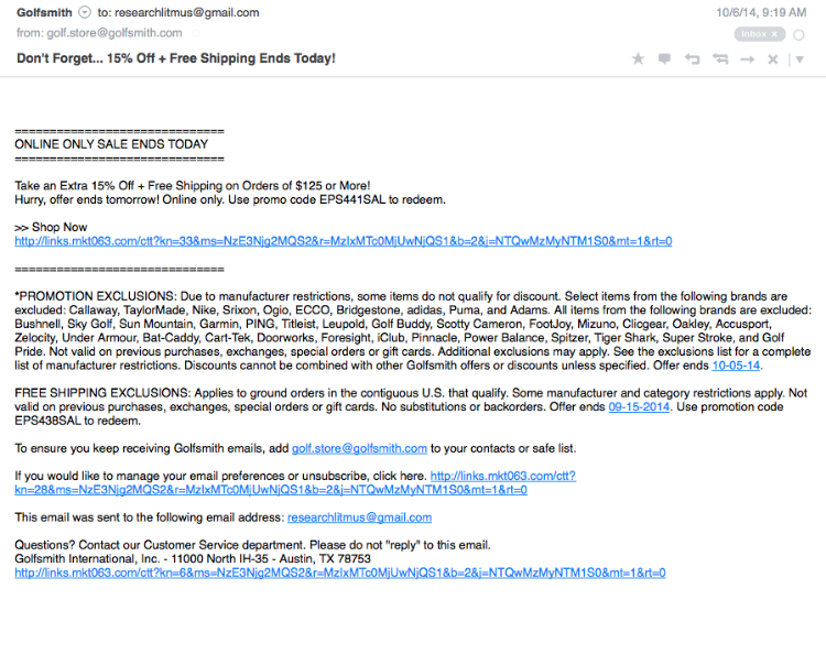
No need to overdo with links
Here everything looks like the layout of HTML-letters - if the user opens the message and sees a bunch of CTA buttons, he will not like this congestion. The same with the text version of the message - very few people will like to read the letter, almost entirely consisting of external links (especially if they contain all sorts of tags for tracking transitions):

A letter looks much better, the creators of which used a minimalistic approach to including links and for the convenience of users decided to donate statistics collection using tags - as a result, links look much nicer to the eye:

Note : It is extremely important when using text formatting elements to pay attention to the text of the preview, which is displayed in mail clients in addition to the subject of the message. It should not contain "service" elements, such as quotes, equality signs, etc. About how to work with the text of the preview, we wrote in this material .
Conclusion
Using the tips described above, coupled with the tactics of progressive letter improvement, we can gradually, step by step, turn simple text into a pleasant and well-structured message with bright headings, clear calls to action and basic design elements. We wrote about the process of such a gradual improvement here (below are the options before and after registration):
For a user, such a letter may look simple and understandable - but in fact, to achieve this, you will have to spend time and, perhaps, sacrifice some marketing elements like “wrapped” links for tracking clicks to the convenience of readers. However, in the end, it is precisely this concern for subscribers who will be appreciated by them - nowadays, a well-made plain-text letter can help a company stand out from hundreds of senders of HTML messages.
Source: https://habr.com/ru/post/272971/
All Articles