Persuasive web design
The easiest way to convince another person of something is to speak confidently, persistently, to operate with numbers, promises and guarantees. But how to achieve the same without words? It's simple - with the help of visualization.
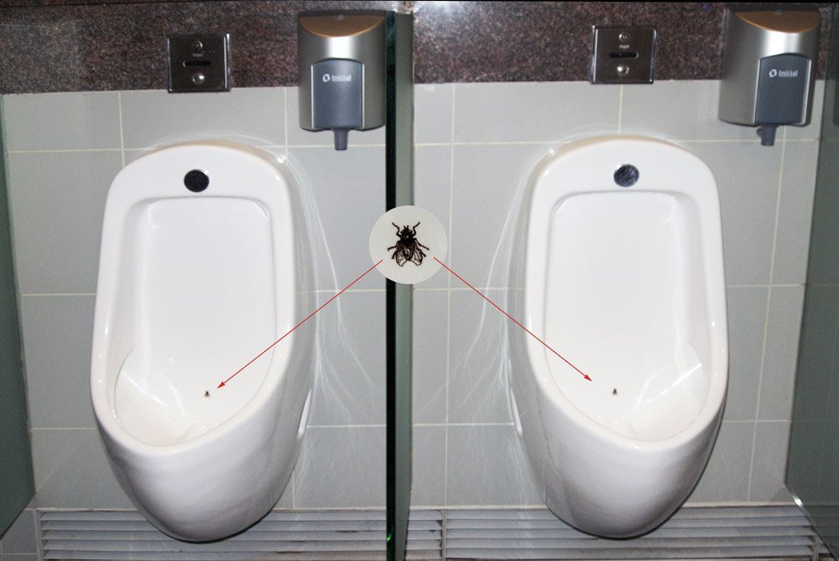
Let's take a simple example with the WC of Amsterdam Schiphol Airport. The appearance of the fly in the urinal miraculously changed the behavior of men. Judging by the results of this unexpected and strange experiment, the male gender has a tendency to aim in such places. Thanks to the fly, Amsterdam Airport has reduced cleaning costs by 80% (and it’s better not to know how they checked it).
')
The perception of visual information has its own mechanisms, which are often forgotten in web design. First of all, the site should be simple and user friendly. Creativity and originality are certainly good, but not at the expense of usability. The man came first of all for the information he was interested in. And if he does not get answers quickly enough, then the beautiful design is unlikely to notice.

The site must answer three user questions: “What is it?”, “What can I do here?” And “Why do I need to do this?”.
Check if this page will respond to them.

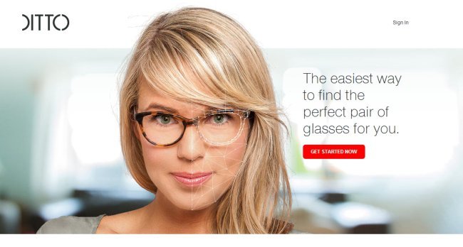
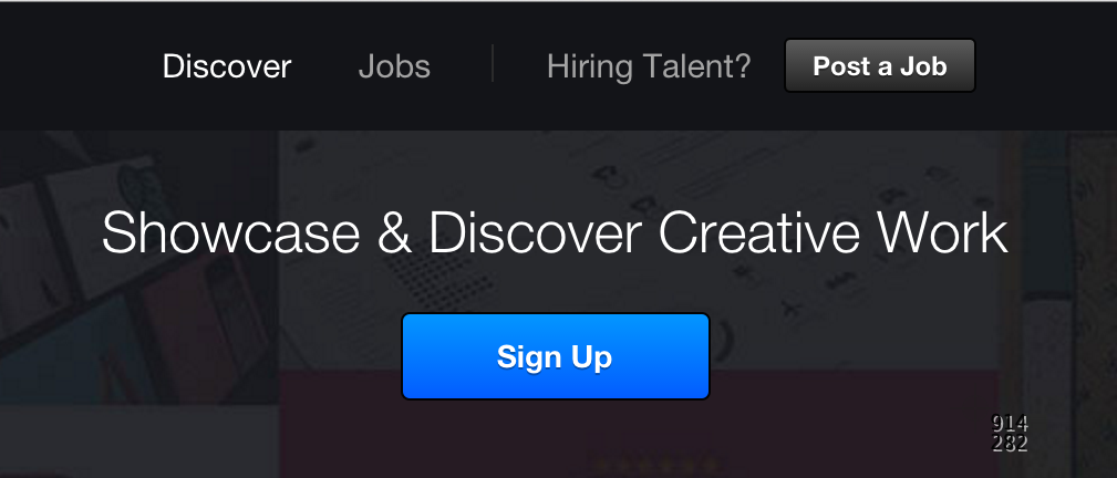
What is it? “I’ll start accepting credit cards today” is a clear answer and a meaningful illustration.
What can I do here? - I can get a card reader for bank cards.
Why do I need to do this? - Because it is free and here they offer the lowest transaction fees (2.75%).
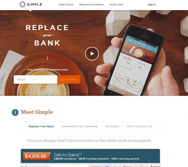
Another example showing a visual way of contacting a visitor.
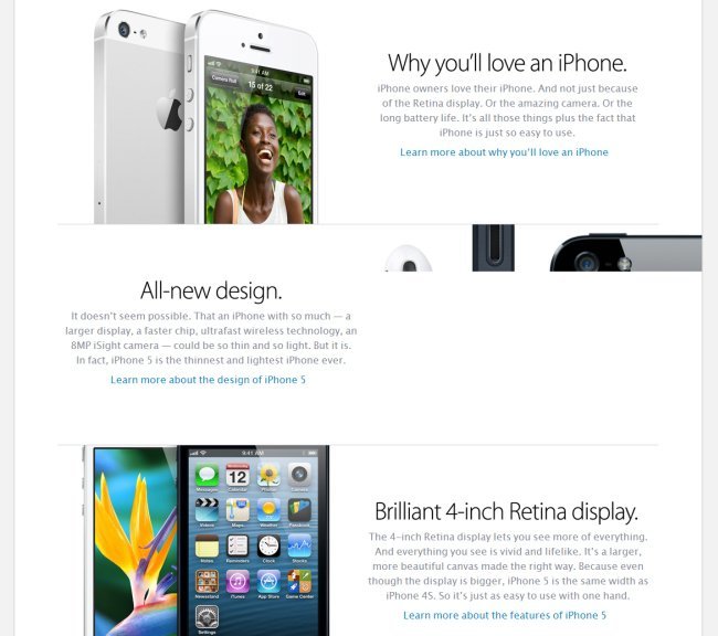
The human brain performs the processing of visual information 50 times faster than text. As in the proverb "it is better to see once ...". On the page above is a demonstration of what is for sale. But it is better to refrain from words in superlatives. This is a juggled stunt that in our time causes more distrust than disposition.
Many web marketers are still using epithets to a superlative degree (“best”, “early”, “simplest”, etc.). However, without confirmation, such statements are not convincing and will most likely annoy visitors to the site. For example, an ad from the “Best Pizza in the City” series is unlikely to convince a person to go to this pizzeria. But the clarification "Homemade pasta" - a more specific statement that does not contain superlative adjectives. You can also describe brief advantages (“We will deliver your pizza in 20 minutes,” etc.).
After the user understands that he is in the right place and agrees that the offer is really profitable, it is the turn to take him through the sales funnel. The first impression solves a lot.
People often make hasty conclusions. A user needs only a few seconds to form an opinion on the landing page / site. And such a hasty impression will guide the visitor in his decision to stay or leave the site. First impressions affect user satisfaction, they can last for years.
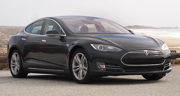
A good example is the Tesla Model S. Many will say that the car is good, although they did not personally carry out test drives and perhaps did not even see the car live. Opinion is based solely on appearance.
But what makes a good design? Some people like green, some people like blue, some like minimalism, and some admire the abundance of elements on the page. Google tried to find out this question, during a large-scale survey, 2 factors of attractiveness of sites for the average user were determined:
- low visual complexity (the simpler the site, the better);
- Compliance with the stereotype (the design coincides with the user's ideas about how a site of a certain category should look like).
An example of a simple site, attractive to most users.
Visual hierarchy is one of the most important principles underlying web design. This is the order by which the human eye perceives what it sees.

If you ask any person to rate the circles in order of importance, he will cope with the task without even knowing anything about these circles. This is the visual hierarchy.
Some parts of the site are more important than others, respectively, and the user's attention must be directed correctly. If the site menu has 10 points, it is worth considering whether they are all equally important. If the task is to make the user click on specific menu items, they should be made more visible. The place in the hierarchy is determined by the size, color, font.
It is desirable to place elements on the page in a certain hierarchy, created in accordance with the concept of the site.
Here is an example of a Williams Sonoma site selling dishes. The main lure for the eyes of users is a juicy piece of meat that stimulates the appetite. It is followed by a headline and a call to action button. The fourth place is taken by the paragraph with the text under the heading, and on the fifth - the promise of free delivery. The banner located at the top of the window last attracts attention.

There are still debates on the Internet about which color converts better - red or orange. There is even a common C / A color A / B test of colors with green and red.

It seems that red converts better than green by 21%. But if you look ... Most users clicked on the red button, not because of the peculiarities of the color, but because it stands out more from the general environment. Red itself is aggressive and dominant, and in contrast to green, its influence is increasing. The red button is even more noticeable. If the site is mostly red, then the blue or green buttons will be the best to convert. The main thing is the contrast of the CTA element and the main color of the page.
The empty space around the object emphasizes its importance and adds “air”.

According to the research and observations of marketers, in most cases, the initial view of the users (for 69%) is attracted by the upper left of the screen. It is from this place begins the inspection of the web page.
Studies of neuroscientists prove that large images attract the attention of people in the first place.
A good way is to use photos of people looking directly at the viewers. When talking, the conversation usually looks into each other's eyes, so these images act like a magnet.
Another way to attract attention is “surprise”. When a user notices something unexpected or unusual that causes him curiosity.
But attracting attention is not as difficult as holding it. And in order not to discourage the user from any desire is on the site, it is better to avoid hackneyed phrases, a large text array, superfluous information and other things. For example, the main page is hardly worth putting the section "Our Philosophy". People are interested in information and they do not care about the views of the company on various issues, even if it concerns business.
First of all, the site needs good content, presented in an attractive form. The human eye is constantly trying to recognize images, and recognizing them, learns to ignore in the future. That is why it is important to “refresh” the page layout to improve the appeal. Attention can really attract something new, standing out from the familiar environment. Neurophysiologists also confirm that novelty contributes to the improvement of the assimilation of information, and obtaining new experience is an urgent need for the mind.
Here is a simple but effective technique with vertical text paragraphs interleaved. At the very top of the text on the right, below - the text on the left, and then - again on the right.
As soon as the user starts the selection, he needs help. Choice is hard work. The more of it, the lower the conversion.
The first step is to help people narrow their choices. This can be done with the help of filters that distribute the goods offered according to certain characteristics, categories. What is the most important factor when choosing a pair of shoes, a new shirt or a watch? in the case of an online store, the way the product looks.

As already mentioned, large pictures work better and for a long time grabbing the attention of the client.
Here is another example of the initial version of the product page with 4 photos of products in the line:

Reduce the number of photos to 3, but increase their size:
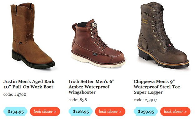
Result: 25% increase in sales.
The stated principles listed in no way limit the flight of fantasy and creative freedom. These are only options for helping and improving the site that impact the target audience using persuasive web design methods.
Let's take a simple example with the WC of Amsterdam Schiphol Airport. The appearance of the fly in the urinal miraculously changed the behavior of men. Judging by the results of this unexpected and strange experiment, the male gender has a tendency to aim in such places. Thanks to the fly, Amsterdam Airport has reduced cleaning costs by 80% (and it’s better not to know how they checked it).
')
Clarity is the basis of everything
The perception of visual information has its own mechanisms, which are often forgotten in web design. First of all, the site should be simple and user friendly. Creativity and originality are certainly good, but not at the expense of usability. The man came first of all for the information he was interested in. And if he does not get answers quickly enough, then the beautiful design is unlikely to notice.
The site must answer three user questions: “What is it?”, “What can I do here?” And “Why do I need to do this?”.
Check if this page will respond to them.
What is it? “I’ll start accepting credit cards today” is a clear answer and a meaningful illustration.
What can I do here? - I can get a card reader for bank cards.
Why do I need to do this? - Because it is free and here they offer the lowest transaction fees (2.75%).
Another example showing a visual way of contacting a visitor.
The human brain performs the processing of visual information 50 times faster than text. As in the proverb "it is better to see once ...". On the page above is a demonstration of what is for sale. But it is better to refrain from words in superlatives. This is a juggled stunt that in our time causes more distrust than disposition.
Many web marketers are still using epithets to a superlative degree (“best”, “early”, “simplest”, etc.). However, without confirmation, such statements are not convincing and will most likely annoy visitors to the site. For example, an ad from the “Best Pizza in the City” series is unlikely to convince a person to go to this pizzeria. But the clarification "Homemade pasta" - a more specific statement that does not contain superlative adjectives. You can also describe brief advantages (“We will deliver your pizza in 20 minutes,” etc.).
Visual appeal
After the user understands that he is in the right place and agrees that the offer is really profitable, it is the turn to take him through the sales funnel. The first impression solves a lot.
People often make hasty conclusions. A user needs only a few seconds to form an opinion on the landing page / site. And such a hasty impression will guide the visitor in his decision to stay or leave the site. First impressions affect user satisfaction, they can last for years.
A good example is the Tesla Model S. Many will say that the car is good, although they did not personally carry out test drives and perhaps did not even see the car live. Opinion is based solely on appearance.
But what makes a good design? Some people like green, some people like blue, some like minimalism, and some admire the abundance of elements on the page. Google tried to find out this question, during a large-scale survey, 2 factors of attractiveness of sites for the average user were determined:
- low visual complexity (the simpler the site, the better);
- Compliance with the stereotype (the design coincides with the user's ideas about how a site of a certain category should look like).
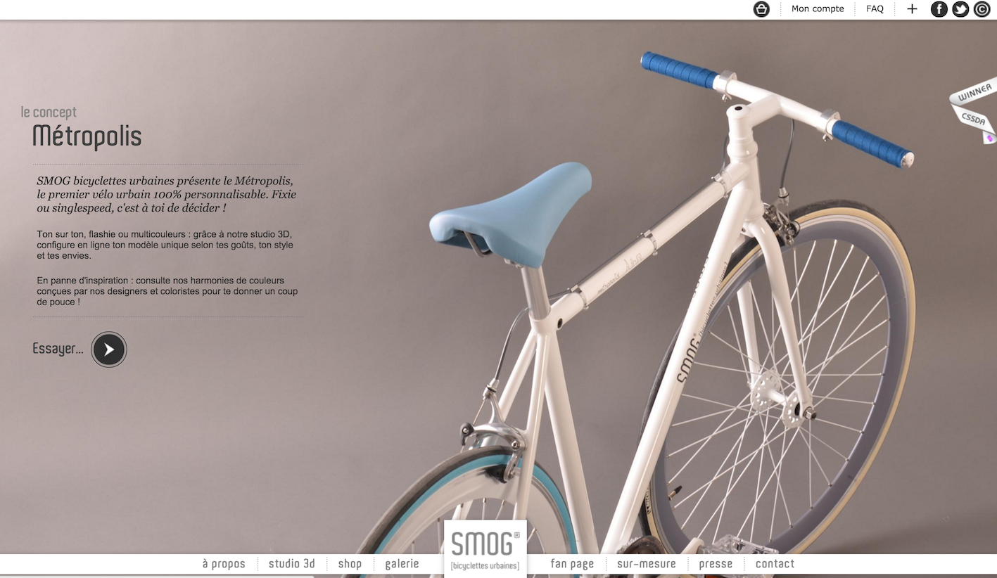
An example of a simple site, attractive to most users.
Strict visualization hierarchy
Visual hierarchy is one of the most important principles underlying web design. This is the order by which the human eye perceives what it sees.
If you ask any person to rate the circles in order of importance, he will cope with the task without even knowing anything about these circles. This is the visual hierarchy.
Some parts of the site are more important than others, respectively, and the user's attention must be directed correctly. If the site menu has 10 points, it is worth considering whether they are all equally important. If the task is to make the user click on specific menu items, they should be made more visible. The place in the hierarchy is determined by the size, color, font.
It is desirable to place elements on the page in a certain hierarchy, created in accordance with the concept of the site.
Here is an example of a Williams Sonoma site selling dishes. The main lure for the eyes of users is a juicy piece of meat that stimulates the appetite. It is followed by a headline and a call to action button. The fourth place is taken by the paragraph with the text under the heading, and on the fifth - the promise of free delivery. The banner located at the top of the window last attracts attention.
There are still debates on the Internet about which color converts better - red or orange. There is even a common C / A color A / B test of colors with green and red.
It seems that red converts better than green by 21%. But if you look ... Most users clicked on the red button, not because of the peculiarities of the color, but because it stands out more from the general environment. Red itself is aggressive and dominant, and in contrast to green, its influence is increasing. The red button is even more noticeable. If the site is mostly red, then the blue or green buttons will be the best to convert. The main thing is the contrast of the CTA element and the main color of the page.
The empty space around the object emphasizes its importance and adds “air”.
Keep attention at all costs
According to the research and observations of marketers, in most cases, the initial view of the users (for 69%) is attracted by the upper left of the screen. It is from this place begins the inspection of the web page.
Studies of neuroscientists prove that large images attract the attention of people in the first place.
A good way is to use photos of people looking directly at the viewers. When talking, the conversation usually looks into each other's eyes, so these images act like a magnet.
Another way to attract attention is “surprise”. When a user notices something unexpected or unusual that causes him curiosity.
But attracting attention is not as difficult as holding it. And in order not to discourage the user from any desire is on the site, it is better to avoid hackneyed phrases, a large text array, superfluous information and other things. For example, the main page is hardly worth putting the section "Our Philosophy". People are interested in information and they do not care about the views of the company on various issues, even if it concerns business.
First of all, the site needs good content, presented in an attractive form. The human eye is constantly trying to recognize images, and recognizing them, learns to ignore in the future. That is why it is important to “refresh” the page layout to improve the appeal. Attention can really attract something new, standing out from the familiar environment. Neurophysiologists also confirm that novelty contributes to the improvement of the assimilation of information, and obtaining new experience is an urgent need for the mind.
Here is a simple but effective technique with vertical text paragraphs interleaved. At the very top of the text on the right, below - the text on the left, and then - again on the right.
As soon as the user starts the selection, he needs help. Choice is hard work. The more of it, the lower the conversion.
The first step is to help people narrow their choices. This can be done with the help of filters that distribute the goods offered according to certain characteristics, categories. What is the most important factor when choosing a pair of shoes, a new shirt or a watch? in the case of an online store, the way the product looks.
As already mentioned, large pictures work better and for a long time grabbing the attention of the client.
Here is another example of the initial version of the product page with 4 photos of products in the line:
Reduce the number of photos to 3, but increase their size:
Result: 25% increase in sales.
The stated principles listed in no way limit the flight of fantasy and creative freedom. These are only options for helping and improving the site that impact the target audience using persuasive web design methods.
Source: https://habr.com/ru/post/272969/
All Articles