Modes and states in SCSS
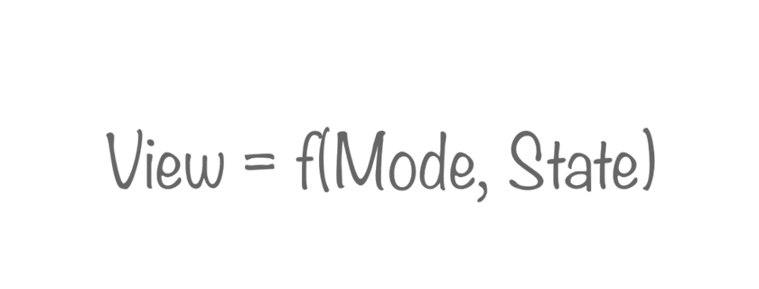
Considerations on the use of modes and states of the components of the user interface. Consider the use of the approach when working with style preprocessors. Carefully, there are too many code examples in the article.
')
Concept
An interface component can have several states: the green button can be pressed and released. An interface component can have several sets of states: a button can be not only green, but also blue, and both of them can be either pressed or pressed.
Each button state corresponds to a design. The appearance of an interface component can be repeated in different states of one mode and in different modes. The number of mode states depends on the particular mode.
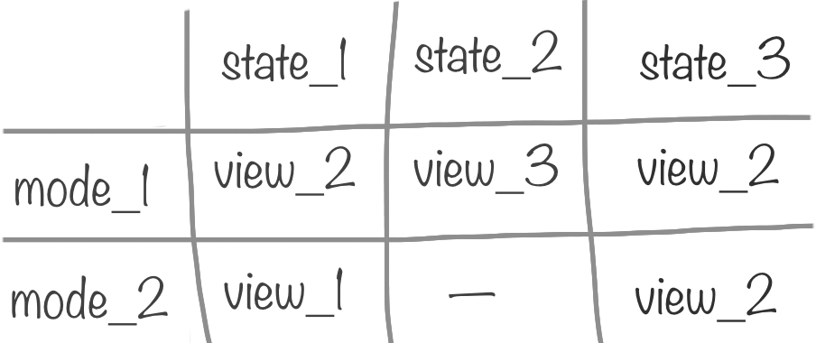
Thus, we can agree that
- View / View
- a set of styles describing the essence of the user interface (in a certain state); - State / State
- conditions affecting the Submission; - Mode / Mode
- many States of one entity.
The role of the Mode object is an interface component not lower than the Block level in terms of BEM.
Two modes cannot have Views with the same properties. If Modes affect the same properties, combine them.
Simple example
In the interface, the button has several states: link - waiting for the user to act, hover - the user has moved the mouse over the button, active - the user has pressed the left mouse button over the button. The button can be blue and green.
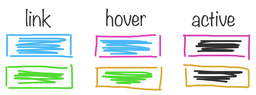
In this example, both buttons (blue and green) are presented in three states. For each of the buttons, the set of states is identical. A set of states forms a mode.
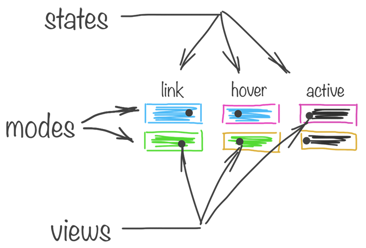
I create the styles for the buttons as follows:
// set modes @each $skinName, $skinColor in ( ( 'green', $green ), ( 'blue', $blue ) ) { .button_color_#{ $skinName } { // set state «link» @include skinView($skinName, 'link', $skinColor); // call view } .button_color_#{ $skinName }:hover:not(.button_disabled) { // set state «hover» @include skinView($skinName, 'hover', $skinColor); // call view } .button_color_#{ $skinName }:active:not(.button_disabled) { // set state «active» @include skinView($skinName, 'active', $skinColor); // call view } } The description of the views is separated from the description of the states:
// set views @mixin skinView($skin, $state, $color) { & { background-color: if( $state == 'link', $color, null ) if( $state == 'hover', lighten($color, 10%), null ) if( $state == 'active', darken($color, 10%), null ); } &:before { border-bottom-color: if( $state == 'link', darken($color, 10%), null ) if( $state == 'hover', $color, null ) if( $state == 'active', darken($color, 20%), null ); } .button__text { color: if( $state == 'link', #fff, null ) if( $state == 'hover', lighten($color, 45%), null ) if( $state == 'active', lighten($color, 40%), null ); } } Thus, we have an extensible mechanism for generating styles for various buttons in different states.
The example is more complicated
On my site [without an address, for a ban] the width of the content area is not fixed. The content part is filled with many blocks: paragraphs, lists, images, code samples, etc. Each of the content blocks has several modifications for different parameters. For example, the lists can be
ol , ul and dl .And each of them can be both “wide” and “narrow” depending on various conditions.
One of the parameters for displaying lists is the width of the content part, which affects the width of the list itself.
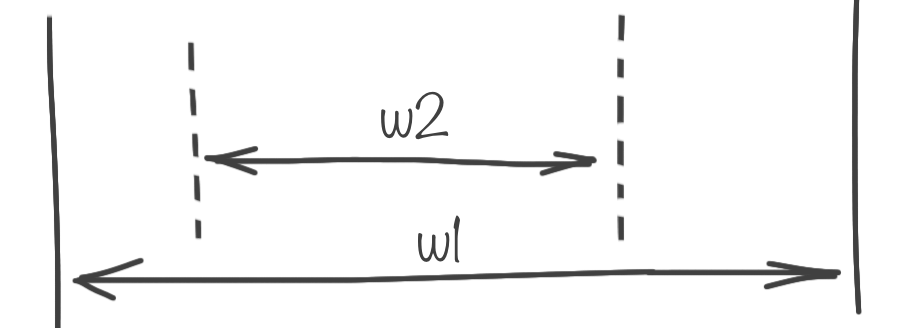
If the user's screen is relatively large, the list is exactly 640px in width, if the screen is small, the entire width of the content area of the page.
A similar dependence is inherent in other content blocks. The content snippet area of the code on the big screen is narrow, its width is 640px, and on the small one it is narrow, but different.
And, the “wide” image, wide on all screens - it occupies 100% of the parent's width. Thus, the combinations of Content Block Views are too large.
A large number of content blocks and the presence of several display conditions force us to create one universal abstract entity, the behavior / characteristics of which would inherit all content blocks. Just like in the PLO.
On my site, each content block accepts one of three Behaviors:
- wide
wide on the big screen, wide on the small one; - tricky / tricky
narrow on the big screen, wide on the small one; - slim / narrow
narrow on the big screen, narrow on the small.
Display conditions are: device type and screen size. The “Sly” mode adds complexity, which includes Views from the other two modes: it is “narrow” on the big screen and “wide” on the small screen.

Modes and States are described as follows:
// set modes @mixin slimContent($mode) { // set states for desktop and tablet @include device(desktop, tablet) { @include screen_m-- { @include slimContent__view($mode, 'screenBig'); // call view } @include screen_--s { @include slimContent__view($mode, 'screenSmall'); // call view } } // set state for phone @include device(phone) { @include slimContent__view($mode, 'screenSmall'); // call view } } To describe the views we use the helper:
// set views @mixin slimContent__view($mode, $screenSize) { @if $mode == 'wide' { @if $screenSize == 'screenBig' { @include slimContent__view-helper(padding, 0); // call view-helper } @if $screenSize == 'screenSmall' { @include slimContent__view-helper(padding, 0); // call view-helper } } @if $mode == 'tricky' { @if $screenSize == 'screenBig' { @include slimContent__view-helper(margin, auto); // call view-helper } @if $screenSize == 'screenSmall' { @include slimContent__view-helper(margin, 0); // call view-helper } } @if $mode == 'slim' { @if $screenSize == 'screenBig' { @include slimContent__view-helper(padding, auto); // call view-helper } @if $screenSize == 'screenSmall' { @include slimContent__view-helper(padding, $d); // call view-helper } } } The content of the helper is:
// view-helper @mixin slimContent__view-helper($property, $value) { @include device(desktop, tablet, phone) { @if $value == 'auto' { #{$property}-left: calc((100% - #{$contentWidth})*(1/3)); #{$property}-right: calc((100% - #{$contentWidth})*(2/3)); } @else { @if $value != 0 { #{$property}-left: $value; #{$property}-right: $value; } } } @include device(ie) { @if $value == 'auto' { #{$property}-left: 3*$d; #{$property}-right: 6*$d; } @else { @if $value != 0 { #{$property}-left: $value; #{$property}-right: $value; } } } } Application of the Mode is elementary:
.ui-snippet { @include slimContent(slim); @include ritm(1*$v); overflow-x: auto; } .ui-image { &.ui-image_wide { @include slimContent(wide); } &.ui-image_narrow { @include slimContent(tricky); } } Such an approach makes it possible to structure the code and avoid multiple duplications that would have occurred when describing this behavior for each content block separately.
At the request of stardust_kid I place the generated CSS, the code for the
desktop device type. On the way, I marked out the full code of the slimContent__view-helper , targeting by device and checking for zero.Button-specific code
.btn_color_blue { background-color: #1aa2e6; } .btn_color_blue:before { border-bottom-color: #1481b8; } .btn_color_blue .btn__text { color: #fff; } .btn_color_blue:hover:not(.btn_disabled) { background-color: #47b4eb; } .btn_color_blue:hover:not(.btn_disabled):before { border-bottom-color: #1aa2e6; } .btn_color_blue:hover:not(.btn_disabled) .btn__text { color: #e8f6fc; } .btn_color_blue:active:not(.btn_disabled) { background-color: #1481b8; } .btn_color_blue:active:not(.btn_disabled):before { border-bottom-color: #0f618a; } .btn_color_blue:active:not(.btn_disabled) .btn__text { color: #d1ecfa; } Snippet code and image
@media screen and (min-width: 1240px) { pre.ui-code { padding-left: calc((100% - 640px)*(1/3)); padding-right: calc((100% - 640px)*(2/3)); } } @media screen and (max-width: 1239px) { pre.ui-code { padding-left: 24px; padding-right: 24px; } } // , span.ui-code @media screen and (min-width: 1240px) { .ui-img.ui-img_narrow { margin-left: calc((100% - 640px)*(1/3)); margin-right: calc((100% - 640px)*(2/3)); } } To understand the scale of the problem being solved, I will cite some data:
- devices 4
- about 20 content blocks
- Each content block "inside" a particular device has 1-2 states
Source: https://habr.com/ru/post/272921/
All Articles