Hellish UX Spotify
Spotify is the most popular music streaming service today. In October, 60 million people listened to music through Spotify, 15 million of them with a paid subscription. In the catalog of more than 20 million songs.
I want to talk about the UX of this undoubtedly wonderful service. More precisely, how everything is bad. More precisely, BAD.
In Belarus, Russia and Ukraine, the service is not yet available, so trust notarized screenshots. Or try it yourself through VPN. Those who are not afraid of such displemeyr, as well as a lot of pictures and a long sheet of text, please under the cat.
As with all such services, the main scenarios are: add a song from the catalog to the playlist / bookmarks / collection; and actually listening. Spotify has programs for Windows and Mac; and mobile apps for iOS and Android. 52% of the playbacks are on phones, 10% on tablets. I suspect that it is in the desktop version that users search for music more, create and edit playlists, and mostly listen from the phone.
Thus, it all starts with a search, probably in the desktop version. If you are looking for a specific group or artist, then everything works fine. There is a hint on the written letters and even the correction of typos.
')
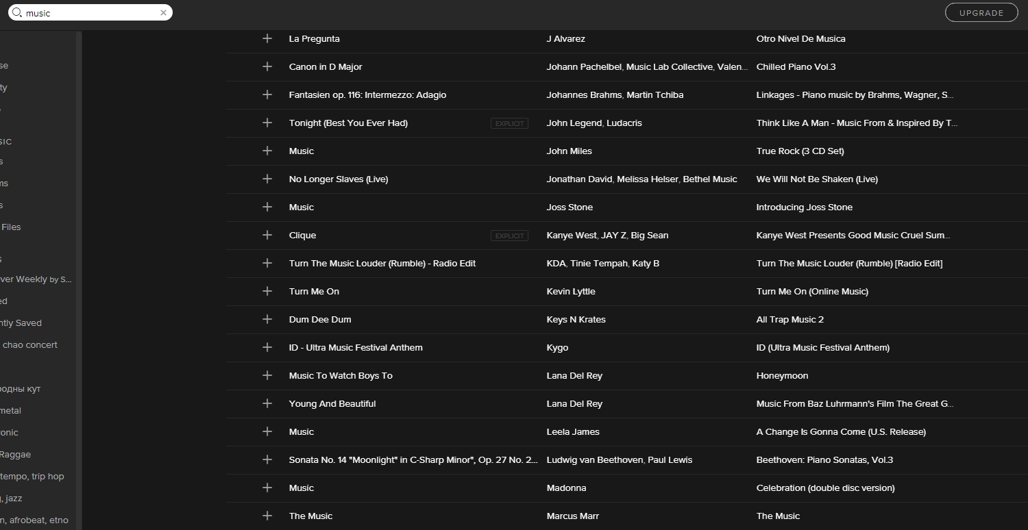
But when you are looking for a song, and even more so a song with a simple and popular name, then thrash and intoxication begins. Let's look for the song Music by LTJ Bukem. At the request of "Music" we see different artists, albums and play-lists with pictures, and a long list. It is not very clear where the performers are, and where the albums are, but now we need a song. In the long list, you can enable sorting.

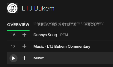
We twist the list to the letter and L and see that LTJ Bukem is not listed. Probably, there is no such song in the catalog.
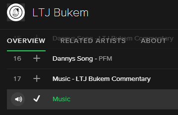
But if you do not be lazy, and write in the search line LTJ Bukem, then everything is miraculously located.
Let's listen to the song and save it for later. Click on the little plus sign, which says “Save to your music“, the plus sign becomes a tick. Done!
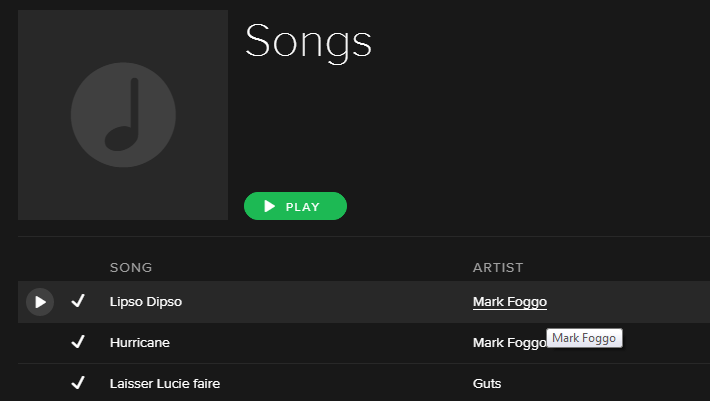
We go to the playlist of Recently Saved and see that it is empty. Heck!

Since the plus sign didn’t work out, let's be different: let's create a playlist and add songs to it. To do this, we again find the song, click on it with the cursor and click on the small button “three points” with the signature More. Pops up the menu, save the song and playlist. Hooray! When we added the song to the playlist, no tick appeared.And no cartoon. No indication at all that the song was added.
When adding several songs from one performer or from one album, it is not visible which songs have already been added and which are not. To prevent the same songs from being added to the playlists several times, the designers came up with this dialogue:

When a song gets bored, you can delete it from the playlist via the menu, or simply with the Delete button on the keyboard. You can delete several songs at once by holding Shift. But if you suddenly change your mind or delete the wrong songs, just exhale and walk around the computer, because there is no Undo button.
Despite the wealth of functions in the menu for each song, you simply cannot move the song to another playlist: you can only copy it and then delete it manually from the first playlist. If you parse a lot of songs, or just poorly organized play lists, then Spotify will teach you to think hard in advance.
After a few months, you may notice the Your Music section. It is here that those songs come into which you have pressed the plus sign. By the way, in the Discovery section, the plus sign (+) button is already used for another function - subscription to the executor (Follow). This includes not only songs, but also whole albums, if you click Save on a search on a specific album. Yes, Save is another way to save songs and blow your brain.
Especially I want to note the navigation in Your Music. Songs are represented by a list, and by clicking on an artist or album you will go to all the songs from this artist or from this album. And even carefully emphasized.
But when you look at the artist list (with pictures), the link only leads to the songs that you have saved in Your Music. And if all of a sudden your songs are stored in playlists, then everything is clear further:

The artist’s page shows the most popular songs with the number of plays:

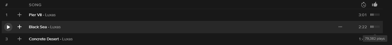
The same information is presented in a slightly different form on the list of all the songs in the album: small sticks under the Like button! Moreover, the scale is chosen such that the information does not carry the payload.
The article was quite long, so we smoothly proceed to the conclusion.
According to Nielsen there are 10 UX rules that would be good to follow. I counted violations of 6 of them.
And the last thing: despite the hellish usability, Spotify is an excellent service, which I myself have been using for 3 years almost daily.
I want to talk about the UX of this undoubtedly wonderful service. More precisely, how everything is bad. More precisely, BAD.
In Belarus, Russia and Ukraine, the service is not yet available, so trust notarized screenshots. Or try it yourself through VPN. Those who are not afraid of such displemeyr, as well as a lot of pictures and a long sheet of text, please under the cat.
As with all such services, the main scenarios are: add a song from the catalog to the playlist / bookmarks / collection; and actually listening. Spotify has programs for Windows and Mac; and mobile apps for iOS and Android. 52% of the playbacks are on phones, 10% on tablets. I suspect that it is in the desktop version that users search for music more, create and edit playlists, and mostly listen from the phone.
Thus, it all starts with a search, probably in the desktop version. If you are looking for a specific group or artist, then everything works fine. There is a hint on the written letters and even the correction of typos.
')
But when you are looking for a song, and even more so a song with a simple and popular name, then thrash and intoxication begins. Let's look for the song Music by LTJ Bukem. At the request of "Music" we see different artists, albums and play-lists with pictures, and a long list. It is not very clear where the performers are, and where the albums are, but now we need a song. In the long list, you can enable sorting.
We twist the list to the letter and L and see that LTJ Bukem is not listed. Probably, there is no such song in the catalog.
But if you do not be lazy, and write in the search line LTJ Bukem, then everything is miraculously located.
Let's listen to the song and save it for later. Click on the little plus sign, which says “Save to your music“, the plus sign becomes a tick. Done!
We go to the playlist of Recently Saved and see that it is empty. Heck!
Since the plus sign didn’t work out, let's be different: let's create a playlist and add songs to it. To do this, we again find the song, click on it with the cursor and click on the small button “three points” with the signature More. Pops up the menu, save the song and playlist. Hooray! When we added the song to the playlist, no tick appeared.
When adding several songs from one performer or from one album, it is not visible which songs have already been added and which are not. To prevent the same songs from being added to the playlists several times, the designers came up with this dialogue:
When a song gets bored, you can delete it from the playlist via the menu, or simply with the Delete button on the keyboard. You can delete several songs at once by holding Shift. But if you suddenly change your mind or delete the wrong songs, just exhale and walk around the computer, because there is no Undo button.
Despite the wealth of functions in the menu for each song, you simply cannot move the song to another playlist: you can only copy it and then delete it manually from the first playlist. If you parse a lot of songs, or just poorly organized play lists, then Spotify will teach you to think hard in advance.
After a few months, you may notice the Your Music section. It is here that those songs come into which you have pressed the plus sign. By the way, in the Discovery section, the plus sign (+) button is already used for another function - subscription to the executor (Follow). This includes not only songs, but also whole albums, if you click Save on a search on a specific album. Yes, Save is another way to save songs and blow your brain.
Especially I want to note the navigation in Your Music. Songs are represented by a list, and by clicking on an artist or album you will go to all the songs from this artist or from this album. And even carefully emphasized.
But when you look at the artist list (with pictures), the link only leads to the songs that you have saved in Your Music. And if all of a sudden your songs are stored in playlists, then everything is clear further:
The artist’s page shows the most popular songs with the number of plays:
The same information is presented in a slightly different form on the list of all the songs in the album: small sticks under the Like button! Moreover, the scale is chosen such that the information does not carry the payload.
The article was quite long, so we smoothly proceed to the conclusion.
According to Nielsen there are 10 UX rules that would be good to follow. I counted violations of 6 of them.
And the last thing: despite the hellish usability, Spotify is an excellent service, which I myself have been using for 3 years almost daily.
Source: https://habr.com/ru/post/272753/
All Articles