Site navigation - burping a bygone era
Excuse me, ladies and gentlemen, to glance at the text of one entertaining and terribly truthful story that happened quite recently in the distant and snowy Ural province. To regale this bike, I intended you purely for the reason that it has the remarkable truth of life, food for the mind and a reason for a heated hussar dispute (with the obligatory waving of the sword).
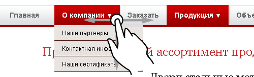
Once a certain young man, working on the path of usability and interface design, that is, to put it more simply, earning his caviar to a sandwich with the help of simple drawing gray squares; accidentally forgot on the next prototype to draw a horizontal main menu. Well, it doesn’t happen to anyone, the whole night the person smoked on the social network, the slippery jokes were let out by the unmarried mamselka - and he got tired of it in the morning. And in the morning he was assigned protection, which will be discussed further. No, not the defense of the thesis, and not even the Donetsk Airport - but the defense in front of the buyer of his picture with gray squares.

Here I intend to make a small digression for the uninitiated - sowing a bourgeois infection in the form of designing websites and studying the User Experience came to us from abroad. I regret to inform you that there, in the inhuman laboratories of Busurman, have long and stubbornly watched these same people, as if experimental mice. They will show a picture, give a cookie - and look at the reaction, write everything down and make profound conclusions then - as if to tear off even more money from these “mice”. Fortunately, everything is not right with us, we have Orthodox, experiments on people have long been banned, so instead of expensive laboratories, focus groups and (forgive me, God) Aytreker, we have learned how to use so-called “expert opinion” when any nonsense a mare in the mouth of an eloquent orator or a flattering maiden begins to seem sensible and even a reasoned set of words. And the presence of bright and juicy slides only enhances the hypnotic effect during such “protection”, allowing any gray square image to sell at the price of an early Surikov.
')
But back to the point. A certain venerable merchant ordered our hero to design a site for himself, on which the main menu would flaunt exactly like his arrogant competitor. And now our UX expert came to the defense, and among the gray squares there is no menu. And what do you think, gracious rulers, expelled our usability vzashey? Nothing of the kind, here to you, tea, not America. All the orders of Chinar, sat down at the tables of oak, clean bedclothes were laid, and "Protection of his concept" began, on which our clever young man proclaimed something like the following:
- After conducting the survey, our team of experts found that the current trends in the development of design in your market segment allow us to state that the navigation component has long since been relegated to importance. Your target audience, (photos of the characters of which are attached to the study), today is much more important to answer yourself the internal question: “What should I do next right now?” - which is solved using our call-to-action on the page (look at screen, please); than to dive into the painful and rather vague reasoning on the topic: “Where, in principle, could I go from here?”. Simply put, linking the user to a clear sales route guarantees a much higher conversion, since a potential client, in fact, has nowhere to turn in your future sales funnel.
Where your competitor’s buyer is off the hook, not having run away in time through the notorious menu to read “Prices”, or “Testimonials”, or “Contacts” - in our case, we drag him by the arm on all the necessary pages in a clear order, output forming a clear and sustained interest in the order. In essence, our concept is a natural development of the universally existing trend that every web page today should be like a landing page, which in itself is an independent and autonomous unit in your battle for a client. So, again, based on the principles of modern military art, when combat columns and firing a line have become morally obsolete - just autonomous combat units capable of acting independently without compulsory grouping - and bring the maximum effect.

It was based on these tendencies of the 21st century that we made a bold, but absolutely confirmed by our analysts decision that in your situation the standard menu horizontal will only be a tribute to the fashion of the last century, in which the extensive Big Data we have accumulated according to the behavioral scenarios of users and optimal sales routes.
Needless to say, this research wasn’t close at all to any research, analysts and experts, and that this speech in defense of its concept had only one reason to avoid legal retribution for the fact that its thousand-dollar squares did not contain a strip with the main menu.
What kind of instruction can our reader extract from this true story? I believe that the moral of this story is that in our current realities it is not so important to study analytics or programming, marketing or sociology - in these alien Western sciences there is no our age-old century-old soul, no grain of the heart of our people. But having learned eloquence, speaking in public and the ability to go on so well, to express your thoughts smoothly that verbally, in writing, you will be fed and dressed in any situation, no matter what age is standing outside the window.

Once a certain young man, working on the path of usability and interface design, that is, to put it more simply, earning his caviar to a sandwich with the help of simple drawing gray squares; accidentally forgot on the next prototype to draw a horizontal main menu. Well, it doesn’t happen to anyone, the whole night the person smoked on the social network, the slippery jokes were let out by the unmarried mamselka - and he got tired of it in the morning. And in the morning he was assigned protection, which will be discussed further. No, not the defense of the thesis, and not even the Donetsk Airport - but the defense in front of the buyer of his picture with gray squares.
Here I intend to make a small digression for the uninitiated - sowing a bourgeois infection in the form of designing websites and studying the User Experience came to us from abroad. I regret to inform you that there, in the inhuman laboratories of Busurman, have long and stubbornly watched these same people, as if experimental mice. They will show a picture, give a cookie - and look at the reaction, write everything down and make profound conclusions then - as if to tear off even more money from these “mice”. Fortunately, everything is not right with us, we have Orthodox, experiments on people have long been banned, so instead of expensive laboratories, focus groups and (forgive me, God) Aytreker, we have learned how to use so-called “expert opinion” when any nonsense a mare in the mouth of an eloquent orator or a flattering maiden begins to seem sensible and even a reasoned set of words. And the presence of bright and juicy slides only enhances the hypnotic effect during such “protection”, allowing any gray square image to sell at the price of an early Surikov.
')
But back to the point. A certain venerable merchant ordered our hero to design a site for himself, on which the main menu would flaunt exactly like his arrogant competitor. And now our UX expert came to the defense, and among the gray squares there is no menu. And what do you think, gracious rulers, expelled our usability vzashey? Nothing of the kind, here to you, tea, not America. All the orders of Chinar, sat down at the tables of oak, clean bedclothes were laid, and "Protection of his concept" began, on which our clever young man proclaimed something like the following:
- After conducting the survey, our team of experts found that the current trends in the development of design in your market segment allow us to state that the navigation component has long since been relegated to importance. Your target audience, (photos of the characters of which are attached to the study), today is much more important to answer yourself the internal question: “What should I do next right now?” - which is solved using our call-to-action on the page (look at screen, please); than to dive into the painful and rather vague reasoning on the topic: “Where, in principle, could I go from here?”. Simply put, linking the user to a clear sales route guarantees a much higher conversion, since a potential client, in fact, has nowhere to turn in your future sales funnel.
Where your competitor’s buyer is off the hook, not having run away in time through the notorious menu to read “Prices”, or “Testimonials”, or “Contacts” - in our case, we drag him by the arm on all the necessary pages in a clear order, output forming a clear and sustained interest in the order. In essence, our concept is a natural development of the universally existing trend that every web page today should be like a landing page, which in itself is an independent and autonomous unit in your battle for a client. So, again, based on the principles of modern military art, when combat columns and firing a line have become morally obsolete - just autonomous combat units capable of acting independently without compulsory grouping - and bring the maximum effect.
It was based on these tendencies of the 21st century that we made a bold, but absolutely confirmed by our analysts decision that in your situation the standard menu horizontal will only be a tribute to the fashion of the last century, in which the extensive Big Data we have accumulated according to the behavioral scenarios of users and optimal sales routes.
Needless to say, this research wasn’t close at all to any research, analysts and experts, and that this speech in defense of its concept had only one reason to avoid legal retribution for the fact that its thousand-dollar squares did not contain a strip with the main menu.
What kind of instruction can our reader extract from this true story? I believe that the moral of this story is that in our current realities it is not so important to study analytics or programming, marketing or sociology - in these alien Western sciences there is no our age-old century-old soul, no grain of the heart of our people. But having learned eloquence, speaking in public and the ability to go on so well, to express your thoughts smoothly that verbally, in writing, you will be fed and dressed in any situation, no matter what age is standing outside the window.
Source: https://habr.com/ru/post/272709/
All Articles