Simple Blender. Part 1
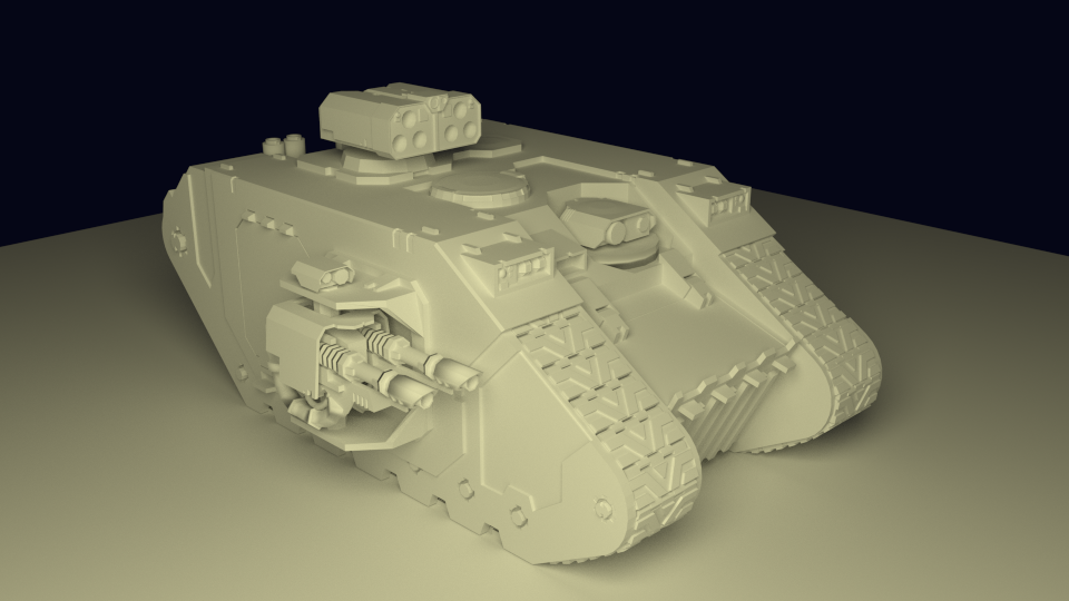
KDPV. Based on.
What is the post about
The post is written based on this comment . Especially inspired by the picture in the responses to this comment. Initially I wanted to write here about UI and the basics of modeling in Blender, but it’s a bit too much (I’m a talker). Therefore, about modeling - later (if the public wants). And here - about UI Blender from the point of view of a layman.
Introduction / Preface / disclaimer.
I’m not a real welder and I’m doing 3D modeling just for fun and quite sporadically (as can be seen from my results in KDPV). And I really want to emphasize this. None of my models went further than my computer, and I gave the assessment myself. He started, like many, with 3Ds Max Studio Autodesk (still not aware of how correctly Tridemax is called). What is a stack of operations, how to texture, make a translucent material and render - I have mastered. How to make a boat with NURBS - no.
After another system reinstallation and an attempt to figure out how “Autodesk 3ds Max 2009” is better, “Discreet 3dsmax 7” and, on the basis of these data, give the selected version of the package download time and gigabytes of the system partition to the installation (with associated pollution of the system with any additional programs) . My hobby is modeling, and not rendering gigahaypolypolutoratorachotkovogo cartoons for the next version of Warcraft.
')
By that time, I had already thoroughly climbed the Max interface (mainly to solve another problem like “how to return the rotation / scaling arrows” display) to decide for myself that max is like a Word, almost everyone uses 5% of the functionality, the remaining 95% are needed by professionals, of whom they themselves are 5%. Caesar - Caesar.
In general, I was ready to accept the loss of the ability to assign hair to a ball in exchange for a more manageable modeling program. After learning about the market, throwing away the remaining harvesters like Maya and LightWave, without taking SketchUp, I set up Blender. I will say right away - I was lucky, and by the time of my search the guys from the Blender Foundation had left their old interface:
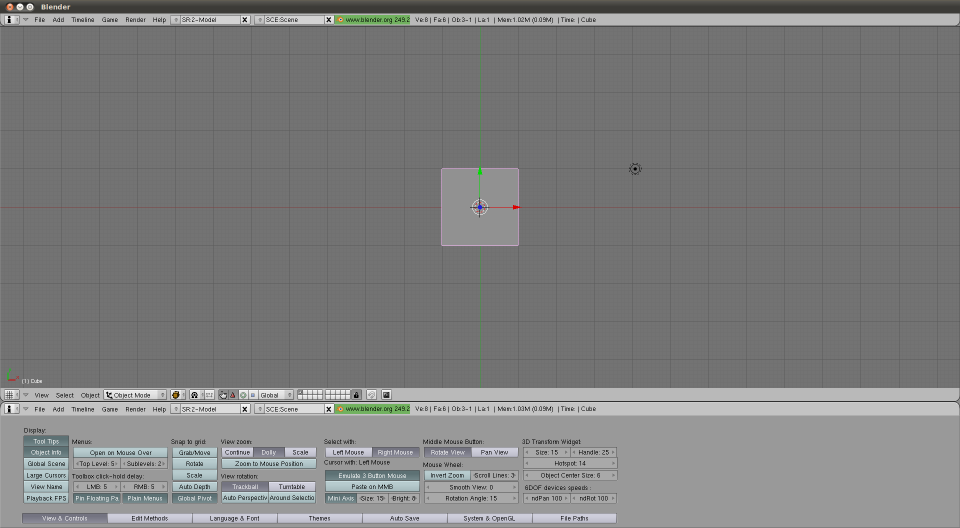
Figure 0. The interface version 2.4, which I, fortunately, did not find.
The program was:
- Free - no comments.
- Lightweight:
- Blender-2.76b-windows64.msi: 79.8 Mb
- Autodesk 3ds Max 2016 x64 (I'm even afraid to imagine what the installer looks like): 7000 Mb (according to the rutracker readings)
- Manageable. Windows, MacOs, Linux, FreeBSD. You can download the .zip package. Missing a service computer with Linux on a business trip, you can completely surrender to your hobby, then removing traces after yourself.
- Covering all my Wishlist, even with a vengeance (now, like, they render the Cycles engine with might and main polishing - randomly fucked up post on a habr , for example). NURBS, inverse kinematics, sculpture - you name it, as they say. I do not want to be a free product seller, just look at www.blender.org/features , there are pictures there.
- Able to communicate with the outside world. Out of the box there is export / import, including for:
- .fbx (these are your unity with these your animations)
- .stl (SolidWorks approve, for example)
- .obj (something like a standard for 3D packages)
- .3ds (well, what if ?!)
In general, I started to get used to it, and then use it. The process has been going on for several years. The process is episodic, and, again, in the form of a hobby. Below, in fact, my results of development.
Ui
Default window
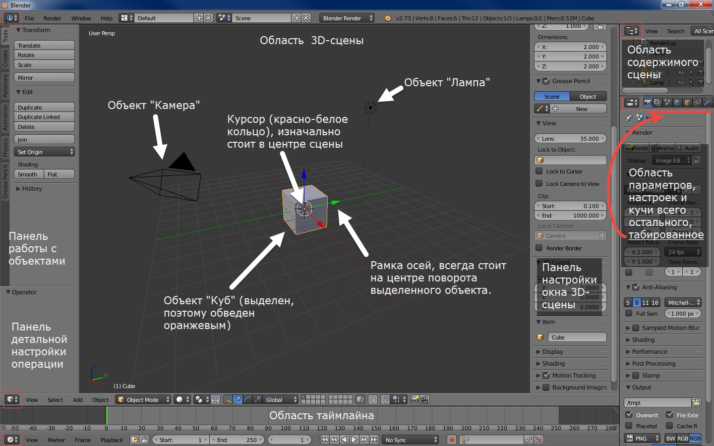
Figure 1. Window 2.6+ versions by default after start. Pay attention to the buttons circled in red squares.
It does not look megaprosto, but, IMHO, this is because the guys from BF believe in "showing the goods face."
As can be seen from the inscriptions on the picture, the situation at the start with the default settings is as follows:
- A cube, a lamp and a camera have been added to the scene. That, theoretically, gives us the ability to instantly start the render scene (F12 to start, Esc to exit) and get a non-black screen.
- The control panels of the 3D scene area are open, which, again, theoretically, makes it possible to immediately pull out the displayed scene.
- Added timeline area in case if we again, at once, want to reduce the cube.
In my opinion, the decision is controversial. But, on the other hand, it shows at once the possibility to open several areas, and how the objects look like, and about the setting panels, says.
In fact
Anyway, in fact, you see the following:
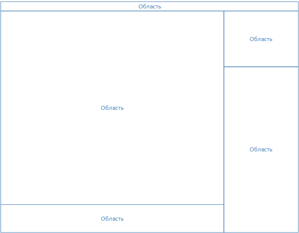
Figure 2. Blender window structure.
I focus on the lack of ordinal numbers near the words "Region". In fact, the blender window itself is a desktop with a controlled set of areas (they are called Area in the program). The menu (at the top) is also an area. They can be resized (as usual, with a mouse by the edge of the area), split / glue (again, click the mouse on the edge of the area, right click, choose the desired option), change the type (the menu is also a type of area).
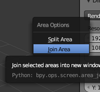
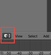
Figure 3. On the left - the area splitting / gluing menu, on the right - the region changing button (see also Figure 1).
You can make a nostalgic layout (I used it first, then I learned the buttons for changing views in the 3D area (NumPad 1,3,7 - front, right, top. If with Ctrl - the opposite - behind, left, bottom. NumPad 5 - switching between orthogonality and perspective)):
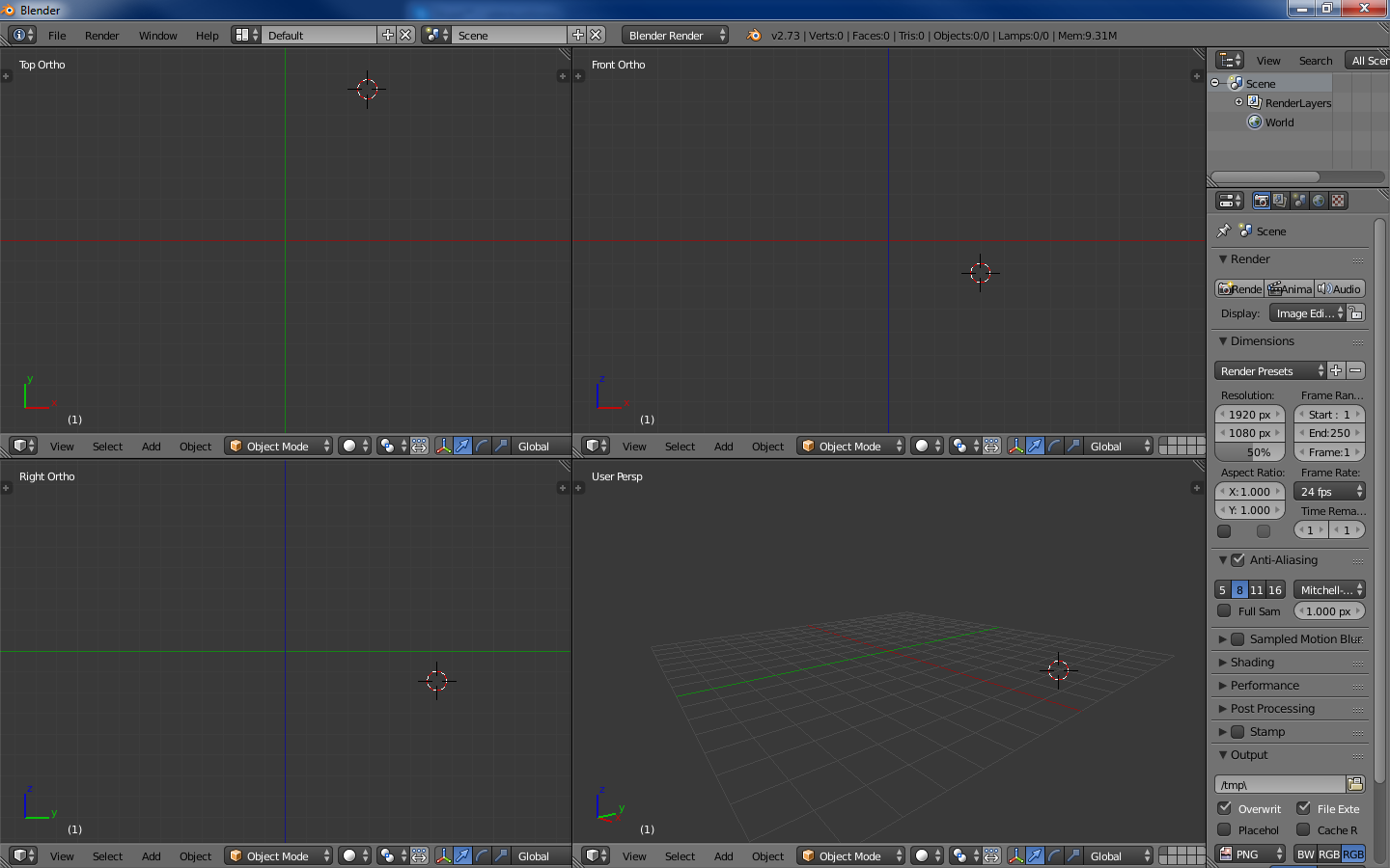
Figure 4. 3DS Max - a similar interface.
Also, the developers added a switch to the layouts (the ability to add-delete), with pre-configured layouts. IMHO, this is for the later stages of the learning curve. At first I did not need it:
Figure 5. On the left, the button for selecting an existing layout is marked, on the right, the buttons for adding and deleting the current layout.
It is important to note that Blender has a function for saving UI settings (File-> Save Startup File).
As a result, I removed the pre-created lamp, camera and die from the scene, and also glued the animation area to the 3D scene area
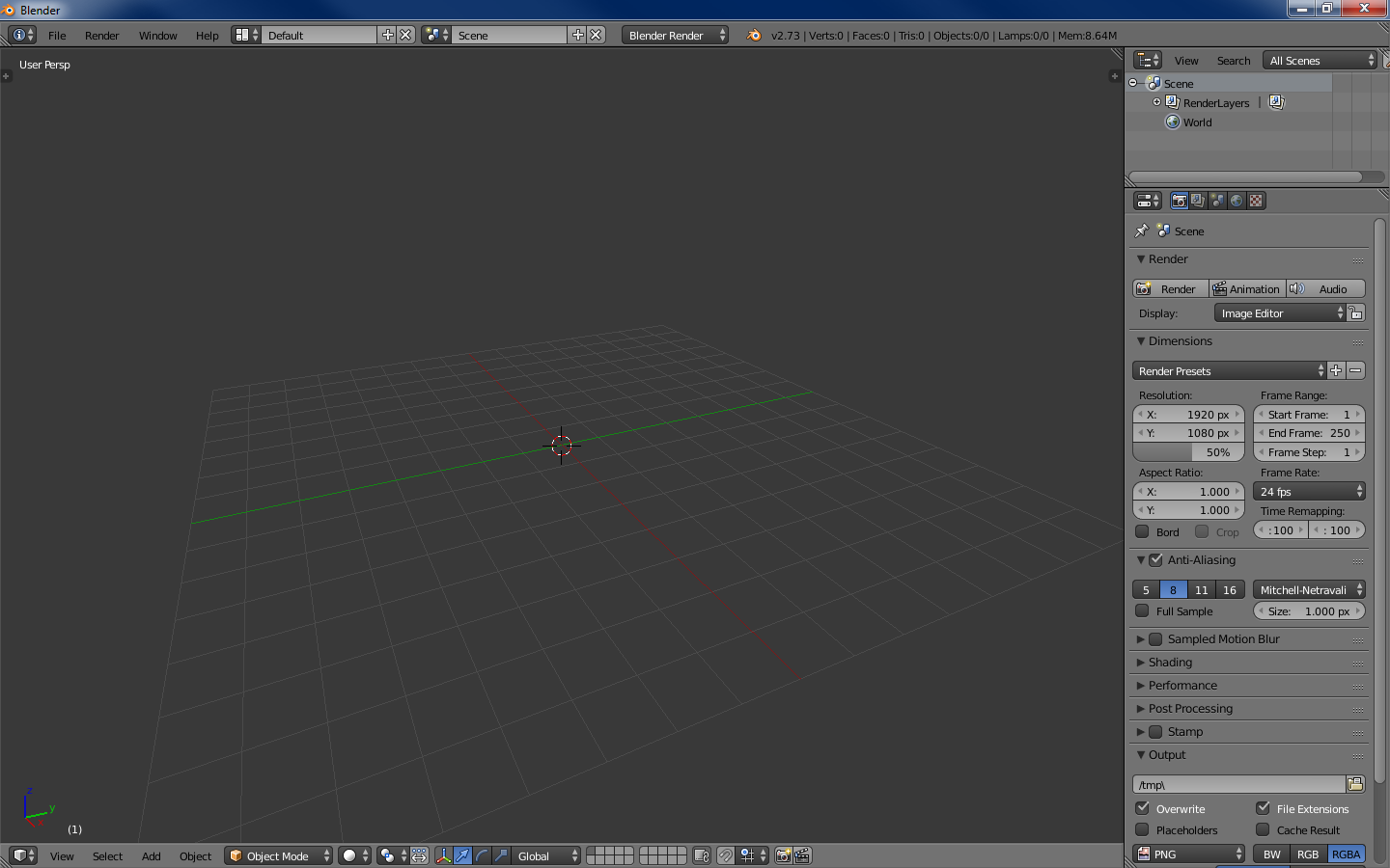
Figure 6. 4 areas - the menu, the outliner (the contents of the scene), the tuning and, in fact, the 3D scene.
When I start a new model - this is the most necessary minimum. Further, knowing the above, you can bloat in terms of displaying anything.
Summarizing. This is not a terrible Blender, it’s a controversial default.
Navigation
Left key - set 3D cursor (about it below) to the specified point.
The right key is the choice of something (object, face, etc.).
Middle key:
Drag - rotation around the center of the scene (or around the cursor, see below).
Scroll - removal / approach from / to the center of the scene / kurosor.
Tab - switch editing mode (below).
Spacebar - search command box.
100,500 keyboard shortcuts - the rest of the command (about some - below).
Work with the program
Retreat
As mentioned earlier, the program can do a lot, while it looks digestible from the start. Conceptually speaking, all these dances with layouts, in my opinion, serve one purpose - to allow the user to focus on a specific type of task, at the cost of discarding features that are unnecessary at this stage (compare predefined layouts, for example, scripting and motion tracking).
That is, the program at different stages looks different and, in general, requires different knowledge (which personally allows me not to load brains with video editing, for example).
Returning to Max, I once read that the first versions were written under DOS and, accordingly, had a limit of 640 KB (you can look at the prototype in general at vimeo.com/9652184 ). Hence the decision - a set of programs instead of one program. That is, in order to render a volume letter, it was necessary:
- Open a program for drawing 2D lines, which allows you to make splines, for example, and draw a letter. Save the file, close the program.
- Open a 3D modeling program with Bevel support, draw out a letter in 3D, save, close.
- Open the texture program, pull the texture, save, close.
- Open the render program, render.
I see a similar mechanic here, with the only difference that switching between types of tasks is instantaneous. The task, in this case, you define yourself. And, importantly for me, the interface remains clean.
Introduction
Here, in my opinion, the very place to write the most important Blender mantra, which you (if you start to get acquainted with it), will meet almost everywhere: “Use hotkeys”. Few people start working with the new program, having learned all its hotkeys. This is the case where the panel for working with objects is provided (see fig. 1) - pay attention to the tabs on the left of the panel. By the way, both panels on the 3D scene area are hidden / displayed by pressing T and N. The command search window (space) is also from this opera.
But the use of hot keys (at least in modeling) - I personally highly recommend. Fortunately, there are not so many basic operations, 10-15 pieces. During the work on one not very elementary model, they learn a light one. Admittedly, the interface allows you to do anything without pressing a single hot key. It just takes more time. Here, as in Starcraft, you either drive Jim Raynor on the map and furiously put all of his 3 mines by clicking on the abilities below on the right, or you control the drop against the Koreans.
In the next series - about modeling.
Source: https://habr.com/ru/post/272519/
All Articles