The font of your letters spoils your life.
In our blog, we already talked about how to work with typography in the design of email newsletters , and today we present to your attention an adapted translation of the material from the Bloomberg publication about why using the popular Helvetica and Arial fonts in letters may not be the best solution.
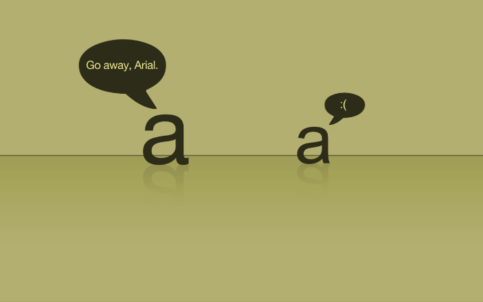
Helvetica, the most obvious choice for many brands and “ print typography ”, is used by default in Apple Mail. Gmail, by default, uses Arial, a font that one designer called Helvetika's "homely bastard son." If the browser does not support Arial, Gmail uses Helvetica instead.
')
Although Helvetica is a favorite option for many of those who are “obsessed with design,” since it is relatively neutral, the insufficient distance between the font elements and their strong similarity make it difficult to read voluminous texts. “The letters start to stick together,” says Nadine Chahine, type designer from Monotype. “It makes the text too crowded.”
Arial, like Helvetica, has what font designers call elements “reflected along a vertical or horizontal axis” - this makes it difficult to distinguish letters in a line. “Remember the letters b and d, p and q - children often confuse them. They are reflections of each other, says type designer Bruno Maag. “This property is enhanced in fonts such as Arial, where elements are literally the mirror image of various forms.”
Notice how the letters b and d look like in the image below, and also that the distance between h and e for Helvetica is slightly larger than the distance between t and i. It may seem that these are minor details, but both of them seriously complicate the readability of the texts, especially when the texts are voluminous, and you have to read them in large numbers (as often happens with e-mail).

But you really get a lot of letters. Americans spend about a third of their working time checking and reading mail. If you work 40 hours a week, you spend 11 of them reading online correspondence, which uses fonts that are completely inappropriate for this purpose.
Gmail, Apple Mail and Outlook (according to a study of over a billion letters, it turned out that these email clients are the most popular for desktop PCs), as a rule, use sans serif (sans-serif) fonts like Helvetica, Arial and Calibri - this is the default font. for Microsoft Outlook.
“Until relatively recently, most computers used in a corporate environment did not have a sufficiently high screen resolution,” says typer Jerry Leonidas. Simpler headsets, not burdened with small details and design elements that are found in serif fonts, on these screens reproduced "cleaner." But “over the past 4-5 years, the quality of the screens has grown so much that the distance between the font elements is clearly visible, the glyphs are reproduced clearly and do not merge with each other,” emphasizes Leonidas. Now, email clients have no reason to use sans serif fonts.
However, the burden of past years makes developers resist possible changes - and this, according to Maag, is a real tragedy. “The opinion that serif fonts are too coarse for mail no longer stands up to criticism. You need a font whose different elements are not reflections of each other. ” Due to the characteristic serifs that are present in the serif group fonts, their elements clearly differ from each other. See how the tick marks in the image below give each letter a personality.

The main advantage of a good font is its readability: a combination of speed and convenience in the process of reading, as well as clarity of the text, something like an emotional font acceptance. The way the letters look, their size and the distance between them determines whether it will be easy to read the text.
“When we read, we don’t take each letter separately,” said Jose Scaglione, creator of Literata , one of the fonts for e-books from Google Play. “We recognize letters in groups, and our brain evaluates the nature of the interaction between the dark and light parts of the text.”
Bookerly , a new font created by Bruno Maag for the Kindle, is a serif that many people find convenient for reading large amounts of text (however, the question of how far this or that serif surpasses sans serif fonts in readability - 1 , 2 ). “Each glyph is unique here,” says its creator about Bookerly. “Thanks to this, the font contains diverse and harmonious elements.” According to Amazon’s international tests , Bookerly fonts read 2% faster and more pleasantly than fonts used by Amazon earlier.
The font Literata was designed according to the same principles. Designers lengthened the outrigger elements of letters (for example, d and p) in order to improve the distinctiveness of a particular form. They also made the font elements a little wider.
Although we often have to read so many letters that their volume would be enough for a whole novel, we interact with digital communications and the text of books in different ways - and ideally the font should reflect these differences. Bookerly was designed to read large documents, and when it was created it was taken into account that attentive reader eyes might get tired.
We read e-mails much less thoughtfully - as a rule, we simply run our eyes over a couple of paragraphs. Designers who we interviewed agree that for such a “fast” reading it is very important that there is a lot of space between the letters. A serif font, among other things, will make it easier to recognize the letters themselves.
Even today, users are not obliged to "break their eyes" about Helvetica or Arial. In Gmail, you can choose from six additional fonts and adjust the saturation level of its font.
In essence, everyone who knows something about fonts tries to change the default settings of applications. Maag uses Verdana (sans-serif) and Georgia (serif) fonts for e-mails: both have a more “open” sign shape than Helvetica and Arial. Verdana, as shown below, has a larger (and more uniform) spacing between characters. Scalione likes Georgia. Sahin prefers Calibri and Verdana fonts. Leonidas used Verdana before, but after acquiring an HD monitor, he switched to a font called Input .

Maybe it's time for email clients to change their default settings. “I’m sincerely convinced that companies can seriously improve the lives of their customers by introducing better-quality fonts that, of course, will affect how you read e-mail,” says Maag. And what if you suggest using Bookerly for e-mail? “In theory, this is a good idea. It can be used to read letters, ”confirms Scalione. Well, dreaming is not bad.
Font designers avoid choosing Helvetica and Arial. You should be wary of them too.
Helvetica, the most obvious choice for many brands and “ print typography ”, is used by default in Apple Mail. Gmail, by default, uses Arial, a font that one designer called Helvetika's "homely bastard son." If the browser does not support Arial, Gmail uses Helvetica instead.
')
Although Helvetica is a favorite option for many of those who are “obsessed with design,” since it is relatively neutral, the insufficient distance between the font elements and their strong similarity make it difficult to read voluminous texts. “The letters start to stick together,” says Nadine Chahine, type designer from Monotype. “It makes the text too crowded.”
Arial, like Helvetica, has what font designers call elements “reflected along a vertical or horizontal axis” - this makes it difficult to distinguish letters in a line. “Remember the letters b and d, p and q - children often confuse them. They are reflections of each other, says type designer Bruno Maag. “This property is enhanced in fonts such as Arial, where elements are literally the mirror image of various forms.”
Notice how the letters b and d look like in the image below, and also that the distance between h and e for Helvetica is slightly larger than the distance between t and i. It may seem that these are minor details, but both of them seriously complicate the readability of the texts, especially when the texts are voluminous, and you have to read them in large numbers (as often happens with e-mail).
But you really get a lot of letters. Americans spend about a third of their working time checking and reading mail. If you work 40 hours a week, you spend 11 of them reading online correspondence, which uses fonts that are completely inappropriate for this purpose.
Gmail, Apple Mail and Outlook (according to a study of over a billion letters, it turned out that these email clients are the most popular for desktop PCs), as a rule, use sans serif (sans-serif) fonts like Helvetica, Arial and Calibri - this is the default font. for Microsoft Outlook.
“Until relatively recently, most computers used in a corporate environment did not have a sufficiently high screen resolution,” says typer Jerry Leonidas. Simpler headsets, not burdened with small details and design elements that are found in serif fonts, on these screens reproduced "cleaner." But “over the past 4-5 years, the quality of the screens has grown so much that the distance between the font elements is clearly visible, the glyphs are reproduced clearly and do not merge with each other,” emphasizes Leonidas. Now, email clients have no reason to use sans serif fonts.
However, the burden of past years makes developers resist possible changes - and this, according to Maag, is a real tragedy. “The opinion that serif fonts are too coarse for mail no longer stands up to criticism. You need a font whose different elements are not reflections of each other. ” Due to the characteristic serifs that are present in the serif group fonts, their elements clearly differ from each other. See how the tick marks in the image below give each letter a personality.
The main advantage of a good font is its readability: a combination of speed and convenience in the process of reading, as well as clarity of the text, something like an emotional font acceptance. The way the letters look, their size and the distance between them determines whether it will be easy to read the text.
“When we read, we don’t take each letter separately,” said Jose Scaglione, creator of Literata , one of the fonts for e-books from Google Play. “We recognize letters in groups, and our brain evaluates the nature of the interaction between the dark and light parts of the text.”
Bookerly , a new font created by Bruno Maag for the Kindle, is a serif that many people find convenient for reading large amounts of text (however, the question of how far this or that serif surpasses sans serif fonts in readability - 1 , 2 ). “Each glyph is unique here,” says its creator about Bookerly. “Thanks to this, the font contains diverse and harmonious elements.” According to Amazon’s international tests , Bookerly fonts read 2% faster and more pleasantly than fonts used by Amazon earlier.
The font Literata was designed according to the same principles. Designers lengthened the outrigger elements of letters (for example, d and p) in order to improve the distinctiveness of a particular form. They also made the font elements a little wider.
Although we often have to read so many letters that their volume would be enough for a whole novel, we interact with digital communications and the text of books in different ways - and ideally the font should reflect these differences. Bookerly was designed to read large documents, and when it was created it was taken into account that attentive reader eyes might get tired.
We read e-mails much less thoughtfully - as a rule, we simply run our eyes over a couple of paragraphs. Designers who we interviewed agree that for such a “fast” reading it is very important that there is a lot of space between the letters. A serif font, among other things, will make it easier to recognize the letters themselves.
Even today, users are not obliged to "break their eyes" about Helvetica or Arial. In Gmail, you can choose from six additional fonts and adjust the saturation level of its font.
In essence, everyone who knows something about fonts tries to change the default settings of applications. Maag uses Verdana (sans-serif) and Georgia (serif) fonts for e-mails: both have a more “open” sign shape than Helvetica and Arial. Verdana, as shown below, has a larger (and more uniform) spacing between characters. Scalione likes Georgia. Sahin prefers Calibri and Verdana fonts. Leonidas used Verdana before, but after acquiring an HD monitor, he switched to a font called Input .
Maybe it's time for email clients to change their default settings. “I’m sincerely convinced that companies can seriously improve the lives of their customers by introducing better-quality fonts that, of course, will affect how you read e-mail,” says Maag. And what if you suggest using Bookerly for e-mail? “In theory, this is a good idea. It can be used to read letters, ”confirms Scalione. Well, dreaming is not bad.
Source: https://habr.com/ru/post/272403/
All Articles