Visual tests with the Galen Framework. Improving code readability
Two years have passed since the writing of the first article on the Galen Framework . At that time, all that Galen was was just a simple set of checks for locating page elements relative to other elements. Then it was not possible either to check the screenshot pixel-by-pixel, nor to expand the language of Galen Specs, which, in fact, is the basis of the framework. Also, tests could be run using only one format of test suites, which greatly limited the possibilities of Galen tests. Since then, thanks to community support, a lot has changed in Galen. Today, this is a full-fledged tool for visual testing, which can not only check screenshots pixel-by-pixel and apply filters to the test images, but also provides a rich set of features that allow you to expand the capabilities of the Galen Specs language. In this article I would like to demonstrate the new features of the Galen Specs language, and also show how to improve the readability of visual tests in the Galen Framework using the example of this page .
Readability is one of the important properties of any test code. One of my employees even argued that the readability of tests is more important than the readability of the main code, since It is the test that will be the entry point when trying to figure out how any functionality works in the application. I liked this idea, and I decided to apply it for visual tests in the Galen Framework. My goal was to write a test, reading which, it will become clear how the site should look like in different browser sizes. Let's take a look at the most common cases when testing the layout of an adaptive site and try to figure out how to improve our tests.
Since the release of the first version of the Galen Framework, all my attempts to write a clear visual test have failed. At first, the test code was clear, but as soon as the number of elements on a page went over 10, it became difficult to understand and maintain these massive sets of instructions.
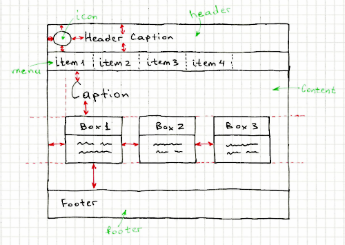
One of the most common examples is horizontally spaced repeating elements (ex. Menu)
')
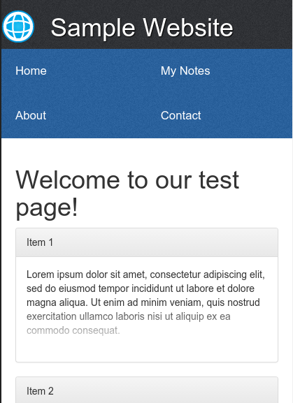
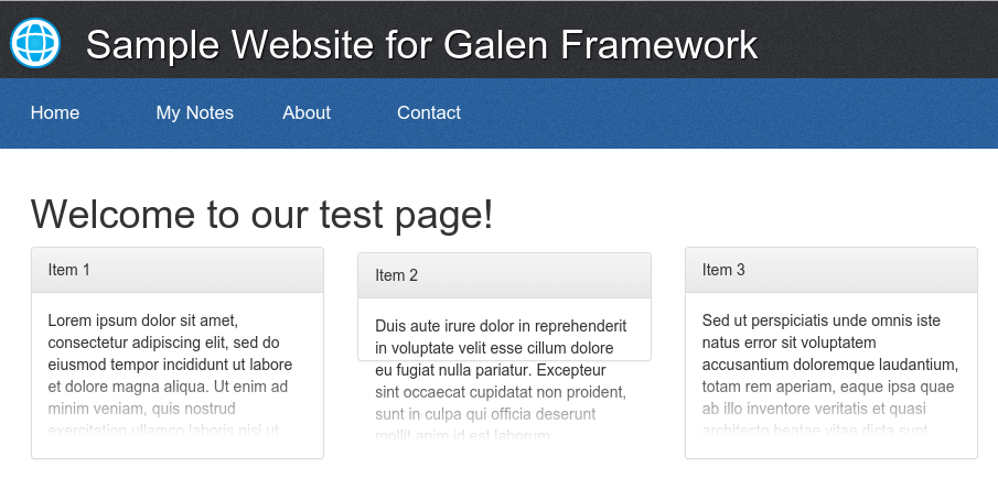
Our test site in desktop resolution looks like this:
To test the elements of the horizontal menu in Galen, using standard instructions, you have to write similar code:
As you can see, this code is the most common loop in which all menu items are sorted. Each menu item compares with the following, checking the alignment between the upper and lower edges, as well as the distance between the elements. This piece of code itself looks quite understandable, but once a lot of such blocks are used in one file, it becomes difficult to understand.
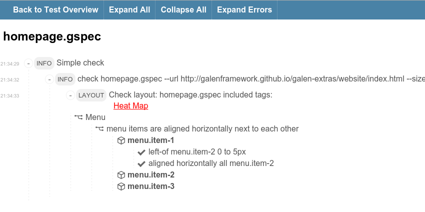
Let's run this test and look at the reports:
As a result, we get the following report:
Not very informative. When you look at such reports or try to penetrate into the test code, there are always questions: why was this or that test chosen? What exactly did they want to test? etc.
So how can you improve this code? So-called Custom Rules come to the rescue. In short, it is something like a function, only the parameters are parsed from the usual sentence written by the user. For now, let's leave the parameterization for later and try first to implement the simplest rule. For example, for the above case we can create the expression “menu items are aligned horizontally next to each other” . A little later we will add parameters to this expression. And so that it does not callus our eyes in the main test file, transfer it to the file my-rules.gspec :
Now, instead of this code in the main file, we can call this function like this
Another good thing is that in the report we will also see the same sentence, and all its checks will be grouped under it. Thus, our reports will also be more readable.
Now we can improve our expression by adding parameters to it. For example, if we look at a page, we will see more
Now we change our test:
Already better. The only thing I don’t like is to use
Now, instead of the
Now our checks are even more readable. However, the page we are testing is responsive, and our checks only work for a large screen. If you check the layout on the mobile resolution (eg 450 pixels wide), you will see that the menu items are displayed in a table with two columns.
Also, the box elements are aligned not horizontally, but vertically. Let's try to implement these new expressions so that we end up with something like this:
Verification of the vertical arrangement of elements for mobile layout of boxes can be copied from the horizontal and slightly corrected:
But with the table rendering of menu items will be a little more difficult. Let's try to implement this check using JavaScript code. To do this, create a
Well, in the file my-rules.js, we will write the following piece of code. We use the built-in findAll function, which finds all the specified elements in a search expression.
Notice the syntax
Now you can run tests using the command
As a result, we obtain the following reports:
After lengthy experiments with different layouts, I created the Galen Extras project. In this project, I implemented extensions for the most common cases. The main code is in the files galen-extras-rules.gspec and galen-extras-rules.js
I will not describe in detail the development of all the other special expressions, I will just show what happened in the end. Here is a test that checks all items on the page:
As you can see, not all cases turned out to write special expressions. For example, in the section “Page is centered horizontally inside screen with 900px ...” I had to split the checks into several subexpressions. Unfortunately, it seemed to me difficult to write a special expression for all the varieties of this particular case. The result would be too long and, accordingly, the probability of typos would increase. But if you have ideas on how to expand or improve all these expressions - I will be happy with your pool of requests.
By the way, I also prepared a version of the site with layout bugs:
If we run the same tests for this version of the site, we will see errors like these in the reports:
As you can see, if you accurately use the @rule feature, you can achieve very good results, significantly reduce your test code and improve test support. Also, this approach will be easier to apply for TDD in the development of the site. And what's more important, such code will be clear documentation that explains where and how the site should look. In the next article I will try to look at the Galen Framework from the other side and describe in detail the various techniques for pixel-by-image comparison of images.
Readability is one of the important properties of any test code. One of my employees even argued that the readability of tests is more important than the readability of the main code, since It is the test that will be the entry point when trying to figure out how any functionality works in the application. I liked this idea, and I decided to apply it for visual tests in the Galen Framework. My goal was to write a test, reading which, it will become clear how the site should look like in different browser sizes. Let's take a look at the most common cases when testing the layout of an adaptive site and try to figure out how to improve our tests.
Since the release of the first version of the Galen Framework, all my attempts to write a clear visual test have failed. At first, the test code was clear, but as soon as the number of elements on a page went over 10, it became difficult to understand and maintain these massive sets of instructions.
One of the most common examples is horizontally spaced repeating elements (ex. Menu)
')
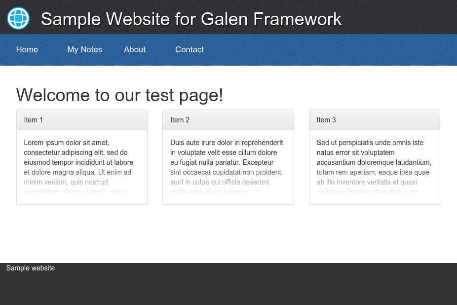
Our test site in desktop resolution looks like this:
To test the elements of the horizontal menu in Galen, using standard instructions, you have to write similar code:
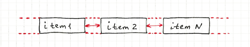
@objects menu #menu ul item-* li a = Menu = @forEach [menu.item-*] as menuItem, next as nextItem ${menuItem}: left-of ${nextItem} 0 to 5px aligned horizontally all ${nextItem} As you can see, this code is the most common loop in which all menu items are sorted. Each menu item compares with the following, checking the alignment between the upper and lower edges, as well as the distance between the elements. This piece of code itself looks quite understandable, but once a lot of such blocks are used in one file, it becomes difficult to understand.
Let's run this test and look at the reports:
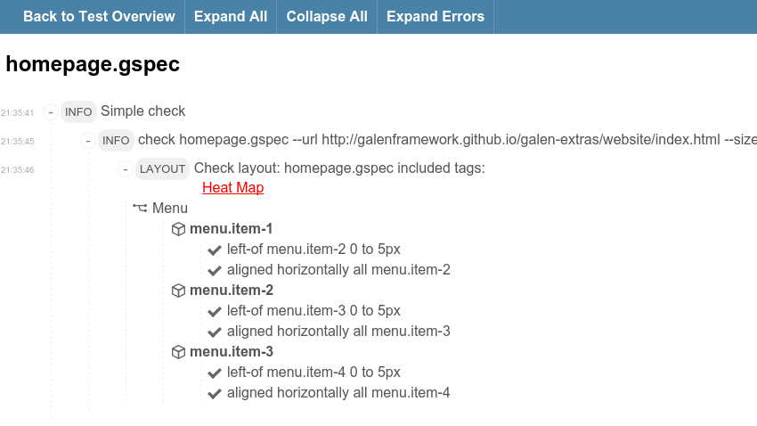
galen check homepage.gspec --url http://galenframework.imtqy.com/galen-extras/website/index.html --size 1024x768 --htmlreport reports As a result, we get the following report:
Not very informative. When you look at such reports or try to penetrate into the test code, there are always questions: why was this or that test chosen? What exactly did they want to test? etc.
So how can you improve this code? So-called Custom Rules come to the rescue. In short, it is something like a function, only the parameters are parsed from the usual sentence written by the user. For now, let's leave the parameterization for later and try first to implement the simplest rule. For example, for the above case we can create the expression “menu items are aligned horizontally next to each other” . A little later we will add parameters to this expression. And so that it does not callus our eyes in the main test file, transfer it to the file my-rules.gspec :
@rule menu items are aligned horizontally next to each other @forEach [menu.item-*] as menuItem, next as nextItem ${menuItem}: left-of ${nextItem} 0 to 5px aligned horizontally all ${nextItem} Now, instead of this code in the main file, we can call this function like this
@import my-rules.gspec @objects menu #menu ul item-* li a = Menu = | menu items are aligned horizontally next to each other Another good thing is that in the report we will also see the same sentence, and all its checks will be grouped under it. Thus, our reports will also be more readable.
Now we can improve our expression by adding parameters to it. For example, if we look at a page, we will see more
box elements on it, to which this check also applies. It would not be bad to use the same expression for different objects. Let's try to change our expression to this by substituting objectPattern and margin parameters into it: @rule %{objectPattern} are aligned horizontally next to each other with %{margin} margin @forEach [${objectPattern}] as item, next as nextItem ${item}: left-of ${nextItem} ${margin} aligned horizontally all ${nextItem} Now we change our test:
@import my-rules.gspec @objects menu #menu .middle-wrapper item-* ul li box-* .box-container .box .panel = Menu = | menu.item-* are aligned horizontally next to each other with 0 to 5px margin = Main Section = | box-* are aligned horizontally next to each other with ~ 30px margin Already better. The only thing I don’t like is to use
-* characters in all these expressions. Transferring them to @rule is not a reasonable solution, since the flexibility of our design is impaired. But specifically in this case, we can use the grouping of objects in the test itself. It works as follows. After declaring objects in the new @groups section , we can specify groups of objects, come up with a name for each of the groups and list which objects we want to merge. For now let's create two groups, menu_items and boxes . @import my-rules.gspec @objects menu #menu .middle-wrapper item-* ul li box-* .box-container .box .panel @groups menu_items menu.item-* boxes box-* Now, instead of the
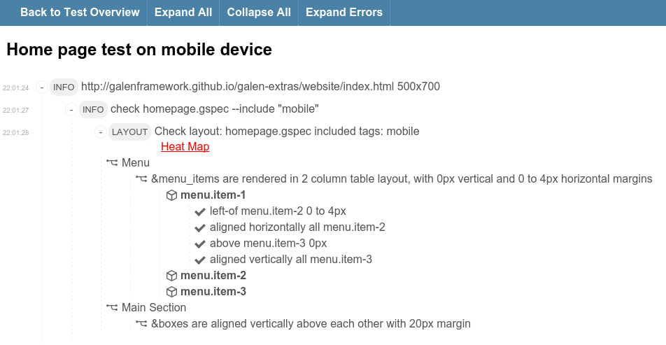
menu.item-* and box-* search expressions, we can specify groups using the & = Menu = | &menu_items are aligned horizontally next to each other with 0 to 5px margin = Main Section = | &boxes are aligned horizontally next to each other with ~ 30 px margin Now our checks are even more readable. However, the page we are testing is responsive, and our checks only work for a large screen. If you check the layout on the mobile resolution (eg 450 pixels wide), you will see that the menu items are displayed in a table with two columns.
Also, the box elements are aligned not horizontally, but vertically. Let's try to implement these new expressions so that we end up with something like this:
# ... = Menu = @on desktop, tablet | &menu_items are aligned horizontally next to each other with 0 to 5px margin @on mobile | &menu_items are rendered in 2 column table layout, with 0px vertical and 0 to 4px horizontal margin = Main Section = @on desktop, tablet | &boxes are aligned horizontally next to each other with ~30 px margin @on mobile | &boxes are aligned vertically above each other with 20px margin Verification of the vertical arrangement of elements for mobile layout of boxes can be copied from the horizontal and slightly corrected:
# ... @rule %{objectPattern} are aligned vertically above each other with %{margin} margin @forEach [${objectPattern}] as item, next as nextItem ${item}: aligned vertically all ${nextItem} above ${nextItem} ${margin} But with the table rendering of menu items will be a little more difficult. Let's try to implement this check using JavaScript code. To do this, create a
my-rules.js file and import it into the my-rules.gspec : @script my-rules.js # ... Well, in the file my-rules.js, we will write the following piece of code. We use the built-in findAll function, which finds all the specified elements in a search expression.
function _ruleRenderedInTable(rule, itemPattern, columns, verticalMargin, horizontalMargin) { var allItems = findAll(itemPattern); var currentColumn = 0; for (var i = 0; i < allItems.length - 1; i += 1) { if (currentColumn < columns - 1) { // rule.addObjectSpecs(allItems[i].name, [ "left-of " + allItems[i + 1].name + " " + horizontalMargin, "aligned horizontally all " + allItems[i + 1].name ]); } var j = i + columns; if (j < allItems.length) { // , rule.addObjectSpecs(allItems[i].name, [ "above " + allItems[j].name + " " + verticalMargin, "aligned vertically all " + allItems[j].name ]); } currentColumn += 1; if (currentColumn === columns) { currentColumn = 0; } } } rule("%{itemPattern} are rendered in %{columns: [0-9]+} column table layout, with %{verticalMargin} vertical and %{horizontalMargin} horizontal margin", function (objectName, parameters) { _ruleRenderedInTable(this, parameters.itemPattern, parseInt(columns), parameters.verticalMargin, parameters.horizontalMargin); }); Notice the syntax
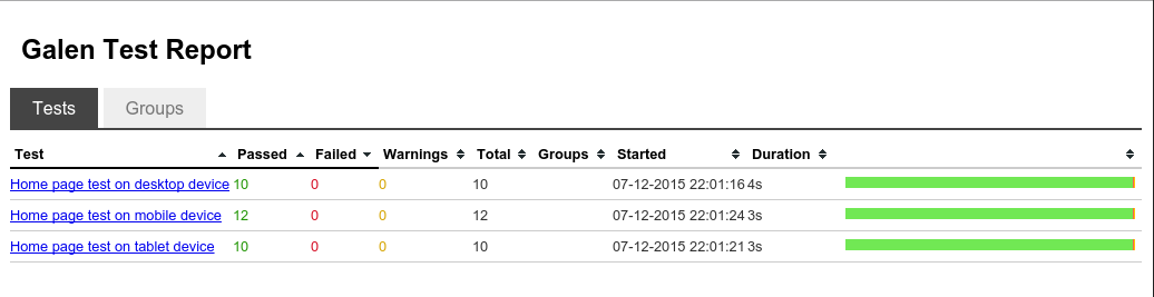
%{columns: [0-9]+} . In this case, we specify our own regular expression [0-9]+ instead of the standard .* , Which will be used for the columns parameter. Although it is not necessary, but in this way we make protection from typos. Since we added checks for three different layouts, we need to prepare a test suite in order to run tests on all virtual devices (desktop, tablet, mobile) with one team. Create the file my.test : @@ table devices | tag | size | | desktop | 1024x768 | | tablet | 800x600 | | mobile | 500x700 | @@ parameterized using devices Home page test on ${tag} device http://galenframework.imtqy.com/galen-extras/website/index.html ${size} check homepage.gspec --include "${tag}" Now you can run tests using the command
galen test my.test --htmlreport reports As a result, we obtain the following reports:
What's next?
After lengthy experiments with different layouts, I created the Galen Extras project. In this project, I implemented extensions for the most common cases. The main code is in the files galen-extras-rules.gspec and galen-extras-rules.js
I will not describe in detail the development of all the other special expressions, I will just show what happened in the end. Here is a test that checks all items on the page:
@import galen-extras/galen-extras-rules.gspec @objects header #header .middle-wrapper box-* .box-container .box .panel menu #menu .middle-wrapper item-* ul li content #content greeting #content h1 footer #footer .middle-wrapper @groups (box, boxes) box-* (menu_item, menu_items) menu.item-* skeleton_elements header, menu, content, footer skeleton_element &skeleton_elements image_validation header, menu.item-* = Skeleton = | &skeleton_elements sides are inside screen with 0px margin from top and bottom | &skeleton_elements are aligned vertically above each other with 0 to 1px margin = Page is centered horizontally inside screen with 900px on desktop, but on mobile and tablet it stretches to screen = | every &skeleton_element is centered horizontally inside screen @on desktop | every &skeleton_element has width 900px @on mobile, tablet | every &skeleton_element is aligned vertically all screen = Menu items should adapt layout = @on * | amount of visible &menu_items should be 4 | every &menu_item is inside menu and has height ~ 64px | first &menu_item is inside menu 0px top left @on desktop, tablet | &menu_items are aligned horizontally next to each other with 0 to 5px margin @on mobile | &menu_items are rendered in 2 column table layout, with 0px vertical and 0 to 4px horizontal margin = Main Section = = Greeting = greeting: height 30 to 60px inside content 40px top, 20px left right @on * | amount of visible &boxes should be 3 | test all &boxes with box-component.gspec @on desktop, tablet | &boxes are aligned horizontally next to each other with equal distance | &box sides are inside content with 20px margin from left and right | every &box is below greeting ~ 10px | every &box is above footer > 19px @on mobile | &boxes are aligned vertically above each other with 20px margin | every &box is inside content 20px left right | first &box is below greeting ~ 10px | last &box is above footer > 19px As you can see, not all cases turned out to write special expressions. For example, in the section “Page is centered horizontally inside screen with 900px ...” I had to split the checks into several subexpressions. Unfortunately, it seemed to me difficult to write a special expression for all the varieties of this particular case. The result would be too long and, accordingly, the probability of typos would increase. But if you have ideas on how to expand or improve all these expressions - I will be happy with your pool of requests.
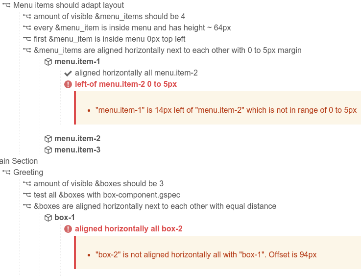
By the way, I also prepared a version of the site with layout bugs:
If we run the same tests for this version of the site, we will see errors like these in the reports:
Conclusion
As you can see, if you accurately use the @rule feature, you can achieve very good results, significantly reduce your test code and improve test support. Also, this approach will be easier to apply for TDD in the development of the site. And what's more important, such code will be clear documentation that explains where and how the site should look. In the next article I will try to look at the Galen Framework from the other side and describe in detail the various techniques for pixel-by-image comparison of images.
Links
Source: https://habr.com/ru/post/272213/
All Articles