How to create a round Progress Button
Lesson on the implementation of the round button download (hereinafter progress button) by Colin Garven. We will use the technique of SVG line animation, described by Jake Archibald, to animate the progress button and show the user the status of "success and fail".
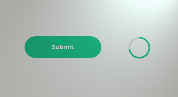
Today we will show you how to create an elegant progress button. This is a unique concept submit button proposed by Colin Garven. First look at this ( Demo ), try to figure out how to implement it, and just enjoy the animation. The idea is as follows: the first click, the submit button is transformed into a circle, which will show the loading animation using its borders (hereinafter Border). When the animation ends, the button will return the original form and show a mark indicating whether the confirmation was successful or not.
There are several ways to implement a button with this effect. Thinking about implementing only through CSS, the most difficult part seems to be a circle of progress. There is an implementation technique using the clip property. Anders Ingemann wrote a great full tutorial (on LESS). But we will use the technique based on SVG, CSS transitions and some JS. As for the progress circle, the success / fail marks, we will use the SVG line drawing technique described by Jake Archibald.
')
It is worth noting that animating SVG can be problematic for some browsers. So take this tutorial only as an experimental exercise.
Go!
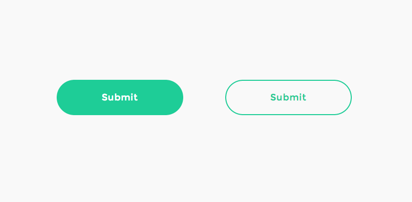
If you carefully studied the Colin's Dribbble shot, you should have noticed that we should take care of several button states. The interesting part is the transition between two such states. First we need to show a simple button with a transparent background and a color border. When you hover the mouse button fills the color of the border, and the text becomes white.
When you click on the button (in order to, for example, confirm the form is submitted), the text should disappear smoothly, the button width decreases to the circle state, the border becomes narrower and the animation should start. We will use the SVG-circle for animation, so we need to make sure that the resulting button is the same size and in the same position as the SVG-circle, which is visible at this moment. Then we draw a circle depicting the upload confirmation.

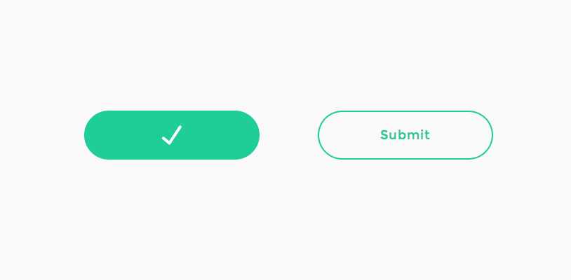
When the confirmation is completed and the circle is completely drawn, the button should expand again, draw a tick in case of a successful confirmation. And paint the button accordingly.
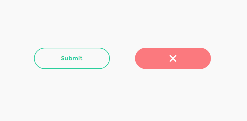
In case of failure of confirmation, you need to show the error status.
Let's create our markup with all the necessary elements.
For the markup, we need the main container, a button with a span (span) containing the text, and three SVGs:
We use Method Draw , because the easiest way is to use the online SVG generator to draw a tick and a cross for the button. All SVG sizes will be 70x70, since the height of our button is 70px. If we want a circle with a border of 5 units in thickness, we need to set the correct radius when we wake to draw it in a graphic editor, so that the whole circle with its border has a height of 70 pixels. Notice that in SVG the stroke is drawn symmetrically to the border of the object. For example, a stroke with a thickness of 2 pixels will increase a circle with a radius of 10 pixels to the actual thickness and height of 20 + 2 instead of 20 + 4 (border width twice), that is, the formula 2 * r + border. For our case, we know 2 * r + 5 = 70, from here our circle should have a radius of 32.5 pp. Thus goes: />.
Unfortunately, we cannot use only these basic dimensions, because each browser has its own default insertion parameters and we cannot control where the “download animation will start”. Thus, we have to convert this form to a path and use it. You can easily do this in Method Draw under Object> Convert to Path.
For the cross we will use four elements that can be drawn from the middle point, and animate as well as a tick.
So, we have all the necessary elements. Consider the procedure and start styling.
First you need to stylize the container for the button:
We indicate our button colors and fonts. To make it fit the concept, install the correct border and font Montserrat:
Also set the transition for all properties that will be animated (background-color, width etc.).
When you hover the mouse cursor, we change the background color and the text color:
Remove all strokes (outline):
All SVGs must be centered, all pointer-events are disabled:
Forms should not have fill colors, since we only want to play with a stroke. We do not show elements in any states of the button, except for the desired one, so let's hide them by making them transparent:
Our boot circle will be created by setting the stroke-width to 5 units:
Success / fail indicators will have a thinner stroke, and it should be white. Set the value of round to the stroke-linecap property, so they will be more beautiful. They set a quick change in transparency:
Now let's summarize and recall our master plan. We needed to be able to stylize the three added states (besides the default) buttons and special elements. We will use the classes “loading”, “success” and “error” to display them.
The button will go round and will look exactly like the SVG boot circle when we start the boot process:
Remember that we already set the transition when we set the styles for the button. The text should disappear quickly when the download animation starts, ...
... by setting a value of zero for transparency:
When changing states from loading to success / error, we don’t need transition, just leave the text hidden.
When we remove all classes and return the button to its original state. The text needs a little more time to appear, so let's set different values for the duration of the animation and its delay for the normal state:
When the last state is reached, you need to override the transition, since we do not need to animate the color of the border or the latitude of the button:
Set the colors for the last state:
When the required class is applied, you need to show our SVG and animate the stroke-dashoffset by setting the following values for the transition:
Add easing to animate the latitude of the button:
If you like to play with other easing functions, try Ceaser , CSS Easing Animation Tool by Matthew Lein.
Determined styles, create magic further.
Let's start with the initialization of some elements: button is the button html element, progressEl is the progress bar ring SVG element, progress bar, successEl, errorEl are the check mark and cross SVG elements, respectively:
Added SVGEI function to be used to provide SVG elements and their paths. We cache the path and, accordingly, the length for each. Initially, we “pull off” all paths by controlling the values of the strokeDasharray and strokeDashoffset properties. Later we will “pull” them back when we show the boot circle, or a tick, or a cross. This technique is well explained by Jake Archibald in the article Animated line drawing in SVG . Set the value of the stroke-dasharray equal to the length of the path and delay it. Setting the value of the stroke-dashoffset also equal to its length, we no longer see it. When we need to show a shape, set the offset to 0, imitating the drawing of the shape:
Next, we need to initialize the onclick event for our button. First, the button will turn into a circle (by adding a loading class). After the end of the animation, either the callback function will be called, or the progress will be set to 100%. At the moment, the button is disabled (this event should be the very first, but a browser such as firefox, for example, cannot delete the transitionend event):
As soon as progress reaches 100%, you need to update the filling of the boot circle. Then you need to show either a tick or a cross. After some time (options.statusTime) we remove all the status indicators and re-enable the button. Please note that all transitions are controlled by CSS.
Button is ready!
"We hope you enjoyed this tutorial and find it useful!"
Today we will show you how to create an elegant progress button. This is a unique concept submit button proposed by Colin Garven. First look at this ( Demo ), try to figure out how to implement it, and just enjoy the animation. The idea is as follows: the first click, the submit button is transformed into a circle, which will show the loading animation using its borders (hereinafter Border). When the animation ends, the button will return the original form and show a mark indicating whether the confirmation was successful or not.
There are several ways to implement a button with this effect. Thinking about implementing only through CSS, the most difficult part seems to be a circle of progress. There is an implementation technique using the clip property. Anders Ingemann wrote a great full tutorial (on LESS). But we will use the technique based on SVG, CSS transitions and some JS. As for the progress circle, the success / fail marks, we will use the SVG line drawing technique described by Jake Archibald.
')
It is worth noting that animating SVG can be problematic for some browsers. So take this tutorial only as an experimental exercise.
Go!
The master plan
If you carefully studied the Colin's Dribbble shot, you should have noticed that we should take care of several button states. The interesting part is the transition between two such states. First we need to show a simple button with a transparent background and a color border. When you hover the mouse button fills the color of the border, and the text becomes white.
When you click on the button (in order to, for example, confirm the form is submitted), the text should disappear smoothly, the button width decreases to the circle state, the border becomes narrower and the animation should start. We will use the SVG-circle for animation, so we need to make sure that the resulting button is the same size and in the same position as the SVG-circle, which is visible at this moment. Then we draw a circle depicting the upload confirmation.
When the confirmation is completed and the circle is completely drawn, the button should expand again, draw a tick in case of a successful confirmation. And paint the button accordingly.
In case of failure of confirmation, you need to show the error status.
Let's create our markup with all the necessary elements.
Markup
For the markup, we need the main container, a button with a span (span) containing the text, and three SVGs:
<!-- progress button --> <div id="progress-button" class="progress-button"> <!-- button with text --> <button><span>Submit</span></button> <!-- svg circle for progress indication --> <svg class="progress-circle" width="70" height="70"> <path d="m35,2.5c17.955803,0 32.5,14.544199 32.5,32.5c0,17.955803 -14.544197,32.5 -32.5,32.5c-17.955803,0 -32.5,-14.544197 -32.5,-32.5c0,-17.955801 14.544197,-32.5 32.5,-32.5z"/> </svg> <!-- checkmark to show on success --> <svg class="checkmark" width="70" height="70"> <path d="m31.5,46.5l15.3,-23.2"/> <path d="m31.5,46.5l-8.5,-7.1"/> </svg> <!-- cross to show on error --> <svg class="cross" width="70" height="70"> <path d="m35,35l-9.3,-9.3"/> <path d="m35,35l9.3,9.3"/> <path d="m35,35l-9.3,9.3"/> <path d="m35,35l9.3,-9.3"/> </svg> </div><!-- /progress-button --> We use Method Draw , because the easiest way is to use the online SVG generator to draw a tick and a cross for the button. All SVG sizes will be 70x70, since the height of our button is 70px. If we want a circle with a border of 5 units in thickness, we need to set the correct radius when we wake to draw it in a graphic editor, so that the whole circle with its border has a height of 70 pixels. Notice that in SVG the stroke is drawn symmetrically to the border of the object. For example, a stroke with a thickness of 2 pixels will increase a circle with a radius of 10 pixels to the actual thickness and height of 20 + 2 instead of 20 + 4 (border width twice), that is, the formula 2 * r + border. For our case, we know 2 * r + 5 = 70, from here our circle should have a radius of 32.5 pp. Thus goes: />.
Unfortunately, we cannot use only these basic dimensions, because each browser has its own default insertion parameters and we cannot control where the “download animation will start”. Thus, we have to convert this form to a path and use it. You can easily do this in Method Draw under Object> Convert to Path.
For the cross we will use four elements that can be drawn from the middle point, and animate as well as a tick.
So, we have all the necessary elements. Consider the procedure and start styling.
CSS
First you need to stylize the container for the button:
.progress-button { position: relative; display: inline-block; text-align: center; } We indicate our button colors and fonts. To make it fit the concept, install the correct border and font Montserrat:
.progress-button button { display: block; margin: 0 auto; padding: 0; width: 250px; height: 70px; border: 2px solid #1ECD97; border-radius: 40px; background: transparent; color: #1ECD97; letter-spacing: 1px; font-size: 18px; font-family: 'Montserrat', sans-serif; -webkit-transition: background-color 0.3s, color 0.3s, width 0.3s, border-width 0.3s, border-color 0.3s; transition: background-color 0.3s, color 0.3s, width 0.3s, border-width 0.3s, border-color 0.3s; } Also set the transition for all properties that will be animated (background-color, width etc.).
When you hover the mouse cursor, we change the background color and the text color:
.progress-button button:hover { background-color: #1ECD97; color: #fff; } Remove all strokes (outline):
.progress-button button:focus { outline: none; } All SVGs must be centered, all pointer-events are disabled:
.progress-button svg { position: absolute; top: 0; left: 50%; -webkit-transform: translateX(-50%); transform: translateX(-50%); pointer-events: none; } Forms should not have fill colors, since we only want to play with a stroke. We do not show elements in any states of the button, except for the desired one, so let's hide them by making them transparent:
.progress-button svg path { opacity: 0; fill: none; } Our boot circle will be created by setting the stroke-width to 5 units:
.progress-button svg.progress-circle path { stroke: #1ECD97; stroke-width: 5; } Success / fail indicators will have a thinner stroke, and it should be white. Set the value of round to the stroke-linecap property, so they will be more beautiful. They set a quick change in transparency:
.progress-button svg.checkmark path, .progress-button svg.cross path { stroke: #fff; stroke-linecap: round; stroke-width: 4; -webkit-transition: opacity 0.1s; transition: opacity 0.1s; } Now let's summarize and recall our master plan. We needed to be able to stylize the three added states (besides the default) buttons and special elements. We will use the classes “loading”, “success” and “error” to display them.
The button will go round and will look exactly like the SVG boot circle when we start the boot process:
.loading.progress-button button { width: 70px; /* make a circle */ border-width: 5px; border-color: #ddd; background-color: transparent; color: #fff; } Remember that we already set the transition when we set the styles for the button. The text should disappear quickly when the download animation starts, ...
.loading.progress-button span { -webkit-transition: opacity 0.15s; transition: opacity 0.15s; } ... by setting a value of zero for transparency:
.loading.progress-button span, .success.progress-button span, .error.progress-button span { opacity: 0; /* keep it hidden in all states */ } When changing states from loading to success / error, we don’t need transition, just leave the text hidden.
When we remove all classes and return the button to its original state. The text needs a little more time to appear, so let's set different values for the duration of the animation and its delay for the normal state:
/* Transition for when returning to default state */ .progress-button button span { -webkit-transition: opacity 0.3s 0.1s; transition: opacity 0.3s 0.1s; } When the last state is reached, you need to override the transition, since we do not need to animate the color of the border or the latitude of the button:
.success.progress-button button, .error.progress-button button { -webkit-transition: background-color 0.3s, width 0.3s, border-width 0.3s; transition: background-color 0.3s, width 0.3s, border-width 0.3s; } Set the colors for the last state:
.success.progress-button button { border-color: #1ECD97; background-color: #1ECD97; } .error.progress-button button { border-color: #FB797E; background-color: #FB797E; } When the required class is applied, you need to show our SVG and animate the stroke-dashoffset by setting the following values for the transition:
.loading.progress-button svg.progress-circle path, .success.progress-button svg.checkmark path, .error.progress-button svg.cross path { opacity: 1; -webkit-transition: stroke-dashoffset 0.3s; transition: stroke-dashoffset 0.3s; } Add easing to animate the latitude of the button:
.elastic.progress-button button { -webkit-transition: background-color 0.3s, color 0.3s, width 0.3s cubic-bezier(0.25, 0.25, 0.4, 1), border-width 0.3s, border-color 0.3s; -webkit-transition: background-color 0.3s, color 0.3s, width 0.3s cubic-bezier(0.25, 0.25, 0.4, 1.6), border-width 0.3s, border-color 0.3s; transition: background-color 0.3s, color 0.3s, width 0.3s cubic-bezier(0.25, 0.25, 0.4, 1.6), border-width 0.3s, border-color 0.3s; } .loading.elastic.progress-button button { -webkit-transition: background-color 0.3s, color 0.3s, width 0.3s cubic-bezier(0.6, 0, 0.75, 0.75), border-width 0.3s, border-color 0.3s; -webkit-transition: background-color 0.3s, color 0.3s, width 0.3s cubic-bezier(0.6, -0.6, 0.75, 0.75), border-width 0.3s, border-color 0.3s; transition: background-color 0.3s, color 0.3s, width 0.3s cubic-bezier(0.6, -0.6, 0.75, 0.75), border-width 0.3s, border-color 0.3s; } If you like to play with other easing functions, try Ceaser , CSS Easing Animation Tool by Matthew Lein.
Determined styles, create magic further.
Javascript
Let's start with the initialization of some elements: button is the button html element, progressEl is the progress bar ring SVG element, progress bar, successEl, errorEl are the check mark and cross SVG elements, respectively:
function UIProgressButton( el, options ) { this.el = el; this.options = extend( {}, this.options ); extend( this.options, options ); this._init(); } UIProgressButton.prototype._init = function() { this.button = this.el.querySelector( 'button' ); this.progressEl = new SVGEl( this.el.querySelector( 'svg.progress-circle' ) ); this.successEl = new SVGEl( this.el.querySelector( 'svg.checkmark' ) ); this.errorEl = new SVGEl( this.el.querySelector( 'svg.cross' ) ); // init events this._initEvents(); // enable button this._enable(); } Added SVGEI function to be used to provide SVG elements and their paths. We cache the path and, accordingly, the length for each. Initially, we “pull off” all paths by controlling the values of the strokeDasharray and strokeDashoffset properties. Later we will “pull” them back when we show the boot circle, or a tick, or a cross. This technique is well explained by Jake Archibald in the article Animated line drawing in SVG . Set the value of the stroke-dasharray equal to the length of the path and delay it. Setting the value of the stroke-dashoffset also equal to its length, we no longer see it. When we need to show a shape, set the offset to 0, imitating the drawing of the shape:
function SVGEl( el ) { this.el = el; // the path elements this.paths = [].slice.call( this.el.querySelectorAll( 'path' ) ); // we will save both paths and its lengths in arrays this.pathsArr = new Array(); this.lengthsArr = new Array(); this._init(); } SVGEl.prototype._init = function() { var self = this; this.paths.forEach( function( path, i ) { self.pathsArr[i] = path; path.style.strokeDasharray = self.lengthsArr[i] = path.getTotalLength(); } ); // undraw stroke this.draw(0); } // val in [0,1] : 0 - no stroke is visible, 1 - stroke is visible SVGEl.prototype.draw = function( val ) { for( var i = 0, len = this.pathsArr.length; i < len; ++i ){ this.pathsArr[ i ].style.strokeDashoffset = this.lengthsArr[ i ] * ( 1 - val ); } } Next, we need to initialize the onclick event for our button. First, the button will turn into a circle (by adding a loading class). After the end of the animation, either the callback function will be called, or the progress will be set to 100%. At the moment, the button is disabled (this event should be the very first, but a browser such as firefox, for example, cannot delete the transitionend event):
UIProgressButton.prototype._initEvents = function() { var self = this; this.button.addEventListener( 'click', function() { self._submit(); } ); } UIProgressButton.prototype._submit = function() { classie.addClass( this.el, 'loading' ); var self = this, onEndBtnTransitionFn = function( ev ) { if( support.transitions ) { this.removeEventListener( transEndEventName, onEndBtnTransitionFn ); } this.setAttribute( 'disabled', '' ); if( typeof self.options.callback === 'function' ) { self.options.callback( self ); } else { self.setProgress(1); self.stop(); } }; if( support.transitions ) { this.button.addEventListener( transEndEventName, onEndBtnTransitionFn ); } else { onEndBtnTransitionFn(); } } As soon as progress reaches 100%, you need to update the filling of the boot circle. Then you need to show either a tick or a cross. After some time (options.statusTime) we remove all the status indicators and re-enable the button. Please note that all transitions are controlled by CSS.
UIProgressButton.prototype.stop = function( status ) { var self = this, endLoading = function() { self.progressEl.draw(0); if( typeof status === 'number' ) { var statusClass = status >= 0 ? 'success' : 'error', statusEl = status >=0 ? self.successEl : self.errorEl; statusEl.draw( 1 ); // add respective class to the element classie.addClass( self.el, statusClass ); // after options.statusTime remove status and undraw the respective stroke and enable the button setTimeout( function() { classie.remove( self.el, statusClass ); statusEl.draw(0); self._enable(); }, self.options.statusTime ); } else { self._enable(); } classie.removeClass( self.el, 'loading' ); }; // give it a little time (ideally the same like the transition time) so that the last progress increment animation is still visible. setTimeout( endLoading, 300 ); } Button is ready!
"We hope you enjoyed this tutorial and find it useful!"
Source: https://habr.com/ru/post/271881/
All Articles