How to make a website adaptive using MobilizeToday

Hello friends! Congratulations on the New Year holidays and we offer you to get acquainted with the free services of creating mobile sites on the experience of our projects. If this is your first time on our blog, we recommend reading “Total Mobilization with MobilizeToday”. Mobilization is particularly relevant due to changes in the indexation of sites and the growth of mobile audience.
According to the TNS Web Index study, the share of exclusive mobile Internet users in Russia of 100,000+ has increased by 90% over the year.Before we get started, let's look at common questions and technical issues.
The choice of adaptation method
There are three main ways to create a mobile version of the site:
- Dynamic display
For different devices use the same URL, but different versions of the HTML code. When selecting the desired option, the system is guided by the available information about the user's browser. - Separate mobile site
For different types of devices, different code variants and different URLs are used. The system tries to determine the type of user device, and then redirects to the desired page using HTTP redirection and the Vary HTTP header. - Responsive design (responsive web design)
The server sends the same HTML code to all devices (regular computers, tablets, mobile phones), but this code is displayed differently (i.e. adapts) depending on the screen size. Google recommends using this design method.
Advantages and technical conditions of adaptive design with MobilizeToday
We recommend using responsive design for the following reasons:
- It is more convenient for users to share your content if it uses a single URL.
- Google’s algorithms more accurately index page settings, rather than registering different versions of the same page.
- Creating a single responsive page takes less time than creating several variations of the same content.
- No forwarding is required, which reduces download time. In addition, when redirecting using user agents, errors often occur, which is unlikely to appeal to visitors.
- Does not require the introduction of a new content management system (CMS), which means that there is no need for additional costs for staff training.
- The positive impact on the current position of the site in the search results, and does not "fall" as in the case of a complete rework of the site. Your site will be successfully recognized by search engines as Mobile-Friendly.
- Saving resources when crawling a site using Googlebot. Googlebot’s user agent can scan a responsive page at a time. Otherwise, you would have to scan all versions of the content. This increased crawl efficiency allows Google to more accurately index your site’s content and reflect it in search.
To get started, no integration with a CMS, database or API is required. Simply insert the initialization script in the header of the pages to be optimized for working with the DOM of the site in the IDE. Therefore, we guarantee complete security. An example of such a script:
<script id="flamingo-switcher" type="text/javascript" charset="utf-8">(function(c,a,i,b){if(!i()){return}a.write('<plaintext style="display:none">');var h=false;try{h=localStorage}catch(f){}var g=3,d=function(){var j=Object.prototype.toString.call(b.dataUrl)=="[object Array]"?b.dataUrl[0]:b.dataUrl,e=a.createElement("script"),k=a.getElementsByTagName("script")[0];e.src=j+"flamingo"+(!a.evaluate?"-compat":"")+".js";e.id="flamingo-engine";e.charset="utf-8";e.onload=function(){try{Flamingo.init(c,a,h,b)}catch(l){console.error("Unable to initialize Flamingo Engine",l)}};e.onerror=function(){g--;k.parentNode.removeChild(e);if(g){if(Object.prototype.toString.call(b.dataUrl)=="[object Array]"){b.dataUrl.splice(0,1);b.dataUrl.push(j)}d()}else{alert("Something is going wrong. Try to reload page.")}};k.parentNode.insertBefore(e,k)};setTimeout(d)})(window,document,function(){if(typeof(Flamingo)!=="undefined"){return false}if(window.name.indexOf("flamingo")===0){return true}return(navigator.userAgent.match(/iPhone|Ipod/i)||navigator.userAgent.match(/Android/i)||navigator.userAgent.match(/(Mobile|Tablet);.*rv:.*Gecko/i))},{dataUrl:"//office-expert.kz/mobile/latest/"});</script> ')
FAQs
What devices are supported
For mobile devices, we rank all smartphones with a screen width of more than 320px with support for modern browsers running on iOS and Android. Modern browsers (more than 95% of smartphone traffic): iOS Safari 6+, Android 4+, Google Chrome 17+. Added support for Microsoft Edge and Internet Explorer 10+ browsers.
We consider tablets as a different class of devices and we usually adapt the website for them separately. It all depends on the size of the screens and customer requirements. Otherwise, the desktop version of the site will be displayed.
Is MobilizeToday friends with SEO?
We use technology that Google recommends to mobilize sites. The robot detects the mobile version faster and indexes the site more accurately, which better affects the results of the issue.
How our technology affects the speed of site loading
We pay great attention to the speed of loading the site and implement tools for optimization, so the functionality was implemented that allows you to automatically compress images. In addition, we offer additional ways to increase speed, such as CDN, CSS code optimization, HTML and JavaScript. Built-in caching using localStorage minimizes the number of requests and improves the performance of the mobile site. Read more about optimization techniques - “Instant download of desktop and mobile sites.”
Terms of site development
It depends on the experience and qualifications of the developers, as well as on the complexity of the main site, the number of pages requiring optimization; time is also influenced by the need to adapt JavaScript for mobile devices.
If the development is carried out by our specialists, the site for small and medium businesses can take from 4 to 10 working days. We are also ready to provide our services to large companies for bulky sites that require optimization, as well as for websites and electronic stores with a large number of visits.
Read the answers to other questions in the FAQ , or ask the support service.
Creating a mobile site
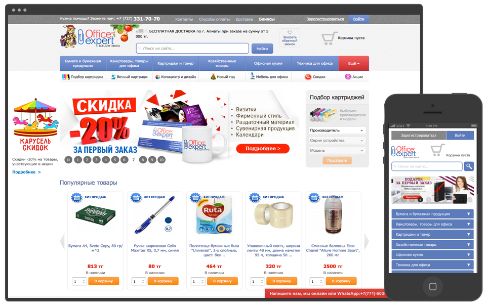
Consider the example of the project office-expert.kz - B2B service company that provides customers throughout Kazakhstan. The company's online store has more than 7,000 items of goods and services for offices, schools and homes.
Task:
"It is necessary to develop a mobile version to improve the ranking of our site in search engines, as well as for the convenience of users who prefer to order via the phone."
Stages of creation
- Task analysis
The process of creating a mobile version of the site begins with an analysis of the resource, its structure and usage scenarios. Estimated amount of work on HTML and JavaScript code. The list of typical pages for which templates will be created, the need for support for tablets and additional connection of frameworks is determined.
Technology:- IDE: Mobilizetoday
- CMS: 1C-Bitrix
- Frameworks: jQuery, Bootstrap, Swiper
In our case, the list of typical pages:- the main
- check in
- Product
- Category, discount, search
- Catalog
- Basket
- All pages
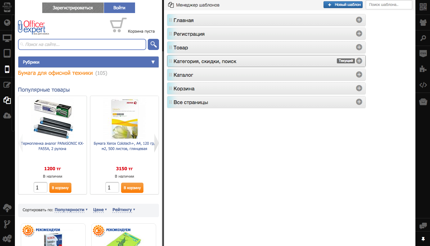
- Prototyping and design layouts
Prototypes and layouts of typical pages are developed taking into account the features of the site, requirements for the presentation of information and corporate identity. The site navigation is thought out, best practices and UX patterns are used to simplify information retrieval and order placement. - Layout layouts
On the basis of the developed design layouts, all sample pages are imposed. Selection of content from the desktop site is done using CSS selectors or XPath. Familiarize yourself with all API functions in the User’s Guide.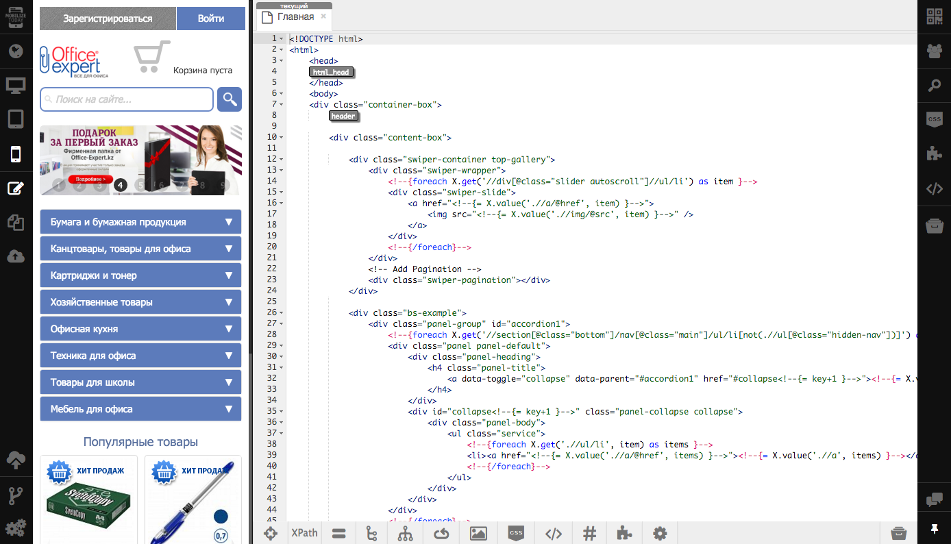
- Site development
At the integration stage, we associate the created mobile templates with the content and interactivity of your main site. The possibility of partial or complete replacement of the original desktop page with a new, optimized for mobile device.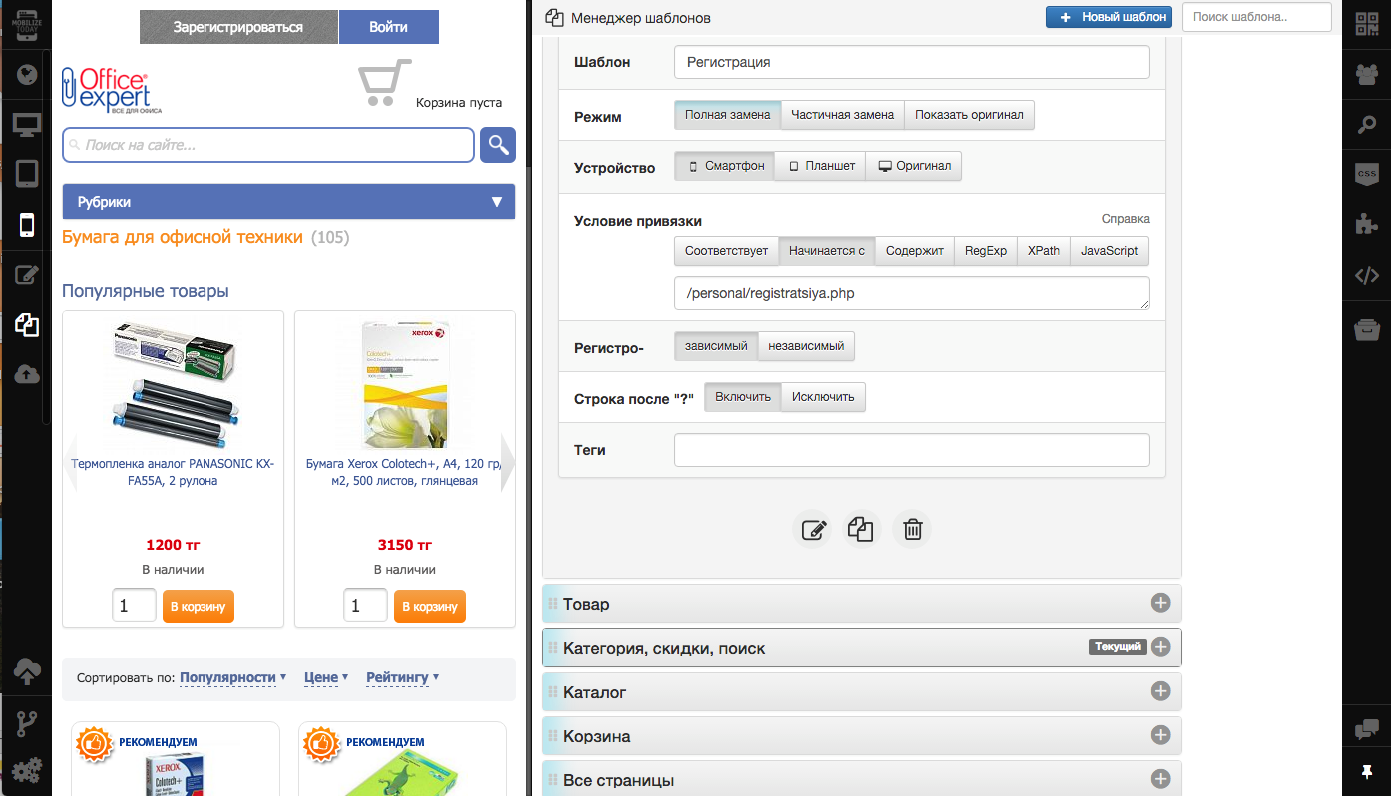
- Testing
The stage begins with testing the site in the IDE on device emulators, for different screen resolutions and orientations and ending with live testing on mobile devices and various browsers. Additionally, the site can be tested on: Windows Phone, Firefox OS, Ubuntu, Kaizen OS.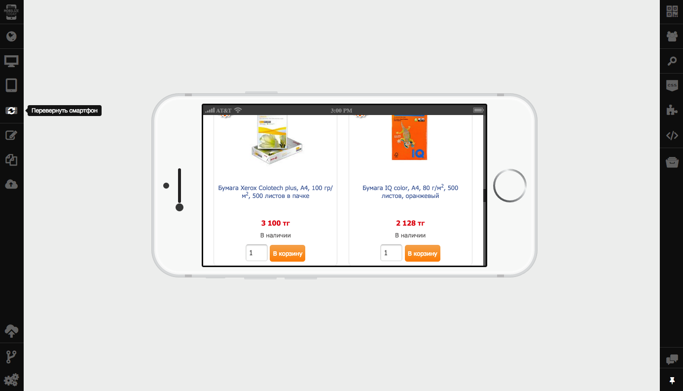
- Site publishing
When the adaptation work is completed using the Constructor and the Control Panel, all the resulting files, including static HTML, CSS, JavaScript files, images, and dynamic template files are placed on the client’s server or on the CDN content distribution network.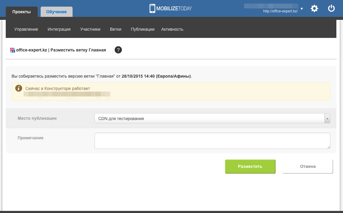
- Support and optimization
This includes additional work on optimizing the content, CSS code, HTML and JavaScript, interaction experience (UX).
results
- 100% passing Google test on Mobile-Friendly.
- Full mobile version tailored to platforms.
- Improved issuance and indexing speed in Google.
- Mobile audience growth by 53% after launch.
- Improved usability (click-to-call, optimization of content, forms).
- Added tracking counters for mobile traffic (Google Analytics and Yandex.Metrica).
Source: https://habr.com/ru/post/271561/
All Articles