Flexbox for interfaces in all its glory: Implementing Tracks (Part 2)
We continue to translate the article smashingmagazine, which details all the nuances of interface development using flexbox using the example of the Tracks website .
Part 1
For developers, shapes can be a nightmare, especially when they are closely related to the complex mesh design created in Photoshop. The "lowercase" template, as I call it, has the same role in our industry as Fender Stratocaster in rock music.
As we mentioned in the previous section, decide for yourself how your content will be placed and occupy space in your container when the size of the browser changes or when using dynamic content.
')

Decide for yourself how the content will be posted. On the left, the table display is vertically aligned to the center. On the right, the flexbox aligns the elements to the center.
These screenshots clearly reflect errors that can be caused by flexbox if you use dynamic or too long content. The effect shown in the image on the right is what I call the “center shift”, which means that the content shifts from the center beyond the frame along the x and y axes.
Here is the markup for the inline label template shown in Figure 2. eight.
The solution to the problem in this case can be using display: table; for more convenient text length management. This allows content to flow down instead of outside the center.
Combining flexbox with a table is a good way, and I recommend that you study it in more detail. When you combine these elements, always check them in different test environments to detect bugs in the layout in time.
I have seen many search fields performed using this template. This is a very flexible template that can be used in a huge number of layouts. Of course, CSS elements that may intervene, such as context-related properties and not related to a common template, should be kept separate.
HTML is quite standard here and includes an ambient div to define the structure of the flexbox.
This is what our HTML looks like:
And CSS:
The drop-down menu consists of a column on the left, containing vertically centered items located in lines, and a list of items on the right, in which each item in the list is located on its own line.
The menu for this main interface was built using only the flexbox layout.
CSS is simple and readable here - just the way the developers like to see it.
With just a few lines of code, you get the perfect layout. In addition, it is separated from any mesh structure, and HTML and CSS have semantic meaning. This is another example of the strength of a flexbox to avoid complex positioning tactics and verbose markup.

Using flexbox, a fixed-width SVG is on the left and flexible content is next to it.
This is what CSS looks like:
In this example of resizing the browser, the image width is set to a maximum of 100%, and the right side is set to a flexible value of 1. Be careful how you combine fixed width and flexible children.
Flexbox works great with this kind of template, but be careful how your content reacts to its adjacent content, as shown above. In the above video, how the graphics space collapses and the text comes over the image. This example may seem silly, because hardly anyone will decide to reduce the width of the browser so much, can it? The bottom line is that we need to understand how the content relates to the surrounding space before we start using flexbox.
For this pattern, I would advise setting images width to max-width: 100% always when they line up inside a flexible parent element, or setting images to a fixed width, and then using media queries to customize them.

How can we not try using this approach to create a calendar? You will probably ask "Why not use a table?". In this case, the calendar is used to select the date, so I decided to use the buttons for each day, month and year, and bind these buttons to the rows (each row of the week in the calendar is enclosed in a div). Using this approach, we get less markup and a simpler layout.
The markup turns out really straightforward and even works with numbering control in the calendar header.
CSS is easier than ever. It is clear to anyone who reads the code, and is brief enough to write it.

In this month-by-month calendar, justify-content: space-between is used on the left and justify-content: flex-start is used on the right. Both functions make content differently.
These two examples clearly show why everything needs to be planned in advance. How will the content be transferred? How will he react to resizing the viewport? Do I need to transfer content? To get the right strategy for content, you need to answer all these questions.
Flexbox is great for interface elements, but it also interacts well with certain templates.
The code for this layout is implemented very simply, and the additional code required for the fallback options is minimal.
The layout of the admin layout uses a set of div elements that carry each container, as shown above.
Here is a great fallback for our layout. The pattern does not include a complex mesh structure. Plus, our old friend display: table is ready to help us when it is needed.
The display element: table-cell is a powerful CSS tool that appeared in the days of CSS 2 and is an ideally reliable fallback for this. The value causes the element to behave like a table element, which is exactly the behavior that we need to recreate the flexbox version. You can also change the order using a table, using declarations such as display: table-header-group and display: table-footer-group.
The fixed footer is one of the rites of initiation into experienced web designers, in which the footer should be placed at the bottom of the viewing area. If content is added, it can move the footer down, but in any other case the footer should always be at the bottom of the viewport.
Fixed footer in the right sidebar
Here is the layout of the right sidebar:
And this is what CSS looks like:
Here is a great backup option for fixed footers in the flexbox, which also preserves the layout in all versions, up to IE 6.
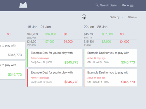
Another part of the layout in which I tried to use flexbox was the main type of application, or it is also called the “pipeline” of the application. Each card has a specific width and uses the flex property. This gives each card uniform proportions.

Flexbox allows you to accurately place content on each card. The entire application is one big version of the layout as in the movie “Start”, in which flexbox contains a flexbox that contains small atoms and molecules that use flexboxes. It seems incredible when you think about how hard it was for developers to center elements before, and today we do it with just a few lines of code.
In the process of testing browsers, we found that combining the flex property with other distance properties, such as indents, results in bugs when the page is displayed in IE 10
When the parent shell of a module, specified using display: flex, has child elements that use the flex property along with padding or margin, IE 10 generates errors.
The @supports (display: flex) {} function request may be something like Modernizr , but will be implemented using native CSS. Unfortunately, @supports support is weak at the moment, and therefore this option should be avoided. Instead, here are some tips for backup options:
Part 1
Line entry forms
For developers, shapes can be a nightmare, especially when they are closely related to the complex mesh design created in Photoshop. The "lowercase" template, as I call it, has the same role in our industry as Fender Stratocaster in rock music.
As we mentioned in the previous section, decide for yourself how your content will be placed and occupy space in your container when the size of the browser changes or when using dynamic content.
')
Decide for yourself how the content will be posted. On the left, the table display is vertically aligned to the center. On the right, the flexbox aligns the elements to the center.
These screenshots clearly reflect errors that can be caused by flexbox if you use dynamic or too long content. The effect shown in the image on the right is what I call the “center shift”, which means that the content shifts from the center beyond the frame along the x and y axes.
Here is the markup for the inline label template shown in Figure 2. eight.
<div class="form-group"> <label>…</label> <select>…</select> </div> The solution to the problem in this case can be using display: table; for more convenient text length management. This allows content to flow down instead of outside the center.
.form-group { display: flex; } .form-group label { display: table; vertical-align: middle; } .form-group input { flex: 1; } Combining flexbox with a table is a good way, and I recommend that you study it in more detail. When you combine these elements, always check them in different test environments to detect bugs in the layout in time.
I have seen many search fields performed using this template. This is a very flexible template that can be used in a huge number of layouts. Of course, CSS elements that may intervene, such as context-related properties and not related to a common template, should be kept separate.
HTML is quite standard here and includes an ambient div to define the structure of the flexbox.
This is what our HTML looks like:
<div class="form-group"> <input type="text" placeholder="Add a note…"> <button>Add</button> </div> And CSS:
.form-group { display: flex; } .form-group input { flex: 1; } Drop-down menu
The drop-down menu consists of a column on the left, containing vertically centered items located in lines, and a list of items on the right, in which each item in the list is located on its own line.
The menu for this main interface was built using only the flexbox layout.
<nav class="menu"> <div class="menu__options"> <a href="export-data.html">Export</a> <a href="help.html">Get Help</a> </div> <div class="menu__items"> <a href="account.html">Account</a> <a href="preferences.html">Preferences</a> <a href="users.html">Users</a> <a href="payment.html">Payments</a> <a href="logout.html">Logout</a> </div> </nav> CSS is simple and readable here - just the way the developers like to see it.
.menu { display: flex; } .menu__options { display: flex; align-items: center; } .menu__items { display: flex; flex-direction: column; } With just a few lines of code, you get the perfect layout. In addition, it is separated from any mesh structure, and HTML and CSS have semantic meaning. This is another example of the strength of a flexbox to avoid complex positioning tactics and verbose markup.
Media
Using flexbox, a fixed-width SVG is on the left and flexible content is next to it.
<div class="media-obj"> <div class="media-obj__fig">…</div> <div class="media-obj__body">…</div> </div> This is what CSS looks like:
.medi-obj { display: flex; align-items: flex-start; } .media-obj__body { flex: 1; } In this example of resizing the browser, the image width is set to a maximum of 100%, and the right side is set to a flexible value of 1. Be careful how you combine fixed width and flexible children.
Flexbox works great with this kind of template, but be careful how your content reacts to its adjacent content, as shown above. In the above video, how the graphics space collapses and the text comes over the image. This example may seem silly, because hardly anyone will decide to reduce the width of the browser so much, can it? The bottom line is that we need to understand how the content relates to the surrounding space before we start using flexbox.
For this pattern, I would advise setting images width to max-width: 100% always when they line up inside a flexible parent element, or setting images to a fixed width, and then using media queries to customize them.
The calendar
How can we not try using this approach to create a calendar? You will probably ask "Why not use a table?". In this case, the calendar is used to select the date, so I decided to use the buttons for each day, month and year, and bind these buttons to the rows (each row of the week in the calendar is enclosed in a div). Using this approach, we get less markup and a simpler layout.
The markup turns out really straightforward and even works with numbering control in the calendar header.
<div class="datepicker"> <header class="datepicker__header flex-container"> <button>Left Arrow</button> <span>2015</span> <button>Right Arrow</button> </header> <div class="datepicker__view flex-container"> <button>Jan</button> <button>Feb</button> </div> </div> CSS is easier than ever. It is clear to anyone who reads the code, and is brief enough to write it.
.flex-container { display: flex; } .datepicker__header { justify-content: space-between; } .datepicker__view { align-items: center; justify-content: flex-start; } In this month-by-month calendar, justify-content: space-between is used on the left and justify-content: flex-start is used on the right. Both functions make content differently.
These two examples clearly show why everything needs to be planned in advance. How will the content be transferred? How will he react to resizing the viewport? Do I need to transfer content? To get the right strategy for content, you need to answer all these questions.
Layout
Flexbox is great for interface elements, but it also interacts well with certain templates.
Sample layout. The sidebar on the left and the main content on the right are the perfect script for flexbox. He also reminds me of a fake speaker technique.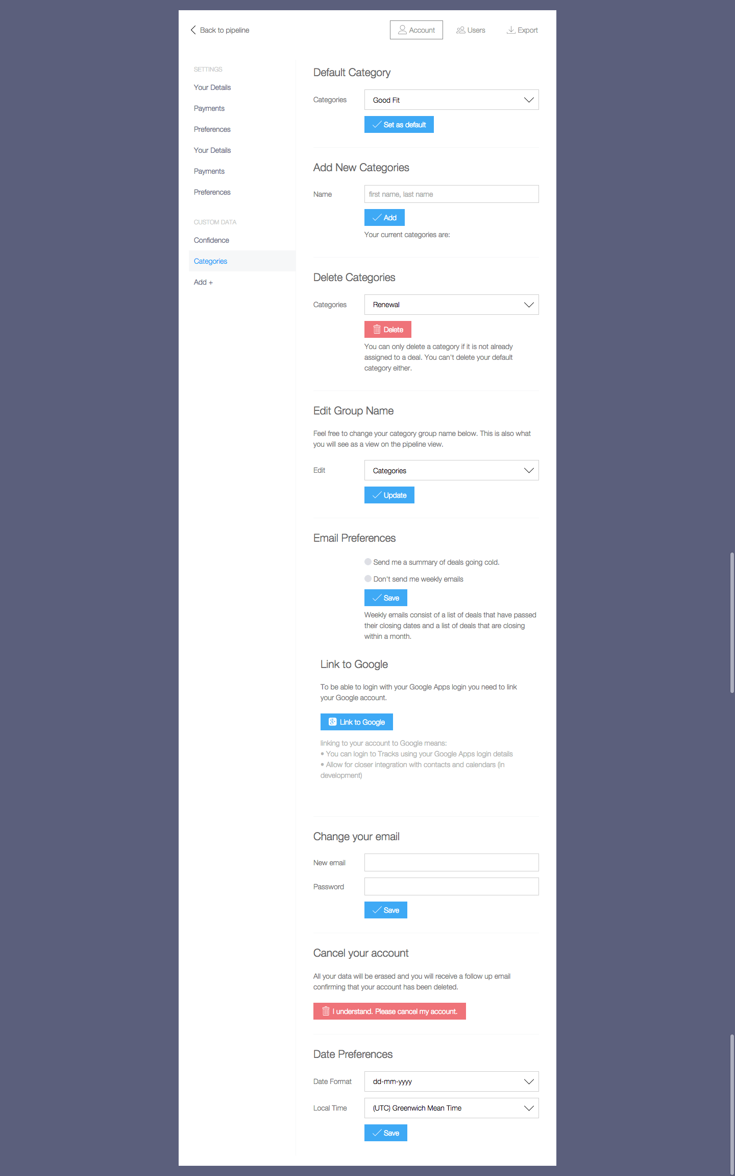
The code for this layout is implemented very simply, and the additional code required for the fallback options is minimal.
The layout of the admin layout uses a set of div elements that carry each container, as shown above.
<div class="admin-ui"> <div class="admin-ui__nav">…</div> <div class="admin-ui__body"> <nav>…</nav> <main>…</main> </div> </div> .admin-ui__body { display: flex; } .admin-ui__body nav { flex: 30%; } .admin-ui__body main { flex: 70%; } Here is a great fallback for our layout. The pattern does not include a complex mesh structure. Plus, our old friend display: table is ready to help us when it is needed.
The display element: table-cell is a powerful CSS tool that appeared in the days of CSS 2 and is an ideally reliable fallback for this. The value causes the element to behave like a table element, which is exactly the behavior that we need to recreate the flexbox version. You can also change the order using a table, using declarations such as display: table-header-group and display: table-footer-group.
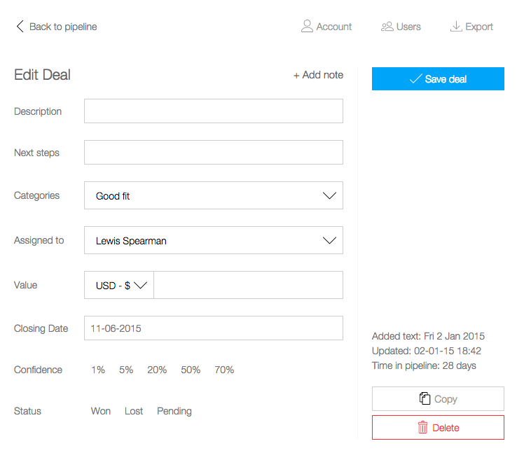
Fixed footer
The fixed footer is one of the rites of initiation into experienced web designers, in which the footer should be placed at the bottom of the viewing area. If content is added, it can move the footer down, but in any other case the footer should always be at the bottom of the viewport.
Fixed footer in the right sidebar
Here is the layout of the right sidebar:
<div class="admin-edit"> <button class="admin-edit__save">Save Deal</button> <div class="admin-edit__footer"> <p>…</p> <button>Copy</button> <button>Delete</button> </div> </div> And this is what CSS looks like:
.admin-edit { display: flex; flex-direction: column; justify-content: space-between; } Here is a great backup option for fixed footers in the flexbox, which also preserves the layout in all versions, up to IE 6.
Another part of the layout in which I tried to use flexbox was the main type of application, or it is also called the “pipeline” of the application. Each card has a specific width and uses the flex property. This gives each card uniform proportions.
Flexbox allows you to accurately place content on each card. The entire application is one big version of the layout as in the movie “Start”, in which flexbox contains a flexbox that contains small atoms and molecules that use flexboxes. It seems incredible when you think about how hard it was for developers to center elements before, and today we do it with just a few lines of code.
be careful
In the process of testing browsers, we found that combining the flex property with other distance properties, such as indents, results in bugs when the page is displayed in IE 10
.parent { display: flex; } .parent .child { flex: 1; padding: 20px; /* IE 10 */ } When the parent shell of a module, specified using display: flex, has child elements that use the flex property along with padding or margin, IE 10 generates errors.
The @supports (display: flex) {} function request may be something like Modernizr , but will be implemented using native CSS. Unfortunately, @supports support is weak at the moment, and therefore this option should be avoided. Instead, here are some tips for backup options:
- Use the no-flexbox class from Modernizr to search for properties.
- Use transform or table mapping for centering.
- Use table mapping.
- Control the order with table-mapping properties such as table-caption, table-header-group and table-footer-group.
- Use floats as a fallback for all structures.
- Use lowercase or lowercase blocks as a backup display option for lowercase patterns.
- Use conditional comments for IE 9 and older versions to create styling without flexbox.
Paysto payment solutions for Habr readers:
→ Get paid by credit card right now. Without a site, PI and LLC.
→ Accept payments from companies via the Internet. Without a site, PI and LLC.
→ Acceptance of payments from companies for your site. With document circulation and exchange of originals.
→ Automation of sales and service transactions with legal entities. Without intermediary in the calculations.
→ Accept payments from companies via the Internet. Without a site, PI and LLC.
→ Acceptance of payments from companies for your site. With document circulation and exchange of originals.
→ Automation of sales and service transactions with legal entities. Without intermediary in the calculations.
Source: https://habr.com/ru/post/271397/
All Articles