Flexbox for interfaces in all its glory: Implementing Tracks (Part 1)
The days of tweaks with float and margin are finally over, since today CSS offers developers new enhanced features that are great for delicate layouts. Layout functions such as vertical alignment, uniform distribution of free space, managing the order of the source code, and other patterns, such as “sticky” footers, are fairly easy to implement using flexbox.
In this article, we will look at layout templates that are suitable for flexbox using the interface of the Tracks application, which also uses atomic design principles. I will tell you how flexbox has proven its effectiveness, and will point out some of the pitfalls of using it along with certain layout templates. We will look at patterns that create problems, give examples of fallback options, and share additional tactics on how to start using this CSS property immediately.
Part 2
The approach to the Tracks interface began with examining each element as a separate case using the principles described by Brad Frost .
')
An atomic design can be considered as consisting of small LEGO parts that are put together to create a larger, discernible piece of interface. Scientific terms, such as an organism, an atom, and a molecule, are used so that developers can categorize individual interface elements and gain a deeper understanding of each individual part of the whole. This type of categorization makes it possible to identify such patterns and prevents the influence from outside of such elements as grids, colors and free space on the achievement of the goal, which is to identify patterns. Building from the microscopic level, provides a more extensive distribution of these parts across the entire interface.
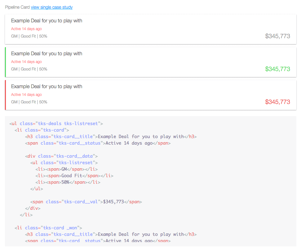
Figure 1. These application cards are used to display data that was built using atomic design principles. Try to guess in which parts flexbox is used.
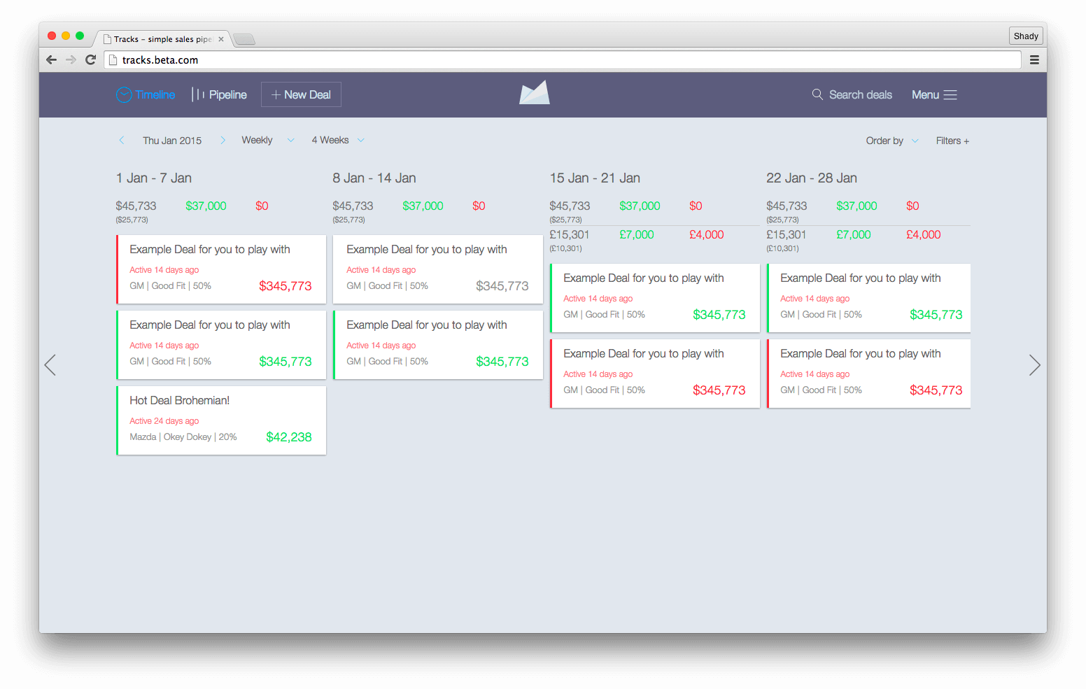
Figure 2. The main interface of the Tracks application, in which flexbox and atomic design are fully used.
The interface design is transmitted as a set of InVision compilations. During the initial interface evaluation process, I began to identify areas in which flexbox would be most useful. I also decided to use flexbox for page layouts using such well-known templates such as “sidebar on the left, main content on the right,” which are most often embodied by pressing.
One of the nicest aspects of the Tracks redesign is that the project required support for Internet Explorer (IE) 10+, Android 4.1+ and iOS 7+. This was good news, as they perfectly support flexbox with the appropriate prefixes. Even in spite of the fact that today support has become much more stable, operating systems younger than, say, Android 4.1, require backup options. What might the backup option look like when support does not exist? Developers using Modernizr can direct such browsers using the .no-flexbox class and create a more stable supported layout system (or you can use CSS function requests with @supports , which are also well supported). For example:
If flexbox is not properly supported, we can go ahead and use display: inline-block to create a fallback layout. We can also add no-js to the declaration in case JavaScript fails. If flexbox is not supported, the cascading nature of the CSS will work, even if JavaScript is disabled or errors are found during the download. Flexbox can coexist with float and display: table and relative positioning; in addition, browsers that support flexbox will give it priority over other definitions, while browsers that do not support flexbox will ignore its properties and simply roll back to the good old CSS layout mechanisms.
As in any other case, a difficult choice will depend on the scale of the project, analytics and budget. My golden rule is to always choose what is most logical for a project.
Navigation components have long proved to be very effective in combination with flexbox, not only in terms of simplifying the implementation, but also to shorten development sessions. Inline templates, the implementation of which, as we know, takes a lot of time from developers, can now be implemented in minutes thanks to flexbox. If you have experienced developing with this kind of template before IE 9, then you know how annoying it is.
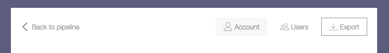
Figure 3. This navigation in the admin panel uses a lower-case layout template with navigation elements centered vertically.
The markup template for navigating through the admin panel consists of the nav tag, which includes a series of anchors. Here is an example of such a template in HTML:
But the corresponding styles:
The amount of CSS here is as minimal as the markup. Remember the value of the inline-block. This definition eliminates any future problems in IE 10 if you had to change the sequence of elements using the order property. It was also found that any indents defined by the immediate children of the flex container, defined by the flex property, cause layout problems in IE 10. It would be nice to perform constant checks on all browsers and platforms.

Figure 4. This header navigation pattern with a centered logo is often found on the web, and is also suitable for flexbox.
The generic string pattern above is usually implemented using non-semantic markup. Now that flexbox has appeared, such tricks are no longer required.
The layout consists of a set of menu items on the left, a logo in the center and additional elements on the right. The markup for such a template looks like this:
Flexbox helps eliminate the need for HTML tricks and can support semantics, as shown in the markup. Preserving semantics is a rather important step, since HTML will have more chances to be reused in the future, among other things - beyond the scope of this discussion.
Before flexbox appeared, developers used approaches such as display: inline-block and float: left to get lower-case layouts. Today, when flexbox has become a very real option, developers no longer need to follow unsuccessful practices for the sake of aesthetics. The required CSS is not as concise as in the admin navigation pattern in fig. 3, but it can still be implemented faster than in the methods described earlier.
When you use the template shown in fig. 3, remember that the order of the source may change. If you need to shift the position of the logo, it will be quite difficult to do with the order property. Keep in mind that the original order is always important for accessibility and is somewhat controversial when it comes to flexbox. To navigate using the keyboard, all browsers and screen readers use the source code order, and not the visual order defined by CSS.
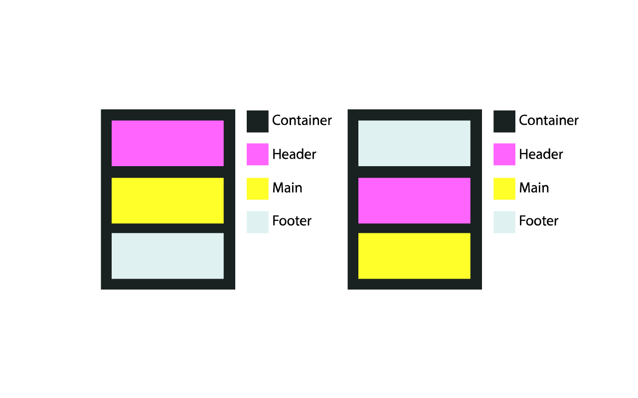
Figure 5. Normal flow recorded in the markup and drawn in the browser (left) and the order changed using flexbox without the markup setting (right).
The code below refers to the layout described above. The markup has never changed to affect the display order.
This is the CSS used to change the order in the diagram on the right in Figure. five.
This type of layout is intended not only for navigation. You must have seen such a pattern in the footer.
Using this template, consider how content can fill a container and consume space. Will the content go beyond the center? What if the content goes down? How will this affect other layout elements? Ask yourself these questions in every project before embarking on implementation. And taking into account the order of navigation from the keyboard is also important for the end user.
Part 2
In this article, we will look at layout templates that are suitable for flexbox using the interface of the Tracks application, which also uses atomic design principles. I will tell you how flexbox has proven its effectiveness, and will point out some of the pitfalls of using it along with certain layout templates. We will look at patterns that create problems, give examples of fallback options, and share additional tactics on how to start using this CSS property immediately.
Part 2
Flexible atomic components
The approach to the Tracks interface began with examining each element as a separate case using the principles described by Brad Frost .
')
An atomic design can be considered as consisting of small LEGO parts that are put together to create a larger, discernible piece of interface. Scientific terms, such as an organism, an atom, and a molecule, are used so that developers can categorize individual interface elements and gain a deeper understanding of each individual part of the whole. This type of categorization makes it possible to identify such patterns and prevents the influence from outside of such elements as grids, colors and free space on the achievement of the goal, which is to identify patterns. Building from the microscopic level, provides a more extensive distribution of these parts across the entire interface.
Figure 1. These application cards are used to display data that was built using atomic design principles. Try to guess in which parts flexbox is used.
Figure 2. The main interface of the Tracks application, in which flexbox and atomic design are fully used.
The interface design is transmitted as a set of InVision compilations. During the initial interface evaluation process, I began to identify areas in which flexbox would be most useful. I also decided to use flexbox for page layouts using such well-known templates such as “sidebar on the left, main content on the right,” which are most often embodied by pressing.
One of the nicest aspects of the Tracks redesign is that the project required support for Internet Explorer (IE) 10+, Android 4.1+ and iOS 7+. This was good news, as they perfectly support flexbox with the appropriate prefixes. Even in spite of the fact that today support has become much more stable, operating systems younger than, say, Android 4.1, require backup options. What might the backup option look like when support does not exist? Developers using Modernizr can direct such browsers using the .no-flexbox class and create a more stable supported layout system (or you can use CSS function requests with @supports , which are also well supported). For example:
<ul class="flexbox-target"> <li>…</li> <li>…</li> <li>…</li> </ul> html.flexbox ul.flexbox-target, html.no-js ul.flexbox-target { display: flex; flex-direction: row; } html.no-flexbox ul.flexbox-target li, html.no-js ul.flexbox-target li { display: inline-block; /* , */ } If flexbox is not properly supported, we can go ahead and use display: inline-block to create a fallback layout. We can also add no-js to the declaration in case JavaScript fails. If flexbox is not supported, the cascading nature of the CSS will work, even if JavaScript is disabled or errors are found during the download. Flexbox can coexist with float and display: table and relative positioning; in addition, browsers that support flexbox will give it priority over other definitions, while browsers that do not support flexbox will ignore its properties and simply roll back to the good old CSS layout mechanisms.
As in any other case, a difficult choice will depend on the scale of the project, analytics and budget. My golden rule is to always choose what is most logical for a project.
Lowercase patterns
Navigation components have long proved to be very effective in combination with flexbox, not only in terms of simplifying the implementation, but also to shorten development sessions. Inline templates, the implementation of which, as we know, takes a lot of time from developers, can now be implemented in minutes thanks to flexbox. If you have experienced developing with this kind of template before IE 9, then you know how annoying it is.
Figure 3. This navigation in the admin panel uses a lower-case layout template with navigation elements centered vertically.
The markup template for navigating through the admin panel consists of the nav tag, which includes a series of anchors. Here is an example of such a template in HTML:
<header role="banner"> <nav role="navigation"> <a href="pipeline.html">Back to pipeline</a> <a href="account.html">Account</a> <a href="users.html">Users</a> <a href="export.html">Export</a> </nav> </header> But the corresponding styles:
nav[role="navigation"] { display: flex; align-items: center; /* */ } nav[role="navigation"] a { display: inline-block; /* IE 10 */ } nav[role="navigation"] a[href="pipeline.html"] { flex: 1; } The amount of CSS here is as minimal as the markup. Remember the value of the inline-block. This definition eliminates any future problems in IE 10 if you had to change the sequence of elements using the order property. It was also found that any indents defined by the immediate children of the flex container, defined by the flex property, cause layout problems in IE 10. It would be nice to perform constant checks on all browsers and platforms.
Figure 4. This header navigation pattern with a centered logo is often found on the web, and is also suitable for flexbox.
The generic string pattern above is usually implemented using non-semantic markup. Now that flexbox has appeared, such tricks are no longer required.
The layout consists of a set of menu items on the left, a logo in the center and additional elements on the right. The markup for such a template looks like this:
<header class="pipeline-header" role="banner"> <a href="pipeline.html" class="pipeline-logo">… </a> <nav class="pipeline-nav" role="navigation">…</nav> <form class="pipeline-search" role="form">…</form> <a href="#menu">…</a> </header> Flexbox helps eliminate the need for HTML tricks and can support semantics, as shown in the markup. Preserving semantics is a rather important step, since HTML will have more chances to be reused in the future, among other things - beyond the scope of this discussion.
Before flexbox appeared, developers used approaches such as display: inline-block and float: left to get lower-case layouts. Today, when flexbox has become a very real option, developers no longer need to follow unsuccessful practices for the sake of aesthetics. The required CSS is not as concise as in the admin navigation pattern in fig. 3, but it can still be implemented faster than in the methods described earlier.
.pipeline-header { display: flex; align-items: center; justify-content: space-between; } .pipeline-header > a { display: inline-block; /* IE 10 order, , . */ } .pipeline-logo { flex: 1; order: 2; text-align: center; } .pipeline-nav { flex: 1.25; order: 1; } .pipeline-search { flex: 1; order: 3; } a[href="#menu"] { order: 4; } When you use the template shown in fig. 3, remember that the order of the source may change. If you need to shift the position of the logo, it will be quite difficult to do with the order property. Keep in mind that the original order is always important for accessibility and is somewhat controversial when it comes to flexbox. To navigate using the keyboard, all browsers and screen readers use the source code order, and not the visual order defined by CSS.
Figure 5. Normal flow recorded in the markup and drawn in the browser (left) and the order changed using flexbox without the markup setting (right).
The code below refers to the layout described above. The markup has never changed to affect the display order.
<div class="container"> <header role="banner"></header> <main role="main"></main> <footer role="contentinfo"></footer> </div> This is the CSS used to change the order in the diagram on the right in Figure. five.
.container { display: flex; flex-direction: columns; /* */ } header { order: 2; } main { order: 3; } footer { order: 1; } This type of layout is intended not only for navigation. You must have seen such a pattern in the footer.
Using this template, consider how content can fill a container and consume space. Will the content go beyond the center? What if the content goes down? How will this affect other layout elements? Ask yourself these questions in every project before embarking on implementation. And taking into account the order of navigation from the keyboard is also important for the end user.
Part 2
Paysto payment solutions for Habr readers:
→ Get paid by credit card right now. Without a site, PI and LLC.
→ Accept payments from companies via the Internet. Without a site, PI and LLC.
→ Acceptance of payments from companies for your site. With document circulation and exchange of originals.
→ Automation of sales and service transactions with legal entities. Without intermediary in the calculations.
→ Accept payments from companies via the Internet. Without a site, PI and LLC.
→ Acceptance of payments from companies for your site. With document circulation and exchange of originals.
→ Automation of sales and service transactions with legal entities. Without intermediary in the calculations.
Source: https://habr.com/ru/post/271195/
All Articles