Big data as art
The Teradata's The Art Of Analytics project looks quite unusual. The idea of the project is to explain research based on big data in the form of artistic images to a wide audience. Want to know what bank fraud and terrorist threats look like or compare single malt whiskey? Under the cut, some of the 20 studies depicted in the form of pictures.

Teradata experts in big data analysis were able to explain complex things in simple language, expressing the most complicated mathematical connections in the language of art. Instead of graphs and figures, each case of working with bid data is represented by an abstract picture resembling associative graphics. The project "Art of Analytics" consists of 20 paintings. No matter how simple they look, this is the result of the truly hard work of world scientists in the field of big data.
')
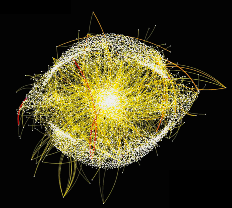
In my opinion the most interesting project, the visualization of which at the same time looks like an eye. This is a big data analyst during a twitter storm (a huge number of tweets and retweets immediately appear on some tweet) about the death of Margaret Thatcher.
The user publishes a tweet - a new point appears in the picture. Thus, you can find out who was the "starting point" of a particular post, understand the reasons and identify the perpetrators. Such mechanisms can at least find the instigators of terrorist acts, and even prevent them. Such an analysis of activity in social networks would be very useful, for example, for Arab governments shaken by the revolutions of the Arab Spring of 2010 - after all, the opposition was preparing and coordinating the main protest actions on Facebook and Twitter.
The data was downloaded using the twitterR package and collected for one week, then they were uploaded to Teradata Aster for further processing. Then Aster Lens was used, with which the graph was created.
This cute bouquet of Lankaran acacia is all moving money between different companies that are marked with different colors.
A large company will look at large flowers and cooperate with them, saving themselves from risks, and frail flowers - ventures - will attract the attention of various support funds without affecting the entire market and not putting the economy as a whole at risk. One of the applications is that the tax police can use such analytics to initiate an audit of the company for illegal financial transactions.
Data on transactions loaded for processing: more than 60 million records of 670 thousand companies. The graph has 3883 points and 3943 lines.
Anonymized visualization is part of an analytical project conducted in Taiwan for a single mobile operator seeking to stop malicious Internet attacks against itself.
Stargates are aimed at identifying and stopping - Advanced Persistent Threat (APT) attacks, which are hidden and continuous processes of hacking computers and systems aimed at a specific organization or an entire country for political or business reasons.
The analysis covers the logs data of 2300 employees for the period of the system operation for one year. This analysis uses nPath, cluster and text analytics.
Can the analyst radically simplify all the subtleties and nuances accumulated over the 700-year history of Scotch whiskey?
This type of analytics is used in food science. It can be combined with data on market share and segment profile to create new flavors or to reposition existing brands in new segments.
For whiskey lovers, he also offers a fun way to explore this extremely complex subject area. If you like the flavor profile of one brand, you can try others that are similar to it, or discover completely different types of flavor combinations.
The visualization consists of 86 single malt brands grouped by 12 flavor characteristics (sweetness, honey notes, nutty flavor, etc.)

Where does the information about who you call, when, how long you talk, who receives your SMS and MMS? This data gets into the database of the cellular operator, or any organization that has access to them. This information is a classic example of “big data”: its volume is colossal.
The line connects 2 points, that is, the one who has access to such information knows not only that you have a mobile phone, but also how often you use it, who you call and who calls you. Why do you need? Such analytics is very useful for cellular operators, who can thus adjust tariffs and programs to the needs of subscribers and track user habits and preferences.
Teradata experts in big data analysis were able to explain complex things in simple language, expressing the most complicated mathematical connections in the language of art. Instead of graphs and figures, each case of working with bid data is represented by an abstract picture resembling associative graphics. The project "Art of Analytics" consists of 20 paintings. No matter how simple they look, this is the result of the truly hard work of world scientists in the field of big data.
The epicenter of the storm (Eye of the Storm)
')
In my opinion the most interesting project, the visualization of which at the same time looks like an eye. This is a big data analyst during a twitter storm (a huge number of tweets and retweets immediately appear on some tweet) about the death of Margaret Thatcher.
- Red dots: haters users.
- White dots: supporters of the policy of the iron lady.
- Yellow: opposition.
- All the lines between them - informational communication (who responded to whom and what).
The user publishes a tweet - a new point appears in the picture. Thus, you can find out who was the "starting point" of a particular post, understand the reasons and identify the perpetrators. Such mechanisms can at least find the instigators of terrorist acts, and even prevent them. Such an analysis of activity in social networks would be very useful, for example, for Arab governments shaken by the revolutions of the Arab Spring of 2010 - after all, the opposition was preparing and coordinating the main protest actions on Facebook and Twitter.
The data was downloaded using the twitterR package and collected for one week, then they were uploaded to Teradata Aster for further processing. Then Aster Lens was used, with which the graph was created.
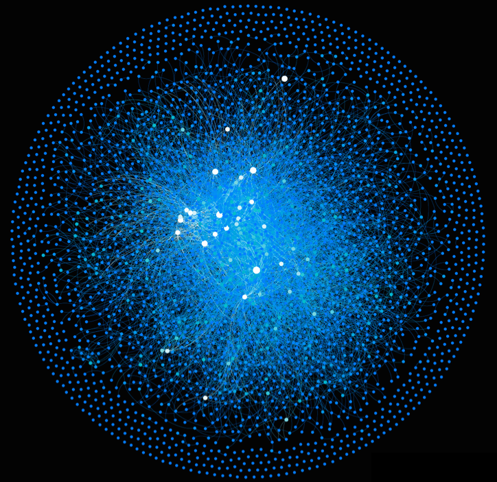
Funding Fountains
This cute bouquet of Lankaran acacia is all moving money between different companies that are marked with different colors.
- Points: companies.
- Lines: number of transactions: the more lines, the company is more successful.
A large company will look at large flowers and cooperate with them, saving themselves from risks, and frail flowers - ventures - will attract the attention of various support funds without affecting the entire market and not putting the economy as a whole at risk. One of the applications is that the tax police can use such analytics to initiate an audit of the company for illegal financial transactions.
Data on transactions loaded for processing: more than 60 million records of 670 thousand companies. The graph has 3883 points and 3943 lines.
Stargate
Anonymized visualization is part of an analytical project conducted in Taiwan for a single mobile operator seeking to stop malicious Internet attacks against itself.
Stargates are aimed at identifying and stopping - Advanced Persistent Threat (APT) attacks, which are hidden and continuous processes of hacking computers and systems aimed at a specific organization or an entire country for political or business reasons.
- Points: web pages opened by the user.
- Ribs: paths to other pages.
- Line width: characterizes the time spent on the site, and the size of the nodes represents an indicator calculated on the basis of 128 characteristics of the web page (category, reputation score, frequency of visits, content, TTL- prescribed lifetime of the packet being sent).
- Larger sites in the center of the picture: these are high-risk sites that lead to malicious behavior, in which it makes sense to increase the security policy, as an example of a WAL (Web application firewall).
The analysis covers the logs data of 2300 employees for the period of the system operation for one year. This analysis uses nPath, cluster and text analytics.
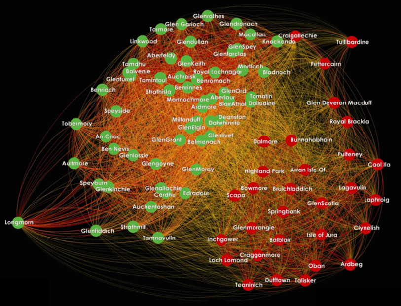
Single Salt Sampler
Can the analyst radically simplify all the subtleties and nuances accumulated over the 700-year history of Scotch whiskey?
This type of analytics is used in food science. It can be combined with data on market share and segment profile to create new flavors or to reposition existing brands in new segments.
For whiskey lovers, he also offers a fun way to explore this extremely complex subject area. If you like the flavor profile of one brand, you can try others that are similar to it, or discover completely different types of flavor combinations.
- Points: single malt brands.
- Ribs: the degree of similarity between the whiskey - the thicker and darker the line, the more similar the taste characteristics.
The visualization consists of 86 single malt brands grouped by 12 flavor characteristics (sweetness, honey notes, nutty flavor, etc.)
Calling Circles
Where does the information about who you call, when, how long you talk, who receives your SMS and MMS? This data gets into the database of the cellular operator, or any organization that has access to them. This information is a classic example of “big data”: its volume is colossal.
- Points: phone numbers.
- Ribs: calls, where long - long calls, short - short.
The line connects 2 points, that is, the one who has access to such information knows not only that you have a mobile phone, but also how often you use it, who you call and who calls you. Why do you need? Such analytics is very useful for cellular operators, who can thus adjust tariffs and programs to the needs of subscribers and track user habits and preferences.
Basic analysis tools:
- Teradata Aster - data processing.
- Aster Lens / Quartal Super Graphics / Gephi - data visualization.
Links about the project:
- The official page of the project Art of Analytics , research will be published here.
- Another project page.
Source: https://habr.com/ru/post/271001/
All Articles