Design for Dyslexics, Part Two
The ladders in the pools are physically hard to use.

... continued. Getting Started: Designing for Dyslexics, Part One .
The versatility of the design implies an equally high-quality, thoughtful and accessible way for people to interact with the product / interface / object, regardless of whether they have any limitations or not. This time we will talk about how the principles of universal design can be applied to our work on the Internet.
')
The ladders in the pools are physically hard to use. They require your strong hands and ability to stand firmly on their feet. Therefore, older people and children need alternative ways to get out of the pool. This approach cannot be called universal, - it is not suitable for everyone. And here, for example, a ramp gradually going under the water is possible, since swimmers standing uncertainly on their feet will be able to easily enter and leave the pool, while people who could use the ladder will also be able to use this type of ramp. And this is not to mention the fact that those who are just learning to swim or are not very confident can afford not to rush down into the water, and not to walk the stairs, holding the railing as for the last chance to survive. In other words, this approach implies a wider range of use cases and, consequently, a greater reach of the user audience.
There are 7 basic principles that can help make the right choice for a wider audience and 5 of them apply to the field of websites and web applications, in which the majority of readers (and me) are engaged. In the first part of this article, I talked about the fact that users with dyslexia are often not taken into account when designing an interface, despite their rather large number. I also described the problems that arise as a result. Now I will talk about how to create interfaces for the widest possible audience, and why this will be not just an improvement for dyslexics, but an improvement for everyone.
Hereinafter, the word “accessible” will be translated as “accessible” , implying a property of the site, application, interface or product that determines the widest possible possibilities for using the functionality that is incorporated by the creators.
Universal design means creating a single product that suits the widest possible audience. If what you have done can figure out how to use an 80-year-old man, then a 20-year-old boy is also more likely to be able to take advantage of it. The same approach applies to people with disabilities. If a site with an application, bench or stove can be used by a person with disorders of the musculoskeletal system, then a healthy person will feel confident. However, “affordable” design is not always “universal” design. An “accessible” site is like a hearing aid: it will not allow you to hear better without sitting down your ears. Similarly, a site that has options for the visually impaired with an increased font size will not be able to become more convenient for people with normal vision. The approach from the point of view of universality implies techniques that give benefits to everyone.
The University of North Carolina Universal Design Center offers 7 basic approaches, 5 of which are applicable to web and mobile applications. Since they were originally intended for designing physical space, 2 of them (“minimum physical effort” and “size and use space”) are poorly applicable to the digital world. The remaining 5 will help people ensure the greatest functional accessibility not only for people with dyslexia, but also for all users. Namely:
Flexibility in universal design implies the possibility of achieving the same goal in several ways. In the course of my research, respondents very often mentioned IMDB as a site that was made very friendly to people with dyslexia.
In the first part of the article, I talked about the fact that a deck of cards can be sorted in many different ways and that dlexics can perceive all the cards individually and only then group them in some way. Just as cards can be grouped by color, suit or order, information on IMDB can be grouped and categorized in many different ways. The user can search for actor Tom Hanks, Woodpecker Woody, the company Pixar or animated films from 1995 and at the same time Toy Story. Many UX specialists and researchers use methods like an example of sorting maps to determine where and how people will look for information most likely, however, offering different ways to access the same section of the resource, thereby increasing usability and versatility.
Many have explained to me that their brain analyzes things differently than others. Therefore, sites offering different ways of navigating through the content are easy to use in terms of dyslexia as much as for other groups of users.
Although the origin of the quotation is still under discussion, the words “simplicity” and “clarity” have become ubiquitous under the theme of interface design. And not only universal design, but globally. When creating a “clear” interface, our goal is to create it so that it can be learned very quickly. Since dyslexia is, in broad terms, an inability to learn, it is very important to create information structures that are understandable and uniform.
This brings us to the goals that these tools face: they should tell us what to do, freeing us from having to remember information. Ideally, the interface would be so simple that even a user with memory impairment can quietly move in the stream of content. In his famous work “ 10 heuristic approaches to user interface design / 10 Heuristics for User Interface Design”, Jacob Nielsen / Jakob Nielson refers to one simplification method. He wrote that the design should minimize the “memory load” of a person by making functional objects and options visible. Users may have noticed, for example, that the logo is a link to the main page. It goes beyond just memories and is more a awareness of such behavior as a phenomenon. This is an action that requires minimal memory.
Also on Habré you can find many translations of Nielsen’s articles.
Link to search results: https://clck.ru/9afa3
During my research of the sites, both http://www.npr.com and http://www.apartmenttherapy.com resources were mentioned by the interviewed dyslexics as very convenient sites for them. In addition to high flexibility in information retrieval and navigation, both are well structured in terms of layout information. The content is quite readable and there is a small intro about how to use the site. Because of the simple markup and the division of content into sections, which follows the general formula, it is not difficult either to find a specific news story on NRP, or to go to the photo gallery on Apartment Therapy.
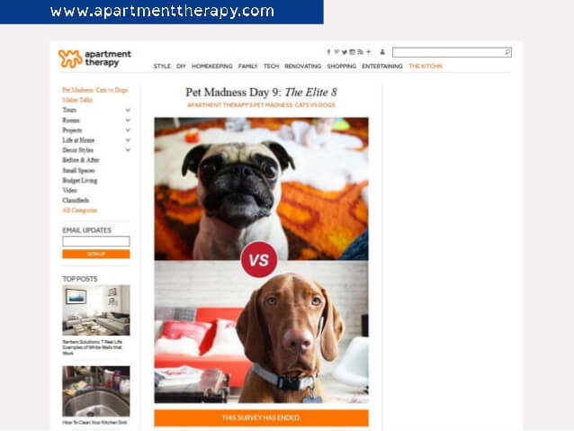
Apartment Therapy screenshot
Also, the information should not be only in the form of text. When working with an audience that includes people with dyslexia, the ability to view product demonstrations, for example, in the form of an image or the ability to interact with the product will help you build a more trusting relationship with them as potential customers.
Tangible information is information that can be found as easily as it is quickly learned.
While ADHD has a high percentage of comorbidity among dyslexic patients, digital products with a high signal level compared to noise are most beneficial.
By “signal” in this case, the main message of the site is meant, for example, call to action , while by “noise” everything else that distracts from the signal. One of the main advantages of the thermostat Nest , which distinguishes this product from all others, is the ability to show users exactly the information that they need without any distracting details. For the same reason, the disgusting boarding passes of most airlines can be confusing even to people without dyslexia. The FlightCard for iPhone application was created to group fragmented and heterogeneous information on airline tickets into a more digestible form. Increasing the signal to noise ratio in digital products improves the sensitivity of their information to all groups of users, and not just to people with disorders.
 Promo picture thermostat Nest
Many of the landing pages use a simple recipe for perceptible information, based on simple calls to action, understandable explanatory headlines and illustrations of the product. One of the ways to make the information on the page even easier to perceive: this is what I call the “test of a foreign language”. If the site were in a language that the user does not understand, would he be able to understand what the product is? How understandable would calls to action be if they were written in another language? Some information may obviously be lost due to the translation, but when you take into account both parameters: signal-to-noise ratio and clarity of calls to actions, this simple test can help improve the usability of the interface.
In addition, I can say that there are many fonts that are comfortable for dyslexics. One of them is Open Dyslexic . These fonts are designed to improve the readability of the text. One of the ways to make the design more universal is to put the font for dyslexics first in the CSS document. Users with dyslexia who already have a similar font will see the adapted font on the page, the rest, who hardly downloaded such a font, will see the normal version.
Users will not always behave as you intended, no matter how intuitive the design you created. Therefore, taking into account the possibility of interaction errors, technical errors, giving the user the opportunity to return to where he has just been, and in general, minimizing the negative consequences of atypical behavior is a good way to make your product more comfortable to use. This is called “Tolerance for error”. "Protection against the fool" in the people in Russian.
Understanding that people actually use things in different ways will help to create an interface as error-resistant as possible (and this is without taking the testing stage into account).
Those who are dyslexic can help spell checkers for obvious reasons. Much of my research was based on questionnaires compiled in Google Forms, where spell checking was turned off by default. Spelling errors were in abundance. In fact, some were even angry with me because of this, but it was a local phenomenon geographically, so it also helped me visualize a picture of how dyslexia manifests itself).
I was also pointed to Excel and other applications based on input fields as a source of frustration, because they do not support spell checking in a simple way.
One way or another, do not assume that every error notification is the right approach to business. One of the most difficult and controversial moments of protection from a fool is a pop-up notification window, it’s also popup, it’s also popup, it’s pop up. This is, frankly, the point of contention in the UX community. On the one hand, the notification or confirmation window allows the user to correct a possible error, but on the other hand, it can be very intrusive and, in fact, also the source of an inconvenient and uncomfortable way of using a resource or application, rather than an improvement method.
There are many examples of notification messages that do not help a person (and see them not only dyslexics). Here is an example of a different situation: the process of buying on Amazon. After the order is placed, the user can still cancel it or change the content before forming the parcel. At the same time, sufficient time is allocated for these actions.
If we talk about dyslexia, the time and opportunity for checking, canceling and making changes to the order is the very thing that removes the feeling of anxiety from the user and makes the difference between buying on the site and an abandoned basket.
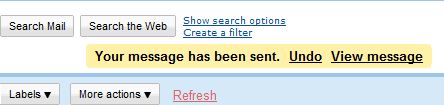 This feature is also present in Gmail
Finally, accessible functionality is just what works for everyone. It is, in a sense, the cornerstone of universal design. Before dividing consumers into groups or characters - “blind”, “dyslexics”, “ideal user”, “man”, “able-bodied” - we should instead look at them as users, as clients and, above all, like people.
We can not just make a separate version for the blind and another one for everyone else. From the very beginning, the goal should be to create a design in which as many small details, cases and situations as possible are thought out. This is a wider message than all the others, perhaps because it is so simple and understandable. Availability of product use is respect for your audience.
Designing for people with dyslexia is a unique challenge. It requires empathy and understanding, and also forces you to make design decisions that can be based not on what most of us, not dyslexics, think is right.
Instead of asking “Which user is better? Which one to choose? ”We should ask the question“ How can we satisfy them all? ”I believe that the essence of the question is in the pursuit of inclusiveness and courage for design for people who are not like us. I have almost never created a product that I really used at the time of completion of work, so it would be useless to rely on my own feelings instead of knowledge about other people. A more affordable design is more likely to be accepted.
Designing for dyslexics is a call to action for designers. Universal design gives us the foundation to create accessible and meaningful things. In the case of dyslexia, which is usually overlooked in the design process, the universal design can be the difference between the used and the unused, a good impression of working with the product and a negative attitude on the result of the interaction.
From the author: since the universal design was created to design physical spaces, it reached the web only now and is still evolving. The remaining two principles describe the design of physical spaces and physical interactions. Although I believe that for these 2 principles there is a place in the field of mobile and web applications, they remained outside the scope of this article, which does not focus on physical abilities or disabilities.
Resource Open Dyslexic helped me a lot in finding topics for interviews and popularization of my questionnaire.
Free translation-interpretation. Translated and published with the permission of the author.
Links from the article:
... continued. Getting Started: Designing for Dyslexics, Part One .
The versatility of the design implies an equally high-quality, thoughtful and accessible way for people to interact with the product / interface / object, regardless of whether they have any limitations or not. This time we will talk about how the principles of universal design can be applied to our work on the Internet.
')
The ladders in the pools are physically hard to use. They require your strong hands and ability to stand firmly on their feet. Therefore, older people and children need alternative ways to get out of the pool. This approach cannot be called universal, - it is not suitable for everyone. And here, for example, a ramp gradually going under the water is possible, since swimmers standing uncertainly on their feet will be able to easily enter and leave the pool, while people who could use the ladder will also be able to use this type of ramp. And this is not to mention the fact that those who are just learning to swim or are not very confident can afford not to rush down into the water, and not to walk the stairs, holding the railing as for the last chance to survive. In other words, this approach implies a wider range of use cases and, consequently, a greater reach of the user audience.
There are 7 basic principles that can help make the right choice for a wider audience and 5 of them apply to the field of websites and web applications, in which the majority of readers (and me) are engaged. In the first part of this article, I talked about the fact that users with dyslexia are often not taken into account when designing an interface, despite their rather large number. I also described the problems that arise as a result. Now I will talk about how to create interfaces for the widest possible audience, and why this will be not just an improvement for dyslexics, but an improvement for everyone.
Principles of universal design
Hereinafter, the word “accessible” will be translated as “accessible” , implying a property of the site, application, interface or product that determines the widest possible possibilities for using the functionality that is incorporated by the creators.
Universal design means creating a single product that suits the widest possible audience. If what you have done can figure out how to use an 80-year-old man, then a 20-year-old boy is also more likely to be able to take advantage of it. The same approach applies to people with disabilities. If a site with an application, bench or stove can be used by a person with disorders of the musculoskeletal system, then a healthy person will feel confident. However, “affordable” design is not always “universal” design. An “accessible” site is like a hearing aid: it will not allow you to hear better without sitting down your ears. Similarly, a site that has options for the visually impaired with an increased font size will not be able to become more convenient for people with normal vision. The approach from the point of view of universality implies techniques that give benefits to everyone.
The University of North Carolina Universal Design Center offers 7 basic approaches, 5 of which are applicable to web and mobile applications. Since they were originally intended for designing physical space, 2 of them (“minimum physical effort” and “size and use space”) are poorly applicable to the digital world. The remaining 5 will help people ensure the greatest functional accessibility not only for people with dyslexia, but also for all users. Namely:
- Flexibility
- Simplicity and clarity
- Information perception
- The admissibility of user error / "Protection against a fool"
- Available functionality
Flexibility
Flexibility in universal design implies the possibility of achieving the same goal in several ways. In the course of my research, respondents very often mentioned IMDB as a site that was made very friendly to people with dyslexia.
In the first part of the article, I talked about the fact that a deck of cards can be sorted in many different ways and that dlexics can perceive all the cards individually and only then group them in some way. Just as cards can be grouped by color, suit or order, information on IMDB can be grouped and categorized in many different ways. The user can search for actor Tom Hanks, Woodpecker Woody, the company Pixar or animated films from 1995 and at the same time Toy Story. Many UX specialists and researchers use methods like an example of sorting maps to determine where and how people will look for information most likely, however, offering different ways to access the same section of the resource, thereby increasing usability and versatility.
Many have explained to me that their brain analyzes things differently than others. Therefore, sites offering different ways of navigating through the content are easy to use in terms of dyslexia as much as for other groups of users.
Simplicity and clarity
“The only clear interface is the nipple. All the rest is acquired skills. ”
Although the origin of the quotation is still under discussion, the words “simplicity” and “clarity” have become ubiquitous under the theme of interface design. And not only universal design, but globally. When creating a “clear” interface, our goal is to create it so that it can be learned very quickly. Since dyslexia is, in broad terms, an inability to learn, it is very important to create information structures that are understandable and uniform.
This brings us to the goals that these tools face: they should tell us what to do, freeing us from having to remember information. Ideally, the interface would be so simple that even a user with memory impairment can quietly move in the stream of content. In his famous work “ 10 heuristic approaches to user interface design / 10 Heuristics for User Interface Design”, Jacob Nielsen / Jakob Nielson refers to one simplification method. He wrote that the design should minimize the “memory load” of a person by making functional objects and options visible. Users may have noticed, for example, that the logo is a link to the main page. It goes beyond just memories and is more a awareness of such behavior as a phenomenon. This is an action that requires minimal memory.
Also on Habré you can find many translations of Nielsen’s articles.
Link to search results: https://clck.ru/9afa3
During my research of the sites, both http://www.npr.com and http://www.apartmenttherapy.com resources were mentioned by the interviewed dyslexics as very convenient sites for them. In addition to high flexibility in information retrieval and navigation, both are well structured in terms of layout information. The content is quite readable and there is a small intro about how to use the site. Because of the simple markup and the division of content into sections, which follows the general formula, it is not difficult either to find a specific news story on NRP, or to go to the photo gallery on Apartment Therapy.
Apartment Therapy screenshot
Also, the information should not be only in the form of text. When working with an audience that includes people with dyslexia, the ability to view product demonstrations, for example, in the form of an image or the ability to interact with the product will help you build a more trusting relationship with them as potential customers.
Information perception
Tangible information is information that can be found as easily as it is quickly learned.
- ADD: Attention Deficit Disorder
- ADHD: Attention Deficit Hyperactivity Disorder
- General Wikipedia article on ADHD
- Hereinafter, the abbreviation ADHD will be used for both types of disorders, as follows from its interpretation in Russian.
- Comorbidity - in a simple way, when one or several others appear on the background of one disease.
While ADHD has a high percentage of comorbidity among dyslexic patients, digital products with a high signal level compared to noise are most beneficial.
By “signal” in this case, the main message of the site is meant, for example, call to action , while by “noise” everything else that distracts from the signal. One of the main advantages of the thermostat Nest , which distinguishes this product from all others, is the ability to show users exactly the information that they need without any distracting details. For the same reason, the disgusting boarding passes of most airlines can be confusing even to people without dyslexia. The FlightCard for iPhone application was created to group fragmented and heterogeneous information on airline tickets into a more digestible form. Increasing the signal to noise ratio in digital products improves the sensitivity of their information to all groups of users, and not just to people with disorders.
Promo picture thermostat NestMany of the landing pages use a simple recipe for perceptible information, based on simple calls to action, understandable explanatory headlines and illustrations of the product. One of the ways to make the information on the page even easier to perceive: this is what I call the “test of a foreign language”. If the site were in a language that the user does not understand, would he be able to understand what the product is? How understandable would calls to action be if they were written in another language? Some information may obviously be lost due to the translation, but when you take into account both parameters: signal-to-noise ratio and clarity of calls to actions, this simple test can help improve the usability of the interface.
In addition, I can say that there are many fonts that are comfortable for dyslexics. One of them is Open Dyslexic . These fonts are designed to improve the readability of the text. One of the ways to make the design more universal is to put the font for dyslexics first in the CSS document. Users with dyslexia who already have a similar font will see the adapted font on the page, the rest, who hardly downloaded such a font, will see the normal version.
"Protection against a fool"
Users will not always behave as you intended, no matter how intuitive the design you created. Therefore, taking into account the possibility of interaction errors, technical errors, giving the user the opportunity to return to where he has just been, and in general, minimizing the negative consequences of atypical behavior is a good way to make your product more comfortable to use. This is called “Tolerance for error”. "Protection against the fool" in the people in Russian.
Understanding that people actually use things in different ways will help to create an interface as error-resistant as possible (and this is without taking the testing stage into account).
Those who are dyslexic can help spell checkers for obvious reasons. Much of my research was based on questionnaires compiled in Google Forms, where spell checking was turned off by default. Spelling errors were in abundance. In fact, some were even angry with me because of this, but it was a local phenomenon geographically, so it also helped me visualize a picture of how dyslexia manifests itself).
I was also pointed to Excel and other applications based on input fields as a source of frustration, because they do not support spell checking in a simple way.
One way or another, do not assume that every error notification is the right approach to business. One of the most difficult and controversial moments of protection from a fool is a pop-up notification window, it’s also popup, it’s also popup, it’s pop up. This is, frankly, the point of contention in the UX community. On the one hand, the notification or confirmation window allows the user to correct a possible error, but on the other hand, it can be very intrusive and, in fact, also the source of an inconvenient and uncomfortable way of using a resource or application, rather than an improvement method.
There are many examples of notification messages that do not help a person (and see them not only dyslexics). Here is an example of a different situation: the process of buying on Amazon. After the order is placed, the user can still cancel it or change the content before forming the parcel. At the same time, sufficient time is allocated for these actions.
If we talk about dyslexia, the time and opportunity for checking, canceling and making changes to the order is the very thing that removes the feeling of anxiety from the user and makes the difference between buying on the site and an abandoned basket.
This feature is also present in GmailAvailable functionality
Finally, accessible functionality is just what works for everyone. It is, in a sense, the cornerstone of universal design. Before dividing consumers into groups or characters - “blind”, “dyslexics”, “ideal user”, “man”, “able-bodied” - we should instead look at them as users, as clients and, above all, like people.
We can not just make a separate version for the blind and another one for everyone else. From the very beginning, the goal should be to create a design in which as many small details, cases and situations as possible are thought out. This is a wider message than all the others, perhaps because it is so simple and understandable. Availability of product use is respect for your audience.
Design for everyone
Designing for people with dyslexia is a unique challenge. It requires empathy and understanding, and also forces you to make design decisions that can be based not on what most of us, not dyslexics, think is right.
Instead of asking “Which user is better? Which one to choose? ”We should ask the question“ How can we satisfy them all? ”I believe that the essence of the question is in the pursuit of inclusiveness and courage for design for people who are not like us. I have almost never created a product that I really used at the time of completion of work, so it would be useless to rely on my own feelings instead of knowledge about other people. A more affordable design is more likely to be accepted.
Designing for dyslexics is a call to action for designers. Universal design gives us the foundation to create accessible and meaningful things. In the case of dyslexia, which is usually overlooked in the design process, the universal design can be the difference between the used and the unused, a good impression of working with the product and a negative attitude on the result of the interaction.
From the author: since the universal design was created to design physical spaces, it reached the web only now and is still evolving. The remaining two principles describe the design of physical spaces and physical interactions. Although I believe that for these 2 principles there is a place in the field of mobile and web applications, they remained outside the scope of this article, which does not focus on physical abilities or disabilities.
Resource Open Dyslexic helped me a lot in finding topics for interviews and popularization of my questionnaire.
Free translation-interpretation. Translated and published with the permission of the author.
Links from the article:
Source: https://habr.com/ru/post/270999/
All Articles