Incorrectly used mobile interface patterns
If you are an experienced designer, then agree that inspiration from other works is not theft of user interface elements. On the contrary, it is a research process. This is following the guidelines. This application of patterns with which users are familiar.
Some may argue that following the guidelines can kill creativity, and in the end all applications will look the same. From the point of view of UX, I see another problem here. It may seem that using the best templates that use Google / Facebook / Instagram / [insert favorite app] is always a great solution. That they set themselves the same tasks as you. Here are a few templates that are considered (or were considered) the best, but at the same time they are not as good as they seem at first glance.
1. Hidden navigation
At least half a million articles have been published on the hamburger menu. Basically, the authors of these articles argue against. If you missed them, read one or the other . In short, these articles are not about the icon itself, but about how designers hide navigation behind the icon.
')
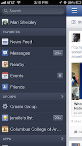
Slide menu is flexible and convenient.
This solution is quite convenient for the designer. You do not need to worry about the limited screen size, just squeeze all navigation into a separate screen and hide by default.
However, experiments show that displaying a menu in a more obvious way increases engagement, user satisfaction, and even profit. That is why all the big players are moving from the hamburger menu to leaving the most used navigation elements visible.

Changes in the YouTube app navigation (tagged by Luke Wroblewski)
If you have a difficult navigation, then hiding it will not fix the situation. And prioritization will fix.
2. Icons, icons everywhere
Because of the limited space, it seems reasonable to save some space by replacing text with icons wherever possible. Pictograms take up less space, they do not need to be translated into other languages, and in the end people are already familiar with them, right? And each application does it.
Knowing all this, application designers sometimes hide the functionality behind icons, which are actually quite difficult to recognize. For example, would you guess from this icon that you can send private messages to Instagram?

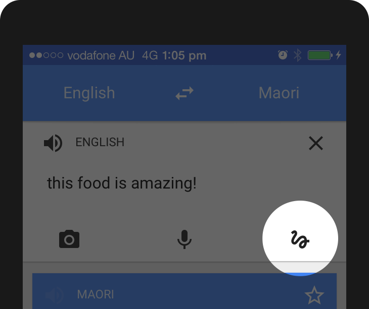
Or suppose you've never used Google Translator before. What happens if you click on this icon?
A common mistake when developers assume that users are either familiar with abstract icons, or they want to spend a couple of minutes studying them.

Mysterious application icons Bloom.fm
If you come up with a new icon and think that you need to substitute a small hint for it, then you are wrong. Even if you are a Foursquare, and your users will still learn this icon.

Tooltip next to the icon in the Swarm app
This does not mean that you do not need to use icons at all. There are many icons that users know well . Most of them represent well-known functionality: search, video playback, mail, settings, etc.

Some icons are recognizable by most users and can be considered universal.
Complex functions must be accompanied by a text label. In such cases, the icons are still useful, as they improve the degree of perception of the menu elements and give the application individuality.

Pixelmator Navigation
The basic functionality can be effectively displayed with icons, but for complex functions, text labels must be used. (If you use icons, their usability should be tested.)
3. Navigation gestures
When Apple introduced the iPhone in 2007, thanks to the multi-touch feature, users realized that they could not only tap the screen, but also use many other gestures (zoom, swipe, etc.).
Gestures have become popular among designers, and many applications have been built on the basis of experiments on the management of various gestures.
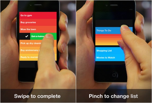
Managing the Clear application with gestures
As well as hiding navigation and using icons instead of text, gestures can look tempting in the eyes of the designer. ("It is necessary to remove the knokpu to remove, people will simply swipe to the left. Or to the right. We will decide.")
The first thing to know about gestures is that they are always hidden. People need to memorize. As with the “hamburger” menu, if you hide this or that option, then less people will use it.
In addition, gestures have the same problem as icons. There are many common gestures that most users understand, such as tap, zoom, or scroll, and there are those that need to be studied.
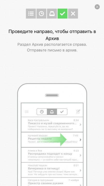
Unfortunately, so far most of the gestures are not standard or permanent in all applications. This is still a fairly new area in user interface design. Even such a simple gesture as a swipe letter can mean different things depending on the mail application.
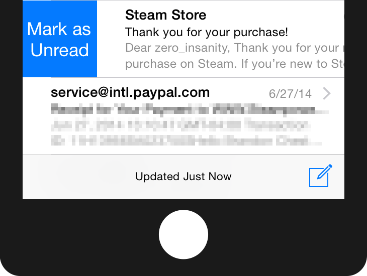
Swipe to the right in the Mail app on iOS devices opens the option "Mark as unread"
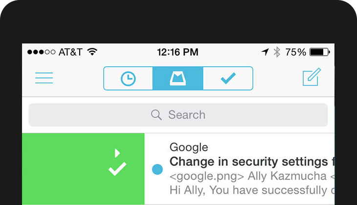
The same gesture adds a letter to the archive in the Mailbox application.
Or, for example, shaking a device can mean canceling an action in iOS or sending a review to Google Maps.
Never forget that gestures are hidden functionality that needs to be memorized by the user. If you are a Tinder app designer, you can teach the whole world what swipe means to the right, but only if it is a necessary ingredient of your app .
4. Dating screens or how to use the application
Onboarding is a familiarity between the user and the application. In many cases, this simply means that there are screens that overlap the application and explain the interface elements:
Dutorial tutorial
Why is this a bad decision ? Because most users will skip all this, they just need to start working with the application. And even if they read the tutorial, they will most likely forget everything immediately after closing. (Especially if the application is replete with information.) And, finally, an explanation of how to use the interface does not make it more intuitive. Remember:
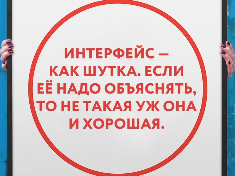
The interface is like a joke. If it is necessary to explain it, then it is not so good. Source: Startup Vitamins
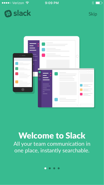
The screen of acquaintance with the application can be presented in different ways, effective for users. A Slack application, for example, uses the first screen to create a context. They are simply presented, focusing on their advantages , and not on functionality.
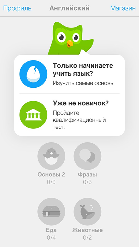
An even more interactive way of first user interaction is progressive onboarding. Duolingo does not explain how the application works: users are encouraged to take a quick test of the selected language (without registration), because people learn faster by acting. In addition, it is an effective way to show the value of the application to the user.
Remember how the swipe gesture was different in the Mailbox app and in Apple Mail? This is how progressive onboarding works. Users can try different gestures before using the application directly:
Before designing the training screen against the background of the main screens, stop and think about what the first user interaction with the application should be. Focus on context. In most cases, there is a more efficient way to greet users.
5. Creative, but not intuitive blank screens
Empty screens can go unnoticed by inexperienced designers. However, they can be an important factor when it comes to the overall interaction experience.
Sometimes designers see the opportunity to show creativity in blank screens and error messages.
Take for example the blank screen of the Google Photo application:

Blank screen in Google Photos
At first glance, everything seems in order, right? Well-designed guide with nice graphics.
However, after looking, you can notice some oddities:
- Why do we see the search icon? Why should a user want to search when there is nothing?
- The second noticeable element is a picture in the center that cannot be clicked on (although many will try).
- The hint says that I have to find the "+" button at the top of the screen, which is strange. Why does the tooltip itself not contain an Add button? It's like saying "Click on the Continue button to continue."
This blank screen does not help users understand the context:
- What is a collection? How are they useful?
- Why don't I have them?
- What should I do about it?
When it comes to creativity, less is more. The blank screen below turned out with a bang in terms of usefulness to the user.

Blank screen in Lootsy application
Do not forget that empty screens (as well as 404 pages on the web) are not only visual aesthetics and brand identity. They play an important role in usability. Make them intuitive.
Question everything
Don't get me wrong, the patterns in the design are still your best friends. But keep in mind that not all applications and users are the same. One solution may work for one application and fail in another.
Think for yourself. Create it yourself. Explore yourself.
Measure, test, confirm and do not be afraid not to follow the guidelines if there is no point in what is written there.
From the translator. With all the wishes and comments about the translation, please contact me in PM. Thank!
Source: https://habr.com/ru/post/270891/
All Articles