Impose a responsive website correctly with Fronzy media-queries
 The best employee is a lazy employee, because he strives to complete the task as simple as possible. The task, the solution of which was converted into the methodology of Fronzy media-queries, can be described as follows:
- Create mixins in an SCSS document for quick media query announcement
- Use these mixins in other projects.
For example, we want some styles in a css document to apply only to smartphones with a screen width of less than 600px. In the css document we write this code:
@media screen and (max-width: 600px) { ... } // - But there is a shorter form of recording. In the scss document we write this code:
@include fronzy(xs) { ... } // - For more contrast, I will give one more example. We want the styles to be displayed only on devices with a screen width ranging from 700px to 1000px. In the css document we write this code:
')
@media (min-width: 700px) and (max-width: 1000px) { ... } Option for the lazy:
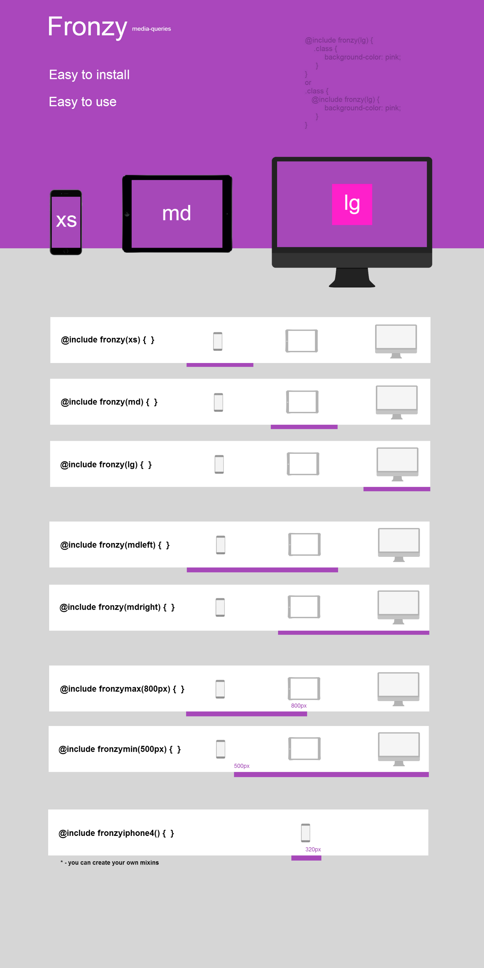
@include fronzyfromto(700px, 1000px) { ... } A complete list of Fronzy media queries for use in the SCSS file:
$xs: 600px; // 600px $lg: 1000px; // 1000px @include fronzy(xs) { ... } // , 600px @include fronzy(md) { ... } // , 601px 999px @include fronzy(lg) { ... } // , 1000px @include fronzymin(700px) { ... } // , 700px ( ) @include fronzymax(1200px) { ... } // 1200px @include fronzyfromto(300px, 500px) { ... } // 300px 500px /* . . */ /* - iPhone4 : */ @include fronzyiphone4() { ... } // : @media screen and (max-width: 320px) { ... } /* 320 px - iphone4 */ To use Fronzy media queries, you need to insert this code (default mixins) into your SCSS file:
/* 1________________________________________ fronzy media-queries */ /* 1.1_____________________ def vars */ $xsdef: 600px; // don`t change this var. You can change -> main vars <- like -> $xs <- $lgdef: 1200px; //don`t change this var. You can change -> main vars <- like -> $lg <- /* btm def vars */ /* 1.2_____________________ main vars */ $xs: $xsdef; // can change. Like this -> $xs: 500px; or $xs: 720px; or $xs: any count; !But count must be < $lg $lg: 800px; // can change Like this -> $lg: 1000px; or $lg: 1300px; !But count must be > $xs /* btm main vars */ /* 1.3_____________________ def mixins */ @mixin fronzy($bp) { @if $bp == "xs" { @media screen and (max-width: $xs) { @content; } } @else if $bp == "mdleft" { @media screen and (max-width: ($lg - 1)) { @content; } } @else if $bp == "md" { @media (min-width: ($xs + 1)) and (max-width: ($lg - 1)) { @content; } } @else if $bp == "mdright" { @media screen and (min-width: ($xs + 1)) { @content; } } @else if $bp == "lg" { @media screen and (min-width: $lg) { @content; } } } @mixin fronzymin($min) { @media screen and (min-width: $min) { @content; } } @mixin fronzymax($max) { @media screen and (max-width: $max) { @content; } } @mixin fronzyfromto($min, $max) { @media (min-width: $min) and (max-width: $max) { @content; } } /* btm def mixins */ /* 1.4_____________________ user mixins */ /* You can add your own mixins like this: // @mixin fronzyiphone4() { @media screen and (max-width: 360px) { @content; } } // Add your mixin before -> btm user mixins <- string */ @mixin fronzyiphone4() { @media screen and (max-width: 360px) { @content; } } /* btm user mixins */ /* btm fronzy media-queries. Created by Anre La http://fb.com/myanrela */ You can see an example of using Fronzy media-queries here and here .
We create our mixins according to the principle:
@mixin fronzyiphone4() { /* fronzyiphone4() , fronzy */ @media screen and (max-width: 360px) { /* css - */ @content; /* */ } } Summarize. Using Fronzy media-queries is impossible without the following steps:
- Inserting default mixins at the beginning of the SCSS document
- The desire to create websites with layout that is convenient to maintain
Source: https://habr.com/ru/post/270637/
All Articles