Font Lato: Sketch vs Android Studio
Life in Avito made go to Sketch and start drawing in mdpi (1x). To immediately support phones and tablets. Since I work on the principle of Atomic Design adapted to myself.
I started the transition to Sketch by transferring font guides. I took the phone with mdpi (1x), installed my test application with the Avito font grid. Began to circle. I already did this for Photoshop. (I need to know the exact boundaries of the text in order to make precise design specifications for developers)
')
As it turned out, the shoals (features of the work :)) with the font rendering from Android is enough. I will give a specific example. Took 2 identical TextView (font in one line, 14 Bold). In addition, the second TextView has assigned the attributes android: maxLines = "1" and android: ellipsize = "end" in addition . This means that if the text is long, it will appear on one line with "..." at the end. As a result, the height of the container and the baseline of the second TextView were rendered with a shift of 1dp relative to the first. There were other oddities, but not the essence.
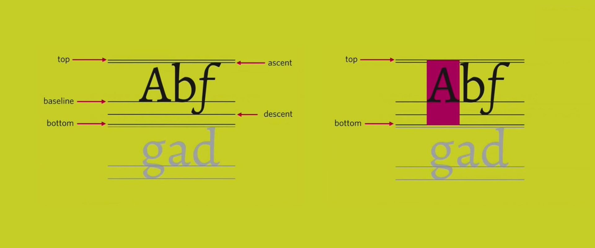
He continued the experiment. Then I remembered the recent video from Lisa Wray about working with the font. I dug up screenshots on the desktop about the font structure from the point of view of Android.

Thought googled. I came across the android attribute : includeFontPadding = "false" . As I understand it, it removes the padding from the top of the font between top and ascent and the bottom between descent and bottom (see the first screenshot).
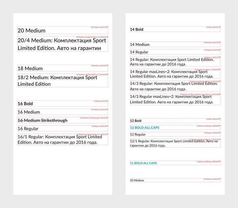
Added this attribute to all TextView in a test application. Began to look again. Played with different attributes in TextView, equalized - everything is cool. The TextView from the example above is rendered equally, without shifts. Began to circle the text for the font grid. To get the output for Sketch here is this:
During the stroke, I noticed that the borders of the text layer in Sketch are one-on-one with the border of TextView in Android (Studio). I tried other sizes - they also match. Cool!
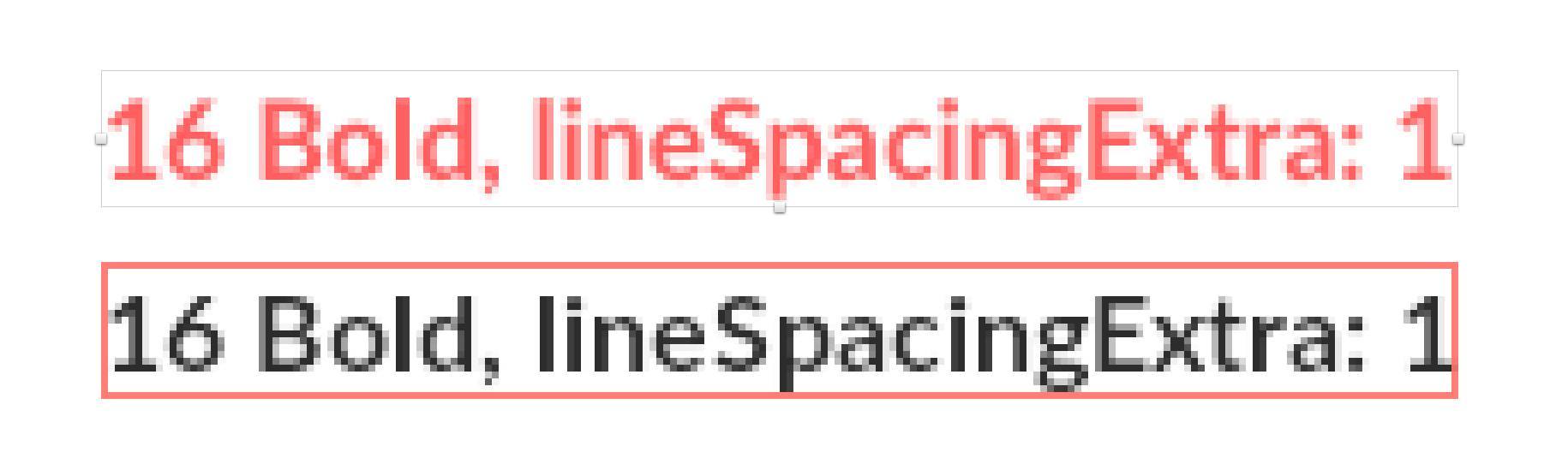
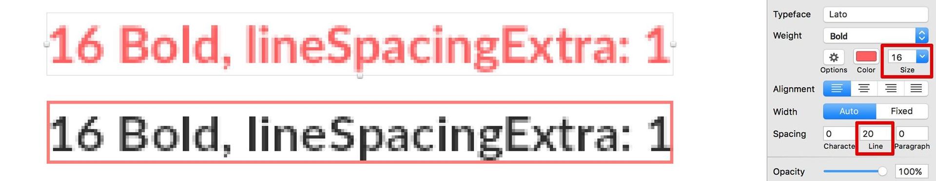
And what about the line spacing? It turned out, too, everything is good. For Lato Bold font size 16, the Line parameter of the new text layer in Sketch defaults to 19. Attribute android: lineSpacingExtra = "1sp" increases the line spacing by 1. I decided to add 1 to the Line parameter in Sketch. That is, it became 20. Earned, the containers are the same!
Moreover, the height was 1 more. Added this space below. That is, you can play the exact alignment of the text of the buttons.
Conclusion
For the Lato font, if you draw layouts in mdpi (1x), the font rendering in Sketch is the same as Android (Studio), if you add the TextView android attribute : includeFontPadding = “false”
Hypothesis
It seems that this behavior is true for any font. And not just Lato. Need to check.
Who likes to read on Facebook, add to my group about Quality Android .
Source: https://habr.com/ru/post/270389/
All Articles