Windows 10 through 10. Issue # 4. Giving final gloss to UWP application
We are continuing to translate a series of articles Windows 10 to 10 . New article is devoted to the theme of application design. The translation was prepared by Sly Lamb , a studio specializing in developing applications for the Microsoft platform.
A few introductory words from the studio director Alexey Perezhogin:
Developing an application is not just a choice of templates and controls. This is a permanent job to make your users enjoy working with it. Focusing on creating the best experience of interacting with the product (UX) when developing applications, you should not forget about the effective use of colors and convenient controls, and you also need to understand what should be in the application and what should not be in it. And the most important thing is, of course, to make your application work on various devices of various sizes, whether it be a phone, tablet or desktop computer.
')
It all starts with the grid. It is the foundation of application development and must be present at every stage. The basic 4-pixel grid serves a very important purpose: it helps align the design elements, focusing on the user reading visually placed accents. You can learn more about the importance of the grid by reading this MDSN article .
The grid also allows you to scale the design elements depending on the size of the display. To avoid fractional numbers when increasing or decreasing the scale of your UI, you need to make sure that all the guide lines of the grid stand on multiples of four. To make the design elements as clear as possible, tie them to the grid. The example below shows what happens when design elements are attached to a 4x4 pixel grid: the borders of an element or image will always be sharper and clearer.

If you do not tie a design element to the grid, it will look blurry and on some devices have fuzzy edges.

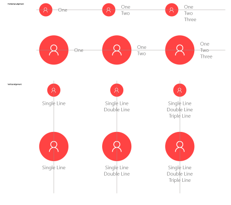
If you create an application using horizontal alignment of icons and text, the choice of the optimal method depends on the size of the icons and the amount of text.
If the lines of text (one or several) do not exceed the height of the icon, it is recommended to center the text vertically. If the height of the text goes beyond the height of the icon, the text that does not go beyond the icon is better aligned vertically, and the remaining text - placed below. Here is an example of how it should look like:

If you use circles with typographic marks, make sure that both the circle and the sign are properly aligned. The following examples demonstrate both alignment options - horizontal and vertical:
One of the most effective ways to distinguish your application from others is to choose the right colors. The color scheme that you choose can greatly affect the visual appeal and usability of the application.
Notice how boldly the bright yellow color is used in contrast to black in the example below. Yellow is very simple, but the desired area is effectively highlighted:

This example demonstrates the effectiveness of using bright colors, as well as a strong contrast between the primary color and the background.

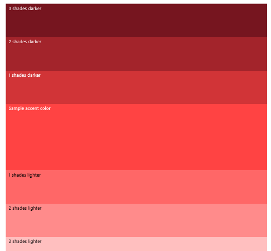
Usually, everyone starts with the selection of the main color of the application and the accent color, which can be used for the application launch button, the taskbar and hyperlinks in the standard controls. As soon as you have decided on the accent color, the creation of light and dark shades of the accent color based on the values of the HCL color space begins. You can use different shades (see red below) to create a visual hierarchy and as an indication of the interaction between different parts of the application.
As for color and contrast, the font color must necessarily be different from the background color. However, overly contrasting text can be difficult to read on digital screens. The importance of contrast can be seen from the example below: thanks to the white and light background, the foreground color becomes more pleasing to the eye and more distinguishable.

Color contrast is especially important when developing applications for various devices and with various capabilities. The minimum value of good contrast is 4.5 1, and the optimal degree of legibility of the text is achieved at a ratio of 7∶1. Below are online resources and sites that can be used to check contrast:
• Contrast Checker
• Check my colors
• Color Contrast
• Color Contrast Analyzer
Color Contrast Analyzer is a very useful resource for checking contrast. Using it, you can try different colors of the foreground and background and use the results to determine the contrast ratio.
If colors and contrast are chosen incorrectly, the result will be very difficult to read. The following examples demonstrate successful contrast options, along with unsuccessful ones (the latter are crossed out diagonally).

Usually light color schemes are suitable for productive applications. Using a light color scheme makes it easier to read large pieces of text for a long time.
The dark color scheme creates a visible contrast for more media-oriented applications or scenarios, when a large number of video clips or images are offered to the attention of the user.
If you take the red color discussed earlier, the variants of the light and dark color scheme of your application would look like this:

When building your UX, do not forget that black, white and gray colors fit everything. Even well-chosen bright colors look great on a black, white or gray background, which can be estimated using the Microsoft homepage as an example:

Here is another example:

If you are looking for inspiration, there are many free online color palette generators, such as color.adobe.com or COLOURlovers.com , a community where people create and share their color palettes. In addition, there are two other great sites for creating color samples and color schemes - Coolors and Palleton .
Navigation controls help users find the content they need, but they visually take up space in your application that could be used as content. Therefore, it is imperative to spend a certain amount of time thinking through the flow of your application and using navigation elements to improve the overall user experience:
To learn more about how to effectively use the navigation controls (and much more!), Visit the Windows UI navigation basics pages.
Since your application will most likely have to function on various devices of all sizes, you should always remember about the need for responsive design. This topic will be discussed in more detail in one of the articles in our series.
To make a responsive design quality, Windows 10 adds a VisualStateManager , as well as a number of new controls . Taking advantage of these controls, as well as the built-in functions of the Universal Windows Platform, structural elements and adaptive design technology, you can create a UI that looks great on any device.
If you need more information, go to the Design basics section of the Windows Dev Center .
Finishing Stihees
Remember that many users have an opinion about the application based on the overall usability and quality, mainly design, often within the first 1-2 minutes of use. No matter what stage of development you are at, it is always worthwhile to find time to add gloss to your design - pay more attention to snapping to the grid, or arranging colors and animation. Additional design guidelines, as well as templates for designers, can be found at https://dev.windows.com . We also recommend reading Smashing Magazine , which is an excellent source of information on graphic design.
A few introductory words from the studio director Alexey Perezhogin:
Good day! Before we wrote about our experience in adapting the design of iOS applications under WP 8.x. On the eve of the release of Windows 10 Mobile, we want to draw your attention to the changes in the guidelines of the Windows 10 platform as compared to the previous Modern UI (by the way, the manuals continue to be updated, and from the latest news, templates for designers appeared in PSD (before they were only in Illustrator and PowerPoint )).
The topic is relevant for Windows developers who are planning to develop or port their applications under UWP. Therefore, we decided to translate one of the very useful articles on designing applications for Windows 10.
Giving the final gloss to the application - improving the appearance and ease of use
Developing an application is not just a choice of templates and controls. This is a permanent job to make your users enjoy working with it. Focusing on creating the best experience of interacting with the product (UX) when developing applications, you should not forget about the effective use of colors and convenient controls, and you also need to understand what should be in the application and what should not be in it. And the most important thing is, of course, to make your application work on various devices of various sizes, whether it be a phone, tablet or desktop computer.
')
Snap to Grid
It all starts with the grid. It is the foundation of application development and must be present at every stage. The basic 4-pixel grid serves a very important purpose: it helps align the design elements, focusing on the user reading visually placed accents. You can learn more about the importance of the grid by reading this MDSN article .
The grid also allows you to scale the design elements depending on the size of the display. To avoid fractional numbers when increasing or decreasing the scale of your UI, you need to make sure that all the guide lines of the grid stand on multiples of four. To make the design elements as clear as possible, tie them to the grid. The example below shows what happens when design elements are attached to a 4x4 pixel grid: the borders of an element or image will always be sharper and clearer.
If you do not tie a design element to the grid, it will look blurry and on some devices have fuzzy edges.
Alignment
Images and text on the grid
If you create an application using horizontal alignment of icons and text, the choice of the optimal method depends on the size of the icons and the amount of text.
If the lines of text (one or several) do not exceed the height of the icon, it is recommended to center the text vertically. If the height of the text goes beyond the height of the icon, the text that does not go beyond the icon is better aligned vertically, and the remaining text - placed below. Here is an example of how it should look like:
Alignment of circles and typographic marks
If you use circles with typographic marks, make sure that both the circle and the sign are properly aligned. The following examples demonstrate both alignment options - horizontal and vertical:
Use bright colors
One of the most effective ways to distinguish your application from others is to choose the right colors. The color scheme that you choose can greatly affect the visual appeal and usability of the application.
Notice how boldly the bright yellow color is used in contrast to black in the example below. Yellow is very simple, but the desired area is effectively highlighted:
This example demonstrates the effectiveness of using bright colors, as well as a strong contrast between the primary color and the background.
The basic principles of color matching
Usually, everyone starts with the selection of the main color of the application and the accent color, which can be used for the application launch button, the taskbar and hyperlinks in the standard controls. As soon as you have decided on the accent color, the creation of light and dark shades of the accent color based on the values of the HCL color space begins. You can use different shades (see red below) to create a visual hierarchy and as an indication of the interaction between different parts of the application.
Contrast
As for color and contrast, the font color must necessarily be different from the background color. However, overly contrasting text can be difficult to read on digital screens. The importance of contrast can be seen from the example below: thanks to the white and light background, the foreground color becomes more pleasing to the eye and more distinguishable.
Color contrast is especially important when developing applications for various devices and with various capabilities. The minimum value of good contrast is 4.5 1, and the optimal degree of legibility of the text is achieved at a ratio of 7∶1. Below are online resources and sites that can be used to check contrast:
• Contrast Checker
• Check my colors
• Color Contrast
• Color Contrast Analyzer
Color Contrast Analyzer is a very useful resource for checking contrast. Using it, you can try different colors of the foreground and background and use the results to determine the contrast ratio.
If colors and contrast are chosen incorrectly, the result will be very difficult to read. The following examples demonstrate successful contrast options, along with unsuccessful ones (the latter are crossed out diagonally).
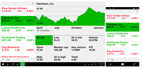
Color schemes
Usually light color schemes are suitable for productive applications. Using a light color scheme makes it easier to read large pieces of text for a long time.
The dark color scheme creates a visible contrast for more media-oriented applications or scenarios, when a large number of video clips or images are offered to the attention of the user.
If you take the red color discussed earlier, the variants of the light and dark color scheme of your application would look like this:
When building your UX, do not forget that black, white and gray colors fit everything. Even well-chosen bright colors look great on a black, white or gray background, which can be estimated using the Microsoft homepage as an example:
Here is another example:
If you are looking for inspiration, there are many free online color palette generators, such as color.adobe.com or COLOURlovers.com , a community where people create and share their color palettes. In addition, there are two other great sites for creating color samples and color schemes - Coolors and Palleton .
How to facilitate user experience
Navigation controls help users find the content they need, but they visually take up space in your application that could be used as content. Therefore, it is imperative to spend a certain amount of time thinking through the flow of your application and using navigation elements to improve the overall user experience:
- Tabs and pivot You can use tabs and pivot if you want to place a permanent list of links for pages of the same level, such as in the case of an application on 2-5 pages, or when it is assumed that the user will often switch between pages. If only one tab does not make sense, then 5 or more will make the page too “cluttered”. A good example of using tabs and pivot is the restaurant search application:

- Navigation Bar (Nav pane) The navigation bar displays a list of links to the highest level pages. This is a good choice if you want to save space, provided that users do not switch frequently between pages (at the cost of slower navigation), or if most pages of your application are at the highest level. This smart home control application uses a simple, attractive navigation bar:

- Master / details And finally, let's quickly go over UX applications, mainly based on lists - the “main view” (master view) containing the most important information. In such applications with an emphasis on information, the user selects a position, and the corresponding information elements are displayed on its page in the “details” section. On a smaller screen, this page would replace the master view, while on the big screen they would be displayed side by side. It is a good idea to use this element if it is expected that users will frequently switch between child positions, or if you want to give users the right to perform high-level operations, such as deleting or sorting individual items. This product tracking application shows how the master / details scheme creates a good, engaging user experience:
To learn more about how to effectively use the navigation controls (and much more!), Visit the Windows UI navigation basics pages.
Design must be responsive.
Since your application will most likely have to function on various devices of all sizes, you should always remember about the need for responsive design. This topic will be discussed in more detail in one of the articles in our series.
To make a responsive design quality, Windows 10 adds a VisualStateManager , as well as a number of new controls . Taking advantage of these controls, as well as the built-in functions of the Universal Windows Platform, structural elements and adaptive design technology, you can create a UI that looks great on any device.
If you need more information, go to the Design basics section of the Windows Dev Center .
Finishing Stihees
Remember that many users have an opinion about the application based on the overall usability and quality, mainly design, often within the first 1-2 minutes of use. No matter what stage of development you are at, it is always worthwhile to find time to add gloss to your design - pay more attention to snapping to the grid, or arranging colors and animation. Additional design guidelines, as well as templates for designers, can be found at https://dev.windows.com . We also recommend reading Smashing Magazine , which is an excellent source of information on graphic design.
Source: https://habr.com/ru/post/270303/
All Articles