Mastering the Coordinator Layout
At the presentation of Google I / O 15 , Google introduced a new version of the support library that implements several components strongly associated with the Material Design specifications , among these components you can find new ViewGroup types such as
With the right combination and customization, Viewgroup data can be a very powerful tool, so I decided to write an article with some settings and tips.
As its name suggests, the purpose and philosophy of this
Consider the following picture:
')
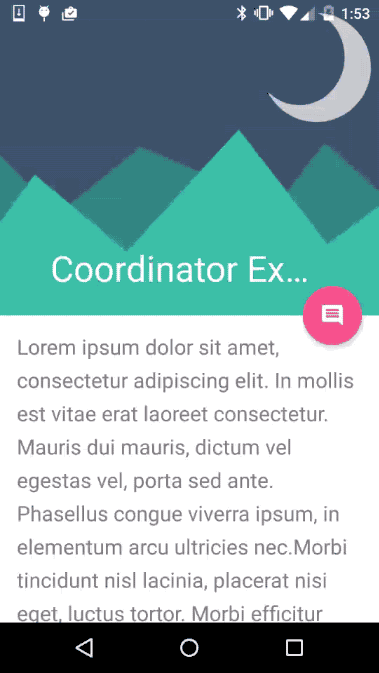
In this example, we can see how the view elements are placed relative to each other, without resorting to a detailed view, we see how some
This will be the simplest structure for using
Consider the skeleton of this layout. This
Simply put,
It may sound confusing at first, but how, - “It’s better to see once than to hear a hundred times”, to your attention .gif-example:
In this case,
We can control the behavior of the
With the value of:
As you can see, the real power of
All of these options are available in the Google Developers documentation . In any case, I recommend playing with examples. At the end of the article there are links to Github repositories with examples implemented.
Let's make a small experiment, launch Android Studio (> = 1.4) and create a project from the template: Scrolling Activity , changing nothing, compiling and here we see:
When considering the generated code, neither the layout layouts nor the java classes have anything to do with scaling the floating button animation. Why?
The answer is in the source code
For animation scaling, a new element is presented, which is presented together with the design library, called
If you look inside the package of design support library widgets, you can find an open class called:

Creating your own behavior pattern ( Behavior ) is not so difficult as it may seem, for a start we must take into account several basic elements: child and dependency .
child is an element that enhances behavior; dependency is the one who will serve him as a trigger for interacting with the child element. Let's look at an example, child is an ImageView element, and dependency is a Toolbar , so if the Toolbar is moving, the ImageView is also moving.

Now that we have defined the concept, we can talk about the implementation, the first step is to inherit from:
Method:
Whenever
And now all together:
Additional materials
Coordinator Behavior Example - Github
Coordinator Examples - Github
Introduction to coordinator layout on Android - Grzesiek Gajewski
AppbarLayout , CollapsingToolbarLayout and CoordinatorLayout .With the right combination and customization, Viewgroup data can be a very powerful tool, so I decided to write an article with some settings and tips.
CoordinatorLayout
As its name suggests, the purpose and philosophy of this
ViewGroup is to coordinate the view elements that are inside it.Consider the following picture:
')
In this example, we can see how the view elements are placed relative to each other, without resorting to a detailed view, we see how some
View depend on others. (we will talk about it later).This will be the simplest structure for using
CoordinatorLayout :View code
<?xml version="1.0" encoding="utf-8"?> <android.support.design.widget.CoordinatorLayout xmlns:android="http://schemas.android.com/apk/res/android" xmlns:app="http://schemas.android.com/apk/res-auto" android:layout_width="match_parent" android:layout_height="match_parent" android:background="@android:color/background_light" android:fitsSystemWindows="true" > <android.support.design.widget.AppBarLayout android:id="@+id/main.appbar" android:layout_width="match_parent" android:layout_height="300dp" android:theme="@style/ThemeOverlay.AppCompat.Dark.ActionBar" android:fitsSystemWindows="true" > <android.support.design.widget.CollapsingToolbarLayout android:id="@+id/main.collapsing" android:layout_width="match_parent" android:layout_height="match_parent" app:layout_scrollFlags="scroll|exitUntilCollapsed" android:fitsSystemWindows="true" app:contentScrim="?attr/colorPrimary" app:expandedTitleMarginStart="48dp" app:expandedTitleMarginEnd="64dp" > <ImageView android:id="@+id/main.backdrop" android:layout_width="match_parent" android:layout_height="match_parent" android:scaleType="centerCrop" android:fitsSystemWindows="true" android:src="@drawable/material_flat" app:layout_collapseMode="parallax" /> <android.support.v7.widget.Toolbar android:id="@+id/main.toolbar" android:layout_width="match_parent" android:layout_height="?attr/actionBarSize" app:popupTheme="@style/ThemeOverlay.AppCompat.Light" app:layout_collapseMode="pin" /> </android.support.design.widget.CollapsingToolbarLayout> </android.support.design.widget.AppBarLayout> <android.support.v4.widget.NestedScrollView android:layout_width="match_parent" android:layout_height="match_parent" app:layout_behavior="@string/appbar_scrolling_view_behavior" > <TextView android:layout_width="match_parent" android:layout_height="wrap_content" android:textSize="20sp" android:lineSpacingExtra="8dp" android:text="@string/lorem" android:padding="@dimen/activity_horizontal_margin" /> </android.support.v4.widget.NestedScrollView> <android.support.design.widget.FloatingActionButton android:layout_height="wrap_content" android:layout_width="wrap_content" android:layout_margin="@dimen/activity_horizontal_margin" android:src="@drawable/ic_comment_24dp" app:layout_anchor="@id/main.appbar" app:layout_anchorGravity="bottom|right|end" /> </android.support.design.widget.CoordinatorLayout> Consider the skeleton of this layout. This
CoordinatorLayout has only three children: AppbarLayout , a scrollable view and an assigned FloatingActionBar .View code
<CoordinatorLayout> <AppbarLayout/> <scrollableView/> <FloatingActionButton/> </CoordinatorLayout> AppBarLayout
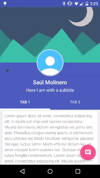
Simply put,
AppBarLayout is LinearLayout on steroids, their elements are placed vertically, with certain parameters the elements can control their behavior when the content is scrolled.It may sound confusing at first, but how, - “It’s better to see once than to hear a hundred times”, to your attention .gif-example:
In this case,
AppBarLayout is a blue view, placed under the vanishing image, it contains a Toolbar , LinearLayout with a title and subtitle and TabLayout with several tabs.We can control the behavior of the
AppbarLayout elements using the parameters: layout_scrollFlags . Value: scroll in this case is present in almost all view elements, if this parameter were not specified in any of the AppbarLayout elements, it would remain unchanged, allowing scrollable content to pass behind it.With the value of:
snap , we avoid falling into a semi-animated state , which means that the animation always hides or displays the full view size.LinearLayout which contains the title and subtitle will always be displayed when scrolling up ( enterAlways value), and TabLayout will always be visible because no flag is set to it.As you can see, the real power of
AppbarLayout is determined by properly controlling its scroll flags in certain views.View code
<AppBarLayout> <CollapsingToolbarLayout app:layout_scrollFlags="scroll|snap" /> <Toolbar app:layout_scrollFlags="scroll|snap" /> <LinearLayout android:id="+id/title_container" app:layout_scrollFlags="scroll|enterAlways" /> <TabLayout /> <!-- no flags --> </AppBarLayout> All of these options are available in the Google Developers documentation . In any case, I recommend playing with examples. At the end of the article there are links to Github repositories with examples implemented.
Flags AppbarLayout
SCROLL_FLAG_ENTER_ALWAYS : When using the flag, the view will scroll down regardless of the other scrollable view.SCROLL_FLAG_ENTER_ALWAYS_COLLAPSED : Additional flag for 'enterAlways', which changes the returned view to the initially scrollable, when the height disappears.SCROLL_FLAG_EXIT_UNTIL_COLLAPSED : When exiting, the view will be scrolled until it disappears.SCROLL_FLAG_SCROLL : The view element will scroll in the direction of the scroll event.SCROLL_FLAG_SNAP : At the end of the scroll, if the view is only partially visible, it will be docked to its nearest edge.CoordinatorLayout Behaviors
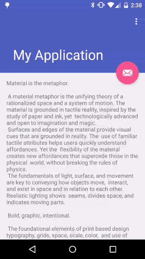
Let's make a small experiment, launch Android Studio (> = 1.4) and create a project from the template: Scrolling Activity , changing nothing, compiling and here we see:
When considering the generated code, neither the layout layouts nor the java classes have anything to do with scaling the floating button animation. Why?
The answer is in the source code
FloatingActionButton , since Android Studio v1.2 includes a java decompiler, using ctrl/cmd + click we can check the source code and see what happens:View code
/* * Copyright (C) 2015 The Android Open Source Project * * Floating action buttons are used for a * special type of promoted action. * They are distinguished by a circled icon * floating above the UI and have special motion behaviors * related to morphing, launching, and the transferring anchor point. * * blah.. blah.. */ @CoordinatorLayout.DefaultBehavior( FloatingActionButton.Behavior.class) public class FloatingActionButton extends ImageButton { ... public static class Behavior extends CoordinatorLayout.Behavior<FloatingActionButton> { private boolean updateFabVisibility( CoordinatorLayout parent, AppBarLayout appBarLayout, FloatingActionButton child { if (a long condition) { // If the anchor's bottom is below the seam, // we'll animate our FAB out child.hide(); } else { // Else, we'll animate our FAB back in child.show(); } } } ... } For animation scaling, a new element is presented, which is presented together with the design library, called
Behavior . In this case CoordinatorLayout.Behavior<FloatingAcctionButton> Which depends on some factors including scrolling, showing FAB or not, I wonder, isn't it?SwipeDismissBehavior
If you look inside the package of design support library widgets, you can find an open class called:
SwipeDismissBehavior . With this new Behavior we can very easily implement the swipe function to cancel in our templates with CoordinatorLayout :View code
@Override public void onCreate(Bundle savedInstanceState) { super.onCreate(savedInstanceState); setContentView(R.layout.activity_swipe_behavior); mCardView = (CardView) findViewById(R.id.swype_card); final SwipeDismissBehavior<CardView> swipe = new SwipeDismissBehavior(); swipe.setSwipeDirection( SwipeDismissBehavior.SWIPE_DIRECTION_ANY); swipe.setListener( new SwipeDismissBehavior.OnDismissListener() { @Override public void onDismiss(View view) { Toast.makeText(SwipeBehaviorExampleActivity.this, "Card swiped !!", Toast.LENGTH_SHORT).show(); } @Override public void onDragStateChanged(int state) {} }); LayoutParams coordinatorParams = (LayoutParams) mCardView.getLayoutParams(); coordinatorParams.setBehavior(swipe); } Custom behaviors
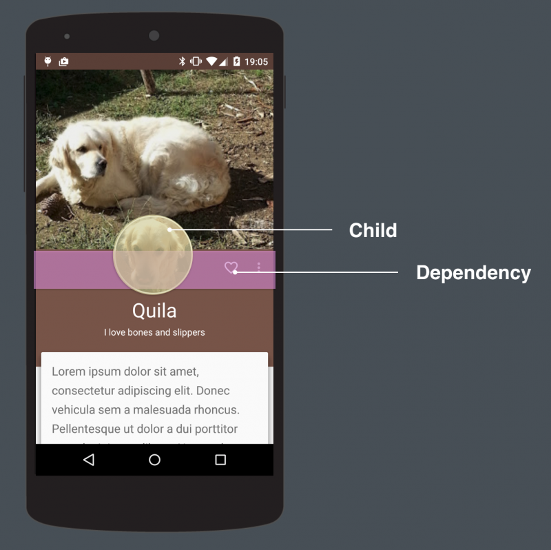
Creating your own behavior pattern ( Behavior ) is not so difficult as it may seem, for a start we must take into account several basic elements: child and dependency .
Child and dependency
child is an element that enhances behavior; dependency is the one who will serve him as a trigger for interacting with the child element. Let's look at an example, child is an ImageView element, and dependency is a Toolbar , so if the Toolbar is moving, the ImageView is also moving.
Now that we have defined the concept, we can talk about the implementation, the first step is to inherit from:
CoordinatorLayout.Behavior<T> , the value of T will be the class that belongs to the view that we need to coordinate, in this case the ImageView , after which we have to override the following methods:- layoutDependsOn
- onDependentViewChanged
Method:
layoutDependsOn will be called every time something happens in the layout to return true , once we have defined dependency, in the example, this method works automatically when scrolling (since the Toolbar will move), so we can submit sign to our child to respond accordingly.View code
@Override public boolean layoutDependsOn( CoordinatorLayout parent, CircleImageView, child, View dependency) { return dependency instanceof Toolbar; } Whenever
layoutDependsOn returns true second onDependentViewChanged will be called. It is here that we must implement our animation, translation or movement always depend on the provided dependency.View code
public boolean onDependentViewChanged( CoordinatorLayout parent, CircleImageView avatar, View dependency) { modifyAvatarDependingDependencyState(avatar, dependency); } private void modifyAvatarDependingDependencyState( CircleImageView avatar, View dependency) { // avatar.setY(dependency.getY()); // avatar.setBlahBlat(dependency.blah / blah); } And now all together:
View code
public static class AvatarImageBehavior extends CoordinatorLayout.Behavior<CircleImageView> { @Override public boolean layoutDependsOn( CoordinatorLayout parent, CircleImageView, child, View dependency) { return dependency instanceof Toolbar; } public boolean onDependentViewChanged( CoordinatorLayout parent, CircleImageView avatar, View dependency) { modifyAvatarDependingDependencyState(avatar, dependency); } private void modifyAvatarDependingDependencyState( CircleImageView avatar, View dependency) { // avatar.setY(dependency.getY()); // avatar.setBlahBlah(dependency.blah / blah); } } Additional materials
Coordinator Behavior Example - Github
Coordinator Examples - Github
Introduction to coordinator layout on Android - Grzesiek Gajewski
Source: https://habr.com/ru/post/270121/
All Articles