How we lost and again found millions without testing A / B
We have always believed that we should share with the world the lessons and technologies gained in the process of engaging in our business, including both successes and failures. We have already written about several successes - how we reduced support response time, accelerated applications and increased reliability. Today I want to tell you about an experience that was not successful.
This is a story about how we made changes to the Basecamp.com website, which cost us millions of dollars, how we got out of this situation and what we learned in the process.
It all started in February 2014, when we officially became Basecamp . It was a major change - rebranding, refusing to support certain products, selling others, etc. In the process, we decided to change the design of the basecamp.com site (this is our marketing site) to reflect the fact that it was no longer just a Basecamp product site, but a Basecamp website.
')
The changes were quite significant - both in content and visual. The redesign touched not only the landing page, (you can see the sites before and after ), but also the main page of the site.
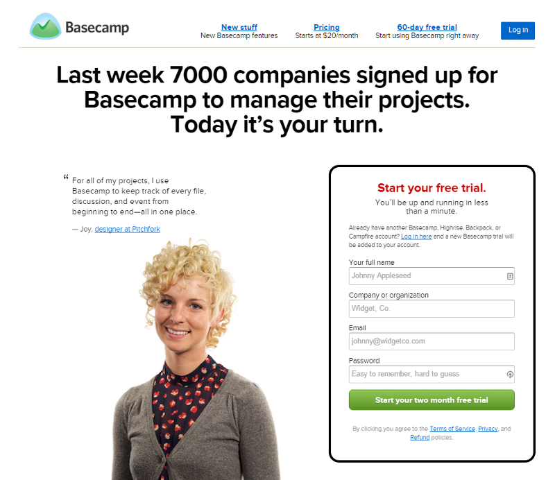

One of the major changes was the disappearance of the login form from the home page. This decision was not particularly thoughtful, we did not conduct a thorough study of how the number of steps required to enter the trial version of the service affects its usability. For years, we argued about the relative value of the ability to quickly “enter” the service (to attract more people) as compared to the “thoughtful” entry system (which will have fewer registrations, but only interested users will take part, most of which will become paid ). But as far as I know, we did not make a special decision about switching to a slower “entry” system. It was just one of the solutions to our “transformation into Basecamp”.
There were many reasons why we didn’t perform A / B testing of the site. We were too busy to prepare very different versions of the new site, we wanted to provide everyone with one consistent image during our changes, and we liked what we came to as a result.
Immediately after the changes on the marketing site, I saw that the conversion had fallen - fewer visitors came to subscribe to the trial version of the service. The effect was not unexpected - we redirected all traffic from 37signals.com, they wrote about us in the press, we had traffic from other resources, so the reduced percentage of subscribers didn’t bother us much. The absolute number remained at the same level.
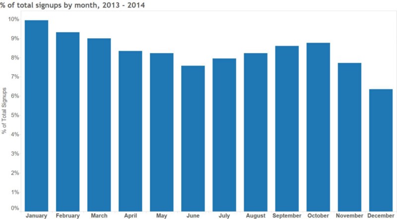
In the first few months after this, the number of subscriptions began to decrease compared to the beginning of the year. This, too, did not cause us fears - we always have the most visitors come in January, and then everything slows down in the summer, and then comes back to normal in the autumn. Since requests to Basecamp depend on normal business cycles, many of which start new projects at the beginning of the year, we feel quite a lot of seasonality.
It took us some time to understand that the reduction in subscriptions, which we saw in the summer of 2014, was more serious than seasonal fluctuations. When the numbers did not go back up in the fall, it became clear that something was wrong. In the review of our work for 2014 for internal use, I wrote:
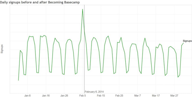
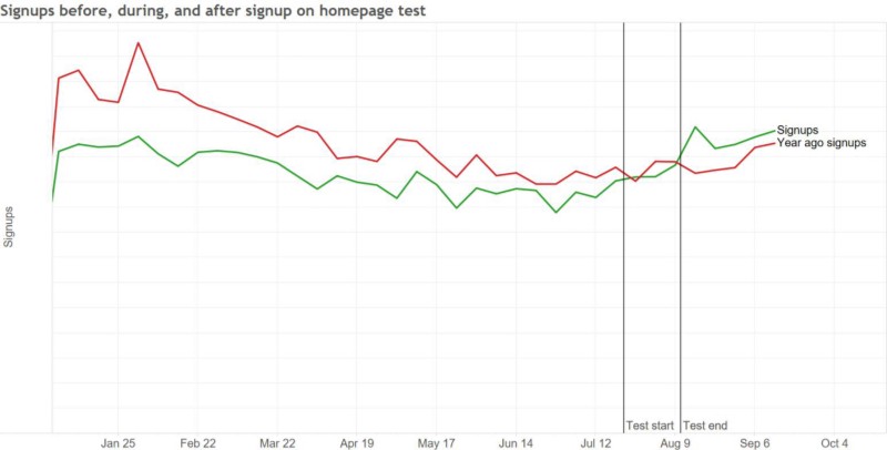
The situation did not improve in the first half of 2015, and we periodically discussed these issues without making any changes. Finally, in July, we launched an A / B test that returned the subscription form back to the home page, and the results were immediate. The number of subscriptions increased by 16% when the form was on the page. So after testing and changing the design, we saw the obvious effect:
We are, of course, pleased to see good results returned — in our case, these improvements are worth millions of dollars in profits. During the period when efficiency was lower, nothing terrible happened (2014 was the most profitable year, and 2015 promises to beat him), but the damage was done.
The lesson is clear - we get more paid customers if we make their way as easy as possible before working with us. A new marketing site for the new version of Basecamp will start soon, and there will be a subscription form on the home page - but this is not the only thing that needs to be learned from our lesson.
The remaining lessons talk about development processes, and there are two key positions that I would like to point out.
We did not conduct A / B testing of our changes, so it took a long time to understand what happened. Such testing would surely catch the deteriorating effectiveness of the redesign in a couple of weeks. In the A / B test, many external factors remain constant - seasonality, sources of visitors, etc. Therefore, you can build a clearer relationship between your changes and the number of subscriptions.
Since we did not test the redesign, we had to be content with comparisons made over long time periods. And given the seasonality and other external effects, it is very difficult to understand exactly what happened to the number of subscriptions - so for a long time we could not figure out what happened.
It is easy to refuse to test changes - you are busy, you yourself think that you already know, they will be better, you don’t want the risks that always exist when conducting such tests. In the future, it will be easier for us to justify spending time and effort on testing the redesign of a marketing site — we learned our lesson in a rather tough way.
And although we are unlikely to make the same mistake, it is worth considering - where else can we err in the same way and not even notice it. Are there any other areas in our product where we have made unverified assumptions that can greatly affect the business or the success of our customers? Is it possible to test these assumptions numerically?
Since our company is small, many small decisions, like where to place a subscription form, are made by individuals or small groups without extensive discussion. In this case, the discussion would give rise to concerns about the risks of deleting the subscription page from the home page. Perhaps we would make another decision.
We also could not make a quick decision and act quickly, even when we realized what was happening. More than six months have passed since we found the problem, and until we solved it.
Our company is focused on the project. We focus on a limited number of things at any given time and are actively working on them. From the moment of the redesign to the current moment, we worked together on different projects. We launched The Distance , added many features to Basecamp, worked on third-party projects, and continued to finish the next version of Basecamp, which will be released soon. We moved the designer who worked, including on the marketing website, to work on Android, and tried many different marketing ideas for advertising, sponsorship, etc.
All this led to the fact that we did not think properly about our marketing website, and this affected the speed of testing and improvements. We conducted a third of the A / B tests in 2014 of their number in the previous year, and made far fewer commits to the site repository. Therefore, we reacted so slowly - in the absence of current projects on this site, we simply did not think about it and did not waste time on it.
I had to do more as a data analyst — I knew that we needed to do an A / B testing redesign, and I knew that it would be necessary to return the subscription to the page several months before we started the tests. I either did not find an opportunity to prove my point of view, or I did not prove it convincingly enough. With hindsight I understand that I would have to knock on the table more strongly.
These were hard and very expensive lessons, and we were lucky that the foundation of our business is strong enough so that they do not turn into an existential crisis. After going through this, we have become the best company, and I hope that we will not fall into such or similar traps in the future.
This is a story about how we made changes to the Basecamp.com website, which cost us millions of dollars, how we got out of this situation and what we learned in the process.
What happened?
It all started in February 2014, when we officially became Basecamp . It was a major change - rebranding, refusing to support certain products, selling others, etc. In the process, we decided to change the design of the basecamp.com site (this is our marketing site) to reflect the fact that it was no longer just a Basecamp product site, but a Basecamp website.
')
The changes were quite significant - both in content and visual. The redesign touched not only the landing page, (you can see the sites before and after ), but also the main page of the site.
One of the major changes was the disappearance of the login form from the home page. This decision was not particularly thoughtful, we did not conduct a thorough study of how the number of steps required to enter the trial version of the service affects its usability. For years, we argued about the relative value of the ability to quickly “enter” the service (to attract more people) as compared to the “thoughtful” entry system (which will have fewer registrations, but only interested users will take part, most of which will become paid ). But as far as I know, we did not make a special decision about switching to a slower “entry” system. It was just one of the solutions to our “transformation into Basecamp”.
There were many reasons why we didn’t perform A / B testing of the site. We were too busy to prepare very different versions of the new site, we wanted to provide everyone with one consistent image during our changes, and we liked what we came to as a result.
Immediately after the changes on the marketing site, I saw that the conversion had fallen - fewer visitors came to subscribe to the trial version of the service. The effect was not unexpected - we redirected all traffic from 37signals.com, they wrote about us in the press, we had traffic from other resources, so the reduced percentage of subscribers didn’t bother us much. The absolute number remained at the same level.
In the first few months after this, the number of subscriptions began to decrease compared to the beginning of the year. This, too, did not cause us fears - we always have the most visitors come in January, and then everything slows down in the summer, and then comes back to normal in the autumn. Since requests to Basecamp depend on normal business cycles, many of which start new projects at the beginning of the year, we feel quite a lot of seasonality.
It took us some time to understand that the reduction in subscriptions, which we saw in the summer of 2014, was more serious than seasonal fluctuations. When the numbers did not go back up in the fall, it became clear that something was wrong. In the review of our work for 2014 for internal use, I wrote:
The situation did not improve in the first half of 2015, and we periodically discussed these issues without making any changes. Finally, in July, we launched an A / B test that returned the subscription form back to the home page, and the results were immediate. The number of subscriptions increased by 16% when the form was on the page. So after testing and changing the design, we saw the obvious effect:
We are, of course, pleased to see good results returned — in our case, these improvements are worth millions of dollars in profits. During the period when efficiency was lower, nothing terrible happened (2014 was the most profitable year, and 2015 promises to beat him), but the damage was done.
What went wrong and what follows?
The lesson is clear - we get more paid customers if we make their way as easy as possible before working with us. A new marketing site for the new version of Basecamp will start soon, and there will be a subscription form on the home page - but this is not the only thing that needs to be learned from our lesson.
The remaining lessons talk about development processes, and there are two key positions that I would like to point out.
1. We do not know what will work.
We did not conduct A / B testing of our changes, so it took a long time to understand what happened. Such testing would surely catch the deteriorating effectiveness of the redesign in a couple of weeks. In the A / B test, many external factors remain constant - seasonality, sources of visitors, etc. Therefore, you can build a clearer relationship between your changes and the number of subscriptions.
Since we did not test the redesign, we had to be content with comparisons made over long time periods. And given the seasonality and other external effects, it is very difficult to understand exactly what happened to the number of subscriptions - so for a long time we could not figure out what happened.
It is easy to refuse to test changes - you are busy, you yourself think that you already know, they will be better, you don’t want the risks that always exist when conducting such tests. In the future, it will be easier for us to justify spending time and effort on testing the redesign of a marketing site — we learned our lesson in a rather tough way.
And although we are unlikely to make the same mistake, it is worth considering - where else can we err in the same way and not even notice it. Are there any other areas in our product where we have made unverified assumptions that can greatly affect the business or the success of our customers? Is it possible to test these assumptions numerically?
2. Our communication was ineffective.
Since our company is small, many small decisions, like where to place a subscription form, are made by individuals or small groups without extensive discussion. In this case, the discussion would give rise to concerns about the risks of deleting the subscription page from the home page. Perhaps we would make another decision.
We also could not make a quick decision and act quickly, even when we realized what was happening. More than six months have passed since we found the problem, and until we solved it.
Our company is focused on the project. We focus on a limited number of things at any given time and are actively working on them. From the moment of the redesign to the current moment, we worked together on different projects. We launched The Distance , added many features to Basecamp, worked on third-party projects, and continued to finish the next version of Basecamp, which will be released soon. We moved the designer who worked, including on the marketing website, to work on Android, and tried many different marketing ideas for advertising, sponsorship, etc.
All this led to the fact that we did not think properly about our marketing website, and this affected the speed of testing and improvements. We conducted a third of the A / B tests in 2014 of their number in the previous year, and made far fewer commits to the site repository. Therefore, we reacted so slowly - in the absence of current projects on this site, we simply did not think about it and did not waste time on it.
I had to do more as a data analyst — I knew that we needed to do an A / B testing redesign, and I knew that it would be necessary to return the subscription to the page several months before we started the tests. I either did not find an opportunity to prove my point of view, or I did not prove it convincingly enough. With hindsight I understand that I would have to knock on the table more strongly.
These were hard and very expensive lessons, and we were lucky that the foundation of our business is strong enough so that they do not turn into an existential crisis. After going through this, we have become the best company, and I hope that we will not fall into such or similar traps in the future.
Source: https://habr.com/ru/post/269905/
All Articles