Extreme economy fonts
 Very long, small bitmap fonts were the scourge of KolibriOS. But relatively recently, another developer, Pathoswithin, joined the project. Quickly oriented in the project, he took up the solution to this problem. The results of his work, you can see in the latest nightly builds. Well, this article is a narration about working on fonts, written by Pathoswithin himself.
Each character of the font is called a "glyph." In fact, this is a regular image. Are there many problems with drawing pictures? At least two. First of all, the font should scale, and if you can still reduce it, then nothing good will come out of the increase.

')
Thus, glyphs must initially have a high resolution, and to achieve maximum quality, several sets of different sizes are needed. And okay, if the font is 256 characters. And if? Such a font will take a lot of memory, even by modern standards.
A bitmap image stores the colors of each point. But why, if you can store a description of how to draw the glyph. Fortunately, the fonts fit perfectly into the principles of vector graphics. In this case, it is enough to indicate the coordinates of several points between which you need to draw straight lines; Maximum - parameters for drawing a curve. Since almost all points are drawn on the fly, such glyphs are not tied to a specific resolution, and take up much less memory.
The second problem: reduction, including smoothing, is to use halftone. This gives an excellent result for photographs, but the glyph is a contrast image, most often a black symbol on a white background, and when gray shades appear, it looks blurry. On the other hand, it is impossible to beautifully draw a small character using only two colors.
To solve this problem, the features of LCD monitors are used. Each pixel of the screen in the horizontal direction consists of three subpixels: red, green and blue. The combination of different brightness of these colors forms all the others. They are encoded in the same way, which makes it easy to manage sub-pixels separately. Moreover, if the difference between their brightness is not too high, the colors of the neighboring pixels may merge. This principle underlies the “ClearType” smoothing technology: the glyphs are drawn in a threefold horizontal resolution, the pixels are equal to subpixels and their brightness is determined by taking into account 4 neighbors. In fact, the color blur is made with a diameter of 5 subpixels, the classic ratio is 1/2/3/2/1.

MenuetOS used a tiny bitmap font with a 6x9 glyph resolution. Each pixel is described by one bit, a line byte, 9 bytes for each of 256 glyphs, total font size is 2 kb. It only looks good with a screen resolution of no more than 800x600. In KolibriOS, they repeatedly tried to use vector fonts, but both problems stood up.
With the exception of the kernel, writing under KOS is possible not only in assembly language. But in order to remain small, fast and not turn into Linux, the main distribution is a 1.4 MB floppy disk image. For some, this is a psychological barrier, for others - a banal fence. Vector fonts can save size compared to huge raster ones, but still take up much more than 2 kb. It will be a shame to use a font larger than the kernel with drivers and graphics.
Also, in any open OS there are problems with drivers for video cards. Nvidia and ATI are still a mafia, they sell hardware, but they don’t explain how to communicate with them in the absence of Windows. Fortunately, there is VESA BIOS Extensions, which at least allows you to set the normal screen resolution, but writing translucent pixels in video memory is not. So you need to manually read a pixel from there, mix the colors in the right ratio, and write them back. The frequency of communication with video memory is high, but there are big delays from the beginning of the transfer to the result. Writing works quickly, but when reading you need to wait a lot until the requested pixel is delivered. For example, creating a screenshot in this mode takes more than a second. Since anti-aliasing is based on blending the background pixels with the color of the glyph, drawing vector fonts on the screen becomes an extremely slow process. Without anti-aliasing, they either require additional data for hinting, or look worse than raster.

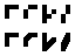
In the best traditions of low-level programming, I asked the question "How to get the maximum at minimum cost?", And decided to try to squeeze more out of what is. With a simple magnification, the symbols consist of squares and right angles (although some connoisseurs of cubism like this style), but if you finish the points in the right places, then angles of 45 or even 30 degrees will appear. I was inspired by the image smoothing algorithm, optionally presented in this “pixel” game. However, existing implementations do not really cope with single-pixel thickness fonts.
For example, the result of the work hqx:

As a result, I created my own algorithm, designed specifically for small raster fonts, and called it Anti Eye Bleeding, for neither more nor less.
You can follow the evolution of the algorithm on our forum .
Using general principles, it produces a multiple increase or smoothing (the choice is regular or subpixel with a precalculated ratio). In the case of anti-aliasing, only a few individual pixels are subject to mixing, which allows to achieve acceptable performance. It is written in assembler and integrated into the core KolibriOS, as a basic tool. Also, I added a 8x16 font to the kernel for 1400 Unicode characters, 22 kb in size (without compression), which caused it to burn up to 188 kb (92 kb after compression).
Immediately after turning on system-wide anti-aliasing, one feature emerged: when drawing text, you must erase the previous one, otherwise the intensity of mixed pixels increases with each redraw. In some programs, the "obesity" of the text can be found so far.
The main problem remains scaling with a fractional multiplier. I tried to write a library in which ClearType is used to reduce to the right size after a multiple increase, but the result remains controversial. However, you can help evaluate it:

Source: https://habr.com/ru/post/269495/
All Articles